Dead & Emerging Tech Panel
•
0 gefällt mir•527 views

My contribution to the dead & emerging tech panel at CiL2010. Notes added for clarity.

Empfohlen
Empfohlen
Weitere ähnliche Inhalte
Was ist angesagt?
Was ist angesagt? (7)
Ähnlich wie Dead & Emerging Tech Panel
Ähnlich wie Dead & Emerging Tech Panel (20)
Mehr von amanda etches
Mehr von amanda etches (11)
Kürzlich hochgeladen
Kürzlich hochgeladen (20)
Dead & Emerging Tech Panel
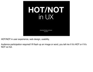
- 1. HOT/NOT in UX Amanda Etches-Johnson CiL2010 HOT/NOT in user experience, web design, usability. Audience participation required! I'll flash up an image or word, you tell me if it's HOT or if it's NOT so hot.
- 2. (not) FLASH. Definitely not hot. For a few reasons: - it!s fluff. frosting. - it!s closed and proprietary - it!s not accessible -- which means that anyone using assistive technology like a screen reader? doesn!t work.
- 3. HTML 5 (hot!) HTML 5 Totally hot. - the next major version of the html markup language - been in development for going on 6 years and it!s finally ready for primetime. - HTML itself is an open standard (hot) - addition of new tags: e.g. one that embeds video into a page, which will effectively rid us of the need to use flash altogether.
- 4. (not) MOBILE APPS MOBILE APPS Kind of not hot. Channelling Jason Griffey @ Top Tech at ALA Midwinter, who posited that this year we!d see the death of the app. With the launch of the iPad last week, apps are probably not going anywhere. BUT the not hot part is apps are device/OS specific. Not hot. How many in the audience have built a standalone app for your library? (1 hand) How many of you are planning to? (3 hands)
- 5. (hot!) MOBILE WEB MOBILE WEB Super hot! - i.e. websites that are optimized for mobile browsers. - doable stuff. - best part? you don!t have to create different versions for different devices, like you do with mobile apps. - creating a mobile website for your library can be easy thanks to all the different frameworks we can use to make it happen.
- 6. valid markup (hot!) VALID MARKUP Unquestionably hot! - good practice -- for both regular format browsing, as well as mobile browsing. - valid markup ensures that your web content looks the same, performs the same, and behaves the same across multiple browsers.
- 7. http://validator.w3.org/mobile/ If building for mobile, W3C has this excellent validator.
- 8. This is the report it spits out. I ran an *unknown* library through the validator and found it to be 23% mobile ready. Click on “detailed report” for all the juicy details on what needs to be fixed to optimize your site for mobile browsing.
- 9. (hot!) THOUGHTFUL DESIGN Definitely hot. So is Rodin's thinker. Thoughtful design is all about taking user needs into consideration when you design for the mobile web. It is definitely NOT about just taking your existing site and adding a few tweaks here and there to make it look better on small format browsers. It is also NOT about just throwing up a text-version of your site for users visiting on their mobile devices.
- 10. McDonald!s as an example of thoughtful design? It!s true! In this case only. If you visit the McDonald!s website on your mobile device, you see this -- a splash page. And the only functionality here is a search box where you enter your zip code or city to find your closest McDonald!s. For all those late-night, Big Mac emergencies. This is thoughtful design because they!ve done enough user research and testing to figure out that the ONLY reason why anyone would visit the McDonald!s website on their mobile device is to find the nearest location.
- 11. Text Contact to Me Text Directions to Me View on Google Maps HOT mobile site from a library. This is Oregon State University Library. Probably a bit more text on this screen than I!d like to see BUT the cool part is you can have the contact and directions texted to yourself OR click a link to view their location on google maps. THIS is thoughtful design, really thinking about the mobile user experience. It!s a small thing with a big impact.
- 12. casual repeat urgent Bottom line with mobile site development: we need to stop thinking about our users in traditional ways (undergrads, grads, teens etc.) Instead, need to think about them in ways that are meaningful to the mobile experience. Are they causal visitors? Are they repeat visitors? Are they urgent visitors? (in search of quick info/and answer; like late-night Big Mac emergency guy) Need to publish the BARE MINIMUM on our mobile sites but still satisfy all three types of visitors.
- 13. (hot!) Watching users use our sites (regular and mobile)? Fantastically hot! There is no better way to get to the bottom of user frustrations and needs than to watch them interact with our interfaces.
- 14. (not) Watching librarians use our sites (regular and mobile)? Not as hot. We are not designing for librarians. PROTIP: do a round of usability with users. Then do the same test with librarians. Review and compare the results of both tests. Present the results to the librarians. Usually quite enlightening. (and hot)
- 15. (not) Cheese grating kids on the playground is definitely not hot. Neither is putting our users through frustrating, painful experiences (which we do everyday, on our mobile sites AND our regular ones). This is definitely not hot.
- 16. (hot!) http://usablelibrary.org Shameful plug: head to usablelibrary.org and print out this poster. Hang it up in your office as a reminder to make sure every decision you make at your library creates a better experience for your users. THANKS!