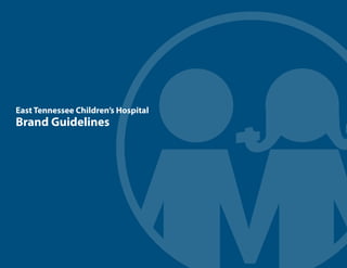
East Tennessee Children's Hospital Brand Guidelines
•
6 likes•19,567 views

How to correctly use the East Tennessee Children's Hospital brand and logo in graphic design, media and publications.

Recommended
Recommended
More Related Content
What's hot
What's hot (20)
Similar to East Tennessee Children's Hospital Brand Guidelines
Similar to East Tennessee Children's Hospital Brand Guidelines (20)
More from East Tennessee Children's Hospital
More from East Tennessee Children's Hospital (20)
Recently uploaded
Recently uploaded (20)
East Tennessee Children's Hospital Brand Guidelines
- 1. 1 East Tennessee Children’s Hospital Brand Guidelines
- 2. 2 A strong brand is one of the most valuable assets an organization owns. To make it truly powerful, it needs to be applied consistently so anyone dealing with East Tennessee Children’s Hospital knows who we are and what we stand for. Everyone has a part to play in doing this and bringing our brand to life. These guidelines are to help you represent our brand consistently.
- 3. 3 Contents Our brand 4 Our logo 6 Color palette 20 Typography 21 Photography 25 In application 32
- 4. 4 Our Brand At the heart of any brand is a big idea. Simple. Memorable. True. For East Tennessee Children’s Hospital, this big idea is: We Get Kids A simple but powerful expression of what we believe in. Children are the focus of everything we do. Even though there is so much expertise and experience behind this simple phrase, it all comes down to how we understand children. We recognize they have unique needs when it comes to health care. We get kids.
- 5. 5 Our Brand Platform With We Get Kids at its heart, our brand platform is a summary of all the elements that make East Tennessee Children’s Hospital special. Our mission is about the impact we want to make. Our values are the standards we believe in that drive the way we do things. Our promise describes what we do for all our audiences. Our personality is the image we want to project. Our positioning is the unique place we occupy in the world. The Brand Platform is the essential tool to help us make the right decisions in everything we do. Our Mission To improve the health of children through exceptional, comprehensive family-centered care and wellness. Our Positioning We are the only hospital in East Tennessee providing the unique care children need. Our Values Exceptional Care Collaborative Compassion Child & Family Partnership Highly Skilled & Dedicated Staff Physician Partnership Service Excellence Integrity Stewardship Our Personality Fun and playful, but backed up by serious health care expertise. Our Promise We are committed to the physical, educational and emotional needs of each child. We Get Kids
- 6. 6 Our Logo
- 7. 7 Our Logo Our logo consists of two elements — the Children’s Hospital symbol and the Children’s Hospital wordmark. Our logo is a unique piece of artwork. The proportion and arrangement of the symbol and wordmark have been specifically determined. The logo should never be typeset, recreated or altered, which could cause inconsistencies that dilute the impact of the brand’s power. symbol wordmark logo
- 8. 8 Our Logo - Color The official color of our logo is reproduced in these following formats: Pantone® 301 CMYK 100 72 27 12 RGB 0 74 136 WEB 004a88
- 9. 9 Our Logo - Marketing Lock-up with tag Blue logo on white In East Tennessee, there are currently no other competing hospitals for children. Our brand is commonly referred to as just“Children’s Hospital.” When communicating to this region, the preferred version of our logo is simplified to reflect the common use.
- 10. 10 Our Logo - Corporate Lock-up Blue logo on white On official corporate communications and on materials that are distributed outside of our service market, we need to identify our brand as East Tennessee Children’s Hospital. In these cases, this is the preferred version of our logo.
- 11. 11 Our Logo - Black logo on white
- 12. 12 Our Logo - White logo on our blue When our logo appears over a dark background always use the version with a white rule around the symbol.
- 13. 13 Our Logo - White logo on photography Always use the version with the blue symbol with a white rule around it and ensure good legibility of our logo when over photographic backgrounds.
- 14. 14 Our Logo - White logo on a color Whenever possible, use the version with the blue mark when our logo appears over a color other than our blue.
- 15. 15 Our Logo - Exclusion Zone Our logo needs breathing room. Maintain a minimum clear space around our logo from competing graphic elements that may divert attention. The minimum clear space for our logo is defined as the height of the“H”in the wordmark.
- 16. 16 Our Logo - Alternate Versions The preferred lock-up of our logo may not fit every need. In instances where the space allowed is limited, use one of these alternate versions. preferred version centered version stacked version n’s Hospital Marketing Lockup ETCH Pantone 301 Horizontal Lockup Centered Lockup Stacked Lockup words East Tennessee on will be used in corporate cted to an audience beyond The marketing version of the logo will NOT have the words East Tennessee above the name Children’s Hospital. Instead the tagline We Get Kids will be placed under the logo. This version will be used in advertising, marketing and other promotional uses for the east Tennessee region. LOGO LOCKUPS East Tennessee Children’s Hospital Prepared by The Tombras Group. August 2012 Corporate Lockup Marketing Lockup Horizontal Lockup Centered Lockup ETCH Pantone 301 Horizontal Lockup Centered Lockup The corporate version of the logo will have the words East Tennessee above the name Children’s Hospital. This version will be used in corporate communications and other uses which are directed to an audience beyond the east Tennessee region The marketing version of the logo will NOT have the words East Tennessee above the name Children’s Hospital. Instead the tagline We Get Kids will be placed under the logo. This version will be used in advertising, marketing and other promotional uses for the east Tennessee region. Centered Lockup Stacked Lockup Centered Lockup Stacked Lockup LOGO LOCKUPS East Tennessee Children’s Hospital Prepared by The Tombras Group. August 2012 Corporate Lockup Marketing Lockup Horizontal Lockup Centered Lockup Stacked Lockup ETCH Pantone 301 Horizontal Lockup Centered Lockup Stacked Lockup The corporate version of the logo will have the words East Tennessee above the name Children’s Hospital. This version will be used in corporate communications and other uses which are directed to an audience beyond the east Tennessee region The marketing version of the logo will NOT have the words East Tennessee above the name Children’s Hospital. Instead the tagline We Get Kids will be placed under the logo. This version will be used in advertising, marketing and other promotional uses for the east Tennessee region. Stacked Lockup Stacked Lockup Horizontal Lockup Centered Lockup Stacked Lockup Horizontal Locku Centered Lockup Stacked Lockup
- 17. 17 Our Logo - Logo No-no’s Incorrect use of our logo compromises its integrity and effectiveness. The examples below are only a small sample of possible no-no’s to show how we need to ensure accurate, consistent reproduction of our logo. Never alter, add to or attempt to recreate it. Do not put a box or other shape around our logo. Do not change the relationship of the tagline to the logo. Do not put the logo on an overly complicated background. Do not distort our logo.Do not change the relationship of the symbol and the wordmark. Do not change the color of the symbol. Do not reproduce our logo in colors other than specified in the guidelines. Do not typeset the wordmark. East Tennessee Children’s Hospital
- 19. 19 Our Brand Graphic Elements It is important that all the materials we create have unifying elements. This makes them part of one family, much like human traits can identify an individual as part of a family. This is achieved through the use of color palette, typography and photography.
- 20. 22 Our Color Palette - Color Below is a group of colors that work well with the official blue of our logo. White is an important color as well. Color ETCH ETCH ETCH ETCH ETCH ETCH ETCH Blue Purple Red Green Yellow Pantone® 301 7447 5135 703 7742 7474 1365 CMYK 100 72 27 12 75 82 25 4 47 79 30 15 16 90 59 4 72 27 92 12 99 29 38 5 0 26 75 0 RGB 0 74 136 94 74 128 132 74 113 189 60 75 72 119 60 0 117 130 255 182 72 WEB 004a88 5e497f 844971 bd3c4b 48773c 007582 ffb648 ETCH ETCH ETCH ETCH ETCH ETCH ETCH Color Light Light Light Light Light Light Light Blue Purple Red Green Yellow Pantone® 291 522 686 169 578 7457 7507 CMYK 32 5 1 0 30 39 5 1 13 34 6 0 3 38 24 1 24 4 42 0 21 2 6 0 0 14 35 0 RGB 152 202 236 176 154 191 211 160 185 236 170 167 183 206 151 186 220 230 253 210 154 WEB 98caec b19bc0 d3a069 eeaba8 b7ce97 badce6 fdd29a
- 21. 21 To help provide a consistent, unified look among all our marketing materials, Myriad Pro typeface should be used. As a sans-serif typeface, Myriad Pro has a business-like, straight forward, no-nonsense attitude. But it also has been designed to have a rounder and friendlier feel. This reflects our brand because we are in the serious business of health care, yet we are not like other hospitals because our focus is children. Typography - Marketing materials Myriad Pro Light ABCDEFGHIJKLMNOPQRSTUVWXYZ abcdefghijklmnopqrstuvwxyz 1234567890! Myriad Pro Light Italic ABCDEFGHIJKLMNOPQRSTUVWXYZ abcdefghijklmnopqrstuvwxyz 1234567890! Myriad Pro Regular ABCDEFGHIJKLMNOPQRSTUVWXYZ abcdefghijklmnopqrstuvwxyz 1234567890! Myriad Pro Italic ABCDEFGHIJKLMNOPQRSTUVWXYZ abcdefghijklmnopqrstuvwxyz 1234567890!
- 22. 22 Typography - Marketing materials Myriad Pro Semi Bold ABCDEFGHIJKLMNOPQRSTUVWXYZ abcdefghijklmnopqrstuvwxyz 1234567890! Myriad Pro Semi Bold Italic ABCDEFGHIJKLMNOPQRSTUVWXYZ abcdefghijklmnopqrstuvwxyz 1234567890! Myriad Pro Bold ABCDEFGHIJKLMNOPQRSTUVWXYZ abcdefghijklmnopqrstuvwxyz 1234567890! Myriad Pro Bold Italic ABCDEFGHIJKLMNOPQRSTUVWXYZ abcdefghijklmnopqrstuvwxyz 1234567890! Myriad Pro Black ABCDEFGHIJKLMNOPQRSTUVWXYZ abcdefghijklmnopqrstuvwxyz 1234567890! Myriad Pro Black Italic ABCDEFGHIJKLMNOPQRSTUVWXYZ abcdefghijklmnopqrstuvwxyz 1234567890!
- 23. 23 Though regular Myriad Pro is recommended for most uses, a condensed version is sometimes needed when space is limited, such as forms. A secondary type face, Gotham Rounded, can be used to add an even more playful attitude to a design while maintaining the professional attitude. Myriad Pro Condensed ABCDEFGHIJKLMNOPQRSTUVWXYZ abcdefghijklmnopqrstuvwxyz 1234567890! Myriad Pro Bold Condensed ABCDEFGHIJKLMNOPQRSTUVWXYZ abcdefghijklmnopqrstuvwxyz 1234567890! Myriad Pro Black Condensed ABCDEFGHIJKLMNOPQRSTUVWXYZ abcdefghijklmnopqrstuvwxyz 1234567890! Gotham Rounded Book ABCDEFGHIJKLMNOPQRSTUVWXYZ abcdefghijklmnopqrstuvwxyz 1234567890! Gotham Rounded Medium ABCDEFGHIJKLMNOPQRSTUVWXYZ abcdefghijklmnopqrstuvwxyz 1234567890! Gotham Rounded Bold ABCDEFGHIJKLMNOPQRSTUVWXYZ abcdefghijklmnopqrstuvwxyz 1234567890! Typography - Secondary Weights and Fonts
- 24. 24 This is a typical size for body copy. Lorem ipsum dolor sit amet, consectetuer adipis icing elit, sed diam nonummy nibh euismod tinci dunt ut laoreet dolore magna aliquam erat volut pat. Ut wisi enitrud exerci tation ullam corper eta suscipit lobortis nisl ut aliquex ea consequat. Myriad Pro Regular Typography - Examples Health care Myriad Pro Light Children Myriad Pro Black Diagnostic Myriad Pro Semi Bold Condensed Patients Myriad Pro Bold Family Gotham Rounded Medium Calendar Gotham Rounded Bold
- 25. 25 Photography The images we show play an important role in expressing our brand personality – fun and playful, but backed up by serious health care expertise. Therefore it’s very important to choose the right kind of imagery. As we all know, children have eternal hope, an unquenchable spirit, and the ability to turn just about any situation into fun. Imagery of children should focus on this positive spirit and have the quality of real emotions and life instead of being stiff and artificial. Look for the fun and playful. It is easy to use photos of unhappy or critcally ill children but doing so does not represent the wide range of services we provide. Whenever possible, we should associate our brand with the vitality of happy active children.
- 26. 26 Photography There are two types of photos that are used in our materials. Photos where the subject is surrounded by white. When you use a photo where the subject is on a white background you achieve a light and fresh quality to your layout. The subject is not confined inside a box. This style supports the fun and playful side of our brand personality. Photos where the image fills the frame Sometimes the background is an important part of the picture and you wish to have the photo inside a frame. Take care when cropping your photo so the subject does not feel crowded. These are both nice examples of photos that have been obviously staged, but the photographer was able to get the children to relax and be themselves.
- 27. 27 Photography - Examples These examples demonstrate how photos can convey our brand personality. These children have a vital energy that comes from wellness and an endearing playful nature.
- 28. 28 Photography - Portrait Examples Portraits of doctors and hospital staff should follow similar guidelines. Their expertise is explained with the words, next to their photo, in your layout. But studies have shown that we decide whether or not to trust an individual based on what we see. Strive for friendly, relaxed portraits that reflect the personality of someone who loves working with children.
- 29. 29 Don’t show children afraid of hospital staff or procedures. Our goal is to have children not fear coming to see the doctor. Do not show children in pain. It’s a parent’s worst nightmare. Avoid showing a painful or frightening medical condition or procedure. Drawings are less personal when illustrating important information. Be careful when using photos of really sick kids. It’s too easy for parents to pigeonhole Children’s Hospital as only a place for really sick kids. Don’t use clichéd imagery.When using stock photos, look for people who look natural, not posed. Photography - No-no’s Keeping imagery on brand can be tricky, but it is very important to try and avoid some of these problems. A photo may seem right at first but we need take a moment and ask if it’s really communicating what our brand stands for. In communications with the general public try not to show facilities or equipment without a human in the photo. Never show an empty bed.
- 30. 30 Don’t use clip art. All imagery should reflect the high quality of care patients receive at our hospital. Cartoons also do not represent our brand of highly competent professionals. An exception might be materials designed specifically for children. Don’t use low-resolution photographs. High-quality imagery reflects the high quality of care we provide. Avoid awkward cropping. If the photo does not fit, then find an alternative. Words or graphics over photos can create clutter and confusion. It’s best to allow the personality and“story”of your photo to speak for itself. Photography - No-no’s Avoid busy photos without a clear point of focus.
- 31. 31 Avoid using group shots where it is impossible to tell who is who. Sometimes an individual can represent a group better. Photography - Portrait No-no’s Avoid photographs of people wearing masks.They may seem dramatic, but it does not fit with our friendly brand. Don’t use photos taken with a phone. Especially self-shot photos. Don’t use photos of people pretending to do their job. It never looks real and natural. Don’t show children as doctors. Our brand is about medical professionals who understand children. Let the kids be kids and the doctors be grown-ups.
- 32. 32 Our Brand In Action On the following pages you will find layout formats and examples of marketing and communication pieces that will be used at Children’s Hospital
- 33. 33 In Application - Letterhead 2018 Clinch Avenue Knoxville,TN 37916 www.etch.com p. 865.541.8172 f. 865.541.8285 Pediatric Specialty Name John Q. Sample, MD, FAAP Jane Doe, MD, FAAP Sample H. Name, MD, FAAP Jonathon Q. Sample, Jr., MD, FAAP John Q. Sample, MD, FAAP Jane Doe, MD, FAAP Sample H. Name, MD, FAAP Jonathon Q. Sample, Jr., MD, FAAP 2018 Clinch Avenue Knoxville,TN 37916 www.etch.com p. 865.541.8172 f. 865.541.8285 Basic Letterhead Basic Letterhead with Specialty
- 34. 34 In Application - Envelope #10 envelope #10 envelope with specialty 2018 Clinch Avenue Knoxville,TN 37916 2018 Clinch Avenue Knoxville,TN 37916 Pediatric Specialty Name
- 35. 35 In Application - Business card Side 1 Side 2 East Tennessee Children’s Hospital Department Name Sample Person Place Title Here p. 865.000.0000 m. 865.000.0000 f. 865.000.0000 sampleperson@etch.com PO Box15010 Knoxville,TN 37901-5010 2018 Clinch Avenue Knoxville,TN 37916 www.etch.com
- 36. 36 In Application - Mailing label 2018 Clinch Avenue Knoxville,TN 37916 2018 Clinch Avenue Knoxville,TN 37916 Pediatric Specialty Name Basic label Basic label with Specialty
- 37. 37 In Application - Partner inclusion Letterhead with partner Envelope with partner Mailing label with partner 2018 Clinch Avenue Knoxville,TN 37916 www.etch.com p. 865.541.8172 f. 865.541.8285 2018 Clinch Avenue Knoxville,TN 37916 2018 Clinch Avenue Knoxville,TN 37916
- 38. 38 In Application - Brochures Consistent design presentation is very important to our brand. When the various brochures, fliers and printed materials all have the same design elements of fonts, colors, imagery and layout grid the brand is strengthened. This builds comfort and trust that Children’s Hospital is a very profes- sional organization that pays attention to details. COVER BACK COVERINSIDE SPREAD The top bar is a grounding element giving the design a solid consistent structure on every page On the cover the hospital name is in the bar. When the brochure is in a rack this portion will be visible. The layout grid: The grid is designed to have a wide 1 inch margin on the outside edges. This gives the brochure “breathing room”. Traditionally called white space, this area, clear of type, is a resting place for the eye and helps lead the reader to things we would like them to focus on. The dimensions of most brochures are 4” x 9” final folded. This size allows for both rack display and mailing in a #10 envelope The headline on the cover falls within the top third of the cover design to be visible in a rack display. 1/3 Cover photos. It is recommended to use cover photos of happy, active kids that are trimmed to the silhouette. This style of photo is on-brand, presenting ETCH as a hospital that understands the needs of children. “We get kids.” The background texture and color of the brochures will be unique to each ser- vice area providing some visual variety and a color- coded system for the service areas. The bottom bar is another grounding element in the design. It is 50% tint of the main brochure color as found in the top bar. The headlines shown here are set in the Gotham Rounded face and set in a non-traditional way with varying type size. This was done to bring out the playful aspect of the brand. Photos or drawings. The gray boxes indicate different ways to treat photos or drawings. It is recommended that these elements line up on the grid. The secondary grid falls in the middle of the text block and half of the empty margin. When graphic ele- ments “snap” to the grid lines they form a clean consistent layout. Style sheets have been created for sub-heads, body copy, bullet lists and side bars. Level 1 sub-heads - 14 pt. Gotham Rounded in the primary brochure color. Yellow rule below. Level 2 sub-heads - 10 pt. Gotham Round- ed in gray Body copy - 9 pt. Myriad Pro on 11 pt. leading in black Side bars should also snap to the grid and can be set apart from the body copy with a color box that is 10% of the primary color. The Children’s Hospital logo and address information should appear on the back of every brochure 9” 4”
- 39. 39 In Application - Brochures color code Hospital Departments (i.e. Sleep Medicine, Emergency Department, Surgical, Inpatient, Radiology, Laboratory, etc.) Specialties (i.e. Pediatric Oncology, Emergency Medicine, etc.) Additional Services (i.e. Child Life, Pastoral Care, Social Work, Interpretation, Food Services, etc.) Fundraising & EventsInternal Programs (i.e. Health & Wellness Tips, New HR policies, Retirement, etc.) Community Outreach (i.e. Safe Kids, Obesity Coalition).
- 40. 40 In Application - Example 4 panel brochure COVER BACK COVERINSIDE SPREAD
- 41. 41 In Application - Example six panel brochure COVERBACK COVERFOLD IN PANEL INSIDE SPREAD
- 42. 42 In Application - Example Rack Card FRONT BACK
- 43. 43 In Application - Two-sided flier FRONT BACK
- 44. 44 In Application - Two-sided flier
- 45. 45 In Application - Newsletter It is useful to have a unifying design for the various newsletters throughout our organization. However to distinguish them apart we will use the departmental color scheme and a masthead that clearly identifies the intended audience. The design is flexible enough to provide the opportunity for a wide variety of content and still have the unifying skeleton of the underlying grid. This newsletter design is built on a three column grid, with an empty column for white space relief, similar to the brochures and fliers. The story heads and body copy share the same style as well.
- 46. 46 In Application - Newsletter Three columns is the base grid and should be used most often. However, there are times when two columns or even one column are desired. Use the three column grid as your guide when using those variations. The grid is also very helpful in organizing photographs and other visual content to maintain a unified look and feel to the page.
- 47. 47