SlideShare ist ein Scribd-Unternehmen logo
1 von 5
Downloaden Sie, um offline zu lesen
WE SERVICE ALL SIZES!
WHITEPAPER ON RESPONSIVE WEB DESIGN


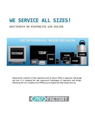
 Exploring the evolution of web experience and its future. What is responsive web design
 and how it is changing the web experience? Advantages of responsive web design.
 Delivering the core competency of PHPFactory on Responsive Web Design services.
WE SERVICE ALL SIZES                                                        DEMOGRAPHICS
WHITEPAPER ON RESPONSIVE WEB DESIGN                                         By the end of 2012, there will
                                                                            be more mobile devices
We live in a world that is technologically evolving at a fast pace. There   connecting to the Internet
is a huge digital revolution happening as more and more people are          than there are people on
                                                                            Earth.
connected to the web not just from traditional PC’s but from an array
of choices like tablets, mobiles and other web devices. The landscape       Android: 1.3 million device
of web is so fast changing that today we need to cater to all these         activations per day and
devices seamlessly but yet ensure integrity. Today market is flooded        climbing. 480 million Android
with users who access web not just from desktop but also from a             users.
multitude of devices. As a company you are faced with a number of           31% of American adults who
challenges in terms of the target end users. A large spectrum of            have cell phones use their
devices, different screen sizes, different resolutions and different        phones for the majority of
performance. Faced with these challenges companies today need to            their Internet access
optimize their digital delivery to accommodate them. This was made
                                                                            17% of cell phone owners do
possible by responsive web design.                                          most of their online browsing
                                                                            on their phone, rather than a
History: Sometime back at the emergence of all these digital devices
                                                                            computer or other device.
we were addressing this by replicating our digital initiatives for
standard devices. We used to have Desktop version website for               At the end of 2011, there
standard PC format then a mobile version of the same website and            were    6 billion      mobile
sometimes a text only site that caters to basic devices. Even within        subscriptions, estimates The
                                                                            ITU(2011). That is equivalent
the desktop version there used to be differences like resolution size
                                                                            to 87 percent of the world
that was addressed by adopting a smart “Liquid layout” to ensure that       population. And is a huge
we capture all the extra space that you find on 600 X 1024px as against     increase from 5.4 billion in
400 X 640px.                                                                2010 and 4.7 billion mobile
                                                                            subscriptions in 2009.
What is Responsive Web Design?
                                                                            6B connections today, 10B
To answer this query first one needs to understand a few basics on web      connections in 2016, 26X
layouts and their organic evolution. The Worldwide web today has            worldwide traffic growth.
undergone a paradigm shift from fixed layouts to Adaptive (Multiple
                                                                            31% of all Americans only or
fixed width) layouts to responsive (Multiple Fluid Grid) layouts.           mostly use the Internet on
                                                                            their mobile phones. That
What Responsive Web Design means?                                           amounts to 50 million
                                                                            Americans
Responsive Web Design is a leap from conventional liquid layout
formats to the concept of fluid grid. In this format we ensure that the
website elements are designed to proportion and not arbitrary
percentages. By doing so as the size of varies the elements in the
layout get realigned along with the text. This is achieved by a lot of


© 2012 PHPFactory                                                                     Page | 1
below the surface scripting on CSS3 media queries at the presentation layer. This basically facilitates
websites to gather a lot of information on the site visitor in terms of what is the device he/she is
accessing from their form factor, resolution so on. Responding to the collected data we are able to
optimize performance and customize content delivery accordingly.


Advantages of Responsive Web Design

Responsive web design is the new forte for digital content to be served seamless across different
devices and different formats on the web. The advantages of adopting responsive web design are the
following

      Considerable saving of time and money
      Implicit capability for cross browser support
      Optimizing Performance based on size of the screen
      Modular delivery of Web Content


© 2012 PHPFactory                                                                    Page | 2
Core Competence of PHPFactory on Responsive Web Design

Please visit our website (www.phpfactory.com) from your desktop and on parallel visit our site from
your tablet or smartphone. You will find that the site is served from the same URL without
compromising on the content. You will also find the various elements on the site adjust itself to form
size of the device and the text wraps around the elements accordingly. This will give you the
experience of what responsive web design can do for you on your website.


© 2012 PHPFactory                                                                   Page | 3
Statistics reveal by July 2012 nearly 2.4 Billion online internet users are accessing web and that is
 34.5% of the global population Across developed and developing countries the telco’s are registering
 major portion of their revenue on smartphone and online usage both for accessing web content as
 well as mobile telephony. This by itself provides a strong proposition to companies for the need to be
 mobile friendly.

 Conclusion:

 By adopting a Responsive web design framework you can make your site not just future friendly but
 also resolution independent and device agnostic. If you are interested to explore possibilities for your
 website and online web applications please call us and discuss with us and we would love to showcase
 some of our case studies on the same.


PHPFactory
Reg: Sedin Technologies Pvt Ltd,
# 38/39 - 3rd Floor, Whites Rd Circular Building,
White's Rd, Royapettah,
Chennai, TN, India - 600014.

Website: www.phpfactory.com
Mail To : info@phpfactory.com
Contact : +91 97899 77565


 © 2012 PHPFactory                                                                     Page | 4

Weitere ähnliche Inhalte

Andere mochten auch

Educational design and innovative pedagogies for open and online teaching and...
Educational design and innovative pedagogies for open and online teaching and...Educational design and innovative pedagogies for open and online teaching and...
Educational design and innovative pedagogies for open and online teaching and...Patrick McAndrew
 
Open Course Data at Loughborough University
Open Course Data at Loughborough UniversityOpen Course Data at Loughborough University
Open Course Data at Loughborough UniversityMartin Hamilton
 
Start a revolution... in your bedroom.
Start a revolution... in your bedroom. Start a revolution... in your bedroom.
Start a revolution... in your bedroom. Ricardo Sousa
 
How I learned to stop worrying and love the cloud
How I learned to stop worrying and love the cloudHow I learned to stop worrying and love the cloud
How I learned to stop worrying and love the cloudShlomo Swidler
 
NFC & RFID on Android
NFC & RFID on AndroidNFC & RFID on Android
NFC & RFID on Androidtodbotdotcom
 

Andere mochten auch (7)

Prominent Traffic Signals
Prominent Traffic SignalsProminent Traffic Signals
Prominent Traffic Signals
 
Educational design and innovative pedagogies for open and online teaching and...
Educational design and innovative pedagogies for open and online teaching and...Educational design and innovative pedagogies for open and online teaching and...
Educational design and innovative pedagogies for open and online teaching and...
 
Open Course Data at Loughborough University
Open Course Data at Loughborough UniversityOpen Course Data at Loughborough University
Open Course Data at Loughborough University
 
No Story No Company
No Story No CompanyNo Story No Company
No Story No Company
 
Start a revolution... in your bedroom.
Start a revolution... in your bedroom. Start a revolution... in your bedroom.
Start a revolution... in your bedroom.
 
How I learned to stop worrying and love the cloud
How I learned to stop worrying and love the cloudHow I learned to stop worrying and love the cloud
How I learned to stop worrying and love the cloud
 
NFC & RFID on Android
NFC & RFID on AndroidNFC & RFID on Android
NFC & RFID on Android
 

Responsive Web design white paper whats your size

  • 1. WE SERVICE ALL SIZES! WHITEPAPER ON RESPONSIVE WEB DESIGN Exploring the evolution of web experience and its future. What is responsive web design and how it is changing the web experience? Advantages of responsive web design. Delivering the core competency of PHPFactory on Responsive Web Design services.
  • 2. WE SERVICE ALL SIZES DEMOGRAPHICS WHITEPAPER ON RESPONSIVE WEB DESIGN By the end of 2012, there will be more mobile devices We live in a world that is technologically evolving at a fast pace. There connecting to the Internet is a huge digital revolution happening as more and more people are than there are people on Earth. connected to the web not just from traditional PC’s but from an array of choices like tablets, mobiles and other web devices. The landscape Android: 1.3 million device of web is so fast changing that today we need to cater to all these activations per day and devices seamlessly but yet ensure integrity. Today market is flooded climbing. 480 million Android with users who access web not just from desktop but also from a users. multitude of devices. As a company you are faced with a number of 31% of American adults who challenges in terms of the target end users. A large spectrum of have cell phones use their devices, different screen sizes, different resolutions and different phones for the majority of performance. Faced with these challenges companies today need to their Internet access optimize their digital delivery to accommodate them. This was made 17% of cell phone owners do possible by responsive web design. most of their online browsing on their phone, rather than a History: Sometime back at the emergence of all these digital devices computer or other device. we were addressing this by replicating our digital initiatives for standard devices. We used to have Desktop version website for At the end of 2011, there standard PC format then a mobile version of the same website and were 6 billion mobile sometimes a text only site that caters to basic devices. Even within subscriptions, estimates The ITU(2011). That is equivalent the desktop version there used to be differences like resolution size to 87 percent of the world that was addressed by adopting a smart “Liquid layout” to ensure that population. And is a huge we capture all the extra space that you find on 600 X 1024px as against increase from 5.4 billion in 400 X 640px. 2010 and 4.7 billion mobile subscriptions in 2009. What is Responsive Web Design? 6B connections today, 10B To answer this query first one needs to understand a few basics on web connections in 2016, 26X layouts and their organic evolution. The Worldwide web today has worldwide traffic growth. undergone a paradigm shift from fixed layouts to Adaptive (Multiple 31% of all Americans only or fixed width) layouts to responsive (Multiple Fluid Grid) layouts. mostly use the Internet on their mobile phones. That What Responsive Web Design means? amounts to 50 million Americans Responsive Web Design is a leap from conventional liquid layout formats to the concept of fluid grid. In this format we ensure that the website elements are designed to proportion and not arbitrary percentages. By doing so as the size of varies the elements in the layout get realigned along with the text. This is achieved by a lot of © 2012 PHPFactory Page | 1
  • 3. below the surface scripting on CSS3 media queries at the presentation layer. This basically facilitates websites to gather a lot of information on the site visitor in terms of what is the device he/she is accessing from their form factor, resolution so on. Responding to the collected data we are able to optimize performance and customize content delivery accordingly. Advantages of Responsive Web Design Responsive web design is the new forte for digital content to be served seamless across different devices and different formats on the web. The advantages of adopting responsive web design are the following  Considerable saving of time and money  Implicit capability for cross browser support  Optimizing Performance based on size of the screen  Modular delivery of Web Content © 2012 PHPFactory Page | 2
  • 4. Core Competence of PHPFactory on Responsive Web Design Please visit our website (www.phpfactory.com) from your desktop and on parallel visit our site from your tablet or smartphone. You will find that the site is served from the same URL without compromising on the content. You will also find the various elements on the site adjust itself to form size of the device and the text wraps around the elements accordingly. This will give you the experience of what responsive web design can do for you on your website. © 2012 PHPFactory Page | 3
  • 5. Statistics reveal by July 2012 nearly 2.4 Billion online internet users are accessing web and that is 34.5% of the global population Across developed and developing countries the telco’s are registering major portion of their revenue on smartphone and online usage both for accessing web content as well as mobile telephony. This by itself provides a strong proposition to companies for the need to be mobile friendly. Conclusion: By adopting a Responsive web design framework you can make your site not just future friendly but also resolution independent and device agnostic. If you are interested to explore possibilities for your website and online web applications please call us and discuss with us and we would love to showcase some of our case studies on the same. PHPFactory Reg: Sedin Technologies Pvt Ltd, # 38/39 - 3rd Floor, Whites Rd Circular Building, White's Rd, Royapettah, Chennai, TN, India - 600014. Website: www.phpfactory.com Mail To : info@phpfactory.com Contact : +91 97899 77565 © 2012 PHPFactory Page | 4