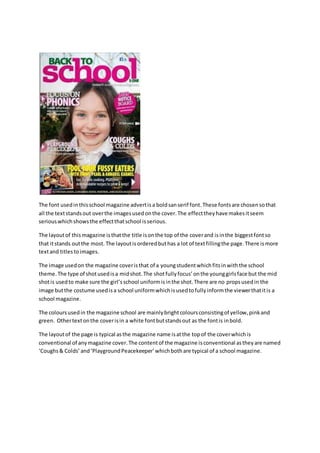
The magazine cover uses a bold sans-serif font to make the text stand out against the images. The font choice gives the impression that the content is serious, reflecting the serious nature of school. The title is displayed in the largest font at the top of the cover to draw the most attention. There is more text than images filling the page. The cover image depicts a young student in school uniform to fit the school theme. Bright colors like yellow, pink, and green are used throughout, and other text stands out in bold white font. The layout and content of the magazine are conventional, with the title at the top and articles about common school topics.
1. The font usedinthisschool magazine advertisa boldsanserif font.These fontsare chosensothat
all the textstandsout overthe imagesusedonthe cover.The effecttheyhave makesitseem
seriouswhichshowsthe effectthatschool isserious.
The layoutof thismagazine isthatthe title isonthe top of the coverand isinthe biggestfontso
that itstands outthe most. The layoutisorderedbuthas a lot of textfillingthe page.There ismore
textand titlestoimages.
The image usedon the magazine coveristhat of a youngstudentwhichfitsinwiththe school
theme.The type of shotusedisa midshot.The shotfullyfocus’onthe younggirlsface but the mid
shotis usedto make sure the girl’sschool uniformisinthe shot.There are no propsusedin the
image butthe costume usedisa school uniformwhichisusedtofullyinformthe viewerthatitis a
school magazine.
The coloursusedin the magazine school are mainlybrightcoloursconsistingof yellow,pinkand
green. Othertextonthe coverisin a white fontbutstandsout as the fontis inbold.
The layoutof the page is typical asthe magazine name isatthe topof the coverwhichis
conventional of anymagazine cover.The contentof the magazine isconventional astheyare named
‘Coughs& Colds’and‘PlaygroundPeacekeeper’whichbothare typical of a school magazine.