1. The house style to this double
page spread consists of two 3
colours yellow, black and
white. This creates a sense of
warning that this band is
dangerous. As well the music
they create is cutting edge
rock.
This page has a variation of
different fonts which attract
the reader in. For example the
beginning of the looks like an
caution sign, so the title has
gone from being bold and
draws attention to spooky and
ghostly. This draws people in
to read the article as it
portrays that they is
something about this band,
which the audience wants to
find out about.
Colum’s have been used so the
text is organised. This grabs
the attention of the reader as
they can follow along and it is
easy to read as it not all over
the place.
A pull quite has been used to
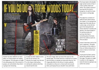
A kicker has been added for an extra A shape has been added so extra The main image, takes up most of the space on the attract the audience to read
effect, as it leads people into reading text can be inserted. This double page. This shows that this is important as it shows this page. This gives an insight
the magazine. This also gives an insight distracts the reader from the text who the band is so people can know who they are. The to what is in the magazine,
into what going to be in the content so as the shape is bold yellow, image adds effect to the title as it creates a ghostly what the band are going to say
people, can read whether they think it alerting the audience that they atmosphere as they are in a forest with mist around within the context.
is going to be interesting. should read this text. them, portraying that you shouldn’t mess with them.