SlideShare ist ein Scribd-Unternehmen logo
1 von 1
Salford City College
Eccles Centre
AS Media Studies
Foundation Portfolio
Colours the colour pallet consist of three bold colours that make
an effective contrast. The dominating colours are deep red,
white and black. These are effective because they illustrate the
genre for example; red connoted danger and is typical associated
with the hybrid genre of indie/rock. It also connotes a romantic
tone. Black and white because they are binary opposition. Black
normally represents death where as white is usually recognised
with purity. So therefore it creates a unique feel to the
magazine. Also theses colours help the red of the artists’ hair to
stand out and look more appealing for the audience.

Masthead It takes the full top left gird square up.

Ed with the

Otherwise known as the primary optical area. The colour
is a bold, deep red witch connotes danger and passion.
Also the white presents a contrast between the red. The
font is bold to create emphasis on the letter. The letter q
is a common tern used in the industry therefore illustrates
the music scene.
Main cover lineit is in black lettering witch is a contrast to the
white background; therefore it catches your eye. This is also
reflected by the fact some worlds are in italics. It is positioned in
the strong fallow field witch is the second thing you look at.

Typefacesthe magazine cover uses white black and red which is
all in a sans serif font. The non- consistency of the font makes
the cover more modern for target audience to relate. For
example some of the fonts are in san serif and the main cover
line is in blocked capitals.

Model creditit is in a sans serif font is bright red lettering. It is
situated in the strong fallow field on the page. This is effective
because it does not distract that target audience from the artist
face; however it is next to the artist so the targeted audience
gets and understanding of the artist if they are not familiar. The
uses of a pull quote is effective it make the audience want to
read more and by the magazine.

Photography LightingThe lighting is high key featured on the
artist this highlights that she is the leading images of the page. It
automatically draws the audience eye to the main focal point
witch is the artist. Also it creates shadows on her body which
adds to the sex appeal. In addition, the high key lighting draws
attention to her pale skin in contrast to the fiery red hair colour.

Coversine’sthe cover line are in the week fallow field. This is so
it does not distract the audience from the main image of the
artist. The cover lines also farm the image the highlight the
importance of the artist. The coversine’s have a background of a
vibrant red colour with white writing. This makes them stand
out.
Main image: The dominating image is the featured artist in
centre of the page that crosses over the rule of three
techniques. This is because she appears in each segment of
page. This make the artist stand out and could introduce a new
audience, if people like her they will buy the magazine. Also, the
artist uses direct address, this makes the audience feel she is
looking at them and helps them to feel connected to the artist.
Also the artist is in the foreground in comparison to the
background of famous iconic landmarks. Because she is larger
than all the predominate icons I could suggest that she is an
iconic artist. The artist has a camera angle of a long shot from a
low angle. This could promote the fact that she has long legs and
introduces ex appeal.

House StyleBy making the artist centre of attention in the middle of famous landmarks, it creates
a urban feel to the magazine. It highlights the genre of alternative/R&B because they are typically
scene as urban. This is demonstrated by typical conventions that music magazine typical have. For
example the coversine’s frames the main image.

Design Principles Used?The title is situated in the primary optical
area in the Guttenberg design principle. This is effective because
it make the title more memorable for the targeted audience
because it is the fist thing that you look at when you are
scanning the page for the fist time. The artist also falls in to this
sector; this is effective because it is the fist thing you see.
Therefore tis will sell the magazine. The strong fallow field it
filled with text to highlight the different stories. The fact that it
has the word “MEN” in blocked capitals suggests that this is the
primary target audience. In each sector of the design principle
there is a clear amount of text. This is effective because it makes
the magazine look like it has lots of news for the audience to
look at. In addition, the dominating image of the artist is in the
centre of the gild lines for the rules of thirds. This automatically
makes the audience subconsciously look at the artist fist and it is
eye catching.

Weitere ähnliche Inhalte

Was ist angesagt?

Dizzee rascal cover page
Dizzee rascal cover page Dizzee rascal cover page
Dizzee rascal cover page ALarsen14
 
Music magazine deconstruction
Music magazine deconstructionMusic magazine deconstruction
Music magazine deconstructionjassinta
 
Music genre powerpoint
Music genre powerpointMusic genre powerpoint
Music genre powerpointLeah Aston
 
Plans and research into my music magazine
Plans and research into my music magazinePlans and research into my music magazine
Plans and research into my music magazineLeah Aston
 
Double page spread annotations
Double page spread annotationsDouble page spread annotations
Double page spread annotationsLeah Aston
 
Front cover analysis: Jack white
Front cover analysis: Jack white Front cover analysis: Jack white
Front cover analysis: Jack white sophieharrison_x
 
Analysis of magazine this one
Analysis of magazine this oneAnalysis of magazine this one
Analysis of magazine this oneemilyyoungx
 
Cover page essay[1]
Cover page essay[1]Cover page essay[1]
Cover page essay[1]MorganClough
 
Front Cover Analysis Mix Mag:Groove Armada
Front Cover Analysis Mix Mag:Groove ArmadaFront Cover Analysis Mix Mag:Groove Armada
Front Cover Analysis Mix Mag:Groove Armadasophieharrison_x
 
Mood Board And Analysis F I N A L O N E E E E
Mood  Board  And  Analysis  F I N A L  O N E E E EMood  Board  And  Analysis  F I N A L  O N E E E E
Mood Board And Analysis F I N A L O N E E E Eryan lovejoy
 
Front cover analysis essay and labelled analysis
Front cover analysis essay and labelled analysisFront cover analysis essay and labelled analysis
Front cover analysis essay and labelled analysisLizRose2012
 
Masthead analysis
Masthead analysis   Masthead analysis
Masthead analysis Amir Mohseny
 
Front Cover Analysis of MixMag
Front Cover Analysis of MixMagFront Cover Analysis of MixMag
Front Cover Analysis of MixMagJosh03
 
Music Magazine Analysis
Music Magazine Analysis Music Magazine Analysis
Music Magazine Analysis caitlinblogg
 
Evaluation q4 q5
Evaluation q4 q5Evaluation q4 q5
Evaluation q4 q5mollybeck_
 

Was ist angesagt? (20)

Dizzee rascal cover page
Dizzee rascal cover page Dizzee rascal cover page
Dizzee rascal cover page
 
Music magazine deconstruction
Music magazine deconstructionMusic magazine deconstruction
Music magazine deconstruction
 
Music genre powerpoint
Music genre powerpointMusic genre powerpoint
Music genre powerpoint
 
Plans and research into my music magazine
Plans and research into my music magazinePlans and research into my music magazine
Plans and research into my music magazine
 
Double page spread annotations
Double page spread annotationsDouble page spread annotations
Double page spread annotations
 
Front cover analysis: Jack white
Front cover analysis: Jack white Front cover analysis: Jack white
Front cover analysis: Jack white
 
Analysis of magazine this one
Analysis of magazine this oneAnalysis of magazine this one
Analysis of magazine this one
 
Cover page essay[1]
Cover page essay[1]Cover page essay[1]
Cover page essay[1]
 
Front Cover Analysis Mix Mag:Groove Armada
Front Cover Analysis Mix Mag:Groove ArmadaFront Cover Analysis Mix Mag:Groove Armada
Front Cover Analysis Mix Mag:Groove Armada
 
Mood Board And Analysis F I N A L O N E E E E
Mood  Board  And  Analysis  F I N A L  O N E E E EMood  Board  And  Analysis  F I N A L  O N E E E E
Mood Board And Analysis F I N A L O N E E E E
 
Magazine 2
Magazine 2Magazine 2
Magazine 2
 
Front cover analysis essay and labelled analysis
Front cover analysis essay and labelled analysisFront cover analysis essay and labelled analysis
Front cover analysis essay and labelled analysis
 
Masthead designs
Masthead designsMasthead designs
Masthead designs
 
Masthead analysis
Masthead analysis   Masthead analysis
Masthead analysis
 
Task 2a
Task 2aTask 2a
Task 2a
 
Task 2 a NME
Task 2 a NMETask 2 a NME
Task 2 a NME
 
Front Cover Analysis of MixMag
Front Cover Analysis of MixMagFront Cover Analysis of MixMag
Front Cover Analysis of MixMag
 
Music Magazine Analysis
Music Magazine Analysis Music Magazine Analysis
Music Magazine Analysis
 
Evaluation q4 q5
Evaluation q4 q5Evaluation q4 q5
Evaluation q4 q5
 
Evaluation q2
Evaluation q2Evaluation q2
Evaluation q2
 

Ähnlich wie Florence q magazine finished,

Researching codes and conventions of music magazines double page spread
Researching codes and conventions of music magazines double page spreadResearching codes and conventions of music magazines double page spread
Researching codes and conventions of music magazines double page spreadEvijaKapeljuha
 
Tasks 1 4 and hwk 1
Tasks 1 4 and hwk 1Tasks 1 4 and hwk 1
Tasks 1 4 and hwk 1charlie__1
 
Duoble page analasis
Duoble page analasisDuoble page analasis
Duoble page analasisemilylouisej
 
Analyising music magazines
Analyising music magazinesAnalyising music magazines
Analyising music magazinesjessasmedia4
 
Presentation2 (1)
Presentation2 (1)Presentation2 (1)
Presentation2 (1)dankyjosh
 
Student textual analysis
Student textual analysisStudent textual analysis
Student textual analysisGudj
 
Analyising music magazines
Analyising music magazinesAnalyising music magazines
Analyising music magazinesjessasmedia4
 
Analyising music magazines
Analyising music magazinesAnalyising music magazines
Analyising music magazinesJess Stafford
 
Deconstruction of magazines 2
Deconstruction of magazines 2Deconstruction of magazines 2
Deconstruction of magazines 2Lauren Holyoak
 
Analyising music magazines
Analyising music magazinesAnalyising music magazines
Analyising music magazinesjessasmedia4
 
Analysis of three magazines (3)
Analysis of three magazines (3)Analysis of three magazines (3)
Analysis of three magazines (3)domingochristal
 
Textual analysis
Textual analysisTextual analysis
Textual analysis049038
 
Front cover analysis
Front cover analysis Front cover analysis
Front cover analysis asmediae15
 

Ähnlich wie Florence q magazine finished, (20)

Xxl
XxlXxl
Xxl
 
Xxl
XxlXxl
Xxl
 
ANALYSIS OF FRONT COVERS
ANALYSIS OF FRONT COVERSANALYSIS OF FRONT COVERS
ANALYSIS OF FRONT COVERS
 
Researching codes and conventions of music magazines double page spread
Researching codes and conventions of music magazines double page spreadResearching codes and conventions of music magazines double page spread
Researching codes and conventions of music magazines double page spread
 
Tasks 1 4 and hwk 1
Tasks 1 4 and hwk 1Tasks 1 4 and hwk 1
Tasks 1 4 and hwk 1
 
Duoble page analasis
Duoble page analasisDuoble page analasis
Duoble page analasis
 
Analyising music magazines
Analyising music magazinesAnalyising music magazines
Analyising music magazines
 
FCD 2
FCD 2FCD 2
FCD 2
 
Presentation2 (1)
Presentation2 (1)Presentation2 (1)
Presentation2 (1)
 
Student textual analysis
Student textual analysisStudent textual analysis
Student textual analysis
 
Analyising music magazines
Analyising music magazinesAnalyising music magazines
Analyising music magazines
 
Analyising music magazines
Analyising music magazinesAnalyising music magazines
Analyising music magazines
 
Deconstruction of magazines 2
Deconstruction of magazines 2Deconstruction of magazines 2
Deconstruction of magazines 2
 
Analyising music magazines
Analyising music magazinesAnalyising music magazines
Analyising music magazines
 
Analysis of three magazines (3)
Analysis of three magazines (3)Analysis of three magazines (3)
Analysis of three magazines (3)
 
Textual analysis
Textual analysisTextual analysis
Textual analysis
 
Front cover analysis
Front cover analysis Front cover analysis
Front cover analysis
 
Magazine analysis
Magazine analysis Magazine analysis
Magazine analysis
 
Vibe
VibeVibe
Vibe
 
Analysis of Magazine Covers
Analysis of Magazine Covers Analysis of Magazine Covers
Analysis of Magazine Covers
 

Mehr von emilylouisej

Mehr von emilylouisej (20)

Evaluation quetsion 4
Evaluation quetsion 4Evaluation quetsion 4
Evaluation quetsion 4
 
Evaluation q1
Evaluation q1Evaluation q1
Evaluation q1
 
Finished evauation of question 3
Finished evauation of question 3Finished evauation of question 3
Finished evauation of question 3
 
Print screens
Print screensPrint screens
Print screens
 
Copyright and location permision (1)
Copyright and location permision (1)Copyright and location permision (1)
Copyright and location permision (1)
 
Contact sheet
Contact sheetContact sheet
Contact sheet
 
Radio head video anayalsis
Radio head video anayalsisRadio head video anayalsis
Radio head video anayalsis
 
Rihanna didgipak
Rihanna didgipakRihanna didgipak
Rihanna didgipak
 
Flo and the machine advert1
Flo and the machine advert1Flo and the machine advert1
Flo and the machine advert1
 
Question 7
Question 7Question 7
Question 7
 
Question 7
Question 7Question 7
Question 7
 
Question 7
Question 7Question 7
Question 7
 
Question 7
Question 7Question 7
Question 7
 
Question 6
Question 6Question 6
Question 6
 
Question 6
Question 6Question 6
Question 6
 
Question 6
Question 6Question 6
Question 6
 
Question 4
Question 4Question 4
Question 4
 
Evaluation Queston 2
Evaluation Queston 2Evaluation Queston 2
Evaluation Queston 2
 
Manipulation
ManipulationManipulation
Manipulation
 
Contack sheet
Contack sheetContack sheet
Contack sheet
 

Florence q magazine finished,

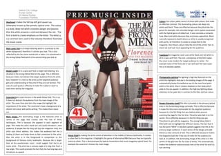
  • 1. Salford City College Eccles Centre AS Media Studies Foundation Portfolio Colours the colour pallet consist of three bold colours that make an effective contrast. The dominating colours are deep red, white and black. These are effective because they illustrate the genre for example; red connoted danger and is typical associated with the hybrid genre of indie/rock. It also connotes a romantic tone. Black and white because they are binary opposition. Black normally represents death where as white is usually recognised with purity. So therefore it creates a unique feel to the magazine. Also theses colours help the red of the artists’ hair to stand out and look more appealing for the audience. Masthead It takes the full top left gird square up. Ed with the Otherwise known as the primary optical area. The colour is a bold, deep red witch connotes danger and passion. Also the white presents a contrast between the red. The font is bold to create emphasis on the letter. The letter q is a common tern used in the industry therefore illustrates the music scene. Main cover lineit is in black lettering witch is a contrast to the white background; therefore it catches your eye. This is also reflected by the fact some worlds are in italics. It is positioned in the strong fallow field witch is the second thing you look at. Typefacesthe magazine cover uses white black and red which is all in a sans serif font. The non- consistency of the font makes the cover more modern for target audience to relate. For example some of the fonts are in san serif and the main cover line is in blocked capitals. Model creditit is in a sans serif font is bright red lettering. It is situated in the strong fallow field on the page. This is effective because it does not distract that target audience from the artist face; however it is next to the artist so the targeted audience gets and understanding of the artist if they are not familiar. The uses of a pull quote is effective it make the audience want to read more and by the magazine. Photography LightingThe lighting is high key featured on the artist this highlights that she is the leading images of the page. It automatically draws the audience eye to the main focal point witch is the artist. Also it creates shadows on her body which adds to the sex appeal. In addition, the high key lighting draws attention to her pale skin in contrast to the fiery red hair colour. Coversine’sthe cover line are in the week fallow field. This is so it does not distract the audience from the main image of the artist. The cover lines also farm the image the highlight the importance of the artist. The coversine’s have a background of a vibrant red colour with white writing. This makes them stand out. Main image: The dominating image is the featured artist in centre of the page that crosses over the rule of three techniques. This is because she appears in each segment of page. This make the artist stand out and could introduce a new audience, if people like her they will buy the magazine. Also, the artist uses direct address, this makes the audience feel she is looking at them and helps them to feel connected to the artist. Also the artist is in the foreground in comparison to the background of famous iconic landmarks. Because she is larger than all the predominate icons I could suggest that she is an iconic artist. The artist has a camera angle of a long shot from a low angle. This could promote the fact that she has long legs and introduces ex appeal. House StyleBy making the artist centre of attention in the middle of famous landmarks, it creates a urban feel to the magazine. It highlights the genre of alternative/R&B because they are typically scene as urban. This is demonstrated by typical conventions that music magazine typical have. For example the coversine’s frames the main image. Design Principles Used?The title is situated in the primary optical area in the Guttenberg design principle. This is effective because it make the title more memorable for the targeted audience because it is the fist thing that you look at when you are scanning the page for the fist time. The artist also falls in to this sector; this is effective because it is the fist thing you see. Therefore tis will sell the magazine. The strong fallow field it filled with text to highlight the different stories. The fact that it has the word “MEN” in blocked capitals suggests that this is the primary target audience. In each sector of the design principle there is a clear amount of text. This is effective because it makes the magazine look like it has lots of news for the audience to look at. In addition, the dominating image of the artist is in the centre of the gild lines for the rules of thirds. This automatically makes the audience subconsciously look at the artist fist and it is eye catching.