
Empfohlen
Weitere ähnliche Inhalte
Was ist angesagt?
Was ist angesagt? (20)
Andere mochten auch
Andere mochten auch (18)
Ähnlich wie Fear itself
Ähnlich wie Fear itself (20)
Mehr von emiliaawcock17
Kürzlich hochgeladen
Kürzlich hochgeladen (20)
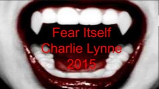
Fear itself
- 2. Fear itself is a story about a girl who is haunted by traumatic events and tells her story through the past 100 years of horror film scenes. Watching this has inspired me in many ways in what I want to include in my final piece. The story is told through out small snippets of horrors which opens up to all the techniques that are included. The story is told through her whispering in a soft tone which creates a creepy atmosphere, there are also parts when we can here her heartbeat which shows the audience she is scared and finding it hard to talk about this topic.
- 3. Some shot types which I have seen from this which I would want to use in my final piece are a extreme close up to a scary or scared face. Having an extreme close up can make the audience feel deluded and disorientated. I would also want to use this shot as a zoom at speed to bring the audience straight into the action. I want to alter the focus effect to be altered, so it goes in and out of focus. Close up and slow motion as a combination are also a good way to create suspense or tension within a scene. An example of this is in this documentary is of popcorn dropping and the drink spilling in the cinema. Extreme close ups of eyes and teeth also scare audience as it can be disorientating.
- 4. Many conventions of horrors are represented through fear itself, one of these are the conventional use of thunder and lightning. Thunder and lighting is used in horrors for dramatic affect and a lot of people have natural fears of thunder and lighting. Using these fears to build up tension and fears is a clever way off creating an atmosphere full of suspense. In slightly more gothic horrors there is typical convention of using extreme high key lighting in flash to show that there is a change happening to someone or something, I plan to use this in my final piece as we zoom into the music box. Jump scares happen when we least expect it from darkness to extreme light and high pitch sound.
- 5. Colour and text techniques are used in horrors to make us aware of the character and genre. An example would be that we know who are innocent as they are stereotypically in white and light clothing. Another way to represent innocence is through young, vulnerable children as they are defenseless. Where as red is known as the colour of evil, suffering and horror as it is a representation of blood. Serif font is known as an, embellishment, classic and traditional which gives an old fashion look. Where as son serif font has no embellishment, modern which gives a current look, that the horror is set in the present rather than past. There is also an editing technique called opacity which means overlapping two types of text. This makes the audience feel confused and struggle to truly understand what's going on as they ty to read both. I want to use something like this in my final piece but with sound rather than text.
- 6. Some quotes from fear itself • ‘Our anxiety's are always with us, building up through life ’ • ‘horrors tap into our pre existing fears’ • ‘Silence and darkness seem to be quite key ingredients to horror’ • ‘Our own minds are the biggest thing which concern us’
- 7. Examples of films I got these horror conventions from: • nosferatue (1922) • midnight lace (1960) • Sette note in Nero (1977) • Night of the demon (1957) • Jaws (1975) • Altered states 1960 • Mujo 1960 • Doce immcuno 2010