
Empfohlen
Weitere ähnliche Inhalte
Was ist angesagt?
Was ist angesagt? (18)
Andere mochten auch
Andere mochten auch (9)
Ähnlich wie Double page
Ähnlich wie Double page (20)
Mehr von ellyshakular
Mehr von ellyshakular (20)
Kürzlich hochgeladen
Kürzlich hochgeladen (20)
Double page
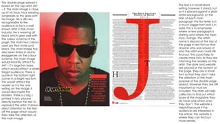
- 1. The double page spread is based on the rap artist JAY – Z. The main image is close up of his face, he is wearing sunglasses as this goes with his image. He is still very recognisable to the audience as he is a well known artist in the music industry. He is wearing all black which goes well with the colour scheme of the page. The main two colours used are Red white and black. The main image has also been tinted in red to exaggerate on the colour scheme. This main image would instantly attract to JAY – Z’s large fan base, which would attract a wider target audience. There is quote in the bottom right corner in a bright red font. This would attract the reader as it is the only writing on the image, it would also inspire the readers. There is a big J printed in red, placed directly behind the text to represent the artist. It draws direct attention to the text off the page which would then take the attention of the main image. The text is in small black writing however it stands out as it is placed against a plain white background. At the start of each main paragraph the first letter is in a much bigger font and is in bold. This is to emphasise where a new paragraph is starting and where the topic may change. The artists name is placed at the top of the page in red font so that anyone who was unsure of who the artist was could still find out. This could help to create more fans as they are informing the readers on the artist. The date and website are placed at the bottom of the page, they are in small font so that they don’t take the attention of the main purpose of the double page spread. However they are still important so must be included. The date will help collectors to find out which issues of the magazine they do have and which ones they don’t. The website is helpful because if the audience are interested in the article, the website is where they can find out more details.