Pentimento
•Als PPT, PDF herunterladen•
0 gefällt mir•540 views

A presentation for "Share it", a conference on digita media and museums organised by the Statens Museum for Kunst, Copenhagen, Denmark, 1.10.09 http://translate.google.com/translate?hl=en&sl=da&u=http://www.kulturarv.dk/i-fokus-nu/kulturnet-danmark/tematimer/2009/&ei=F9kgS9_tAo2h4QaRmazwCQ&sa=X&oi=translate&ct=result&resnum=1&ved=0CAgQ7gEwADge&prev=/search%3Fq%3Delena%2Blagoudi%26hl%3Den%26rls%3Dcom.microsoft:en-US%26sa%3DN%26start%3D30

Empfohlen
Weitere ähnliche Inhalte
Ähnlich wie Pentimento
Ähnlich wie Pentimento (20)
Pentimento
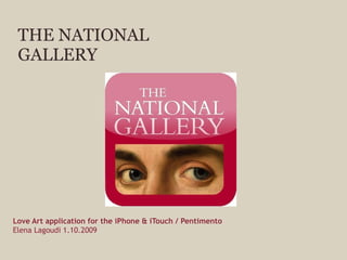
- 1. THE NATIONAL GALLERY Love Art application for the iPhone & iTouch / Pentimento Elena Lagoudi 1.10.2009
- 2. THE NATIONAL GALLERY The National Gallery, London, houses one of the greatest collections of Western European painting in the world, from the 13 th to the 20 th century.
- 4. LOVE ART app for iPhone and iTouch-Pentimento
- 5. Lessons learnt content the brand creative collaboration and business model
- 6. Intro video
- 8. Image viewer
- 9. Galleries
- 10. Rolodex
- 11. LOVE ART app for iPhone and iTouch-Pentimento
- 12. LOVE ART app for iPhone and iTouch-Pentimento IPR
- 14. re-cycling re-purposing re-creating Insert image caption here
- 15. Insert image caption here Ingredients zoom galleries brand & games transcriptions artstart new* the grand tour be inspired content & fun
- 16. Be Inspired and Grand Tour podcasts and the monthly Podcast
- 19. CLICK TO ADD TITLE
- 20. LOVE ART app for iPhone and iTouch-Pentimento Love Art and the NG brand
- 22. THE NATIONAL GALLERY EXPERIENCE BELIEF HONOUR FAITH REASON HISTORY DESIRE PAIN GENIUS RELIGION TRUTH TORMENT LOVE DESTRUCTION ABSOLUTION HEAVEN HELL DREAMS LUST SORROW JOY WAR ECSTASY FURY EVIL INNOCENCE MADNESS DESPAIR DEVOTION TRUST PURITY CRUELTY PRIDE DESPAIR BLOOD FAMILY POWER VANITY SPIRIT HEART FLESH GLORY BENEDICTION VISION NATURE SEX BETRAYAL VALEDICTION SOUL ETERNITY DAMNATION REDEMPTION LIFE DEATH PASSION BEAUTY
- 24. The National Gallery Brand identity review and communications to reinstate the gallery as a ‘must visit’ cultural attraction.
- 25. THE PERMANENT COLLECTION
- 26. DESIGN AND COMMUNCATIOS FOR EXAMPLE: Design, advertising and promotions Gallery services Publishing Merchandise
- 27. Rolodex
- 28. Intro video
- 29. Image viewer
- 30. Zoom
- 40. THANK YOU
Hinweis der Redaktion
- The main title screen. Do not touch ‘The National Gallery’. When formatting the title of the presentation be mindful of the width of the text. Words should not spread right across the screen. Split words onto more than one line to form a pleasing layout. When formatting the date only state the number for the day (ie ‘6’ not ‘6th’).
- It contains over 2,300 works, including many famous works, such as van Eyck’s Arnolfini Portrait, Velázquez’s Rokeby Venus, Turner’s Fighting Temeraire and Van Gogh’s Sunflowers. All major traditions of Western European painting are represented from the artists of late medieval and Renaissance Italy to the French Impressionists . Do not touch ‘The National Gallery’. When formatting the title of the presentation be mindful of the width of the text. Words should not spread right across the screen. Split words onto more than one line to form a pleasing layout. When formatting the date only state the number for the day (ie ‘6’ not ‘6th’).
- The main title screen. Do not touch ‘The National Gallery’. When formatting the title of the presentation be mindful of the width of the text. Words should not spread right across the screen. Split words onto more than one line to form a pleasing layout. When formatting the date only state the number for the day (ie ‘6’ not ‘6th’).
- This screen is for images only and shows an example of where to place one single image.
- This is the standard screen which should be used for almost all pages in your presentation. If you wish to use sub-headings, follow this formatting. It is up to you whether you use two columns or bullet points or just text (etc) but be mindful that you don’t want to include too much text on each screen (see the notes on Using Text in Powerpoint Presentations on the second page of this document).
- This screen is for images only and shows an example of where to place one single image.
- This screen is for images only and shows an example of where to place one single image.
- This screen is for images only and shows an example of where to place one single image.
- Use this screen to separate chapters of content. Use a synopsis if you wish or leave blank.
- Use this screen for images only. If you need to place text alongside the image use a white background.
- This screen is for images only and shows an example of where to place one single image.
- This screen is for images only and shows an example of where to place 2 images.
- Use this screen to emphasis e particular pieces of content, eg, an important piece of information or dramatic statistic , etc. This screen should be used sparingly and do not place one coloured screen directly after another. NEVER place Gallery paintings on this background.
- This screen is for images only and shows an example of where to place one single image.
- Basic Principles for formatting National Gallery Powerpoint Presentations
- The main title screen. Do not touch ‘The National Gallery’. When formatting the title of the presentation be mindful of the width of the text. Words should not spread right across the screen. Split words onto more than one line to form a pleasing layout. When formatting the date only state the number for the day (ie ‘6’ not ‘6th’).
- Basic Principles for formatting National Gallery Powerpoint Presentations
- Basic Principles for formatting National Gallery Powerpoint Presentations
- This screen is for images only and shows an example of where to place one single image.
- The main title screen. Do not touch ‘The National Gallery’. When formatting the title of the presentation be mindful of the width of the text. Words should not spread right across the screen. Split words onto more than one line to form a pleasing layout. When formatting the date only state the number for the day (ie ‘6’ not ‘6th’).