
Empfohlen
Weitere ähnliche Inhalte
Was ist angesagt?
Was ist angesagt? (19)
Andere mochten auch
Ähnlich wie Premiliary task
Ähnlich wie Premiliary task (20)
Mehr von driss123
Kürzlich hochgeladen
Kürzlich hochgeladen (20)
Premiliary task
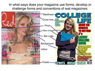
- 1. Masthead Main Image Cover line Price Bar code Footer Background colour In what ways does your magazine use forms, develop or challenge forms and conventions of real magazines:
- 3. How does your media product use, develop or challenge forms and conventions of the media: One of the ways that my media product (magazine) uses conventions of the media is that it has a clear masthead like other magazines. I had to use this as it clearly outline the name of the magazine and it also shows who it is aimed at. In addition another way that my magazine uses media conventions is that on my front cover I have used text. The text allowed me to share information with my target audience into what is inside the magazine. Furthermore another key convention which was critical to use in my magazine was a main image. I used mise-en-scene in my image in the clothing in the person as it portrays what a stereotypical student looks like and it also has elements of college life which was what my magazine was aimed at. Furthermore the placement of my model was important as it is one the left hand side of the page which makes more room for the cover lines which makes them more visible and will there be noticed more by the target audience. Although the image not in the centre of the page which challenges traditionally conventions, but because of the model’s clothes and colour she is still very noticeable on the page. Another way which my magazine challenges the forms and conventions of the media is the colour of the background, because usually they are very dark to make the lighter text stand out more. But because my magazine alright has cover lines which are light in colour there was no need to add a dark background as it would then affect the visibility of the main image.
- 4. What have you learnt from the technologies from the process of constructing your magazine? Firstly I learnt how to use the paint bucket tool to add a background colour to my magazine. I then added an image to my magazine and used a the filter extract tool to add an effect to the image to make it stand out more. I then added cover lines by using the text tool to allow me to write on my magazine and the paint bucket tool to add colour to the text.
- 5. I then added a footer. I did this by still using the text tool and the paint bucket tool to add colour. I then added a price for my magazine again I achieved this by using the text tool and the paint bucket tool for colour. I then added a barcode and for this I used the internet as there was no possible way of creating my own barcode I then added another cover line another cover line and a masthead again by using the text tool
- 6. Technologies used whilst constructing your magazine?
- 7. In-Design I used In-Design to construct my contents page. In my opinion although it had similar tools to Photoshop, because I had never used it before I found it difficult to use. But because the tools were fairly similar I was able to use them which made my contents page have a professional appearance. As mentioned I found In-Design a lot harder and more complex to use than Photoshop, but because there were less tools to use I finished my contents page quicker than I did with Photoshop. Furthermore, I found In-Design to by more user friendly as it was less complex in terms of tools and features to use whether as with Photoshop there were too many tools and most of which I did know or understand how to use them. Seeing as I had never previously used In-Design I believe I have learnt the basic knowledge of how to use the program and it’s features. In addition I believe if I had the chance to use In-Design again I could produce other pieces of work to the same or even a higher standard,
- 8. Digital camera: By using the digital camera I learnt how to use the camera in certain ways in order to get a specific camera shot, for example on my front cover I have an image of a mid shot which I got from zooming in the camera and focusing only it only from the waist upwards. When taking my mid shot I had to ensure it had the rule of thirds, the reason for this is because the rule of thirds attracts the audiences eye to a specific part of an image which is important when trying to attract the audience to a specific image as that image could they lure that person to buy the magazine. Moodle: Using moodle was extremely useful as it allowed me to look at other magazine covers and contents page made by past students which allowed me to gains ideas for my own magazine and what codes and conventions I should use. Furthermore, by suing moodle it also provided me with documents giving me information on how to use Photoshop and In-Design which would aid my front cover and contents page into having a professional and visually appealing look.
- 9. Using Photoshop I have learnt how to use many different tools and how to use them correctly in order to make magazine look more presentable, professional and visually appealing. I used Photoshop for a lengthily period of time and as a result I became accustom to many of it’s tool one being the magnetic lasso. This tool allowed me to remove a specific part of the image I wanted regardless if it was on a background or another image. For example I took the picture below using the digital camera, but I later decided in did not want that background or the another person in the image so I decided to use the magnetic lasso to remove that section of the image I wanted from the background. To do this I simply selected the magnetic lasso tool and carefully highlight the outline of the person I wanted and was then able to move her onto another page. Throughout the production of front cover on Photoshop I used this tool on numerous occasions which was extremely useful as it allowed me to take any area of an image, text or background I wanted and appeal it to my magazine. However, the one problem with this tool was that it was very time- consuming and if you made one mistake you would have to go back and delete the mistake, so although it was extremely helpful it was a very long and lingering process. Photoshop: Magnetic Lasso:
- 10. Another tool I learnt how to use on Photoshop was the text tool. This allowed me to write on any section of the page are any direction with a variety of different fonts and sizes. Above is a few examples of the different fonts and texts I used. This was useful because by using the different fonts it made the magazine stand out more and become more attractive as you were not just looking at the same font but a mixture of them. Text tool:
- 11. Paint Bucket Tool: The paint bucket tool was one of the tools I used most when constructing my college magazine. The paint bucket tool allows you to do any colours you want to a text, image, and background. This tool was extremely useful as it allowed me to put some colour onto my magazine which would make it stand out and become more visually attracting which would therefore lure my target audience to purchase my magazine. An example of where I used this tool can be see below where I added my background colour.