
Empfohlen
Weitere ähnliche Inhalte
Mehr von drasticrsk12
Mehr von drasticrsk12 (20)
Kürzlich hochgeladen
Kürzlich hochgeladen (20)
Mac Miller CD case analysis
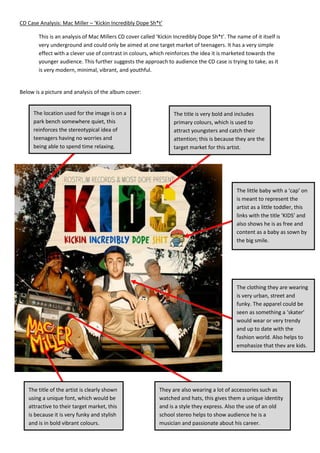
- 1. CD Case Analysis: Mac Miller – ‘Kickin Incredibly Dope Sh*t’ This is an analysis of Mac Millers CD cover called ‘Kickin Incredibly Dope Sh*t’. The name of it itself is very underground and could only be aimed at one target market of teenagers. It has a very simple effect with a clever use of contrast in colours, which reinforces the idea it is marketed towards the younger audience. This further suggests the approach to audience the CD case is trying to take, as it is very modern, minimal, vibrant, and youthful. Below is a picture and analysis of the album cover: The location used for the image is on a The title is very bold and includes park bench somewhere quiet, this primary colours, which is used to reinforces the stereotypical idea of attract youngsters and catch their teenagers having no worries and attention; this is because they are the being able to spend time relaxing. target market for this artist. The little baby with a ‘cap’ on is meant to represent the artist as a little toddler, this links with the title ‘KIDS’ and also shows he is as free and content as a baby as sown by the big smile. The clothing they are wearing is very urban, street and funky. The apparel could be seen as something a ‘skater’ would wear or very trendy and up to date with the fashion world. Also helps to emphasize that they are kids. The title of the artist is clearly shown They are also wearing a lot of accessories such as using a unique font, which would be watched and hats, this gives them a unique identity attractive to their target market, this and is a style they express. Also the use of an old is because it is very funky and stylish school stereo helps to show audience he is a and is in bold vibrant colours. musician and passionate about his career.