
Recommended
More Related Content
What's hot
What's hot (10)
Viewers also liked
Viewers also liked (7)
Similar to Online course design basics
Similar to Online course design basics (20)
More from dlcaven
Recently uploaded
Recently uploaded (20)
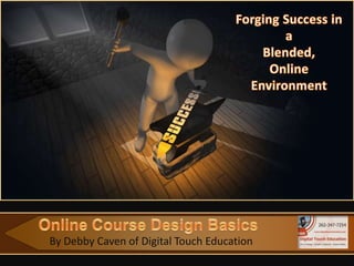
Online course design basics
- 1. By Debby Caven of Digital Touch Education
- 2. A Point to Ponder “To design is much more than simply to assemble, to order, or even to edit; it is to add value and meaning, to illuminate, to simplify, to clarify, to modify, to dignify, to dramatize, to persuade, and perhaps even to amuse.” ~ Paul Rand Author, graphic designer, teacher
- 3. Welcome WEMTA Attendees! Your presenter for today is: Debby Caven / debbycaven@mac.com • Former Educator of 28 years • SMART Certified Trainer • InfoCor, WEI • Online Certified Teacher • eClass4learning • MEIT from Cardinal Stritch University • Adjunct professor •Viterbo University, • Cardinal Stritch University • George Williams College of Aurora University
- 4. Agenda for This Morning Learning Outcomes and Working Backwards Building the Course Foundation The Online Syllabus and Building Your Lessons Elements of an Taking a tour of a Blended Learning Online Course Online Course: with eClass4learning A Tour Language & Clear, concise writing Writing Style Tone, writing instructions and labeling Visual Design Page Layout Basics Text and Graphic Elements
- 5. Building the Course Foundation: Learning Outcomes The Online Course Syllabus The Course Outline From Course Outline to Lessons
- 6. Learning Outcomes: • At the core of a process that creates courses • Assures the learner of rigor and complexity of course • Provides teacher with clear guidelines for developing the online course
- 7. Learning Outcome Requirements: • Are measurable and specific • Wording is clear and definite • Course material is sufficient and is directly related to learning outcomes
- 8. Learning Outcome Requirements: (con’t.) • Resources and activities support learning outcomes • Assessments determine the degree the outcomes have been achieved by students
- 9. Writing Learning Outcomes p. 1: • Be specific • Be clear and concise • Clarify why learners are doing something as well as what they are doing.
- 10. Writing Learning Outcomes p. 2: • Focus on your verbs – Use “active verbs” • Use Bloom’s Taxonomy as a guide • Three Components: • 1. Behavior: What will the learner be able to do? • 2. Conditions: How will the learner be able to do it? • 3. Measurable criteria: How well will the learner be able to do it?
- 11. Writing Learning Outcomes p. 3: • See Figure A.3 from the book, Essentials of Online Course Design by Marjorie Vai and Kristen Sosulski • Sets up a format for writing learning outcomes
- 12. Figure A-3, page 187: Components of a Learning Outcome Behavior Conditions Measurable Criteria Explain how…. In a 10 minute video See Syllabus presentation Describe the Process…. In a paper of no more than See Syllabus 200 words Show how…. In a 3 page report See Syllabus Outline…. In a lesson plan See Syllabus Analyze…. In writing on your Discussion See Syllabus Forum
- 13. Learning Outcomes Review: 1. Learning outcomes are measurable and specific 5. Assessments determine the 2. Wording to effectiveness of define outcomes is activities for clear and definite learning outcomes. 4. Resources & 3. Course material is activities support sufficient & related to learning outcomes. learning outcomes.
- 14. The Online Syllabus • Contains many of the same elements as an onsite syllabus • The core organizing document for both the teachers and students • The place where students go to find out everything they need to know about: ✓Course requirements ✓Evaluation process ✓Contact information ✓Schedule ✓School policies
- 15. The Online Syllabus (cont.) • Must be comprehensive and clear – it is the backbone of your course • Gives students a clear sense of the teacher’s expectations for performance – student knows what it will take for him/her to succeed • A framework for teachers – this is your starting point
- 16. Elements of an Online Syllabus • Basic elements of an onsite syllabus: Course Title Course Name Course Description Course Objectives Evaluation Plan Grading Required Readings Recommended Readings Course Outline
- 17. Elements of an Online Syllabus (cont.) • Special characteristics of an Online Syllabus: ★ A communication strategy ★ A clear description of the course time frame & format ★ Guidelines for online class participation ★ Technical requirements and support ★ A detailed course outline with start and end dates
- 18. Elements of an Online Syllabus (cont.) Communication Strategy: • A description of how and when students can contact you via email, phone, chat, etc. • Important to indicate when you will return emails and phone messages.
- 19. Elements of an Online Syllabus (cont.) A Clear Description of the Course Time Frame & Format: Clearly indicate the synchronous and asynchronous components of your course Include the requirements for class participation in your syllabus and count those activities as part of the course grade Include a rubric for class participation – leaves little room for confusion
- 20. Elements of an Online Syllabus (cont.) A Clear Description of the Course Time Frame & Format:
- 21. Elements of an Online Syllabus (cont.) Guideines for Class Participation: Students should be required to contribute substantially to the discussion forum at a minimum of 2 to 3 times per week Include requirements for class participation in your syllabus and make this a part of your course grade Rubric leaves little room for confusion.
- 22. Elements of an Online Syllabus (cont.) Guidelines for Class Participation:
- 23. Elements of an Online Syllabus (cont.) Technical Requirements & Support: Do not forget to include how students can get help if they are having trouble accessing the course. Be sure to emphasize the technical requirements of your Learning Management System
- 24. Elements of an Online Syllabus (cont.) Technical Requirements & Support:
- 25. Elements of an Online Syllabus (cont.) Course Outline: This serves as a calendar and a “to do” list Presents a sequence of events, assignments, readings, activities and course deliverables Many items are just a carry-over from the syllabus
- 26. Elements of an Online Syllabus (cont.) Course Outline:
- 27. Time for a Tour! eClass4learning Site Let’s look at a completed online course and briefly view the elements we just discussed. eClass4learning Blended Course
- 28. eClass4learning Site Other elements found in an online course: • Announcements • Syllabus • Lessons/Topics • Discussion forums • Dropbox / Assignment uploads • Resources • Grade book • Course emails
- 29. eClass4learning Site More “advanced features” in an online course: • Blogs • Wikis • Tests / Quizzes • Online Texts In Moodle version 2.3 ……….
- 31. Language & Writing Style Clear, concise writing addresses the needs of all types of online learners • It removes one barrier to good communication and understanding • Using clear, concise writing models an accessible style that learners might emulate
- 32. Language & Writing Style Writing Style: “Less is more” “Keep it simple” Motto of Ludwig Mies van der Rohe or …… “Keep it simple” Per Debby Caven 😃
- 33. Language & Writing Style Paragraphs: Enormous blocks of print look formidable to a reader. He has a certain reluctance to tackle them; he can lose his way in them. Therefore, breaking a paragraph in two, even thought it is not necessary to do so for sense, meaning, or logical development, is often a visual help. ~ Strunk, Jr. 1918 Avoid the scroll of death! ~ Debby Caven 2013 😃
- 34. Language & Writing Style Other Brief Thoughts on Writing: • Clear and concise sentences / brief and to the point • Familiar or common words are used • Jargon, cliches and colloquial and idiomatic expressions are avoided. • Provide a glossary or definitions when needed
- 35. Language & Writing Style Other Brief Thoughts on Writing: (cont.) • Tone is important – a supportive second-person conversational tone • Labeling is accurate, readable and clear • Instructions and requirements are stated simply, clearly and logically • Course material has been edited for language and grammar
- 36. Visual Design Basics “Online material should be attractive. This is different than simply clear text and well-organized material. It should be graphically appealing. Researchers at the University of British Colombia rated 127 online courses according to 43 criteria. They found that how a course looks can be just as important as the lessons themselves.” ~ Madden (1999)
- 37. Visual Design Basics: Three Thoughts to Ponder: 1. Good visual design supports understanding through simplicity, clarity and organization. 2. Nothing on the page distracts from communication. 3. An open, clear, attractive page design enhances communication. The Red Pyramid Test Site
- 38. Visual Design Basics • Remember that content presented is visual • Text online replaces speaking through a medium perceived as being visual • Our “digital pros” are used to visual variety • The content they see has been reduced, broken up, illustrated Let’s look at readability on the web through the eyes
- 39. Understanding the Use of White Space Let’s look at readability on the web through the eyes of readability.com
- 40. Visual Design Basics: Page Layout ~ Open means: 1. Enough white space on the page to keep the mind clear. 2. Enough white space to allow the online student to feel that they are not overburdened with the task at hand.
- 41. Visual Design Basics: Space Surrounding Text The space between lines and paragraphs provides white space. It gives the reader a visual break.
- 42. Visual Design Basics: Justification / Headings • Text should be left-justified and right margins ragged • Justified text is not as readable due to inconsistent spacing • Headings and subheadings are used consistently to logically organize content
- 43. Visual Design Basics: Text • Web-safe typefaces: Use sans serif for mobile devices (i.e. Arial, Helvetica, Verdana) • Enhances screen readability for all platforms • Type size should be large enough to be read by all students • Should be at least a 12-point
- 44. Common Screen versus Print Fonts
- 45. Visual Design Basics: Text (continued) • Bold type should be used sparingly for effective use • Italicized type is difficult to read online. • Underlining is used only for hyperlinks • Words in all caps are avoided
- 46. Visual Design Basics: Text (continued) Color with Care! • Contrast is an important factor in readability • Color is good for emphasis • Readability depends on contrast
- 47. Visual Design Basics: Text (continued) Color with Care! • Warning!!! Always keep focused on color’s power to distract. • Color should be used with purpose • There should be good contrast between text and background
- 48. Visual Design Basics: Text (continued)
- 49. Visual Design Basics: Graphic Elements Symbols & Icons • Useful in signaling small elements in a website that appear over and over again. • Icons immediately signal the presence of a certain feature • Icons can also signal certain types of activities. • Students know what to expect when they see and icon / Helpful to all learners
- 50. Visual Design Basics: Graphic Elements The Noun Project • “The Noun Project collects, organizes and adds to the highly recognizable symbols that form the world's visual language, so we may share them in a fun and meaningful way.” All images are free.
- 51. Visual Design Basics: Graphic Elements Bullets & Numbers in a Series • Use bullets or numbers to set apart items that can be listed • Numbers are used to identify sequential steps in a task or process. They are also used for rankings and setting priorities • Bullets are used to highlight a series of items that are not prioritized or sequential.
- 52. Main Resource for this Presentation
- 53. Accompanying Web Site • Essentials for Online Course Design Supplemental Site
- 55. Thank You for Your Time and Attendance!
- 59. Table Page Layout Geographic Region Q1 Q2 Q3 Q4 Here is the description of the graph. This chart is compatible with PowerPoint 2007 - 2010. United States 1254 1873 1015 2284 Here is some more text. You may delete the graphical Europe and Asia 324 310 300 419 elements. Australia 15 18 13 20 Canada 6 3 4 7 Mexico 1 .5 .5 2 TOTALS 1600 2205 1333 2732 This character can be deleted, moved, or resized
- 60. Animated Content Page This page contains a video element and is optimized to work with PowerPoint 2010. Static versions of all layouts are also available.
- 61. Animated or Static? You can change between static and animated layouts by clicking on the Layout tab in the HOME menu on the ribbon. For example this slide uses the static layout.
- 62. Useful Clipart and Images
- 63. Alternate Content Page An alternate content page.
- 64. An alternate content page. FORGING
- 65. Bulleted Content Page • This Layout Page has bullets • And Indented Levels • Level 3 Text Placeholder • Level 4 Place Holder • Level 5 Place Holder
- 66. Agenda or Summary Layout Click Mouse Reveal Next Phase Discussion Item One – Phase 1 Phase 1 A Placeholder for text Phase 2 Discussion Item Two – Phase 2 A Placeholder for text Discussion Item Three – Phase 3 Phase 3 A Placeholder for text Discussion Item Four – Phase 4 Phase 4 A Placeholder for text
- 67. Main Content Page Layout This text is a placeholder. Here is the second level. You may change this text Here is the third level Formatting is controlled by the slide master and the layout pages. There is a third level And even a fourth level
- 68. Two Picture Page Layout A placeholder for the second picture More information can be added here by changing this text. Make changes to this text. A placeholder for the second picture More information can be added here by changing this text. Make changes to this text.
- 69. Three Picture Page Layout A description of the A description of the A description of the first picture. You may second picture. You third picture. You change this text. may change this text. may change this text. A description of the A description of the A description of the first picture. You may second picture. You third picture. You change this text. may change this text. may change this text.
- 70. Bar Graph Page Layout Here is the description of the Chart Title graph. This chart is compatible Series 1 Series 2 Series 3 with PowerPoint 2007 - 2010. 5 Here is some more text. You 4.5 may delete the graphical 4.3 4.4 elements. 3.5 3 2.8 2.4 2.5 2 2 1.8
- 71. Pie Graph Page Layout Here is the description of the graph. This chart is compatible with PowerPoint 2007 - 2010. Chart Title 4th Qtr 9% Here is some more text. You may delete the graphical elements. 3rd Qtr 10% 1st Qtr 58% 2nd Qtr 23%
- 72. Line Chart Page Layout Chart Title Here is the description of the graph. This chart is compatible Series 1 Series 2 Series 3 with PowerPoint 2007 - 2010. 6 Here is some more text. You 5 may delete the graphical elements. 4 3 2 1 0
- 73. Bar Graph Page Layout Here is the description of the Chart Title graph. This chart is compatible with PowerPoint 2007 - 2010. Series 1 Series 2 Series 3 Here is some more text. You may delete the graphical elements. 5 4 3 2 1 0 Category 1 Category 2 Category 3 Category 4
- 74. Pie Graph Page Layout Here is the description of the Chart Title graph. This chart is compatible with PowerPoint 2007 - 2010. 1st Qtr 2nd Qtr 3rd Qtr 4th Qtr Here is some more text. You may delete the graphical elements. 58% 23% 9% 10%
- 75. Smart Art Page Layout Here is the description of the graph. This chart is compatible with PowerPoint 2007 - 2010. Here is some more text. You Stage 3 may delete the graphical elements. Stage 2 Stage 1
- 76. Smart Art Page Layout This chart utilizes Smart Art 1. Learning outcomes which is feature in PowerPoint are measurable and 2007 - 2010. specific 5. Assessments determine the 2. Wording to effectiveness of define outcomes is activities for clear and definite learning outcomes. 3. Course material 4. Resources & is sufficient & activities support related to learning learning outcomes. outcomes.
- 77. Smart Art Page Layout This chart utilizes Smart Art which is feature in PowerPoint Process 1 2007 - 2010. A placeholder for text for more information Process 3 Process 2 A placeholder A placeholder for text for for text for more more information information
- 78. Picture Page Layout Here is a place holder for the picture caption. You may delete this text.
- 79. Questions? More Information? PresenterMedia.com support@presentermedia.com 4416 S. Technology Dr. Sioux Falls, SD 57106