

Empfohlen
Empfohlen
Weitere ähnliche Inhalte
Mehr von Dmitry Anoshin
Mehr von Dmitry Anoshin (20)
Kürzlich hochgeladen
Kürzlich hochgeladen (20)
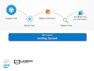
SAP Lumira - Getting started
- 2. Instructions 2 Several important notes about how to use this tutorial: • First of all you should download and install the SAP Lumira Personal Edition here. Personal Edition allows you to use Excel files as the data sources. When there will be a task to use a universe as a data source, you should activate your trial version at the bottom right corner of the home page of SAP Lumira • During this tutorial you will be asked to use the sample Excel file BestRunCorp_Retail.xlsx as long as the eFashion Oracle and eStaff Oracle universes • All theory and explanations will be typed in black font with white background • All tasks and exercises will be typed in blue font with grey background Good luck! Hope you will enjoy building and manipulating visualizations in SAP Lumira.
- 3. Create a document and acquire a dataset from a Microsoft Excel file Acquire your data set based on your local Excel file BestRunCorp_Retail.xlsx : Navigate to the location of the Microsoft Excel file 3
- 4. Create a document and acquire a dataset from a Microsoft Excel file A preview of the file displays, where you can • select a specific sheet; • indicate whether the first row contains column names; • include or exclude hidden columns or rows; • exclude a column by clearing a check box in a column header o Exclude the Comments column o Create a new dataset (the dataset opens in Visualize workspace) o Save your dataset as a local document “Retail” o Close the document (now you have one document and one dataset) o Reopen the document from My Items list 4
- 5. Edit and cleanse a dataset Using the Prepare workspace you can: • include or exclude columns from the existing dataset by Data -> Edit; • edit the data type and content of columns (without changing the original data source); • split and concatenate columns. The Manipulation Tool side bar provides access to all the edit options that you can perform for selected column(s) o Edit your dataset by Data -> Edit to include the column Comments o Convert the Number values of Customer Satisfaction to the text values (a new column is added) o Concatenate the fields Country and City using comma and rename the merged column to “Location” 5
- 6. Edit and cleanse a dataset. Facets mode. In Facets mode you can review the distinct values for each column, which enables you to more easily identify issues with the data. For example, incorrect values could be easily detected and replaced. o Replace “Wet wear” values with “Waterproof” in Category column o Using Formula, create a new column “Year” containing first 4 symbols of the field “Year-Quarter” o Save the changes to the dataset 6
- 7. Build visualizations Once you have acquired and cleansed your dataset, you can start building visualizations using workspace. This interface enables you to • add dimensions and measures to the chart area using drag and drop, double-click or add buttons; • refine the chart by adding objects; • change a chart type; • save the visualizations if you want share or revisit it, add new visualizations; • filter data by clicking the elements of the chart or by using the Add filters button; • adjust appearance settings of the chart and maximize it. 7
- 8. Build visualizations o Create a visualization to display Sales Revenue by Lines o Breakdown Revenue to display different colors for various Years o Change a chart type to the Stacked Column Chart o Change appearance of the chart to Horizontal o Make a filter on Lines keeping Trousers and City Trousers values o Save the chart at the bottom of the workspace for future sharing or revisiting Your chart should look like this: 8
- 9. Build visualizations o Create a new visualization to display Sales Revenue on City, Customer Satisfaction and Number of Issues reported as a Bubble Chart o Make a filter on Lines keeping Trousers and City Trousers values o Change Aggregation of Customer Satisfaction measure to Average o Rank bottom 5 values of Sales Revenue o Save the visualization for future references and save the document The chart should look like this: 9
- 10. Create a storyboard Once you have created visualizations you can combine them using workspace. Storyboard groups the information in a meaningful way By default a New Story and a Board are create where you can • drag and drop visualization onto the board • display visualizations side by side or top to bottom by dragging the thumbnail to a specific location in the board- creation zone • add attributes to the Controls area so that you can filter the data • change the Background, Board Title and Story Name • create multiple Boards, clone a Board, reset a Board or delete a Board • drag a text icon to add an annotation to a chart 10
- 11. Create a storyboard o Create a new visualization as a Tree Map to display Sales Revenue and Customer Satisfaction by Country and save it o Drag the first and second visualizations onto the board so that they display next to each other o Filter on Year o Change the Name of the Story and the title of the Board to “Trousers” and “Sales Revenue” respectively o Change the Background color for the charts to pale blue o Add a second board to the story o Add the third visualization to the new board and suppress the title o Save your changes to both the storyboard and the document 11
- 12. Create a storyboard The result should look like this: 12
- 13. Share visualizations by email You can send any active or saved visualization as an email attachment from the Visualize workspace. Visualizations are converted to image files and added to the email message’s attachments. You can choose the size of the image file. In the workspace there are several options to share your datasets and visualizations. Which options are available depend on which objects you select. 13