Strategies for Unlocking Knowledge Management in Microsoft 365 in the Copilot...
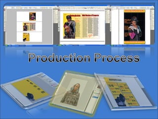
Neco Production Process
1.
2.
3. The first thing I did when I began the production of my magazine is I put the colours in. I was certain on the them colours I wanted to use for my magazine from when I was planning. For the front cover I put in a black background. There are several reasons why I wanted to use black. The main reason is because the gold colour, which is the main theme colour for the magazine, stands out best with black behind it. Secondly, because black can be seen to interpret darkness and conflict, and because my magazine relates in a way to the harsh reality of inner-city living. The purple colour lines in the screen shot are just there as guide lines to give me an idea of where to place all the other aspects of the front cover that I add to the page such as images and headlines. These guide lines can be selected on all pages. On top of the yellow background I have added the conventional top and bottom strips. As you can see they are a gold shaded colour which links in with the theme colour of the magazine. Like I explained above, the gold colour stands out a lot with the black background and this help to attract the audience because as it is the front cover, the gold colour would appear bright and hopefully catch the eye of customers. The writing that is apparent will be explained further on.
4. The next thing I did after I add the top and bottom strip to the page is put text inside the strips, using the rectangular tool.. I chose to do this because it is a key feature to all normal edition music magazines. From the research I did I was able to find this out and acknowledge that real music magazines tend to write sentences or statements in the strips that may persuade people to buy the magazine and see what’s inside. So I did something similar. Horizontally, the strips do not take up a lot of space but are very effective. In the top strip I wrote some brief information about a prize. I made up a T4 music festival and advertised the chance to win four V.I.P. tickets to it. I added to it the appearance of an artist ‘MdotJ’ who’s pictures are in the magazine. The person is actually just a friend of mine in my class but he is represented as a artist in the magazine. This advert is there to attract people to buy the magazine for the V.I.P. tickets. T4 music festival do actually exist but the one I’m advertising does not. The reason why I chose to advertise a T4 music festival is because the showcase artists of different genre’s so from doing this I have given the hope of attracting fans of other genre’s apart from Grime to buy the magazine. I have used the red colour for the font because red is the third them colour of my magazine. Plus, the red colour emerges well from the gold colour of the strips.
5. After inputting the strips in, I add the headlines to the front cover. As you can see I have used the guidelines to help me position the headlines on the page. The font I have used for the headlines is ‘Lucida Sans Unicode’ in a bold format. The colour of the font is yellow apart from the specific words or phrases to in each headline that I have made red with a yellow outer glow. Similar state follows with the font size. I have made the font size bigger than the rest for the words and phrases I have chosen to highlight. The reason for this is because the highlighted phrases are the most important part of the headline and they indicate to the reader what the headline is all about. The whole highlighted feature is a feature on real music magazine covers like the example of the source on the right. Another headline aspect that I have used is their positioning. One thing I noticed from research is that they tend to be put in the left third, similar to this source magazine. The way I made these headlines is by simply making text boxes and writing the headlines in them. Then I made the typography the appropriate font and positioned them where I wanted them.
6.
7.
8.
9.
10.
11. I chose a random style for the numbers on my contents page. I wanted to use a style that was different from the normal fonts which I had been using for the typography of the magazine. So I chose ‘.............’ I created the numbers on Photoshop, then edited them before placing them on in-design. They are like in a playing cards type of format. And I picked them out to give the magazine a bit of variation.
12. As you can see the layout of the magazine is put into sections. I have made 3 boxes for the three different types of topics that the pages in the magazine are about. The three topics are ‘Exclusive interviews and tour info’, ‘Usuals’ and ‘Top artists and latest releases’. The reason why i have done this is so it makes it easier for the reader to find the type of thing it is looking for in the magazine. I made the boxes in in-design and added a glow and a outer shadow to them to make them more effective. If you look closely you will notice that the other two boxes are bigger than the ‘Usuals’ box. This is because I am emphasising to the reader that the pages of ‘Exclusive interviews’ and ‘Latest releases’ are more important to reader than ‘Usuals’. They are called usuals because the are what would appear every week annually if the magazine was real and was released on a weekly basis. The picture is there to fill the space in that left bottom corner. I also placed it on there from Photoshop to increase my number of images.
13.
14. To begin the construction of my double page article, I first made my background. Originally my background was just a gold colour that resembled the colour of my headlines on my front cover. It is the screen shot that is bottom left hand corner. But I wanted a sense of consistency in the magazine so I used the same type of gradient style from my contents page on my double page article. The gradient effects allows the page to fade from one colour to another in your desired direction. A you an see my gradient for the background colours fades from gold to white, from the left to the right. The colour of the page headings is red and black. The use of the red colour is because it is one of my theme colour. But the black colour was just to add an extra effect to the headings, plus it matches with the colours from one of the images’ clothing. The screen shot on the left is not the design of the final double page article. The screenshot on the right is. Therefore, the image that is on the screenshot on the left is not in the final production. The images are positioned where they are now in the final piece and it took me a long time to position them to my satisfaction.