
Empfohlen
Weitere ähnliche Inhalte
Was ist angesagt?
Was ist angesagt? (20)
Andere mochten auch
Andere mochten auch (20)
Ähnlich wie Magazine cover analysis
Ähnlich wie Magazine cover analysis (20)
Mehr von danhops888
Mehr von danhops888 (20)
Kürzlich hochgeladen
Kürzlich hochgeladen (20)
Magazine cover analysis
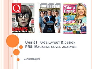
- 1. UNIT 51: PAGE LAYOUT & DESIGN PR8- MAGAZINE COVER ANALYSIS Daniel Hopkins
- 2. FIRST MAGAZINE COVER ANALYSIS. The first magazine cover I am going to be looking at is NME (New Musical Express). The magazine, which was formerly a newspaper, was launched in 1952 and it’s online version in 1996, which remains the most visited standalone music website with 7 million visitors each month. The magazine cover I am looking at is from January 2006 and is a ‘special issue’. The main feature of the magazine is a list of the 100 greatest British Albums ever. I think that this magazine is aimed at the demographic classes C2 and down, due to it’s strong leaning towards working class music and genres such as indie and punk. NME, along with many other musical magazines such as Q and Rolling Stone, often release special issues dedicated to one specific subject. I also think that the magazine is aimed at a mostly male audience (all images of people on the cover are male and all members of the bands listed are male). However, this is not necessarily stating that the magazine is primarily aimed at males, just that it has a more leaning to the male gender. I think that there is no specific age range for the magazine as the music can be enjoyed by many people of different ages. It involves a mix of old bands and new in the rock and punk genres, so it can attract different generations. However, a primary target audience for the magazine will be most likely be around 18-35. The colours for the magazine are generally quite dark, which is in theme with the typical genres of music associated with the magazine. However, the lead article is very clear and bright, prominently displaying what the main part of the magazine is going to be. The artists displayed on the front cover are done so in quite a dark fashion, with just their heads and/or upper bodies on show. This will most likely have been done in order to fit more people onto the cover. Though the theme is quite dark as mentioned, the majority of the text is clear and easily readable. The variety of artists shown and mentioned in either text or image form on the front cover will be in order to cater for as many tastes as possible, which will mean more interest and attraction to the magazine.
- 3. In the primary optical area, we can clearly see the masthead for the magazine. This instantly identifies the magazine to anyone looking at it and is in a prominent location to be spotted. The letters are bold, bright and stand out clearly, which helps draw attention. Also in the primary optical area is a cover line promoting the fact that this issue of NME is a ‘special issue’. The ‘special’ theme of the magazine may encourage people to buy it and thus, it is in a easily viewable location. Furthermore, there is a sticker on the magazine, which is promoting a discount card for HMV. The colours for this are bright and clear, as it is something that someone may purchase the magazine entirely for. The weak fallow area on this magazine cover is used entirely to promote the discount voucher which come free. It is very prominent and is easily viewable. It is strange that something like this is in the weak fallow area but, I think that it may have been put there due to a lack of room on the cover. The colours surrounding the card are bright and attractive and the ‘15%’ off is also bold and clear. NME Magazine Analysis In the strong fallow area we can see a clear and bold cover line, stating that the nominations for the NME awards for that year had been announced. There is also a sticker promoting a competition to win tickets to a tour. As well as the above, the theme of the special issue can be found this area: ‘best British albums ever’. All of these things are clear and prominent and being in the strong fallow area, people will be drawn to this. The axis of orientation brings us from the masthead across the cover to the terminal area. As we go across, we can see some of the artists (in image and text form) that are to be featured in the best album list. There are many artists mentioned on the cover, to cater to many different fans. In the terminal area, we can see the barcode and subsequently, the price. We go to this from across the axis of orientation and the price is small and not prominent. This is so people are not deterred by the price and make their decision to buy it based on other factors. Also in this area is a cover line promoting an article other than the main theme of the special issue. This will be to attract even more people, rather than those just purchasing it for it’s ‘special’ content.
- 4. Masthead Lead Article Kickers Barcode Cover Lines Promotions Promotion Kicker Promotion Cover Line
- 5. Pull Quote Dropcap Kicker Gutters Headline Caption Main article image NME Double Page Spread Analysis
- 6. Second Magazine Cover Analysis The second magazine I am going to be looking at and analysing is Empire Magazine. The magazine is based in the UK and it’s first issue was in July 1989. The magazine is also printed in other countries and has a circulation of approximately 145,000. The magazine cover I am looking at is from 2010 and it’s main feature is on the sci-fi fantasy film directed by Christopher Nolan, Inception. As the magazine mainly deals with popular cinema, I would estimate that the general demographic for it is around B class and down. I think that as much of popular cinema is age- neutral, there is no strict age limit for readers of this magazine. Though, I think there is no upward age limit, I think that the lowest age for a reader would most likely be around 13-14 years old. I also think that the magazine is gender neutral, as it caters for a variety of different film genres and thus, different people’s needs. The colours for the magazine are generally very grey, bland and not very bright. However, the images are usually very visually striking, attractive and very clear. Though the general theme for the magazine is dark, the text is bright and bold, with it easily being readable for someone looking at it. The magazines always have a lead article and many kickers, which will be in order to cater to as many film fans tastes as possible.
- 7. In the primary optical area we can see the bold, clear masthead. It is in a striking, attractive colour that that easily grabs the attention, which helps people to quickly identify the magazine. Also in this area, we see the kicker ‘The Dark Knight Returns’. This compliments one of the cover lines that can be seen on the magazine. It also acts as an enticement, as the ellipsis makes people want to read about the return of batman. In the weak fallow area, we are able to see a cover line, which is clearly identified to a series of parts. The text and shape is white and red, in sharp contrast to the black and white of the general cover background. It is bold, clear and attractive and is clearly visible to a reader. In the strong fallow area, the bold masthead as well as the batman- related cover line continue stretching across the top. This is very common in magazines. Also in this area, you can see some of the films that are to be featured in the magazine. There are many things that can be seen when you go across the axis of orientation. The cover star- Leonardo DiCaprio- can be seen and is attached to the lead article on his film ‘Inception’. Also, you can see some more of the films that are to be featured in the magazine. These cover lines are done in a stretched fashion, stemming from the lead article. Many films as well as the lead article film are featured in order to cater to many film needs. Empire Magazine Analysis In the terminal area, we can see the barcode and part of one of the cover lines. You can also see a gun held by the cover model. This helps identify the genre of film that is being featured and immediately indicates to people that the film is going to feature action. This adds more to the cover rather than simply having him without props on the cover.
- 8. Masthead Cover Lines (Same on opposite side) Barcode Cover Line Lead Article Kicker Cover Line Cover Line