
Empfohlen
Weitere ähnliche Inhalte
Was ist angesagt?
Was ist angesagt? (17)
Andere mochten auch
Ähnlich wie My magazine
Ähnlich wie My magazine (20)
Kürzlich hochgeladen
Kürzlich hochgeladen (20)
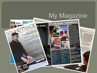
My magazine
- 2. Just how does my music magazine compare to the conventions of other such magazines? The model is on a fairly blank background The eyes of the model look at the reader The model wears clothes suitable for their image Text layering is used to give the magazine depth Text never placed in front of the model Words extra and exclusive used to lure reader Multiple text colours but no more than 5 Different font styles used to add variation Pictures in medium close-up Issue number, price and barcode are small You whilst they were working, instead they would look at Cover lines show what's in the magazine what they’re doing, I framed the picture as a mid shot and Exclamation marks used to add emphasis also framed the picture so that the model would be on the Mast heads give brand Identity left hand side of the page, so that text could be placed Competitions or offers promoted easily on the left of the page, but also so that the model appears to be looking at the cover lines drawing your As you can see from the list above, my magazines front attention to them and consequently what's inside the cover conforms to most of the typical music magazines magazine hopefully enticing someone to pick the magazine conventions, however I think that my magazine breaks one up and buy it. Another convention I have mildly broken is of the most common conventions of a typical magazine in by having the issue number in a large font, I thought this that the model is not looking at the reader, I believe in this was a good idea as this is the magazines first issue, and case this breaking of convention is justified, my magazine is the prominent issue number advertises this well, I also like all about how music is made for film and TV, so my model is the look of the issue number as it is anchored to the side working at a sound mixing desk, if someone were to be angle of the mixing desk. busily working they wouldn’t stop to look at
- 3. I do however think that it is good that my magazine follows many of the conventions of a traditional music magazine, as if it were too far and unconventional potential readers mightn’t realise that it was a music magazine without closer inspection, presumably leading to a lot less sales. I have decided to have a consistent colour scheme throughout the magazine, with blue yellow black and white, this is shown on the front cover in the gradient fill background, (plain as per convention) blue and off blue of the cover line text and the stripes of blue and yellow in both the upper right and lower left corners of the magazine. The magazines cover lines are written in two alternating fonts in alternating colours to add variety and words such as exclusive used to entice the reader into read the magazine, like a conventional magazine. I think that my magazines masthead helps compliments the magazines identity, the title of my magazine is soundtrack, the font is made up of three different lines (or tracks) curving to form the shape of each letter, and the tag line below the mast head of “Film and TV Sound Magazine” simply and effectively tells a potential reader what the magazine is about without sounding vauge or pretentious. Its just straight to the point.
- 4. I think that my contents page both conforms to and breaks some conventions of a usual music magazine. oA message from the editor is included oThe message is written in an informal fashion oPictures, page numbers and contents are in groups oThe pictures and pages are anchored oThe colour scheme from the front page is repeated oImportant stories are bigger oThe logo and title are repeated oThere is no empty space As you can see from the list above it meets many of the conventions of a magazine contents page that we noted in class, however I think the main thing my work does to challenge a convention we didn’t list is that it is made of two pages as opposed to one page as per convention. I decided to do this as the contents page is usually on the The contents page has a table of pictures with related page third page (right hand side) and not much on the left, so I numbers inset, so the reader can see which pictures most decided to add a large picture of some speakers, grey interest them, look up a brief description in the contents and find scaled, posterized, then re coloured to go with my colour the page, I think that this gives the contents page a clean and scheme, overlaying this with a quote, I think this adds to organised look, the letter from the editor is written in an informal the magazines aesthetics and further reinforces the style in the top right, with an advertisement for subscriptions in magazines brand identity. the bottom left, to help promote future sales, as this is the first issue and fill in space so the contents page doesn’t look empty. The rest of the contents page though is relatively on convention.
- 5. The masthead of my magazine is on a clear white background, this is so the title is clean, clear and easy to read. Helping give the magazine a stronger brand identity, this helps distinguish the magazine from similar ones. The font chosen for my masthead is big and bold in an interesting font which should help grab the readers attention. I took this image of Mike in the music room at Priestley College, the lighting was not ideal and this caused mikes skin and hair to look washed out, because of this I used Photoshop to edit the colour levels of the photo increasing contrast, and creating an overlay layer over his hair to remove too much shine from the bright un natural lights, I cut him and the desk from the background using the background eraser tool and used the spot healing brush to get rid of the shine in his glasses, I then gave him a drop shadow to give him some depth The word exclusive is used to entice the reader, suggesting the magazine is special among other similar magazines The font style and colour alternate between two different styles and colours to add variation to them making tem more interesting, the cover lines also have a slight drop shadow which helps give the page some depth. The fonts are also made so that they stand out from the pages background making them easier for a potential customer to read The font style and colour alternate between two different styles and colours to add variation to them making tem more interesting, the cover lines also have a slight drop shadow which helps give the page some depth. Here is a special offer to help entice the reader The issue number is placed here large to draw attention to the fact that this is the first issue of a new magazine, it is also placed at an angle so that it appears to line up with the angle of the mixing desk The price, frequency, barcode and web address are printed in small here, this is so the customer knows information about the magazine and where to look online for more information about it, a common feature of magazines in general
- 6. I have used the title of my magazine in the contents page, helping implement brand identity The art page adds to the overall aesthetic of the contents page and appeals to our arty target audience, its colours are also the same as the colour scheme again helping to implement brand identity These images are specially made to look both interesting and slightly mysterious grabbing the readers attention compelling them to look at the chart below to find out more from a small description. They can then look up the page number and turn to it The editors message is written in an informal and friendly style, designed to sound as if the writer is writing directly to the reader, this should naturally appeal to them and give them a sense of connection and involvement with the magazine, this could inspire some form of brand loyalty from the reader causing them to continue to buy the magazine the letter is even signed at the end, but using a shortened down more informal version of the editors name This is an advert for future subscriptions to the magazine, the advert offers a special offer giving the first 3 issues for £2 each, this is advertised in the bubble, and using exclamation marks for added emphasis, helping entice the reader, into future sales promoting that a subscription is a good saving for them, this is also good for the magazine as it guarantees a definite monthly income
- 7. The caption of the photo helps anchor what is happening in the image to what is being written about in the text, linking the two Here is a key quote from the article, it can help the reader tell at a glance the sort of article they’re looking at, it also helps them get a feeling about if they’d like the article or not In this image the model looks away from the camera in an over the shoulder shot, I did this so that he looks like a busy professional, but also being able to see what he’s working on can help include the audience in the action, they can see what he does making them feel more included in the story, and have a stronger positive feeling towards the magazine, as if they’ve connected with it in some way The article is written in a quite informal style, just like the transcript of a chat, this helps the reader follow the flow of the interview and helps them imagine the peoples voices inside their heads, again making them feel more involved The logo is again repeated to reinforce brand identity and awareness
- 8. I think that the media organization most likely to distribute my magazine is IPC media, this is as the group seems to publish the most niche magazines such as volksworld, superyacht and niche magazines which may also interest the people my magazine is aimed at such as amateur photographer, I think meaning that my magazine fits in well with their current output. I think that the best sort of stockist for my magazine are specialist record or music shops, recording equipment shops, instrument stockists, college or university libraries, this is because my magazine is aimed at quite a niche audience and so probably wouldn’t have a huge circulation, and probably wouldn’t be suitable to a more general stockist such as WHSmith or smaller newsagents, which is why the magazine would be stocked in places that sell related equipment or in education establishments where film and media students could buy the magazine to help with their learning.
- 9. How my magazine represents people On the front of my magazine is my model, Mike. Mike is a music teacher at Priestley College, I think he is a good representation of someone who works professionally in the music industry, and his funky glasses and cool hair are representative of the sort of independent film makers the magazine is aimed at, mikes pose also represents something about the type of people who work in the creative industries, he’s looking at what he’s doing working hard. This idea is also evident in the other images of people in my magazine, no one’s just standing around they’re all at work, I think this helps set them up as positive role models to the readers, and can be a sort of inspiration that they too can do this sort of thing if they put the effort in and learn. Out of the four people shown in my magazine 3 are male, one female, and it might be a good idea to add another female to the magazine however this is indicative of the industry which does seem more male dominated. Another thing I might want to look at should future issues be made would be to include people from other ethnicities or disabled people, as all 4 people shown in the magazine are white, however I think it’s important not to necessarily actively think about this. As really it shouldn’t make much different, it’s just nice for all types of people to be represented in my magazine.
- 10. Click to play the photo story.
- 11. Click to start the short film
- 12. Here is some work I have made in Photoshop, the first is my magazine, the other is a poster for the colleges storytelling evening that I made after making my magazine, I think it is a good example of how I have learned to use the program and have put that learning into practice. before making the magazine, I had only a basic understanding of the program and it confused me but now I have learnt how to use it properly and I feel quite confident in using Quark, after learning how to use it to also learned many new easily sort text into columns and to use the wrap around feature so that techniques, letting me the words fit perfectly around my images, however I also feel that there make the images I want. I is some room for improvement, as I find it hard to keep the layer have also learnt how to use ordering simple and I don’t really like how the program limits the size of Quark Xpress, after no your images as this can sometimes lead to photos being the right size previous experience but not show enough of the image.