LMar Gallery Brand identity
•
0 gefällt mir•212 views

It is the Brand Identity of LMar Gallery.

Empfohlen
Weitere ähnliche Inhalte
Kürzlich hochgeladen
Kürzlich hochgeladen (20)
Empfohlen
Empfohlen (20)
LMar Gallery Brand identity
- 1. Contemporary. Classic. Human.
- 2. We incorporated the feel of sophistication and contemporary classics, but retained the edgy qualities, for a younger audience, but also a familiar feel that appeals to a more distinguished crowd. Since we are not directly putting our logo onto anything that we sell (i.e. artist retains the rights to their work) we do not have a trademarked name.
- 3. Mission Statement LMar gallery is a contemporary art space, founded in 2010, and focuses on establishing mid-career artists. A heavy emphasis is laid on experimental medias in the painting, photographic and installation disciplines. Located in the popular Pilsen Art District in Chicago, LMar Gallery sets itself apart by bringing non-centralized artists to its walls.
- 4. By sticking to our mission statement, we are building trust and respect with artists and clientele. With galleries coming and going, LMar Gallery guarantees and vows to stand by the service of providing non-centralized artist.
- 5. LMar Gallery Mantra “LMar Gallery; more then just four walls, but a miracle of endless imagination and talent.”
- 6. The mantra of LMar Gallery is a simple statement that is the heart of who we are. This short statement gives a clear indication, to both our clientele and employees, of what we offer and our main focus. By displaying our mantra with our mission statement, we make ourselves memorable in talking firsthand and guaranteeing our service. This is a way of displaying both our passionate and professional demeanors.
- 7. Style
- 8. Font Our logo has no specific design elements to it, so we only follow by the rules of; Guideline 1 - Standard character and stylized lettering trademarks composed merely of standard guidelines, Type, Print, Block or Stylized lettering are not coded because they do not contain design elements through the USPTO.gov site.
- 9. Business
- 10. Color LMar Gallery has kept their logo simple and only uses one color element. The color red is both pleasing to look at and signifies strength and authority to the viewer.
- 12. They left their fonts in an Times New Roman (Zolla/ Liberman) and Arial (Ann Nathan) fonts. What this tells me, is that they are already established galleries with names that are recognizable in the arts industry. The names alone outweigh the need for any flashy type or color. When looking at the logos for both Zolla/ Lieberman Gallery and Ann Nathan Gallery, we can see that there is main characteristic for both and that is the simplicity of their style.
- 13. This simple and effective logo from Armani Exchange, has used very simple type, but has also managed to secure itself in being a noticible brand. Even without the name beneath the A|X it is still easily identified as being Armani Exchange.
- 14. Since we will be dealing directly with artists as well as the public (not to mention, contracted workers) we try our hardest to provide a welcoming, comfortable, professional and fun experience. Since, LMar Gallery is owned and operated by Liz Mares and Crystal Angeles, it is fairly easy to keep a clear outline of what our main values and beliefs are.
- 15. Each month, LMar Gallery will provide an article/blog to update our clientele of emerging artists. Intense research will be done, each month, to find an artist to exhibit and mention in the monthly gallery article.
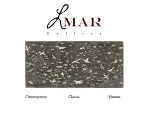
- 16. This tagline is effective in the aspects that it clearly states our mission in three simple words. We are a contemporary art gallery that exhibits/sells contemporary art in classic disciplines (works on paper, painting and installations). Every work of art is the soul of the artist, speaking and reaching for emotional responses; touching the viewers humanity. Contemporary. Classic. Human.
- 17. Through these three very specific words (Contemporary.Classic.Human), we are speaking directly towards our clients and assuring them of the goods that we offer. We are also personalizing ourselves and saying that we are not above or below anyone, but rather of one species that has one common bond - art.
- 18. We have discovered, in our research, that our main competitors do not have a clearly established tagline (if one at all.) I do believe this sets us above the rest, in a manner that we are clearly giving our target audience a reason to see what we are about.
- 19. Since we are new and don’t have the prestige of our competitors, it is essential that we offer a clear picture of who we are without giving too much away. Since our words are positive and bold, this will create a buzz and a curiosity which ultimately brings about a following.
Hinweis der Redaktion
- \n
- \n
- \n
- \n
- \n
- \n
- \n
- \n
- \n
- \n
- \n
- \n
- \n
- \n
- \n
- \n
- \n
- \n
- \n
- \n