SlideShare ist ein Scribd-Unternehmen logo
1 von 17
Downloaden Sie, um offline zu lesen
Mobile	
  Sites	
  &	
  Responsive	
  Design	
  
                                             Building	
  and	
  designing	
  for	
  the	
  future	
  

      …tablet	
  sales	
  are	


                                            ?	
  
      expected	
  to	
  exceed	
  100	
  
      million	
  this	
  year…	
                               …about	
  half	
  of	
  the	
  US’s	
  
                                                               311	
  million	
  people	
  own	
  
                                                               a	
  smartphone…	


   …mobile	
  web	
  usage	
  
   took	
  50%	
  of	
  sales	
  
   related	
  to	
  Mother’s	
  Day	
           …tablet	
  sales	
  	
  are	
  expected	
  to	
  
   in	
  2012…	
                                exceed	
  100	
  million	
  this	
  year…	
  
Mobile	
  Sites	
  &	
  Responsive	
  Design	
  
                                          Building	
  and	
  designing	
  for	
  the	
  future	


          Desktop	
                                      Tablet	
                       Phone	


                                                               The	
  Mobile	
  Experience	
  
                                                                       Mobile	
  Site	


                        Full	
  Spectrum	
  User	
  Experience	
  
The	
  Mobile	
  Experience	
  at	
  a	
  Glance	
  
                                                                       Experience	
  PlaIorms	
  

                         •  Must	
  be	
  downloaded	
  by	
  the	
  user	
  
    APPLICATION	
  
                         •  Runs	
  naIvely	
  on	
  the	
  device	
  
       (APP)	
  
                         •  Most	
  costly	
  to	
  develop	


                         •  m.sitename.com	
  	
  -­‐or-­‐	
  	
  sitename.com/mobile	
  
    MOBILE	
  SITE	
     •  Can	
  be	
  a	
  whole	
  separate	
  code	
  base	
  specifically	
  for	
  
                              mobile	


     RESPONSIVE	
        •  URL	
  stays	
  the	
  same	
  
    DESIGN/CODE	
        •  Fluid	
  design	
  and	
  code	
  base	
  allows	
  for	
  adaptaIon	
  
                            across	
  mulIple	
  screen	
  sizes	


                                        STOP!
Fundamentals	
  of	
  Mobile	
  InteracIons	
  
                               THE	
  WHO:	
  Understanding	
  human	
  needs	
  and	
  moPvaPon	
  
  Let’s	
  take	
  one	
  step	
  back	
  
  before	
  we	
  blindly	
  take	
  
  ten	
  steps	
  forward.	


                                                                 Image	
  source	
  wikipedia.org	


                                        Maslow’s	
  hierarchy	
  of	
  needs	
  
Fundamentals	
  of	
  Mobile	
  InteracIons	
  
                              THE	
  WHO:	
  Understanding	
  the	
  needs	
  of	
  the	
  mobile	
  user	
  

Mobile	
  strategy	
  should	
  
leverage	
  and	
  address	
  
the	
  user’s	
  needs.	
  
                                                                   Extra	
  features/UI	
  enhancements	
  
                                              ENHANCE	


                                             PERFORM	
                     Performance/Speed	


                                              INTERACT	
                           Read/Share/Buy	


                                               ACCESS	
                                  See/Navigate	


                     Kristofer	
  Layon’s	
  hierarchy	
  of	
  mobile	
  moPvaPon	
  
Thinking	
  Full	
  Circle	
  about	
  Mobile	
  
                       NUTS	
  AND	
  BOLTS:	
  Bringing	
  all	
  the	
  players	
  to	
  the	
  table	


                                  Business	


                               MOBILE	
  
                              SOLUTION	
  

              Design	
                                  Development	
  
Thinking	
  Full	
  Circle	
  about	
  Mobile	
  
                                                      BUSINESS:	
  Point	
  of	
  Entry	


                WHERE	
         •  We	
  don’t	
  have	
  a	
  website	
  and	
  are	
  creaIng	
  
                                   one	
  from	
  scratch.	
  
                ARE	
  WE	
     •  We	
  have	
  a	
  legacy	
  site	
  and	
  are	
  adding	
  
 Business	
     NOW	
              mobile	
  enhancements.	
  
                WHERE	
         •  We	
  don’t	
  have	
  a	
  website,	
  but	
  only	
  care	
  
                                   about	
  our	
  mobile	
  users.	
  
                ARE	
  WE	
     •  We	
  have	
  a	
  legacy	
  site,	
  but	
  want	
  to	
  re-­‐
                GOING?	
           build	
  and	
  redesign	
  the	
  enIre	
  site.	
  
Thinking	
  Full	
  Circle	
  about	
  Mobile	
  
                                              BUSINESS:	
  Why,	
  What	
  &	
  How?	


                           •  Why	
  is	
  a	
  mobile	
  experience	
  good	
  for	
  
                              business?	
  
                WHY	
      •  What	
  are	
  the	
  business	
  objecIves	
  for	
  the	
  
                              mobile	
  experience?	
  
 Business	
     WHAT	
     •  What	
  content	
  is	
  important?	
  
                HOW	
      •  How	
  do	
  we	
  want	
  the	
  user	
  to	
  interact	
  with	
  the	
  
                              content?	
  
                           •  What	
  kind	
  of	
  resources	
  do	
  we	
  have	
  for	
  
                              mobile	
  development?	
  
Thinking	
  Full	
  Circle	
  about	
  Mobile	
  
                  CHOOSING	
  A	
  SOLUTION:	
  Design	
  and	
  Development	


                                                   MOBILE	
  SITE	
  
 Business	
        Design	
  
  WHY	
  
  WHAT	
  
  HOW	
         Development	
  
                                                   RESPONSIVE	
  
                                                  DESIGN/CODE	


                                                          hZp://googlemobileads.blogspot.com	
  
Thinking	
  Full	
  Circle	
  about	
  Mobile	
  
                                                                 DESIGN	
  ELEMENTS	
  of	
  the	
  mobile	
  experience	


                                      WHY	
  
       Design	
               +	
     WHAT	
  
                                                                                              ENHANCE	
  
                                      HOW	
  
                                                                                              PERFORM	
  
First	
  and	
  foremost	
  a	
  user	
  needs	
  to	
  be	
  
able	
  to	
  access	
  the	
  experience.	
                                                  INTERACT	
  
•  Limited	
  and	
  Big	
  NavigaIon	
  
•  Shorter	
  Elements	
                                                                       ACCESS	
  

•  UIlizaIon	
  of	
  whitespace	
  
•  Be	
  aware	
  of	
  content	
  length	
  and	
  
   presentaIon	
                                                        •  Build	
  in	
  gradual	
  UI	
  enhancements	
  
•  Limit	
  images	
  within	
  content	
                                  (mobile	
  first	
  thinking)	
  
Thinking	
  Full	
  Circle	
  about	
  Mobile	
  
                                        DEVELOPMENT	
  ELEMENTS	
  of	
  the	
  mobile	
  experience	


                              WHY	
  
   Development	
   +	
        WHAT	
  
                                                                           ENHANCE	
  
                              HOW	
  
                                                                           PERFORM	
  
 Building	
  with	
  Responsive	
  Design	
  
                                                                           INTERACT	
  
•  Media	
  queries	
  
•  Image	
  re-­‐sizing,	
  mobile	
  specific	
  images	
                   ACCESS	
  
•  Flexible	
  grids/fluid	
  CSS	
  
•  Limit/restrict	
  Flash	
  
•  Implement	
  gradual	
  enhancement	
  
Responsive	
  Design	
  Fundamentals	
  
                                                     The	
  flexible	
  layout	
  and	
  responsive	
  behaviors	
  
Responsive	
  Behaviors:	
  The	
  basic	
  concept	
  behind	
  having	
  a	
  responsive	
  design	
  is	
  to	
  have	
  
a	
  layout	
  and	
  organizaIonal	
  structure	
  that	
  can	
  adapt	
  to	
  different	
  screen	
  sizes.	
  	
  Content	
  
importance	
  is	
  prioriIzed	
  and	
  user	
  interacIons	
  are	
  defined	
  based	
  on	
  various	
  screen	
  
sizes.	
  	
  The	
  “break	
  points”,	
  or	
  dimensions	
  at	
  which	
  the	
  design	
  adjusts,	
  are	
  usually	
  set	
  
for	
  average	
  desktop,	
  tablet	
  and	
  mobile	
  phone	
  sizes.	
  

                                                                          Checkout	
  the	
  example	
  at	
  
                                                                          h]p://mobile.creedinteracPve.com/	
  
Responsive	
  Design	
  Fundamentals	
  
                       The	
  flexible	
  layout	
  and	
  responsive	
  behaviors	
  

          NAVIGATION

                                                          Responsive	
  Design	
  
    CONTENT                                               Viewed	
  at	
  Desktop	
  
                                                          Dimensions.	
  	
  NoIce	
  
                                                          the	
  various	
  areas	
  
                                                          called	
  out	
  in	
  blue.	


                               ASIDE
Responsive	
  Design	
  Fundamentals	
  
                    The	
  flexible	
  layout	
  and	
  responsive	
  behaviors	
  

           NAVIGATION
                                     Responsive	
  Design	
  Viewed	
  at	
  
                                     Tablet	
  Dimensions.	
  	
  NoIce	
  
          CONTENT                    how	
  the	
  navigaIon	
  has	
  
                                     adjusted	
  to	
  accommodate	
  the	
  
                                     smaller	
  size	
  and	
  how	
  the	
  aside	
  
                                     slides	
  below	
  the	
  content	
  since	
  
                                     it’s	
  of	
  less	
  importance.	


            ASIDE
Responsive	
  Design	
  Fundamentals	
  
                The	
  flexible	
  layout	
  and	
  responsive	
  behaviors	


                                     Responsive	
  Design	
  Viewed	
  at	
  
                                     Phone	
  Dimensions.	
  	
  NoIce	
  
                                     how	
  the	
  navigaIon	
  has	
  again	
  
NAVIGATION
                                     adjusted	
  to	
  accommodate	
  the	
  
                   ASIDE
                                     smaller	
  size.	
  	
  The	
  navigaIon	
  
                                     links	
  remain	
  large	
  for	
  ease	
  of	
  
                                     use	
  with	
  touch	
  devices.	
  	
  The	
  
                                     aside	
  	
  
 CONTENT
Example	
  of	
  Mobile	
  Only	
  Site	
  
 User	
  interface	
  and	
  design	
  specifically	
  targeted	
  to	
  mobile	
  device	
  use	


     A	
  mobile	
  only	
  template	
  viewed	
  on	
  a	
  desktop.	
  	
  NoIce	
  how	
  
     the	
  design	
  is	
  very	
  streamline	
  and	
  replicates	
  the	
  “mobile	
  
     UI”	
  one	
  would	
  expect	
  on	
  a	
  naIve	
  phone	
  applicaIon.	
  
Example	
  of	
  Mobile	
  Only	
  Site	
  
 User	
  interface	
  and	
  design	
  specifically	
  targeted	
  to	
  mobile	
  device	
  use	


                                              The	
  same	
  template	
  on	
  a	
  mobile	
  phone	
  
                                              screen	
  size.	
  	
  As	
  you	
  can	
  see	
  the	
  
                                              simplificaIon	
  of	
  buZons	
  and	
  content	
  
                                              are	
  well	
  suited	
  for	
  the	
  mobile	
  phone	
  
                                              dimensions.	
  

Weitere ähnliche Inhalte

Was ist angesagt?

UX 101: A quick & dirty introduction to user experience strategy & design
UX 101: A quick & dirty introduction to user experience strategy & designUX 101: A quick & dirty introduction to user experience strategy & design
UX 101: A quick & dirty introduction to user experience strategy & designMorgan McKeagney
 
Discovery 101
Discovery 101Discovery 101
Discovery 101creed
 
UX Camp 2017 – How UX survives in agile development
UX Camp 2017 – How UX survives in agile developmentUX Camp 2017 – How UX survives in agile development
UX Camp 2017 – How UX survives in agile developmentJanne_Bjorsted
 
User Experience Workshop
User Experience WorkshopUser Experience Workshop
User Experience WorkshopMotivate Design
 
Ux Camp: Selling the value of UX
Ux Camp: Selling the value of UXUx Camp: Selling the value of UX
Ux Camp: Selling the value of UXKat K. Richards
 
Designing a Sustainable Enterprise UX Process
Designing a Sustainable Enterprise UX ProcessDesigning a Sustainable Enterprise UX Process
Designing a Sustainable Enterprise UX Processuxpin
 
Web Design and Software Development
Web Design and Software DevelopmentWeb Design and Software Development
Web Design and Software DevelopmentAthena Inc, Goa
 
Website Usability & User Experience: Veel bezoekers, weinig klanten?
Website Usability & User Experience: Veel bezoekers, weinig klanten?Website Usability & User Experience: Veel bezoekers, weinig klanten?
Website Usability & User Experience: Veel bezoekers, weinig klanten?Johan Verhaegen
 
10 spaces-ux capabilities-presentation
10 spaces-ux capabilities-presentation10 spaces-ux capabilities-presentation
10 spaces-ux capabilities-presentationMatt DeYoung
 
How to Achieve Product-Market Fit with Rapid Prototyping and User Testing by ...
How to Achieve Product-Market Fit with Rapid Prototyping and User Testing by ...How to Achieve Product-Market Fit with Rapid Prototyping and User Testing by ...
How to Achieve Product-Market Fit with Rapid Prototyping and User Testing by ...Dan Olsen
 
Mobile Design at Gilt
Mobile Design at GiltMobile Design at Gilt
Mobile Design at GiltDavid Park
 
UX UI & Design Case Studies from Happy Dog
UX UI & Design Case Studies from Happy DogUX UI & Design Case Studies from Happy Dog
UX UI & Design Case Studies from Happy DogHappyDogWebProductions
 
Squareboat Deck
Squareboat DeckSquareboat Deck
Squareboat DeckSquareboat
 
User Experience 101 - The Basics
User Experience 101 - The BasicsUser Experience 101 - The Basics
User Experience 101 - The BasicsBecky Burd
 
Sustainable UX
Sustainable UXSustainable UX
Sustainable UXNick Finck
 

Was ist angesagt? (20)

iAxil Lunch Talk - Lean UX
iAxil Lunch Talk - Lean UXiAxil Lunch Talk - Lean UX
iAxil Lunch Talk - Lean UX
 
UX 101: A quick & dirty introduction to user experience strategy & design
UX 101: A quick & dirty introduction to user experience strategy & designUX 101: A quick & dirty introduction to user experience strategy & design
UX 101: A quick & dirty introduction to user experience strategy & design
 
Discovery 101
Discovery 101Discovery 101
Discovery 101
 
UX workshop
UX workshopUX workshop
UX workshop
 
UX Camp 2017 – How UX survives in agile development
UX Camp 2017 – How UX survives in agile developmentUX Camp 2017 – How UX survives in agile development
UX Camp 2017 – How UX survives in agile development
 
User Experience Workshop
User Experience WorkshopUser Experience Workshop
User Experience Workshop
 
Lean UX
Lean UXLean UX
Lean UX
 
Ux Camp: Selling the value of UX
Ux Camp: Selling the value of UXUx Camp: Selling the value of UX
Ux Camp: Selling the value of UX
 
Designing a Sustainable Enterprise UX Process
Designing a Sustainable Enterprise UX ProcessDesigning a Sustainable Enterprise UX Process
Designing a Sustainable Enterprise UX Process
 
Web Design and Software Development
Web Design and Software DevelopmentWeb Design and Software Development
Web Design and Software Development
 
Website Usability & User Experience: Veel bezoekers, weinig klanten?
Website Usability & User Experience: Veel bezoekers, weinig klanten?Website Usability & User Experience: Veel bezoekers, weinig klanten?
Website Usability & User Experience: Veel bezoekers, weinig klanten?
 
10 spaces-ux capabilities-presentation
10 spaces-ux capabilities-presentation10 spaces-ux capabilities-presentation
10 spaces-ux capabilities-presentation
 
How to Achieve Product-Market Fit with Rapid Prototyping and User Testing by ...
How to Achieve Product-Market Fit with Rapid Prototyping and User Testing by ...How to Achieve Product-Market Fit with Rapid Prototyping and User Testing by ...
How to Achieve Product-Market Fit with Rapid Prototyping and User Testing by ...
 
Mobile Design at Gilt
Mobile Design at GiltMobile Design at Gilt
Mobile Design at Gilt
 
UX UI & Design Case Studies from Happy Dog
UX UI & Design Case Studies from Happy DogUX UI & Design Case Studies from Happy Dog
UX UI & Design Case Studies from Happy Dog
 
What is UX?
What is UX?What is UX?
What is UX?
 
Squareboat Deck
Squareboat DeckSquareboat Deck
Squareboat Deck
 
User Experience 101 - The Basics
User Experience 101 - The BasicsUser Experience 101 - The Basics
User Experience 101 - The Basics
 
Sustainable UX
Sustainable UXSustainable UX
Sustainable UX
 
Effective ui
Effective uiEffective ui
Effective ui
 

Ähnlich wie Mobile and Responsive Design

Why go mobile_app_vault_solutions
Why go mobile_app_vault_solutionsWhy go mobile_app_vault_solutions
Why go mobile_app_vault_solutionsAppVault Sales
 
Responsive Design And You
Responsive Design And YouResponsive Design And You
Responsive Design And YouJoe Hass
 
Design For Mobile Apps
Design For Mobile AppsDesign For Mobile Apps
Design For Mobile Appsmosti Farahat
 
The mobile traveler experience
The mobile traveler experienceThe mobile traveler experience
The mobile traveler experienceKevin May
 
Floyd brad mobile_presentation
Floyd brad mobile_presentationFloyd brad mobile_presentation
Floyd brad mobile_presentationbrfloyd
 
User experience - Why the mobile space is important
User experience - Why the mobile space is importantUser experience - Why the mobile space is important
User experience - Why the mobile space is importantRIA RUI Society
 
Learning interactions on mobile slideshare
Learning interactions on mobile   slideshareLearning interactions on mobile   slideshare
Learning interactions on mobile slideshareRaptivity
 
iPad Apps for the Enterprise
iPad Apps for the EnterpriseiPad Apps for the Enterprise
iPad Apps for the EnterpriseSukumar Jena
 
Designing for mobile user experience
Designing for mobile user experienceDesigning for mobile user experience
Designing for mobile user experienceSameer Chavan
 
Embracing the mobile frontier and reaching the digital natives
Embracing the mobile frontier and reaching the digital nativesEmbracing the mobile frontier and reaching the digital natives
Embracing the mobile frontier and reaching the digital nativesEktron
 
Extending softwareintomobile 11 28-2012
Extending softwareintomobile 11 28-2012Extending softwareintomobile 11 28-2012
Extending softwareintomobile 11 28-2012CorSource
 
Build Mobile Websites | How to make a Mobile Website | Creating Mobile Websites
Build Mobile Websites | How to make a Mobile Website | Creating Mobile WebsitesBuild Mobile Websites | How to make a Mobile Website | Creating Mobile Websites
Build Mobile Websites | How to make a Mobile Website | Creating Mobile WebsitesClickTecs
 
Enterprise Mobile Strategy for SharePoint Server 2013 at SEF2014 in Stockholm
Enterprise Mobile Strategy for SharePoint Server 2013 at SEF2014 in StockholmEnterprise Mobile Strategy for SharePoint Server 2013 at SEF2014 in Stockholm
Enterprise Mobile Strategy for SharePoint Server 2013 at SEF2014 in StockholmJoel Oleson
 
Mobile Monday Presentation April 2010
Mobile Monday Presentation April 2010Mobile Monday Presentation April 2010
Mobile Monday Presentation April 2010Effective
 
Mobile Monday Presentation April 2010
Mobile Monday Presentation April 2010Mobile Monday Presentation April 2010
Mobile Monday Presentation April 2010EffectiveUI
 

Ähnlich wie Mobile and Responsive Design (20)

Mobile Web site options by Reactive
Mobile Web site options by ReactiveMobile Web site options by Reactive
Mobile Web site options by Reactive
 
Building Future Friendly Experiences
Building Future Friendly ExperiencesBuilding Future Friendly Experiences
Building Future Friendly Experiences
 
Why go mobile_app_vault_solutions
Why go mobile_app_vault_solutionsWhy go mobile_app_vault_solutions
Why go mobile_app_vault_solutions
 
Responsive Design And You
Responsive Design And YouResponsive Design And You
Responsive Design And You
 
Responsive Design and Joomla!
Responsive Design and Joomla!Responsive Design and Joomla!
Responsive Design and Joomla!
 
Why Go Mobile
Why Go MobileWhy Go Mobile
Why Go Mobile
 
Design For Mobile Apps
Design For Mobile AppsDesign For Mobile Apps
Design For Mobile Apps
 
The mobile traveler experience
The mobile traveler experienceThe mobile traveler experience
The mobile traveler experience
 
Floyd brad mobile_presentation
Floyd brad mobile_presentationFloyd brad mobile_presentation
Floyd brad mobile_presentation
 
User experience - Why the mobile space is important
User experience - Why the mobile space is importantUser experience - Why the mobile space is important
User experience - Why the mobile space is important
 
Learning interactions on mobile slideshare
Learning interactions on mobile   slideshareLearning interactions on mobile   slideshare
Learning interactions on mobile slideshare
 
iPad Apps for the Enterprise
iPad Apps for the EnterpriseiPad Apps for the Enterprise
iPad Apps for the Enterprise
 
Designing for mobile user experience
Designing for mobile user experienceDesigning for mobile user experience
Designing for mobile user experience
 
Embracing the mobile frontier and reaching the digital natives
Embracing the mobile frontier and reaching the digital nativesEmbracing the mobile frontier and reaching the digital natives
Embracing the mobile frontier and reaching the digital natives
 
Extending softwareintomobile 11 28-2012
Extending softwareintomobile 11 28-2012Extending softwareintomobile 11 28-2012
Extending softwareintomobile 11 28-2012
 
Build Mobile Websites | How to make a Mobile Website | Creating Mobile Websites
Build Mobile Websites | How to make a Mobile Website | Creating Mobile WebsitesBuild Mobile Websites | How to make a Mobile Website | Creating Mobile Websites
Build Mobile Websites | How to make a Mobile Website | Creating Mobile Websites
 
Enterprise Mobile Strategy for SharePoint Server 2013 at SEF2014 in Stockholm
Enterprise Mobile Strategy for SharePoint Server 2013 at SEF2014 in StockholmEnterprise Mobile Strategy for SharePoint Server 2013 at SEF2014 in Stockholm
Enterprise Mobile Strategy for SharePoint Server 2013 at SEF2014 in Stockholm
 
Mobile Monday
Mobile MondayMobile Monday
Mobile Monday
 
Mobile Monday Presentation April 2010
Mobile Monday Presentation April 2010Mobile Monday Presentation April 2010
Mobile Monday Presentation April 2010
 
Mobile Monday Presentation April 2010
Mobile Monday Presentation April 2010Mobile Monday Presentation April 2010
Mobile Monday Presentation April 2010
 

Mobile and Responsive Design

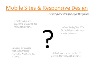
  • 1. Mobile  Sites  &  Responsive  Design   Building  and  designing  for  the  future   …tablet  sales  are   ?   expected  to  exceed  100   million  this  year…   …about  half  of  the  US’s   311  million  people  own   a  smartphone…   …mobile  web  usage   took  50%  of  sales   related  to  Mother’s  Day   …tablet  sales    are  expected  to   in  2012…   exceed  100  million  this  year…  
  • 2. Mobile  Sites  &  Responsive  Design   Building  and  designing  for  the  future   Desktop   Tablet   Phone   The  Mobile  Experience   Mobile  Site   Full  Spectrum  User  Experience  
  • 3. The  Mobile  Experience  at  a  Glance   Experience  PlaIorms   •  Must  be  downloaded  by  the  user   APPLICATION   •  Runs  naIvely  on  the  device   (APP)   •  Most  costly  to  develop   •  m.sitename.com    -­‐or-­‐    sitename.com/mobile   MOBILE  SITE   •  Can  be  a  whole  separate  code  base  specifically  for   mobile     RESPONSIVE   •  URL  stays  the  same   DESIGN/CODE   •  Fluid  design  and  code  base  allows  for  adaptaIon   across  mulIple  screen  sizes   STOP!
  • 4. Fundamentals  of  Mobile  InteracIons   THE  WHO:  Understanding  human  needs  and  moPvaPon   Let’s  take  one  step  back   before  we  blindly  take   ten  steps  forward.   Image  source  wikipedia.org   Maslow’s  hierarchy  of  needs  
  • 5. Fundamentals  of  Mobile  InteracIons   THE  WHO:  Understanding  the  needs  of  the  mobile  user   Mobile  strategy  should   leverage  and  address   the  user’s  needs.   Extra  features/UI  enhancements   ENHANCE   PERFORM   Performance/Speed   INTERACT   Read/Share/Buy   ACCESS   See/Navigate   Kristofer  Layon’s  hierarchy  of  mobile  moPvaPon  
  • 6. Thinking  Full  Circle  about  Mobile   NUTS  AND  BOLTS:  Bringing  all  the  players  to  the  table   Business   MOBILE   SOLUTION   Design   Development  
  • 7. Thinking  Full  Circle  about  Mobile   BUSINESS:  Point  of  Entry   WHERE   •  We  don’t  have  a  website  and  are  creaIng   one  from  scratch.   ARE  WE   •  We  have  a  legacy  site  and  are  adding   Business   NOW   mobile  enhancements.   WHERE   •  We  don’t  have  a  website,  but  only  care   about  our  mobile  users.   ARE  WE   •  We  have  a  legacy  site,  but  want  to  re-­‐ GOING?   build  and  redesign  the  enIre  site.  
  • 8. Thinking  Full  Circle  about  Mobile   BUSINESS:  Why,  What  &  How?   •  Why  is  a  mobile  experience  good  for   business?   WHY   •  What  are  the  business  objecIves  for  the   mobile  experience?   Business   WHAT   •  What  content  is  important?   HOW   •  How  do  we  want  the  user  to  interact  with  the   content?   •  What  kind  of  resources  do  we  have  for   mobile  development?  
  • 9. Thinking  Full  Circle  about  Mobile   CHOOSING  A  SOLUTION:  Design  and  Development   MOBILE  SITE   Business   Design   WHY   WHAT   HOW   Development   RESPONSIVE   DESIGN/CODE   hZp://googlemobileads.blogspot.com  
  • 10. Thinking  Full  Circle  about  Mobile   DESIGN  ELEMENTS  of  the  mobile  experience   WHY   Design   +   WHAT   ENHANCE   HOW   PERFORM   First  and  foremost  a  user  needs  to  be   able  to  access  the  experience.   INTERACT   •  Limited  and  Big  NavigaIon   •  Shorter  Elements   ACCESS   •  UIlizaIon  of  whitespace   •  Be  aware  of  content  length  and   presentaIon   •  Build  in  gradual  UI  enhancements   •  Limit  images  within  content   (mobile  first  thinking)  
  • 11. Thinking  Full  Circle  about  Mobile   DEVELOPMENT  ELEMENTS  of  the  mobile  experience   WHY   Development   +   WHAT   ENHANCE   HOW   PERFORM   Building  with  Responsive  Design   INTERACT   •  Media  queries   •  Image  re-­‐sizing,  mobile  specific  images   ACCESS   •  Flexible  grids/fluid  CSS   •  Limit/restrict  Flash   •  Implement  gradual  enhancement  
  • 12. Responsive  Design  Fundamentals   The  flexible  layout  and  responsive  behaviors   Responsive  Behaviors:  The  basic  concept  behind  having  a  responsive  design  is  to  have   a  layout  and  organizaIonal  structure  that  can  adapt  to  different  screen  sizes.    Content   importance  is  prioriIzed  and  user  interacIons  are  defined  based  on  various  screen   sizes.    The  “break  points”,  or  dimensions  at  which  the  design  adjusts,  are  usually  set   for  average  desktop,  tablet  and  mobile  phone  sizes.   Checkout  the  example  at   h]p://mobile.creedinteracPve.com/  
  • 13. Responsive  Design  Fundamentals   The  flexible  layout  and  responsive  behaviors   NAVIGATION Responsive  Design   CONTENT Viewed  at  Desktop   Dimensions.    NoIce   the  various  areas   called  out  in  blue.   ASIDE
  • 14. Responsive  Design  Fundamentals   The  flexible  layout  and  responsive  behaviors   NAVIGATION Responsive  Design  Viewed  at   Tablet  Dimensions.    NoIce   CONTENT how  the  navigaIon  has   adjusted  to  accommodate  the   smaller  size  and  how  the  aside   slides  below  the  content  since   it’s  of  less  importance.   ASIDE
  • 15. Responsive  Design  Fundamentals   The  flexible  layout  and  responsive  behaviors   Responsive  Design  Viewed  at   Phone  Dimensions.    NoIce   how  the  navigaIon  has  again   NAVIGATION adjusted  to  accommodate  the   ASIDE smaller  size.    The  navigaIon   links  remain  large  for  ease  of   use  with  touch  devices.    The   aside     CONTENT
  • 16. Example  of  Mobile  Only  Site   User  interface  and  design  specifically  targeted  to  mobile  device  use   A  mobile  only  template  viewed  on  a  desktop.    NoIce  how   the  design  is  very  streamline  and  replicates  the  “mobile   UI”  one  would  expect  on  a  naIve  phone  applicaIon.  
  • 17. Example  of  Mobile  Only  Site   User  interface  and  design  specifically  targeted  to  mobile  device  use   The  same  template  on  a  mobile  phone   screen  size.    As  you  can  see  the   simplificaIon  of  buZons  and  content   are  well  suited  for  the  mobile  phone   dimensions.