
Empfohlen
Weitere ähnliche Inhalte
Was ist angesagt?
Was ist angesagt? (20)
Andere mochten auch
Ähnlich wie Digipack
Ähnlich wie Digipack (20)
Mehr von clairewall
Kürzlich hochgeladen
Kürzlich hochgeladen (20)
Digipack
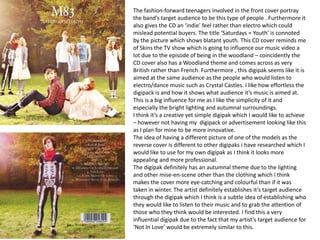
- 1. The fashion-forward teenagers involved in the front cover portray the band’s target audience to be this type of people . Furthermore it also gives the CD an ‘indie’ feel rather than electro which could mislead potential buyers. The title ‘Saturdays = Youth’ is connoted by the picture which shows blatant youth. This CD cover reminds me of Skins the TV show which is going to influence our music video a lot due to the episode of being in the woodland – coincidently the CD cover also has a Woodland theme and comes across as very British rather than French. Furthermore , this digipak seems like it is aimed at the same audience as the people who would listen to electro/dance music such as Crystal Castles. I like how effortless the digipack is and how it shows what audience it’s music is aimed at. This is a big influence for me as I like the simplicity of it and especially the bright lighting and autumnal surroundings. I think it’s a creative yet simple digipak which I would like to achieve – however not having my digipack or advertisement looking like this as I plan for mine to be more innovative. The idea of having a different picture of one of the models as the reverse cover is different to other digipaks i have researched which I would like to use for my own digipak as I think it looks more appealing and more professional. The digipak definitely has an autumnal theme due to the lighting and other mise-en-scene other than the clothing which I think makes the cover more eye-catching and colourful than if it was taken in winter. The artist definitely establishes it’s target audience through the digipak which I think is a subtle idea of establishing who they would like to listen to their music and to grab the attention of those who they think would be interested. I find this a very influential digipak due to the fact that my artist’s target audience for ‘Not In Love’ would be extremely similar to this.
- 2. The inside of the front cover I think is very mundane and doesn’t really appeal to anyone or make anyone want to read it. As it’s the thankyou’s and who’s produced/written the songs on the album I think that they could have made this more appealing by perhaps using the background of the front cover and then putting the text over it. I know that there’s more photographs of the models inside which could perhaps connote that the artist is more interested in fashion than building up their star persona and maybe their music. I like the fact that the CD is brightly coloured in contrast to the CD , this could also perhaps connote to matching/clashing clothing trends and the fashion orientated digipak. Furthermore it brings more colour to the digipak and makes it less predictable and prevents use of the pictures of the models.
- 3. For this electro/dance artist I managed to find both the digipack and advertisement. I think that this digipack is extremely ambiguous as it gives nothing about the artists away. However as it’s call ‘Electronic music from the Swedish leftcoast’ then it could perhaps connote that the artists are more interested and passionate about getting their music known than themselves and building a star persona. The landscape picture used makes the music look more peaceful than dance/electro music which could perhaps disillusion people into thinking it was electronic. I think that the rainbow part in the picture arguably connotes electronic music as it’s vibrant and colourful instead of just purely black and white. The font used is eye-catching and draws attention to it rather than to the picture which could perhaps contradict the fact that i think the artist is more interested in getting their music noticed and could in fact mean that they are more about building up a star persona.
- 4. Like m83’s digipak cover Plej have used a similar style picture of one of the pictures on the front cover. However it has been edited and a white border has been put around it which I think has definitely achieved a professional look and looks simple to do. Unlike the Chemical Brother’s digipak I think that using the background of the picture on the front cover looks better and looks more effortless and simple rather than making the digipak look too ‘busy’.
- 5. This advertisement for Plej’s album uses the picture on the digipack and changed the picture’s colour which is easy to do. However I think that it’s not a very creative or eye-catching way of promoting and advertising their digipack. Furthermore this digipack also includes journalist’s positive opinions on the CD which is meant to show people how good the CD is and that they should buy/listen to it . I think that they should have thought of a more creative way to advertise their CD as it doesn’t look very interesting and wouldn’t grab my attention. Also this advertisement doesn’t really connote anything about their target audience other than that they have to like electronic music.
- 6. For this Chemical Brother’s digipack I found all parts of the digipack and also the CD advertisement. Obviously this was easier to find as The Chemical Brothers are well known for their electro and dance music. I think this digipack is very creative and unique as I’ve never seen one like this. The night sky illustrated on the digipack connotes the title ‘We Are The Night’ which proves the digipack to be to be narrative of a certain extent of the music involved within it. Whereas the hands with eyes and the mountains appear to be quite disjunctive to the music yet somehow blends in with the theme of the digipack itself. However, this is a very professional looking cover which I don’t think I would be able to attain due to the illustrations and amount of Photoshop editing a CD cover along the same lines as this one would need. For the font of the artist’s name they have used the artist's trademark font of displaying their name which is also simple and helps the digipack to be easily recognisable.
- 7. The inside and reverse of the digipack are relatively simple as they have just used one of the illustrations from the front which I think is a simple and great idea to use for my digipack to create a certain theme and give it a professional look. The digipack has a kind of ‘space-aged’ aura which I think connotes to electro music and makes the digipack seem more amplifying of the genre it is portraying. Also the male hands and even the artists name shows that they are male. The advertisement is also simple and just uses the digipack cover as the poster like Plej’s CD advertisement and moreover includes quotes from music critics from magazines and their positive opinions on the CD. This is also a very easy and simple idea to use for my digipack advertisement.
- 8. I think this is a very good example of a successful digipack advertisement due to the fact that it’s brightly coloured and a full page which is guaranteed to grab a readers attention. Also as i found it in a International DJ magazine it shows that the advert is aimed at a target audience of readers of IDJ that are interested in electronic music. Once again I think that the advert automatically connotes its music genre due to the bright electrical colours and also as it’s a ‘mix’. Furthermore the advertisement also includes press quotes from other music magazines like IDJ which flatter the CD and try and persuade people to buy it. It also shows a note on it which shows an ‘exclusive cover version’ by the artist which they think a reader or potential buyer would be interested in.