Life After Death by PowerPoint TIA July 2012
•
1 gefällt mir•778 views

The document discusses effective presentation techniques based on how the brain learns. It recommends keeping presentations brief and visual by using techniques like: limiting slides to 3 sentences or less; incorporating images, videos and interactive polls; and triggering emotions with relevant hooks. It also emphasizes designing slides with empty space, asymmetrical balance and the rule of thirds to guide audience attention.

Empfohlen
Empfohlen
Weitere ähnliche Inhalte
Was ist angesagt?
Was ist angesagt? (17)
Ähnlich wie Life After Death by PowerPoint TIA July 2012
Ähnlich wie Life After Death by PowerPoint TIA July 2012 (20)
Mehr von Chris Shade
Mehr von Chris Shade (20)
Kürzlich hochgeladen
Kürzlich hochgeladen (20)
Life After Death by PowerPoint TIA July 2012
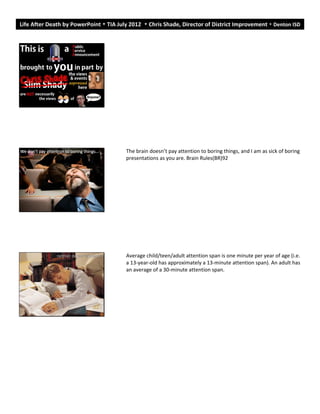
- 1. Life After Death by PowerPoint TIA July 2012 Chris Shade, Director of District Improvement Denton ISD The brain doesn’t pay attention to boring things, and I am as sick of boring presentations as you are. Brain Rules(BR)92 Average child/teen/adult attention span is one minute per year of age (i.e. a 13-year-old has approximately a 13-minute attention span). An adult has an average of a 30-minute attention span.
- 2. Using PowerPoint improperly creates the impression that the presentation is solely about the slides and the presenter, and not about the audience’s comprehension or insights. S:O219 You become the “Sage on the Stage.” After all, how many people can participate at one time? “Teaching is not young people watching old people work.” Before the first quarter-hour is over in a typical presentation, people usually have checked out. BR74 Don’t forget: You can copy- paste this slide into other presentations, and move or resize the poll. Press F5 or enter presentation mode to view the poll In an emergency during your presentation, if the poll isn't showing, navigate to this link in your web browser: http://www.polleverywhere.com/multiple_choice_polls/LTQyODQ3NTU3 MA If you like, you can use this slide as a template for your own voting slides. You might use a slide like this if you feel your audience would benefit from the picture showing a text message on a phone.
- 3. Don’t forget: You can copy- paste this slide into other presentations, and move or resize the poll. Press F5 or enter presentation mode to view the poll In an emergency during your presentation, if the poll isn't showing, navigate to this link in your web browser: http://www.polleverywhere.com/multiple_choice_polls/OTMzNzAzNTk1 If you like, you can use this slide as a template for your own voting slides. You might use a slide like this if you feel your audience would benefit from the picture showing a text message on a phone. 10-minute rule Given the tendency of an audience to check out 20% of the way into a presentation, I knew I initially had only about 600 seconds to earn the right to be heard—or the next hour would be useless. I needed something after the 601st second to “buy” another 10 minutes. After 9 minutes and 59 seconds, the audience’s attention is getting ready to plummet to near zero. They need something so compelling that they blast through the 10-minute barrier and move on to new ground— something that triggers an orienting response toward the speaker and captures executive functions, allowing efficient learning. BR91 The brain continuously scans the sensory horizon, with events constantly assessed for their potential interest or importance. BR76
- 4. Brain rules Regardless of who you are, the brain pays a great deal of attention to these questions: Can I eat it? Will it eat me? Can I mate with it? Will it mate with me? Have I seen it before? BR81 There’s no bigger rule in biology than evolution through natural selection: Whoever gets the food survives; whoever survives gets to have sex; and whoever has sex gets to pass his traits on to the next generation. BR34 Vision We do not see with our eyes. We see with our brains. BR223
- 5. Our evolutionary history was never dominated by text-filled billboards or Microsoft Word. It was dominated by leaf-filled trees and saber-tooth tigers. The major threats to our lives in the savannah were apprehended visually. Ditto with most of our food supplies. Ditto with our perceptions of reproductive opportunities. BR 234 The more visual the input becomes, the more likely it is to be recognized. 3 second rule Presentations are a “glance media”—more closely related to billboards than other media. The audience should be able to quickly ascertain the meaning before turning their attention back to the presenter. Slide:ology(S:O)140 Pretend you are riding in your parents car on the way home from school. I want you notice the billboards on your way home. When we get home, I want you to tell me what the billboards are selling. Ready?
- 6. What caught your eye? Unfortunately, most people never make the jump from verbal expression—which is what we were all taught in school—to effective visual expression, which is neither easy nor natural. S:Oxviii
- 7. The right hemisphere is the picture; the left hemisphere is the thousand words. AWNM 19 Nonlinguistic Representation Ironically, the one thing that combines creative thinking, analytics, data assimilation, and the inherent ability to express oneself visually. S:O2 Nonlinguistic Representations is one of Robert Marzano’s nine essential high Level instructional strategies found within Classroom Instruction That Works & The Handbook for Classroom Instruction that Works. According to research, knowledge is stored in two forms: linguistic and visual. The more students use both forms in the classroom, the more opportunity they have to achieve. Recently, use of nonlinguistic representation has proven to not only stimulate but also increase brain activity. • Incorporate words and images using symbols to represent relationships. • Use physical models and physical movement to represent information. • Creating graphic representations. • Generating mental pictures. • Drawing pictures and pictographs. • Engaging in kinesthetic activity. Picture Superiority Effect If information is presented orally, people remember about 10%, tested 72 hours after exposure. That figure goes up to 65% if you add a picture. PZ234 The more visual the input becomes, the more likely it is to be recognized—and recalled: the pictorial superiority effect.
- 8. If everyone in the room agreed with you, you wouldn’t need to do a presentation, would you? You could save a lot of time by printing out a one-page project report and delivering it to each person. No, the reason we do presentations is to make a point, to sell one or more ideas. If you believe in your idea, sell it. Make your point as hard as you can and get what you came for. Your audience will thank you for it, because deep down, we all want to be sold. Communication is the transfer of emotion. Communication is about getting others to adopt your point of view, to help them understand why you’re excited (or sad, or optimistic or whatever else you are.)If all you want to do is create a file of facts and figures, then cancel the meeting and send in a report. Text (Show Life After Death by PowerPoint)
- 9. Overview • Project Description – Objective – Results • Project Methodology • Key Findings / Results – Results 1 – Results 2 • Conclusion Templates Backgrounds are intended as a surface on which to place elements. They are not in themselves a work of art. PZ118 Your artist’s pallet: Slide dimensions: 800x600 PZ142 When searching for images, the closer to 800x600, the better picture quality. Signal vs Noise Ratio (SNR) SNR is the ratio of relevant to irrelevant elements or information in a slide (or other display). What creates noise? Inappropriate charts, ambiguous labels and icons, lines, shapes, symbols, and logos. PZ122
- 10. Rule of Thirds A viewfinder or slide can be divided by lines—real or imagined—so that you have four intersecting lines or crossing points and nine boxes that resemble a tic-tac-toe board. These four crossing points are also called “power points” are areas you might place your main subject, rather than in the center. The rules is applied by dividing your photo into thirds both vertically and horizontally. The rule of thirds…is a basic design technique that can help you add balance (symmetrical or asymmetrical), beauty, and a higher aesthetic quality to your visuals.” PZ151 A clean white background with plenty of active empty space…helps guide the viewer’s eyes. When a new slide is revealed the eye will naturally draw to the image first and then go to the text element.” PZ146 Empty space. Empty Space Empty space implies clarity and allows for the appreciation of a single item. PZ145 It is not necessary to put all the words that are spoken by the presenter on the screen. PZ146 Empty space guides the viewer’s eyes. The eye will be naturally drawn to the image first then quickly go to the text. PZ146 Empty space can even bring motion to your design. PZ148
- 11. KISS (Keep It Simple Stupid) Symmetrical/Asymmetrical Balance Symmetrical balance is vertically centered and is equivalent on both sides. PZ148 Subjects placed exactly in the middle can often make for an uninteresting photo. PZ151 KISS (Keep It Simple Stupid)
- 12. Symmetrical/Asymmetrical Balance Symmetrical balance is vertically centered and is equivalent on both sides. PZ148 Subjects placed exactly in the middle can often make for an uninteresting photo. PZ151 Empty Space Empty space implies clarity and allows for the appreciation of a single item. PZ145 It is not necessary to put all the words that are spoken by the presenter on the screen. PZ146 Empty space guides the viewer’s eyes. The eye will be naturally drawn to the image first then quickly go to the text. PZ146 Empty space can even bring motion to your design. PZ148 Insert text within images. Insert text within images. Text within Images Look for an image that supports your quote or text. The image should have plenty of empty space so that your text can fit comfortably in the slide. PZ142 Use a graphic element that targets people’s emotions, ads more visual interest, and enhances the effect of the slide. PZ142 The image should have plenty of empty space so that your text can fit comfortably in the slide with good contrast. PZ142 The brain sees words as lots of tiny pictures. PZ234
- 13. 0 1 2 3 4 5 6 Category 1 Category 2 Category 3 Category 4 Series 1 Series 2 Series 3 Charts I use a lot of photographic images in my presentations, so when I do show a chart or graph, I do not usually place any other elements on the slide. The data itself can be a very powerful, memorable graphic on its own. PZ126 If you want people to hear and understand your visual message, the answer is not to add more clutter, but to remove it all. PZ129 (So, don’t use a themed template.)
- 14. Music Songs capture emotions. First date. 5 songs that define your life…your unit. Video Incorporating video [slides] can have powerful—and unexpected—impact. S:O176 Another way to get your message across is to use a video slide, which allows you to integrate video into a presentation. You can create short motion clips lasting from a few seconds to a half minute. Video should be “a high enough quality to get the point across, but doesn’t require elaborate staging.” S:O176 Stickiness What makes messages stick? Sticky ideas have 6 key principles in common: simplicity (if everything is important, nothing is important), unexpectedness, concreteness, credibility, emotions, and stories. PZ76 (See also Made to Stick (MtS) by Chip and Dan Heath)
- 15. Hooks Hooks have to be relevant. If hooks are irrelevant, the presentation seems disjointed or listeners mistrust the speaker’s motives (as if trying to entertain at the expense of providing information)…if the hook is relevant, the group is moved from feeling entertained to feeling engaged. BR91 Must trigger an emotion: fear, laughter, happiness, nostalgia, incredulity (amazement, doubt, skepticism, unbelief, wonder, or novel stimuli—the unusual, unpredictable, or distinctive—are powerful ways to harness attention) BR76)) BR91 fear, disgust, e, happiness, and ss Emotion Emotions get our attention. Emotionally arousing events tend to be better remembered than neutral events. An emotionally charged event is the best-processed kind of external stimulus ever measured. BR80 Emotional arousal focuses attention on the “gist” of an experience at the expense of the peripheral details. With the passage of time, our retrieval of gist always trumps our recall of details. This means our heads tend to be filled with generalized pictures of concepts or events, not with slowly fading minutiae. BR83
- 17. Turn to your neighbor TEACHERS ARE DESIGNERS • An essential act of our profession is the design of: – curriculum – learning experiences • We are also designers of assessments to: – diagnose student needs – guide our teaching – enable us, our students, and others to determine whether our goals have been achieved • Did the students learn and understand the desired knowledge?
- 18. Turn to your neighbor An essential act of our profession is the design of: curriculum learning experiences We are also designers of assessments to: diagnose student needs guide our teaching enable us, our students, and others to determine whether our goals have been achieved Did the students learn and understand the desired knowledge? Conclusion You can get with this or you can get with that.
- 19. 1 thing you learned… 1 thing that surprised you… 1 thing that stuck…
- 20. 1 thing that is still difficult… 76201