young Call girls in Dwarka sector 23🔝 9953056974 🔝 Delhi escort Service
Question 2
1. A key aspect of my magazine, poster and teaser trailer is that they
must all have synergy. To gain an insight into how to form that
synergy I have formed a case study of how the film Scream conveys
the synergy.
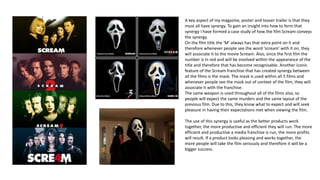
On the film title the ‘M’ always has that extra point on it and
therefore whenever people see the word ‘scream’ with it on, they
will associate it to the movie Scream. Also, since the first film the
number is in red and will be involved within the appearance of the
title and therefore that has become recognisable. Another iconic
feature of the Scream franchise that has created synergy between
all the films is the mask. The mask is used within all 5 films and
whenever people see the mask out of context of the film, they will
associate it with the franchise.
The same weapon is used throughout all of the films also, so
people will expect the same murders and the same layout of the
previous film. Due to this, they know what to expect and will seek
pleasure in having their expectations met when viewing the film.
The use of this synergy is useful as the better products work
together, the more productive and efficient they will run. The more
efficient and productive a media franchise is run, the more profits
will result. If a product looks pleasing and works together, the
more people will take the film seriously and therefore it will be a
bigger success.
2. I have created synergy within my media products in various ways. I
have used the same mask throughout each media form – the teaser
trailer involves the masked man, the poster uses a still image from
the trailer which involves the masked man and the poster is purely
of the masked man. Using this mask forms iconography for the film
as the mask alone will remind audiences of the film. Just like Scream
has created for that franchise. I have also used the same blood
splatter across the title for all 3 media forms. I have purposely done
this to add to the horror conventions and also as it creates synergy
and makes it all link together. If everything in the media forms link
together, it will create a strong bond between them all and appear
to the audience as professional and will look legitimate so therefore
the audience will take it seriously and want to see the film as it will
appear successful before people have seen it. The same font is used
also throughout the 3 forms. I have used that specific font as it looks
like font from a text message, and as we have a film which involves
text messages quite a lot, we felt this was appropriate and fitted
well and created synergy through that way. The image that I have
used on the poster was taken whilst we was filming a scene for the
teaser trailer so therefore that specific scene has become a part of
the iconography and will be especially remembered. Everything links
and that is important to create strong synergy.