1. Cover Drafts
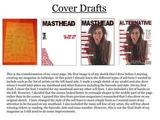
This is the transformation of my cover page. My first image is of my sketch that I drew before I starting
creating my magazine in InDesign. At this point I already knew the different types of sell lines I wanted to
include such as the list of artists on the left hand side. I made a rough sketch of my model and also drew
where I would later place my masthead and other features including the barcode and date. On my first
draft, I chose the font I wanted for my masthead and my other sell lines. I also included a list of bands on
the left. However, I decided that the names looked better in rectangle shapes in the middle part of the page
rather than in the corner. I gained this idea from previous magazines I researched that I also drew on my
original sketch. I later changed the style of the sell lines to more simple fonts as I wanted most of my
attention to be focused on my masthead. I also included the main sell line of my artist, the sell line about
winning tickets to reading, the barcode, date and issue number. However, this is not the final draft of my
magazine as I still need to do some improvements.
2. My Other Ideas
These are my other ideas regarding my cover page including the different images I thought about including.
I finally decided that I wanted to include the image on the previous slide as I thought it was best to use a
close-up image plus I thought this photo looked more interesting due to the facial expression.