1. I’ve asked my client a few questions to help me improve the logo’s and for him to choose a final logo
to go on the rest of the stationary.
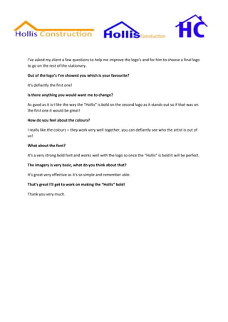
Out of the logo’s I’ve showed you which is your favourite?
It’s defiantly the first one!
Is there anything you would want me to change?
As good as it is I like the way the “Hollis” is bold on the second logo as it stands out so if that was on
the first one it would be great!
How do you feel about the colours?
I really like the colours – they work very well together, you can defiantly see who the artist is out of
us!
What about the font?
It’s a very strong bold font and works well with the logo so once the “Hollis” is bold it will be perfect.
The imagery is very basic, what do you think about that?
It’s great very effective as it’s so simple and remember able.
That’s great I’ll get to work on making the “Hollis” bold!
Thank you very much.