
Empfohlen
Empfohlen
Weitere ähnliche Inhalte
Was ist angesagt?
Was ist angesagt? (20)
Andere mochten auch
Ähnlich wie Climate change: Changes in the atmosphere
Ähnlich wie Climate change: Changes in the atmosphere (20)
Mehr von cdenef
Mehr von cdenef (15)
Kürzlich hochgeladen
Kürzlich hochgeladen (20)
Climate change: Changes in the atmosphere
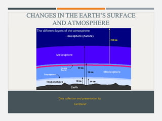
- 1. CHANGES IN THE EARTH’S SURFACE AND ATMOSPHERE Data collection and presentation by Carl Denef The different layers of the atmosphere
- 2. GLOBAL LAND AND SEA SURFACE TEMPERATURE On a centennial time scale, average global surface temperature is steadily increasing, as shown by direct temperature measurements stored in data bases freely available and analyzed by 6 independent scientific organizations. The National Climatic Data Center of the National Oceanic and Atmospheric Admlinistration (NOAA) in the U.S. (NCDC) The NASA/Goddard Institute for Space Studies in the U.S. (GISS) The Hadley Centre of the U.K. Meteorological Office and the Climatic Research Unit at the University of East Anglia (HadCRUT). The Japanese Meteorological Agency (JMA) The Berkeley Earth Surface Temperature study (BEST) 2
- 3. Data analysis In general the surface of the Earth is split into grid boxes. Temperature for each grid box is expressed as temperature anomaly (departures from normal average) or as absolute temperature. A positive anomaly indicates that the observed temperature was warmer than the average value, while a negative anomaly indicates the opposite. The 6 major organizations that analyzed the historical temperatures (see previous slide) used different methods for quality control of the data. As individual temperature histories reported from a single location can be noisy and/or unreliable, it is necessary to compare and combine many records to understand the true pattern of temperature changes. Where instrument data has historically been sparse, interpolations across regions need to be made, which is a source of uncertainty. Adjustments of certain data are necessary because surface weather stations may have been relocated, instrumentation may have been replaced, observation practices may have changed over time, and the land use around an observing station could have been altered by natural or man-made causes. The manifestation of such changes is often an abrupt shift in the mean level of temperature readings, unrelated to true climate trends. Such artifacts (also known as inhomogeneities) may confound attempts to quantify climate variability and change. The process of removing the impact of non-climatic changes is called homogenization. Such modifications have the potential to bias measurements. Only BEST does not use homogeneization but a different statistical process (see 3
- 4. later). The precise station make-up of each temperature record also varies among the 6 groups but BEST has merged all available data. Nevertheless, despite the differences in procedures and data used, the data are very consistent among the different groups, as will be seen in the next slides, . 4
- 5. Land surface temperature Land surface temperature is the temperature above land at 1.5 m height. It is essential that measurements are spread as much as possible over the globe. This was not realized at the beginning of temperature registrations but has continuously been improved. On land, temperature is measured at thousands of weather stations, and on oceanic islands. 5
- 6. Sea surface temperature (SST) Sea surface temperature (SST) is the temperature of the superficial ocean layer. Histotically it was not always taken at the same depth, particilarly in the 19th century when ships were used for the measurements. Early data were systematically cold biased because they were made using canvas or wooden buckets that lost heat to the air before the measurements could be read. Methods with smaller bias and of improved design came into use after 1941. Fixed weather buoys measure the water temperature at a depth of 3 m. Data buoys also measure marine air temperature, air pressure, ocean current velocity, humidity, wave characteristics and wind velocity. 6
- 7. Surface temperature measured by satellites Since 1967, weather satellites have become available to measure SST and land surface temperature, with the first global composites created during 1970.[9] SST measurement is made by sensing the ocean radiation under cloudless condition at two or more wavelengths within the infrared electromagnetic spectrum, which can then be empirically related to SST.[12] To measure land surface temperature, the intensity of upwelling microwave radiation from atmospheric oxygen is measured at different frequencies, which is proportional to the temperature of broad vertical layers of the atmosphere. These different frequency bands sample a different weighted range of the atmosphere.[12] For example, “channel 2” is representative of the troposphere. Satellite measurements are in reasonable agreement with in situ temperature measurements.[11] 7
- 8. Data from NOAA – NCDC Surface temperature steadily rose since the early 20th century, more over land than over sea 8
- 9. Land+sea surface temperature tends to rise more in the Northern than in the Southern Hemisphere 9
- 10. Data from NASA - GISS Annual and five-year global temperature anomalies from 1880 to 2012, with the base period average of 1951-1980. NASA/Goddard 10
- 11. Notice that 1) temperature over land rises more than over sea, and 2) temperature rise is temporarily higher during El Nino (bottom diagram). Updated versions from Dr. Makiko Sato from Columbia University can be seen here. NASA/Goddard 11
- 12. Annual and five-year running mean temperature changes, with the base period 1951-1980, for three latitude bands that cover 30%, 40% and 30% of the Earth’s area. Notice that 1) temperature rise is larger at high latitude and 2) the rise is larger at Northern than at Southern latitudes NASA/Goddard 12
- 13. Annual mean land-ocean temperature changes up to April 2013, with 1951−1980 as base period. Notice that the temperature rise 1) is most pronounced in Arctic regions, 2) is more pronounced in Arctic than Antarctic regions 3) is more pronounced at Northern than at Southern latitudes and 4) is more steady in the Tropics and at Southern latitudes than at Northern. Latitudes. Data source - Click here NASA/Goddard 13
- 14. Data from HadCRUT Land-sea temperature rise is higher in the Northern than in the Southern hemisphere. 14
- 15. Data from JMA The land data for the period before 2000 are from GHCN (Global Historical Climatology Network), provided by NCDC (the U.S. National Climatic Data Center), while that for the period after 2001 consists of CLIMAT messages archived at JMA. The oceanic data are JMA's own long-term sea surface temperature analysis data, known as COBE-SST. JMA 15
- 16. The Berkeley Earth Surface Temperature study (BEST) BEST is a project conceived of and funded by the Novim group at University of California at Santa Barbara.[1]It is an effort to resolve criticism of the records of the Earth's surface temperatures that were previously available on public websites, but in so many different locations and different formats that most people could access only a small subset of the data. BEST merged all data in one database, consisting of 1.6 billion temperature reports from 16 preexisting data archives. BEST is using over 36,000 unique stations, which is about five times more than any other group. The database and analysis of the temperatures, with all calculations, methods and results are available online. The team is an independent, non-political, non-partisan group, including physicists, climate scientists, statisticians, and others with experience analyzing large and complex data sets. It is funded by unrestricted educational grants. Donors have no control over how BEST conducts the research or what they publish.[6] So far, only land-surface temperature records were analyzed but they are going back 250 years, about 100 years further in the past than previous studies. Unlike the other groups, BESTshows temperature anomalies and absolute temperatures BEST also has carefully studied issues raised by skeptics, such as data selection, poor station quality, data adjustment and possible bias from ‘urban heat island effects’ (that were claimed by skeptics to affect average surface temperature even though they amount to less 16
- 17. than 1% of the land area), It was demonstrated that these do not unduly bias the results. BEST uses an algorithm that attaches an automatic weighting to every data point, according to its consistency with comparable readings. This approach allows the inclusion of weird readings without distorting the result. Standard statistical techniques were used to remove outliers. The methodology also avoids traditional procedures that require long, continuous data segments, thus accommodating for short sequences, such as those provided by temporary weather stations. This innovation allowed BEST to compile earlier records than its predecessors, although with a high degree of uncertainty because, at the time, there were only two weather stations in America, just a few in Europe and one in Asia.[11][17] For more about data set analysis, filter use and quality control, click here The BEST analysis reported in 2011-2012 shows that the rise in average world land temperature is approximately 1.5 °C in the past 250 years, and about 0.9 °C in the past 50 years, which mirrors very well the data obtained from all earlier studies, showing that potential bias insinuated by climate change skeptics did not seriously affect the global warming conclusions. 17
- 18. Look here for a video of the regional distribution of the temperature trend. 18
- 20. Berkeley Earth “For Antarctica, large observational uncertainties result in low confidence that anthropogenic forcings have contributed to the observed warming averaged over available stations.” (IPCC AR5) 20
- 21. Pune New York Ann Arbor 21
- 22. Satellite data Two satellite records of the temperature in the lower atmosphere exist: one from the University of Alabama in Hunstville (UAH) and another from Remote Sensing Systems (RSS). The two groups analyzed the same satellite data with different methods to determine temperature (see left Figure). The trend of temperature rise corresponds well with direct thermometer data. The right Figure shows global monthly mean Sea Surface Temperature (SST) anomaly measured by satellites (ATSR-1, -2 and AATSR), compared with in situ records (HadSST3); again there is high agreement of the SST rise between both. From IPCC AR5 Figure 2.17 22
- 23. Temperature in bore holes By taking measurements of the temperature of rock in boreholes hundreds of meters underground, it is possible to detect shifts in the mean surface temperature that existed hundreds of years ago at that location and that had not dissipated because of the very slow conductivity of rocks. The diagram below shows a global surface temperature change over the last five centuries, as measured in bore holes, averaged from 837 individual reconstructions. The thick red line represents the mean surface temperature since 1500 relative to the present-day. The shading represents ± one standard error of the mean. The blue line shows the rise in the global mean surface temperature (five year running average) derived from instrumental records by P.D. Jones and colleagues at the University of East Anglia. Bore hole temperature measurements correspond well with the instrumental measurements of land-sea surface temperature (blue line). From NOAA 23
- 24. Temperature change expressed as decadal trends As shown in the Table below, it is clear that 1) the more recent the measurement, the steeper is the temperature rise, 2) there is high concordance between data sets and 3) Northern Hemisphere surface temperature rose faster than southern in all data sets. (from IPCC AR4) 24
- 25. REGIONAL AND SEASONAL SURFACE TEMPERATURE Average global surface temperature may give a false impression that global warming is small. However, when looked at the regional and seasonal level, departures from the average climate are considerably larger. 25
- 26. Data from NOAA – NCDC Regions where average surface temperature is higher than normal clearly exceeds regions where temperature is lower. The Figure shows temperature distribution over the first half of 2013 (left) and in November 2013 (right). In large parts of the World it was markedly warmer than normal. Only in Western Europe, parts of the U.S and Siberia, it was colder than normal. 26
- 27. November 2013 was the warmest year since 134 years (0.78°C above the 20th century average), with temperatures in Russia and central Asia up to 5 °C higher compared to the 1980-2000 average. 27
- 28. Data from NASA - GISS Look at the animation movie of regional temperature changes from 1880-2012, as compared to the 1951-1980 base period average. If the movie does’nt open please look at the static presentations at the NASA here. Higher than normal temperatures are shown in red and lower then normal temperatures are shown in blue. From 1890 to 1894 From 2008 to 2012 Credit: NASA/Goddard Space Flight Center Scientific Visualization Studio Data provided by Robert B. Schmunk (NASA/GSFC GISS) 28
- 29. Trends in global mean surface temperature by region from 1901 to 2012. Black plus signs (+) indicate grid boxes where trends are significant (i.e. a trend of zero lies outside the 90% confidence interval). 29
- 30. The top warmest seasons since 1900 all occurred between 1998 and 2012. An updated versions of the Figure can be seen here Notice that 1) regional anomalies can be much higher than global average anomaly and 2) again, anomalies are stronger in the Northen hemisphere and Arctic than in the Southern hemisphere. 30
- 31. The top 10 warmest years since 133 years all fell between 1998 and 2012. Updated versions of the Figures can be seen here 31
- 32. Data from BEST In the Northern Hemisphere there is relatively more warming in the winter and spring. In contrast, the change in temperature during the summer is nearly uniform across the globe. Greenland shows nearly no change in temperature in the spring. In the Autumn, North America sees very little temperature change, while parts of Russia and China see greater changes. BEST 32
- 33. TROPOSPHERE AND STRATOSPHERE TEMPERATURE Warming is also be seen in the lower troposphere, as measured by weather balloons and satellites. The trend is opposite in the statosphere, as a consequence of decreased radiation towards space by the absorption of radiation in the troposphere. The Figure shows different data sets. 33 (from IPCC AR5 Figure 2.24).
- 34. The temperature changes in the troposphere and stratosphere are also seen at the regional level: warming of lower troposphere (LT), particularly in the Northern Hemisphere and Arctic, and cooling in the lower stratosphere (LS). The data are from satellite measurements UAH and RSS. From IPCC AR5 Figure 2.25. 34
- 35. ATMOSPHERIC GREENHOUSE GASES 35 The following slides will show that the steady rise in greenhouse gas level in the atmosphere by human-induced fossil fuel burning exerts a positive radiative forcing, resulting in global warming
- 36. Greenhouse gas characteristics Greenhouse gases widely differ by their concentration and residence time in the atmosphere and by their warming potential. Concentrations vary by more than eight orders of magnitude, and their warming potential varies by more than four orders of magnitude. Residence time can differ more than three orders of magnitude. Gas name Chemical formula Pre-1750 tropospheric concentration Lifetime (years) Global warming potential 20-yr time horizon 100-yr time horizon Carbon dioxide CO2 280 ppm See next slide 1 1 Methane CH4 700 ppb 12 72 25 Nitrous oxide N2O 270 ppb 114 289 298 Ozone O3 25 ppb Days-weeks 62-69 CFC-12 CCl2F2 100 11 000 10 900 HCFC-22 CHClF2 12 5 160 1 810 Tetrafluoromethane CF4 50 000 5 210 7 390 ppm = parts per million by volume ppb = parts per billion Table reconstructed from Wikipedia: [1] [2] 36
- 37. The Table below (from IPCCC AR5) shows the CO2 residence times in the different compartments of the carbon cycle 37
- 38. The atmospheric concentration of water vapor is highly variable and depends largely on temperature, from less than 0.01% in extremely cold regions to 3% in saturated air at 32 °C [81] Water vapor and clouds constitute the largest percentage of the natural greenhouse effect, 36-66% for clear sky and 66-85% when including clouds.[15] The average residence time of a water molecule in the atmosphere is only about 9 days.[82] This is because water vapor can condense and precipitate. As the amount of water vapor in the atmosphere is mostly controlled by air temperature, rather than by emissions, human activity does not significantly affect water vapor concentrations except at local scales, such as near irrigated fields. However, water vapor is a feedback agent; it augments warming by other greenhouse gases. The greenhouse gas warming potential of ozone is difficult to measure because it is not present in uniform concentrations across the globe. The most used value is ~25 % of that of CO2. Tropospheric ozone decays much more quickly than CO2 (a few days to a few weeks). Therefore, it does not have a strong global effect, but has very strong radiative forcing effects on regional scales. There are regions where tropospheric ozone has a radiative forcing up to 150% of CO2.[29] Read more 38
- 39. Stratospheric ozone indirectly affects radiative forcing. Depletion of the ozone layer by halocarbons has resulted in a strong cooling effect in the stratosphere. CO, Non-Methane Volatile Organic Compounds (NMVOC), NO and NO2 do not have a direct greenhouse effect, but act indirectly as precursors of tropospheric O3 and aerosol formation, and their impacts on OH concentrations and CH4 lifetime. NMVOC include aliphatic, aromatic oxygenated hydrocarbons (e.g., aldehydes, alcohols, and organic acids), and have atmospheric lifetimes ranging from hours to months. NO and NO2 also have short atmospheric lifetimes. 39
- 40. Global warming potential and temperature change potential Warming can be expressed with two different metrics: The Global Warming Potential (GWP) and the Global Temperature change Potential (GTP) The GWP is defined as the time-integrated radiative forcing (in W/m2) due to a pulse emission of a given greenhouse component, relative to a pulse emission of an equal mass of CO2. GWP is an index of the total energy added to the climate system by a component in question relative to that added by CO2 over a given time period, usually 20, 100 or 500 years. The GWP depends on : the absorption of infrared radiation by a given species (after which it is re-emitted) the spectral location of its absorbing wavelengths the atmospheric lifetime of the species The GTP is the change in global mean surface temperature at a chosen point in time in response to an emission pulse of a greenhouse gas, relative to that of CO2. As for GWP, the choice of time horizon has a strong influence on the metric values and the calculated contributions to warming. 40
- 41. Natural greenhouse gas flux CO2 Natural sources of CO2 in the atmosphere are respiration by living aerobic organisms, the natural decay of organic material in forests and grasslands, forest fires, and volcanic activity. The former release about 439 gigatonnes (Gt) of CO2 every year while volcanos release only 130-230 megatonnes of CO2 each year.[18] CO2 is removed from the atmosphere by plants, algae and cyanobacteria through photosynthesis, which absorbs 450 Gt CO2 per year.[17 Other major sinks for CO2 are the oceans. Notice that the natural CO2 absorbing capacity has about a net positive balance of 11 Gt, which means that sinks can handle an additional 11 Gt/year. 41 There is >50 x carbon dissolved in the oceans (water + biosphere) than in the atmosphere. The ocean reservoir is ~38,000 Gt Carbon equivalents, land ~4000 Gt and the atmosphere 589 Gt (prior to the Industrial Era)
- 42. CH4 Natural methane sources come from microbes on wetlands (~80 %), microbes living in the ocean and microbes of the digestion process of termites.The main sink of CH4 is through its reaction with the hydroxyl radical OH in the troposphere, followed by reaction with water vapour. Tropospheric OH comes from photodissociation of ozone. The Arctic is a modest source of methane, emitted mostly from seasonally unfrozen wetlands. N2O Natural emissions of N2O come mostly from microbial activity in the soil. The main sink for N2O is through photolysis and oxidation reactions in the stratosphere. Ozone (O3) is formed naturally from oxygen by UV rays in the stratosphere. The largest natural net source of tropospheric ozone is influx from the stratosphere. Large amounts of ozone are also produced in the troposphere by photochemical reactions, the amounts increasing with high levels of air pollution. Tropospheric Ozone is destroyed by sunlight which leads to the production of hydroxyl (OH) radicals, that in turn destroy CH4. Another important sink for tropospheric ozone is uptake by plants. 42
- 43. World distribution of stations monitoring atmospheric CO2 and CH4 Source: World Meteorological Organization 43
- 44. Changes in greenhouse gases in the atmosphere over history, as assessed from ice core data and direct modern measurements 10000 5000 0 Time (before 2005) The combined radiative forcing due to increases in CO2, methane, and nitrous oxide is +2.30 W/m2, and its rate of increase during the industrial era is very likely to have been unprecedented in more than 10,000 years (see later). Note that the CO2 level today is already 400 ppm From the IPCC AR4 44
- 45. Atmospheric CO2 levels 1960-present and seasonal variation There is an annual fluctuation of about 3–9 ppm which roughly follows the Northern Hemisphere's growing season. The Northern Hemisphere dominates the annual cycle of CO2 concentration because it has much greater land area with plant biomass than the Southern Hemisphere. Concentrations peak in May as the Northern Hemisphere spring begins and reach a minimum in October[14]. The rise in CO2 from October to May is due to decomposition of the dead vegetation and the subsequent decline is due to the increasing biomass engaged in photosyntesis Source 45
- 46. Present atmospheric CO2 concentrations In 2009, the CO2 global average concentration in Earth's atmosphere was about 0.0387%,[9] or 387 parts per million (ppm) by volume[1] [1][10] At the recording station in Mauna Loa, the concentration reached 0.04% or 400 ppm for the first time in May 2013.[11][12] This level had already been reached in the Arctic in June 2012.[13] The National Geographic noted that the level of CO2 in the atmosphere is this high "for the first time in 55 years of measurement—and probably more than ever during the last 3 million years of Earth history”[16] The global economic recession in 2008 considerably slowed energy consumption and, hence, the carbon emission growth. Emission actually declined slightly from 29.4 Gt CO2 in 2008, to 29 Gt in 2009. However, despite the slow global economic recovery, 2010 saw 46 the largest single year increase in CO2 emissions (1.6 Gt). In 2009 emissions had dropped into the middle of the projections by the IPCC Special Report on Emissions Scenarios (SRES), but by 2010 the increase rebounded toward the SRES worst case scenario. Source Also the yearly growth rate of CO2 level in the atmosphere increased to more than double of the value in 1960-70. Source
- 47. Atmospheric CO2 concentrations are unevenly distributed over the Earth Click the picture below to see an animation. The video shows the monthly distribution in 2003. High CO2 concentrations of ~385 ppm are in red, low CO2, about ~360 ppm, in blue. Click image 47
- 48. Tropospheric ozone Tropospheric ozone levels are spatially and temporally highly heterogeneous. Ozone forcing increased throughout the 20th century, with highest levels at altitudes around 15°–30°North due to tropospheric pollution but negative values over Antarctica due to stratospheric loss late in the century. The Figure shows the distribution over the globe of the mean radiative forcing (W/m2) due to ozone for the indicated times, based on multi-model simulations. Global area-weighted means are given in the upper right. From IPCC AR5 Figure 8.25 48
- 49. Man-made greenhouse gases The Figure shows the changes in averaged levels at Earth’s surface of the major halogen-containing greenhouse gases. Only the most abundant gases are shown. From IPCC AR5 Figure 2.4. Only some halocarbons have decreased after their initial rise. 49
- 50. Anthropogenic CO2 emissions over history Sources: CO2 Information Analysis Center, Oak Ridge National Laboratory (2012) and International Energy Agency, World Energy Outlook (2012) 50 source
- 51. Causes of anthropogenic greenhouse gas emissions Leading cause is burning fossil fuels: Between 1751 to 1900 only ~12 Gt of carbon were released as CO2, whereas from 1901 to 2008 it was about 334 Gt.[28] . Second major cause is deforestation and land use change: Forests are destroyed by humans at a rate of about 13 million hectares/year by logging and by burning to get land for agriculture, livestock and biomass plantations[24] . Deforestation means decrease in CO2 sink and thus higher CO2 in the atmosphere. Up to 20 % of global carbon emissions comes from deforestation – greater than emissions from all our transportation vehicles combined. Forests capture CO2 and release O2. So, instead of forests helping us to solve the climate crisis, deforestation is making the situation worse. Livestock produces methane through enteric fermentation. Read more here Other human activities: use of fertilizers; manure management [74]; anaerobic decay of municipal organic waste; fluorinated gas production for industry and household In 1997, human-caused Indonesian peat fires were estimated to have released 13- 40% of the average carbon emissions caused by the burning of fossil fuels around the world in a single year.[25][26][27] 51
- 52. Deforestation worldwide in % of forest (Source) 52
- 53. 53 ! Listen to the International Energy Agency report of 10 June 2013 Look how the CO2 emissions of New York city can be visualized as a huge mountain of blueish balls – each representing 1 ton of CO2 – that overgrow a 3D virtual city model. Read more
- 54. Anthropogenic greenhouse gas emissions by gas type and sector Figures are from EPA; Source: IPCC AR4Working Group I; Read more 54
- 55. Anthropogenic CO2 emissions by country Figure from EPA; Source: National CO2 Emissions from Fossil-Fuel Burning, Cement Manufacture, and Gas Flaring: 1751-2008. 55
- 56. Anthropogenic CO2 emissions exceed the Earth’s annual capacity to reabsorb. The Earth can absorb ~11 Gt of CO2 above the natural flux. However, the anthropogenic amount of CO2 released into the atmosphere in 1965 was already ~11 Gt, saturating Earth’s capacity of CO2 absorption. CO2 emissions steeply rose since then to reach 33.5 Gt in 2010 and over 34 Gt in 2011[Ref]. Human-generated CO2 emissions today are only about 4.5 % of annual natural emissions (see slide on natural CO2 flux), because removal of CO2 is extremely slow compared to its emission rate. As a result, CO2 has gradually accumulated in the atmosphere, and as of 2013, its concentration is almost 43% above pre-industrial levels.[30][31] The oceans have taken up about a third of CO2 emitted by human activity.[46] We have already produced >400 Gt of carbon as CO2 since the industrial Era The U.S. Geological Survey (USGS) reports that human activities now emit more than 135 times as much CO2 as volcanoes each year (from EPA). 56
- 57. Empirical evidence that greenhouse gas rise causes global warming 1) Basic laws of physics. They show that the Earth without an atmosphere would have an average temperature well below freezing. Yet, the actual global average surface temperature is ~15°C. The Earth surface reflects part of the short wave visible light energy received from the Sun as long wave infrared radiation. This infrared radiation is captured by greenhouse gas molecules – water vapor, clouds, CO2, methane, nitrous oxide, ozone – in the lower atmosphere, a process raising heat content. Absorbed energy is re-radiated in all directions, causing additional warming of the lower troposphere and the Earth’s surface. Water vapor, clouds, CO2, methane, nitrous oxide and ozone are natural greenhouse gases but since the industrial revolution human activity causes a steadily increasing emission of CO2, methane and nitrous oxide. In addition there are man-made artificial 57 greenhouse gases known as halogenated carbons (halocarbons). Industrial pollutants also increased tropospheric ozone levels, while pollution with black carbon provokes an additional longwave radiation from that carbon. Furthermore, when carbon dust is deposited on snow and ice, there is a decrease in albedo and consequently more warming.
- 58. 2) Measurement of downward thermal radiation started to become available during the early 1990s at a limited number of worldwide distributed sites. From these records, Wild et al. (2008) determined an overall increase of +2.6 W/m2 per decade over the 1990s, in line with what climate models project. Measurements at eight radiation stations distributed over the central Alps have shown that atmospheric longwave downward radiation significantly increased with +1.8 W/m2 over eight years (Philipona et al, 2004). 3) Satellites have measured a trend of less heat escaping to space at exactly the wavelengths that absorb CO2, which is consistent with a risen CO2 greenhouse effect in the lower atmosphere. 4) Satellites have measured the stratosphere to cool. If the surface warming is due to a rise in the greenhouse effect, the stratosphere should cool because of the heat being trapped in the lower atmosphere (the troposphere). Next Figure shows that this is indeed the case. Global temperature anomalies in the lower Stratosphere between 1960 and 2010 (base period: 1981–2010) showing cooling. The Figure shows 5 different data sets (in different colors), displaying high concordance. From IPCC AR5 Figure 2.24. 58
- 59. 5) An increased greenhouse effect would make nights warm faster than days, and this is what has been observed. This is because infrared radiation continues during the night, whereas warming during the day stops at night 59
- 60. Calculation of radiative forcing (RF) and temperature rise by greenhouse gas Radiative forcing by a greenhouse gas is a measure of the influence that gas has on altering the balance of incoming and outgoing energy in the Earth’s atmosphere and the resulting change in temperature. It is an index of the importance that gas has as a climate change mechanism. Radiative forcing values are for changes relative to preindustrial conditions and are expressed in Watts per square meter (W/m2) For CO2 it is calculated from a simplified equation ΔF = 5.35 x lnC/C0 W/m2 where ΔF is the radiative forcing by the greenhouse gas 5.35 is a gas-specific constant C is the concentration of CO2 in ppm C0 is the reference concentration of CO2 in ppm (for example the preindustrial value) Notice that the relationship between CO2 and radiative forcing is logarithmic, and thus increased concentrations have a progressively smaller warming effect. For other gases the equation and the gas-specific constant are different Radiative forcing results in a rise of surface temperature (Ts) represented by the following equation: Δ Ts = λ ΔF, where λ is the climate sensitivity, usually with units in °K/(W/m2), and ΔF is the radiative forcing.[5] A typical value of λ is 0.8 K/(W/m2), which gives a warming of 3 °K for doubling of CO2. (K is degrees Kelvin) 60
- 61. Increase in radiative forcing over history Other halocarbons Ozone Tropospheric ozone is warming while stratospheric ozone is cooling (IPCC AR5 Figure 8.7). 61
- 62. Arguments that global warming is anthropogenic 1) Burning of fossil fuels and deforestation, caused by humans, produce greenhouse gas and depress CO2 sinks in amounts exceeding the capacity of the Earth’s carbon absorption. According to laws of physics the increased amount of gases has directly lead to more heat being retained and re-emitted in the atmosphere and, thus, force global average surface temperatures upward. 2) Carbon consists of 2 stable isotopes, C12 (the most common) and C13. Fossil fuel is depleted in C13 and as these isotopes have been buried for millions of years, they display the ratio typical for the period they were buried. The main natural sources of carbon in the atmosphere are the ocean and the biosphere (plants and animals). Carbon from ocean ecosystems is not depleted in C13, whereas carbon from plants and animals is depleted in C13. It has been shown that the ratio of the carbon isotopes (∂C13) is steadily decreasing over the last decades, consistent with the increasing proportion of fossil fuel derived carbon, which is depleted in C13. In addition oxygen in the atmosphere has decreased in the proportion expected from burning fossil carbon (see next slide). Compared to the atmospheric oxygen content of 21% this decrease is very small, but it provides independent evidence that the rise in CO2 must be due to an oxidation process, i.e., fossil fuel combustion, and is not caused by volcanic emissions. 3) Because fossil fuel CO2 is devoid of 14C, since the fuels were buried without contact with the atmosphere for millions of years, during which radioactivity completely disappeared, reconstructions of the 14C/12C isotopic ratio in atmospheric CO2 in tree rings show a declining 62
- 63. trend, as expected from the addition of fossil CO2. Yet, nuclear weapon tests in the 1950s and 60s have offset that trend because these tests added 14C to the atmosphere. After this nuclear weapon testing stopped, the 14C/12C isotopic ratio of atmospheric CO2 resumed its declining trend. The Figure on the right shows the changes of atmospheric concentration of CO2 and oxygen, and the C13 /C12 stable isotope ratio over the last decades in the Northern (solid lines) and the Southern (dashed lines) Hemisphere. From IPCC AR5, WG I, Chapter 6. 4) The observed decrease in atmospheric O2 content over past two decades (see Figure) and the lower O2 content in the Northern compared to the Southern Hemisphere are consistent with the higher burning rate of fossil fuels in the Northern Hemisphere. 63
- 64. 5) Reconstructions of climate of the past 850,000 years demonstrate a close correlation between changes in greenhouse gas levels and temperature (see section on Palaeoclimate). According to IPCC AR4 it is very likely that the sustained rate of increase in the radiative forcing from greenhouse gases over the past four decades is ~6x faster than at any time during the two millennia before the Industrial Era. The present CO2 levels deviate 9 standard deviations from the CO2 - temperature regression line (see section on Palaeoclimate) 6) Global surface temperature has increased 0.2°C per decade in the past 30 years. This is close to the warming rate already predicted in the 1980s in climate model simulations using the warming capacity and human-generated greenhouse gas emission rate as primary cause (Hansen et al, PNAS). 7) Computer-based climate models (see section on Climate Predictions) are unable to simulate the observed warming unless human greenhouse gas emissions are included,[4] while natural forces alone (such as solar and volcanic activity) cannot explain the observed warming.[4] When climate models are run with the observed increases in greenhouse gases over the industrial era, they show gradual warming of the Earth and ocean surface. On the other hand, when the contribution of anthropogenic greenhouse gases 64
- 65. is omitted from the models, the models predict cooling after 1960, which can be attributed to natural forcing factors such as decreasing solar irradiance and higher volcanic activity"[30] [IPCC AR4 Figure 9.5] The right Figure shows an ensemble of computer climate simulations of temperature anomalies during the 20th century, either with all forcing elements included (upper panel) or with greenhouse gas forcing omitted (lower panel). The multi-model ensemble mean is shown as a thick red line or a thick blue line and the individual simulations are in yellow (58 simulations produced by 14 models) or light blue lines (19 simulations produced by 5 models ) without greenhouse gas forcing. The natural temperature anomaly is declining after1960. Anomalies are relative to the 65
- 66. period 1901 to 1950. Furthermore, computer models can dissect out the various components that may cause natural forcing. As can be seen in the Figure, ENSO (El Niño) is an important temporary contributor to global warming, particularly when negative forcing by vulcanic aerosols is not coincidentally present. The anthropogenic trend is linear, reflecting the linear trend in atmospheric CO2 level rise observed. Temperature in °Kelvin (K). 66
- 67. 8) IPCC AR5 showed that temperature “observations in 2010 generally fall well within the projections IPCC made in all of the previous assessment reports since the first report in 1990 (FAR, SAR, TAR and AR4). “ Individual models 67
- 68. IPCC model projections of atmospheric CO2 also correspond well to the observed changes, the observed trend being in the middle of the model-based projection range. IPCC AR5 Figure 1.5 68
- 69. N2O level rose over the lower limit of the IPCC projected values. However, the model- projected rise of CH4 was higher than that observed during the last decade . From IPCC AR5 Figure 1.6 and 1.769
- 70. , 70 Venus has a similar size and gravity as the Earth, but its atmosphere is 96.5 % CO2. Atmospheric pressure is 92 times that of the Earth. The Planet”s surface temperature is >450 °C, with little difference between poles and equator. Clouds are sulfuric acid droplets. Venus is an extreme example of what CO2 can do to a planet. The photo is a near-infrared (2.3 µ wave length) map of the planet, obtained by the Galileo spacecraft at a distance of about 100,000 km. The red color represents the radiant heat from the lower atmosphere shining through the dark sulfuric acid clouds. 9) Planet Venus, a greenhouse gas experiment
- 71. What happens to CO2 once emitted in the atmosphere? Emitted CO2 becomes well mixed with the global atmosphere in about 1 year. It is then rapidly distributed between atmosphere, upper ocean and plants (photosynthesis). Shallow surface ocean waters reach balance with the atmosphere within 1-2 years. Subsequently, the carbon is moved through the different reservoirs of the global carbon cycle, such as soils, the deeper ocean (solution in deep waters and uptake in the biosphere) and rocks (weathering). The marine organisms in surface waters use CO2 in photosynthesis and calcareous carbonate shells, which, after their death, sink to deeper waters (ocean sediments). Weathering of rocks captures CO2 in the chemical reaction Mg2SiO4 + 4 CO2 + 4 H2O ⇌ 2 Mg2+ + 4 HCO3 − + H4SiO4. Between 15% and 40% of emitted CO2 will remain in the atmosphere for up to 2000 years, after which a new balance is established between the atmosphere, the land biosphere and the ocean. Weathering processes will take anywhere from tens to hundreds of thousands of years—perhaps longer—to redistribute the carbon further among the geological reservoirs. Present atmospheric CO2 concentrations will, therefore, persist for a very long time into the future. On relevant human time scales, the greenhouse effect is virtually irreversible unless methods would be designed to extract CO2 from the atmosphere and ocean water. See next slide. 71
- 72. This Figure shows simulations by climate models of the disappearance rate of CO2 from the atmosphere in response to an idealized instantaneous CO2 pulse in year 0. a and b: Multi-model mean (±2 standard deviations, shading blue) simulated during 1,000 years following a pulse of 100 petagram (Pg) carbon-eq. (Joos et al., 2013). c: Multimodel mean and the maximum range of these models (shading) for an instantaneous CO2 pulse in year 0 of 100 Pg (blue), 1,000 Pg (orange) and 5,000 Pg carbon eq. (red) (Archer et al., 2009). The dominant processes that remove the CO2 are indicated in the top of the panels. Notice the extremely slow removal of CO2. From IPCC AR5 Box 6.1, Figure 1: 1 Pg = 1 gigaton 5000 PgC is about 10 x the cumulative CO2 emitted since the beginning of the industrial Era 72
- 73. Impact of a pulse emission of other greenhouse gases on surface temperature It has been calculated what would be the effect of a greenhouse gas on global temperature, if it was emitted for one year at the present emission rate. The Figure shows that CO2 causes a relatively slow temperature rise (in milli-Kelvin) that peaks after about 20 years but keeps its warming effect for a long time. Thus, CO2 emitted in 2013 (36 gigatonnes) will have its maximal warming effect in 2033. In contrast, black carbon (BC) has a very rapid warming effect but a relatively rapid offset. From IPCC AR5 Figure 8.34. 73
- 74. Greenhouse gas radiative forcing The Figure underneath shows the radiative forcing (W/m2) of human-produced greenhouse gases. Both the effect of the emitted greenhouse gases and greenhouse gases formed by chemical reactions in the atmosphere are given. For example, emitted CH4 leads to ozone production and stratospheric water vapor. Note that a negative forcing component of halocarbons is caused by halocarbon-induced depletion of stratospheric ozone. NOx reduces the abundance of CH4, leading to a decrease of radiative forcing (net negative forcing) From IPCC AR5 Figure 8.17 modified74
- 75. Feedbacks on radiative forcing Feedbacks are an important factor in determining the sensitivity of the climate system to increased atmospheric greenhouse gas concentrations. Other factors being equal, a higher climate sensitivity means that more warming will occur for a given increase in greenhouse gas forcing.[114] If feedback is negative, greenhouse gas rise will have less effect on warming. The main negative feedback on global warming is the energy which the Earth's surface radiates into space as infrared radiation.[112] According to the Stefan- Boltzmann law, if temperature doubles, radiated energy increases by a factor of 16 (2 to the 4th power).[113] Other feedbacks - that can be negative and positive - are clouds. Clouds have a greenhouse effect but also reflect solar radiation. Positive feedbacks to warming are the following: melting-induced decrease in ice and snow albedo, water vapor and changes in the Earth's carbon cycle (e.g., the release of carbon from soil and release of methane from thawed permafrost).[111] Another important feedback is change in vegetation. Read more here 75
- 76. Indirect effects of CO2 on global warming Plants take CO2 out of the atmosphere, but also give off water, a process called evapotranspiration. Both processes occur through tiny pores in the leaves (called stomata). On a hot day, a tree can release tens of liters of water into the air, that cools the plant and its surroundings. When CO2 levels increase, the leaf pores shrink, causing less water to be released and diminishing the tree's cooling power. The phenomenon has been shown to play a role in global warming, referred to as “CO2- physiological forcing,” It has been shown in field studies and calculated in models that, averaged over the entire globe, the effect of CO2 rise on plant evapotranspiration accounts for ~16% of warming of the land surface, with greenhouse effects accounting for the rest. But in some regions, such as parts of North America and Eastern Asia, it can be more than 25% of the total warming. Less evapotranspiration is also seen over the Amazon region. Map of the Earth showing the percentage of predicted warming due to the direct effect of carbon dioxide on plant evapotranspiration. (From L Cao and K Caldeira of the Carnegie Institution for Science, published in PNAS 107:9513-8, 2010) 76
- 77. The CO2 fertilization effect Field studies have shown that elevated atmospheric CO2 concentrations lead to higher leaf photosynthesis and water use efficiency (plant carbon gains per unit of water loss from transpiration). In more than 2/3 of the experiments it led to higher plant carbon accumulation by photosynthesis. About 20–25% increased net primary production (NPP) at a CO2 level double that of preindustrial level. Experiments on ecosystems exposed to elevated CO2 also showed higher rates of carbon accumulation over multiple years. However, some ecosystems and some species do not show the response or even a diminish the response. This lack of response occurs despite increased water use efficiency. It is thought that lack of certain nutrients is the primary cause. Warming and CO2 fertilization have also been related to satellite ‘greenness’ observations, that showed a 6% increase of global NPP of vegetation. From IPCC AR5 Box 6.3 77
- 78. NATURAL AND ANTHROPOGENIC AEROSOLS Aerosol are particles present in the atmosphere with a size ranging from a few nm to tens of µm. They are generated by direct emission (primary aerosols) or indirectly by chemical reactions in the atmosphere (secondary inorganic aerosols (SIA) and secondary organic aerosols (SOA)). Primary aerosols are vulcanic eruptions, black carbon, sea salt and dust. SIA are the products of reactions involving SO2, ammonia and N2O e.g. sulphate, nitrate, ammonium. SOA come from chemical reactions of non-methane hydrocarbons with the OH radical, ozone, NO3 or from photolysis. Thus, although many hydrocarbons in the atmosphere are of biogenic origin, anthropogenic pollutants have strong impacts on their conversion to SOA. There is great complexity and uncertainty in the processes involved in the formation of SOA. Due to the short lifetime (days to weeks), trends of tropospheric aerosols from anthropogenic sources (i.e., fossil and biofuel burning) have a strong regional signature, mainly confined to populated regions in the Northern Hemisphere, whereas aerosol from natural sources, such as desert dust, sea salt, volcanoes and the biosphere, are important in both Hemispheres. Stratospheric aerosols are mainly from volcanic eruptions. Aerosols have a cooling effect on surface and tropospheric temperature due to reflection of sunlight, except black carbon (BC) (carbonaceous aerosol) that has a positive radiative forcing. 78
- 79. Aerosols are quantified by aerosol optical depth (AOD) measurements by satellites and ground-based sun-photometer networks. Since the Pinatubo volcanic eruption there have been no major volcanic eruptions, but in the past decade the series of minor eruptions have been increasing the aerosol level, particularly in the Northern Hemisphere. Global negative forcing was about –0.1 ± 0.03 W/m2 Images source 79
- 80. The global average surface temperature pattern shows abrupt dips that match the emissions of known volcanic eruptions. The particulates from such events reflect sunlight and cool the Earth’s surface for a few years. Vulcanos also eject CO2 into the atmosphere, but emissions of CO2 by volcanos are at least 100 times smaller than anthropogenic emissions, These small values are of no consequence for climate on a decade or a century time scale. Effect of 4 volcanic eruptions 80
- 81. Black carbon (BC) radiative forcing Component IPCC (2007)[67] Hansen, et al. (2005)[68] CO2 1.66 1.50 BC 0.05-0.55 0.8 CH4 0.48 0.55 Troposph. Ozone 0.35 0.40 Halocarbons 0.34 0.30 N2O 0.16 0.15 Estimates of BC’s globally averaged direct radiative forcing vary from the IPCC’s estimate of + 0.34 W/m2 ± 0.25,[50] to a more recent estimate by V. Ramanathan and G. Carmichael of 0.9 W/m2.[51] Thus, BC is a substantial contributor to global warming. The IPCC also estimated the globally averaged snow albedo effect of BC at +0.1 ± 0.1 W/m2, as a consequence of decreased snow-albedo by BC aerosols deposited from the atmosphere. Many studies estimate that BC are the second largest contributor to global warming after CO2 emissions, and that reducing BC may be the fastest strategy for slowing climate change, as BC’s residence time is short.[97][98] Table from Wikipedia81
- 82. Radiative effect of anthropogenic aerosols by region Tropospheric aerosol levels are spatially and temporally highly heterogeneous due to differences in economic development, i.e. strong negative aerosol forcing in eastern North America and Europe during the early 20th century, and then extending to Asia, South America and central Africa by 1980. Emission controls have since reduced aerosol pollution in North America and Europe, but not in Asia Changes in W/m2 The Figure shows the effect of aerosols on mean radiative forcing for the indicated times (in W/m2) based on multi-model ACCMIP simulations. Global area-weighted means are given in the upper right. From IPCC AR5 Figure 8.25 82
- 83. Magnitudes and components of anthropogenic positive and negative radiative forcings Total anthropogenic radiative forcing as estimated by IPCC AR5 chapt. 8 (2013) for the period 1750–2011. Positive forcing = 4.3 W/m2; negative forcing = -1.95 W/m2. Net anthropogenic forcing is 2.35 W/m2 Notice that, if fossil fuel burning would abruply be stopped, net radiative forcing would markedly increase due to the sudden disappearance of aerosols. This would lead to additional warming. From IPCC AR5 Figure 8.1783
- 84. WARMING BY CHANGES IN SOLAR RADIATION? Solar energy directly heats the climate system. Total solar irradiance (TSI) at the top of the atmosphere can be measured directly by satellites since 1975. TSI is variable over short and longterm time scales. Indirect estimates of variation in TSI have been obtained from sunspot observations over the last 400 years. There is an 11-year cycle in sunspot number, a higher number being indicative for more irradiance. The magnitude varies from cycle to cycle. Average TSI level also fluctuates on a centennial time scale, with minimum sunspot episodes, such as the Maunder Minimum (1645–1715) and the Dalton Minimum (1795–1825), and maximum sunspot episodes, such as the Grand Modern Maximum since ~1950. 84
- 85. Data source: SIDC - Solar Influences Data Analysis Center (Data are through July 2013, Last modified: 2013/09/01). See also http://www.columbia.edu/~mhs1 19/Solar/ (SSN) 85
- 86. • Since 35 years direct and accurate measurements of TSI could be obtained from satellites. It was found that sunspot number positively correlates with TSI measured by satellites. The figure shows TSI data as measured by different instruments in satellites (adjusted to a common scale). The lower data are counted sunspots. Over the last 35 years the 11 years cycles of TSI remained similar but with a small decreasing trend of the maximums. Source: click here. 86
- 87. • TSI measurements from satellites can be correlated with solar sunspot number and faculae; these correlations can then be used to extrapolate the TSI to time periods prior to satellite-borne measurements, since the solar records extend back 100 years for faculae and 400 years for sunspots. • The figure below is a reconstruction of TSI over the last 400 years based on measurements from the SORCE satellite by the Total Irradiance Monitor (TIM) and analyzed in the Solar Radiation and Climate Experiment (SORCE)(University of Colorado, Boulder). TIM measures the absolute intensity of solar radiation, integrated over the entire solar irradiance spectrum (between 1 nm and 2000 nm (read more about TIM here). The 11 years solar cycles are of variable magnitude and average TSI fluctuates with a centennial period. There was a gradual rise (~0.5 W/m2) in average TSI since the mid- 19th century. Source: click here SORCE satellite in Earth Orbit 87
- 88. • IPCC’s AR4 estimate of solar radiation change over the whole industrial era was lower, i.e. 0.12 W/m2 (0.06-0.30 W/m2) and the IPCC AR5 estimate was only 0.04 ± 0.06 W /m2. There was greater irradiation up to 1980 and then a decrease. The apparent decrease is due to the decline of the solar maximum of latest two solar sunspot cycles. The present cycle shows an unusually low minimum and a slower rise toward maximum as well, suggesting a considerable downward trend in solar activity. Several projections indicate lower TSI for the forthcoming decades, which may attenuate the global warming trend. Source Sato & Hansen, Columbia University 88
- 89. • Another way of estimating solar radiation is by measuring surface solar radiation (SSR), the solar radiation received on the Earth’s surface. Many observations show a decline in SSR from the 1950s to the 1980s (‘dimming’), and a ‘brightening’ (2-3 W/m2/decade; see Figure) from the mid-1980s to 2000. These records are in line with changes in sunshine duration, diurnal temperature range and evaporation data during these periods (IPCC-AR5 chapt. 2). SSR trends are also in line with observed decadal temperature trends, which show less warming during phases of declining SSR, and more warming during phases of increasing SSR. Increased SSR cannot be explained by changes of TSI at the top of the atmosphere as the latter are more than an order of magnitude smaller (~0.16 W/m2 ). Rather, the SSR rise could be explained by increased greenhouse gas radiation and decreased negative forcing by aerosols after 1980. Annual mean Surface Solar Radiation (SSR) as observed at Stockholm, Sweden, from 1923 to 2010. Stockholm has the longest SSR record available worldwide. From IPCC AR5 Figure 2.13: 89
- 90. • A warming UV component in solar irradiance? UV may have a more significant impact on climate than what TSI suggests, as UV produces ozone and ozone is a greenhouse gas. The IPCC AR5 reports that the 11-years cycles of UV irradiance between 1750 and the present increased ~25% at ~120 nm, ~8% at 130–175 nm, and ~4% at 175–200 nm. Thus, the UV irradiance appears to have generally increased over the past centuries, but the magnitude is too small to be responsible for global warming. If it affects climate, it is rather via ozone. • Cosmic rays? Cosmic rays enhance new particle formation in the troposphere, but the effect on the concentration of cloud condensation nuclei is too weak to have any detectable climatic influence. • If the sun were responsible for the observed warming of Earth’s surface and lower troposphere, one would expect warming of both the troposphere and stratosphere.[109]This is not the case: the stratosphere is cooling. CONCLUSION: 1) There is some solar forcing of climate during the 20th century (0.06-0.30 W/m2), but it remains largely inferior to net anthropogenic radiative forcing (2.35 W/m2). 2) Solar radiation at the Earth’s surface level, that rose after 1980, can only be explained by increased greenhouse gas radiation and decreased aerosol loading. 90
- 91. INTERACTION BETWEEN NATURAL CLIMATE VARIABILITY AND GLOBAL WARMING Many natural processes temporarily influence the rising trend in global warming. 91
- 92. Stand-stills in global warming? An apparent stand-still of global temperature rise can be seen during the 1940-1975 period, particularly in the northern hemisphere. This is generally attributed to a cooling event by sulphate aerosols and particulate air pollution, which was seen during the period of rapid growth of fossil fuel use without there was control on particulate air pollution.[33] It is postulated that with passage of the “Clean Air Act” in the late 1970's, which reduced particulate and aerosol emissions, and consequently the cooling effect of the latter, global warming began a more rapid increase. An apparent standstill of the mean global temperature rise can also be seen from 2000 to 2012. The relevance of it is considered low as it is not detectable in the Southern Hemisphere and one decade is too short to conclude that there is a real standstill. A number of scientists explain the apparent stand-still by one or more of the following coincident natural variability events: 1) El Niño in 1998 was exceptionally strong[110], unusually enhancing global temperature in that year but making temperature look relatively lower in following years, 2) there was a La Niña from mid-2007 throughout 2008 and in 2011[Ref] , 3) solar irradiance weakened during this period (see later), 4) a negative phase in the Pacific Decadal 0scillation cycle is in course since the begining of this century. Other possible mechanisms that have been proposed are: 1) a slowdown in radiative forcing due to a decrease in stratospheric water vapour since 2000 (Science 327,1219-1223; water vapour in the stratosphere has a warming effect) and 2) the rapid 92
- 93. increase of stratospheric and tropospheric aerosols4; several small volcanic eruptions have caused a cooling of –0.11 [–0.15 to –0.08] W/m2 for the years 2008–2011, which is approximately twice as strong as during the years 1999–2002. 5All these negative forcing events may have obscured the man-made greenhouse gas-evoked warming. Furthermore, computer-based climate models have given more direct evidence that the standstill is due to natural variability: In 2007 the UK's Met Office Hadley Centre presented the first climate model that does predict natural internal climate variability, known as the “Met Office Decadal Climate Prediction System (DePreSys)”.[Ref] The new model is able to take these parameters into account by including data about the state of the ocean, something that was difficult to do in the past because of a scarcity of data for the ocean. This model explains the apparent stand-still of global warming during the last decade. In continuation of the latter findings, a 2013 paper in Nature 501, 403–407, presented another new model that specifically includes the observed history of sea surface temperature over the central to eastern tropical Pacific (not done in previous climate models) and showed that the stand-still is very likely caused by the recent cooling in the eastern equatorial Pacific. The modeled temperature change was in perfect match with the observed temperature changes (correlation coefficient r = 0.97 for 1970–2012). 93
- 94. These recent findings emphasize the strong link between ocean and atmosphere in determining climate and that climate change due to anthropogenic greenhouse gas emissions can be attenuated or augmented by natural climate variability. Finally, the IPCC AR5 states (Stockholm september 2013) that « mean surface temperature exhibits substantial decadal and interannual variability. Due to natural variability, trends based on short records are very sensitive to the beginning and end dates and do not in general reflect long-term climate trends. » 94
- 95. Natural climate variability and the global warming AMO Source: NOAA, Short-term Cooling on a Warming Planet, Author: Michon Scott, 2009 Black and grey lines are global temperature averages 95
- 96. El Niño/La Niña Global surface temperature anomalies tend to be higher in El Nino years and lower in La Nina years. Figure from World Meteorological Organization 96
- 97. ENSO is a dominant source of year-to-year temperature variability9, 11, 12. During the last several decades, the number of El Niño events tended to increase, and the number of La Niña to decrease[47], although observations of ENSO for much longer are needed to detect robust changes.[48] Furthermore, the amplitude of the ENSO variability increases, by as much as 60% in the last 50 years.[50]The question is whether this is a random fluctuation or the result of global warming. A recent paper in Nature (Nature 502, 541–545, 2013), shed new light on the influence of climate change on El Niño. The paper shows a stronger agreement among the different climate models used in predicting the future impact of El Niño. It was found that future changes in precipitation anomalies during El Niño years are primarily determined by a nonlinear response to surface global warming. Both wet and dry anomalies associated with El Niño will be greater in future El Nino years, indicating that ENSO-augmented droughts and floods are due to climate change. 97
- 98. SUMMARY: THE MAIN CAUSES OF GLOBAL WARMING The net flow of shortwave solar radiation into the Earth System and the longwave radiation out to Space determine the Earth’s energy budget. During the industrial Era this budget became out of balance. Longwave radiation to the Earth surface and troposphere increased as a consequence of: 1. Anthropogenic greenhouse gas emissions 2. Anthropogenic black carbon aerosols 3. Decreased evapotranspiration-linked cooling arising from ‘CO2-physiological forcing’ 4. Periodic warming by El-Niño 5. A slightly increased solar radiation Although radiative forcing is attenuated by anthropogenic aerosols and temporally by volcanic eruption aerosols and La Niña, the effect is too weak to reverse the warming trend. Cumulative net radiative forcing between1970 and today added 8x10²³ Joules (= 25,000 terrawatt.year) heat energy to the Earth System, which is 40 x more than our cumulative fossil and nuclear energy consumption over that time period. Ref For comparison: A 1 Megaton hydrogen bomb = 4x10¹⁵ Joules 98
- 99. The Figure shows the cumulative energy flux (in Joules) into the Earth system from changes in greenhouse gases, solar forcing, changes in tropospheric aerosol forcing, volcanic forcing and surface albedo, (relative to 1860–1879). From IPCC AR5 Box 13.1, Figure 1 99
- 100. VIEW OTHER SLIDES ON CHANGES IN THE ATMOSPHERE 100