Visual power point makeovers
•Als PPTX, PDF herunterladen•
4 gefällt mir•1,843 views

6 slide makeovers. The originals are random slides from a real presentation given to students. There are notes on most of the slides to help explain thoughts and processes.

Empfohlen
Weitere ähnliche Inhalte
Ähnlich wie Visual power point makeovers
Ähnlich wie Visual power point makeovers (20)
Mehr von Jacqueline Bartram
Kürzlich hochgeladen
Kürzlich hochgeladen (20)
Visual power point makeovers
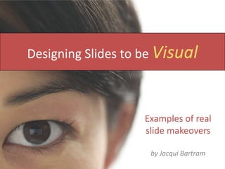
- 1. Designing Slides to be Visual Examples of real slide makeovers by Jacqui Bartram
- 2. Language Slide to Makeover Spoken Verbal cues Language structures perception of world Unspoken eye contact body language personal space touching
- 3. New slide (1 of 2) Non-English speakers can miss verbal cues ?
- 4. New slide (2 of 2) Non-verbal language is interpreted differently by different cultures
- 5. Building the relationship Slide to Makeover Body language 57% Tone 38% Words 5%
- 6. When building relationships, people communicate with more than just words New slide
- 7. Diverse Teams Work teams will include a range of people: Different ages Different educational experiences Different nationalities Different cultures Different faiths Slide to Makeover
- 8. New slide At work, teams will include a range of different types of people
- 9. Layers of culture The outer layer artefacts and products (explicit) language, food, buildings, markets, fashion The middle layer norms - right or wrong behaviour values - good or bad aspirations/desires The inner layer basic assumptions (implicit) survival within the culture Slide to Makeover
- 10. New slide 1 There are 3 layers to culture Artefacts (explicit) Values Basic assumptions (implicit)
- 11. New slide 2 There are 3 layers to culture wrong right Basic assumptions (implicit)
- 12. Student quotations “The group work was hard. All the other group members lived in hall and they began to meet up in hall and make decisions without me. I felt left out. In the end I spoke to the tutor and she raised it as an issue in the tutorial. The other students were upset as they hadn’t realised I felt left out and they would have preferred me to talk to them direct. After that we met on campus during the day and the group worked well together.” Slide to Makeover
- 13. New slide ‘ ‘ The group work was hard. All the other group members lived in hall and they began to meet up in hall and make decisions without me…”
- 14. Student quotations “It was very easy. We got well organised and agreed to meet every fortnight. We spent some time getting to know each other. We shared the work out and everyone kept their promises and delivered on time. If we couldn’t attend a meeting then we texted each other. By the end of the assignment we were all good friends and we got a high mark.” Slide to Makeover
- 15. New slide It was very easy. We got well organised and agreed to meet every fortnight.We spent some time getting to know each other...” ‘ ‘
- 16. Images from Photoxpress or Microsoft Clip Art By Jacqui Bartram, an ICT Learning Adviser at the University of Hull, United Kingdom
Hinweis der Redaktion
- I want to show you visually what I mean about making your slides more visual. I’ve taken some slides from a presentation given to first year Business School students and done some makeovers to show you what I mean.
- This is about as simple as you can make it – but it still does the job. A basic image making the audience want to listen to the narration which would give examples of verbal cues and go on to talk about language structuring perception.
- If you feel you really need to use several images, think about how you display them – think about design. This grid down the left shows all the different aspects of the narration without making the slide cramped and busy. The narration would talk generally about a lot of language being unspoken and then individually about eye contact, body language, personal space and touching.
- This is a slide from further on in the presentation. It is not obvious how the title relates to the content – and the content is crying out to be displayed as a chart. The values add up to 100 and they are all quite different from each other so a pie chart would be the obvious choice.
- This would also work well as a diagram – because there are five different elements one of the only ways that each could all be given equal prominence would be to use a segmented circle.
- There are lots of different types of preset diagrams within the SmartArt tool but the only segmented circles has arrows around the edge showing a cycle process which would be inappropriate here – so I just created it as a pie chart, giving each shape the same value. I’ve stuck with the same colour scheme throughout the presentation to give a sense of unity – this was originally purple, green, blue, red etc
- This one is crying out to be a diagram
- This could be simple diagram and the explanations of what each represents could just be verbal.Or you could include graphic examples.
- This could be simple diagram and the explanations of what each represents could just be verbal.Or you could include graphic examples.
- This is a quote which is by it’s nature verbal. This does not mean the slide has to be boring and just text though. This text is hard to read due to the close line spacing and italic text. It is far too long to actually fix in anyone’s mind. It would be better to pick a smaller part out for the slide. You can always continue with the rest of the quote verbally (after all – it is a quote!)
- Adding the extra image puts the quote into context.
- This is the companion slide to the negative quotation – the brighter colour helps the mood as well as the smiley image.