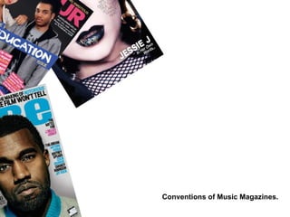
2. This is a magazine very appealing to the average teenager. The title of the magazine spells ‘RWD’’ which is short for Rewind a term commonly used when talking about music or tracks. This let’s the reader know the magazine is about music. The two arrows pointing to the left are universal symbols for the rewind option on technical equipment such as DVD’s and stereo players. The vector symbols, most likely produced in Abobe Illustrator, also anchor the name of the magazine. The font is bold but slightly fades out, letting the front cover image stand out. The image on the front cover is a a portrait. A close up shot of the artist’s face. The expression on her face is slightly shocked, This is done to capture the emotions of the new and upcoming artist. The close up of the artist shows her lips slightly opened as if she was about speak .The media ‘’In Her Own Words’’ anchors this technique. The close up shot on the artist is chosen to capture her feelings on the topic of her upcoming. It has the effect that the audience are meeting her face to face and understanding her story. The fact that the artist’s lips are slightly open makes it look like a conversation between the artist herself and the audience. The placement of the ‘We love Issue ‘ has connotations of Marylyn Monroe. This could suggest the new upcoming artist has the potential to be as great as Marylyn Monroe. There is hardly any background to this image. The artist’s clear , airbrushed skin acts as a canvas for the rest of the rest of the titles in the magazine. A very thing sans serif font is used. To not gain attention and let more of the focus to main title and the photograph. A black font is used the match the rest of the photograph which is mainly black and to blend in. The main title is in white which isn’t used anywhere else in the front cover making the main title stand out. The magazine title itself is also white but blended out to let more of the focus to the main title ‘’Jessie J’’. Names of other celebrities are made in a much smaller font size . They are positioned in the centre but to the right, away from the focus of the front cover which is the image. This let’s the audience know that this issue is going to be about the artist in the photograph. This is anchored by the ‘’We Love Issue’’ symbol. The symbol shows the issue is about what the makers of the magazine love. The symbol is also made black which matches the hair , make up and costumes which are used in the photo- graph of the new artist. The image on the front cover is most likely edited on a graphics package such as Photoshop. The artist is the subject of the photo. Due to airbrush techniques and make up artists the artist has been made to look very pale. This was a sign of wealth and royalty in the olden days
3. This magazine is of the same genre as ‘RWD’ magazine. This magazine has a very well thought out colour scheme of four colours: Blue, Pink white and yellow. A black background is picked the act as canvas for the rest of the colours. White colours are used when giving the magazine website. This is to make the piece of media stand out from the rest of the titles on the cover. The title of the magazine is Flavour. It is positioned at the top which is conventional for any magazine. The male artist in this photo is wearing a blazer which has connotations of class, school and teaching. This is anchored by the media ‘’The Education Issue’’. This suggests this issue is about learning making the viewer think about what the content of this issue could hold. The colour scheme is thoughtfully maintained throughout the front cover. The pink skirt worn by the female artist matches the magazine title and some of the smaller title of the inside content. The blue jeans of the male artist match the blue backgrounds for some of the smaller titles of the inside content. As blue is used more then pink it might suggest the inside content will be mainly about the female artist. A medium shot of the two artists is used. The shot is a slightly low angle which gives the audience the impression that the artist are perhaps looking down at them. Making them a higher class the audience and of a different culture perhaps. Capital letters are used when mentioning celebrities names and stage names to signify importance. The colour gold is used to anchor this. Words such as ‘’Up Close’’ are used to suggest the celebrities are there for your questions. This brings the Utopian Solution of Escape into action. The magazine title is a simple Arial font with maybe a few adjustments such as elongation. The artists in the photo overlap the title making it slightly illegible. This shows the magazine’s title is popular and the logo itself is very recognizable. A bar is used at the bottom of the front cover to add a little extra information about the contents of the magazine. A vector image of a plus sign is used. This has connotations of the extra or more. This makes the audience think apart from the titles displayed on the front cover There is even more content to be viewed along the lines of the content displayed in the centre of the magazine front cover. The masthead is a sans serif font. This has connotations of simplicity.
4. The costume worn by the artist in the photography matches the colour of the magazine title. The same colour is also used for some of the titles for the inside content. Only three fonts are used in this publication. A simple Arial font for the small titles. An Arial look-alike font for the title which looks like It could have been manipulated and a Times New Roman look-alike. The background of this image is the same as the colour in the magazine masthead Only. Faded out to let more focus on the cover lines. The text ‘’ The truth hurts’’ is done in a font which looks similar to Times New Roman. It is also Italic to show it is a very commonly used phrase. The main image is that of the front cover. The name of the artist anchors his image. The artist’s name and the speech marks are the same colour to suggest these are His words. The text ‘I am rap’ is the same colour as that of his clothing suggesting he dresses rap and is rap himself. The font used for the masthead is very simple yet has a very modern and urban feel to it. It has connotations of ‘’Vibes’’ people get when in nightclubs, concerts or other music related events. The target audience for this magazine is people who listen to rap and hip hop. Maybe people who have listened to rap as younger but are now growing up and listening to a more mainstream type music. This is because artist such as Smokey Robinson and Britney Spears are mentioned in the titles. The masthead is a simple sans serif font. The writing on the right hand side is Right Aligned and the writing on the left is left aligned. The effect of these is to align the cover lines around the artist’s face. I think the target audience of this product is mostly male. I know this because of the way the male artist is represented. The artist is not represented in a way which would be attractive for females. This means the target audience is males. The copy ‘’Exclusive’’ signifies the unique nature of the content.
5. The headers are all bold capitalized font on a black background to create impact. The ‘Regulars’ and ‘Features’ are separated to make it easier reference. The page numbers are in chronological order. Making the magazine one easy to navigate package The photography used on these artists is very Unconventional as only 2/3rds of the face is showing. This suggests the magazine shows artists in a different way and maybe shows their inner qualities. The artists are represented in a non sexualised way and the focus is more on their character then their bodies and looks. The font used is Sans serif and bold making it clear communication. The copy ‘’Contents’’ is very unconventional as it is very large. The issue date is also a very large size , this is differs from other magazines as the date is usually in a small sized font at the very bottom of the page. The target audience for this magazine is women as women are represented as talented individuals and in a non sexual way. This suggest this magazine is empowering women. Page numbers and the website is Continuously promoted all throughout the magazine. The fact that there are Four of the female artist shown Shows empowerment of women and represents them as talented individuals.
6. This contents page is very conventional. The pages and page numbers are aligned very well making it very easy for the audience to navigate around the magazine. The focus of the page is the portrait of the male artist. Costumes such as a blazer and tie have been used. The ‘Contents’ Font is gold as are Some of the smaller headings this Anchors the text itself. Different colours are used for ‘’ Reports’’ and ‘’Plugged’’ to separate both sections. The magazine website is at the bottom of the page to show continuous promotion. Photographs of both male and female artists are shown. The are presented in a non sexual way in terms of costume and mise- en-shot. As both genders are shows the target audience is likely to be both male and female. The gratifications of this magazine are Entertainment this is anchored by text such as ‘’Letter and stories such as ‘’Why did I get married t too?’’. A use of this magazine is Educate this is suggested by words such as ‘’Advice’’ and ‘’Tips’’ which are used in the contents page. Different colours are used in the contents page. This is to suggest the content is variable and interesting. The same font is used throughout the contents page this seems to be very common in Magazine front pages, and magazine content pages. The male and female photographs in the top right corner have similar costumes this represents both genders as equal which is very uncommon in other magazines.
7. This contents page is very conventional as it has the ‘’Contents’’ header and smaller sized fonts for the rest of the text on the page. A serif fonts is used with a shadow. This has signifies the contents of this magazine are like no other. Photographs are used to show a sneak preview of what's to come inside the magazine. Some photographs are colour some are in black and white this signifies the magazine is perhaps for an older audience as well as the content relates to their younger years. The serif copy ‘ National Affairs’ is encoded to go out of its way of the music genre and bring something more to the magazine. This represents the magazine very positively Only male artist are shown in this magazine suggesting this magazine is perhaps mostly for a male target audience. Serif fonts are used for all copy on this page. Bigger sized font is used for the main content. This suggests importance. Due to the contents of this magazine and some of the photos I think the target audience would be all ages. Perhaps an older audience who still want to be up to date with the music scene and it’s latest. Musicians, producers and people in the music industry who want to be up to date with the scene itself. This is Anchored by the red colour used all over the page, as red co notates passion and love. The same as the people in the industry have themselves. The website of the magazine is continuously promoted at the bottom of the page. This seems to be very common in music magazines’ front pages and contents pages. The ‘’ Departments’’ section of the magazine is separated in six parts separated by a different colour font to give the impression of extra content audience can’t get in other magazines.
8. This double page is conventional in terms of layout as it has large photographs usually taking up the whole page. The magazine seems to provide the gratification of entertainment. This is suggested by Words such as ‘’ Exposed’’ being used. The photographs have been edited to look vintage this might have been done on a graphics package such as Photoshop. This suggests the artists in the photo are perhaps retro or classic in the genre. Boxes are used to separate certain photographs. As the fonts used are serif and retro looking this anchors the vintage fade Effect on all the photographs this is again placed there to suggest the artists ‘’Wardrobe’’ is vintage.
9. At first look this magazine double page looks very conventional as it has large size photographs and text layered over each other. Large black font is used for the names of the artist the font is likely to be Arial or some sort of manipulated version. The fact that the font is bold makes it clear communication. Artists are shown from a low angle this signifies they are at a higher level and maybe even class. Colours such as grey white are used. These colours are used as a background to the the black fonts and this gives more attention to the rest of the copy. The costumes used in the artist photographs is very casual which suggest the artists are every day people who are climbing up the music industry, this is anchored by the copy ‘’ One to Watch’’. The magazine website is written in a small sized font at the bottom right corner of the double page this shows continuous promotion which is very common in a magazine.
10. A variety of colours are used in this double page. Red is used in the copy ‘’ Industry’’ as red has connotations of love and passion this suggests there is love for the music industry itself. The artists in the photographs are shown in various angles. Most are represented as everyday individuals this is shown through their costumes. The gratification of this magazine is entertainment as allot of the photographs look staged. Some of the copy is tilted it to the right to give the mise-en-shot an unsettled feeling. Photos have borders and have been given the layout of a photo album. The target audience of this magazine is likely to be a younger people as the style of music seems to be very urban, younger artists are being represented as talented individuals. This is anchored through the copy ‘Industry’.
11. Conventions of A Music Magazine Front Cover... After analysing some music magazine front covers there are a few aspects in design and text which seems to be repeated and varied slightly in each issue. The are: The masthead of the magazine. It is always in bold clear writing to make clear communication. The fonts used are usually about three different types, some are changed when there's quotes involved or Exclusive content. Every magazine front cover has its own colour scheme. This is usually made of three colours and their all usually primary colours. The date of the issue release is always somewhere at the bottom of the page in a small sized font but also very clear to see. Professional photos of celebrities in costumes are also very common to see in a magazine front cover. The artists are always represented in differnt ways depending on the nature of the magazine and its content. Every magazine front cover I have looked at has the subject of the photograph overlapping the masthead as the magazine company is very confident that the name will be recognized even though it is being covered up by other images on the page.
12. Conventions of Music Magazine Content Pages. After analysing some Content pages taken from music magazines I discovered a few aspects which seemed to repeat in almost every issue. One of these was the magazine website which is always played in a small sized font at the bottom of the page. The copy ‘’Contents’’ was on every page I analysed and was considered a must. Only parts of images are shown on contents pages to give a sneak preview of what's to come inside the magazine. Page numbers and topics were always aligned to make magazines easy to navigate. The magazine website is always At the corner of the page for continuous promotion. Fonts used in contents pages are bold and sans serif making it clear communication.
13. Conventions of Music Magazine Double Pages. After looking at a few double page spreads in music magazines I realised a few aspects which always seemed to repeat. Large photographs are used with a lot of costumes which are always different depending on the nature of the magazine. If there is a background there it tends to be a mixture of very light colours to give attention to the font itself. Double pages also use a lot of large sized fonts for headlines and quotes. These are some conventions seen in Music magazine I will try to incorporate these into my own Magazine. I will try to follow the same patterns which will help my magazine look like one of the same genre.