
Empfohlen
Weitere ähnliche Inhalte
Was ist angesagt?
Was ist angesagt? (14)
Andere mochten auch
Ähnlich wie Film poster analysis (Let me in)
Ähnlich wie Film poster analysis (Let me in) (20)
Kürzlich hochgeladen
Kürzlich hochgeladen (20)
Film poster analysis (Let me in)
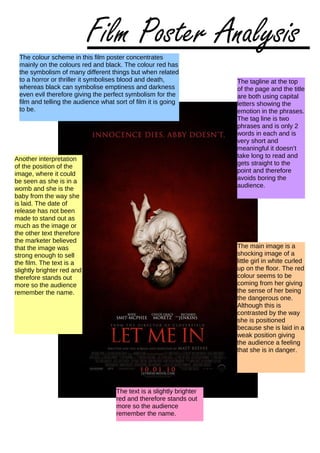
- 1. The colour scheme in this film poster concentrates mainly on the colours red and black. The colour red has the symbolism of many different things but when related to a horror or thriller it symbolises blood and death, whereas black can symbolise emptiness and darkness even evil therefore giving the perfect symbolism for the film and telling the audience what sort of film it is going to be. The tagline at the top of the page and the title are both using capital letters showing the emotion in the phrases. The tag line is two phrases and is only 2 words in each and is very short and meaningful it doesn’t take long to read and gets straight to the point and therefore avoids boring the audience. The main image is a shocking image of a little girl in white curled up on the floor. The red colour seems to be coming from her giving the sense of her being the dangerous one. Although this is contrasted by the way she is positioned because she is laid in a weak position giving the audience a feeling that she is in danger. Another interpretation of the position of the image, where it could be seen as she is in a womb and she is the baby from the way she is laid. The date of release has not been made to stand out as much as the image or the other text therefore the marketer believed that the image was strong enough to sell the film. The text is a slightly brighter red and therefore stands out more so the audience remember the name. The text is a slightly brighter red and therefore stands out more so the audience remember the name. Film Poster Analysis