
Empfohlen
Weitere ähnliche Inhalte
Was ist angesagt?
Was ist angesagt? (20)
Andere mochten auch
Andere mochten auch (14)
Ähnlich wie Questionnaire evaluation
Ähnlich wie Questionnaire evaluation (20)
Kürzlich hochgeladen
Kürzlich hochgeladen (20)
Questionnaire evaluation
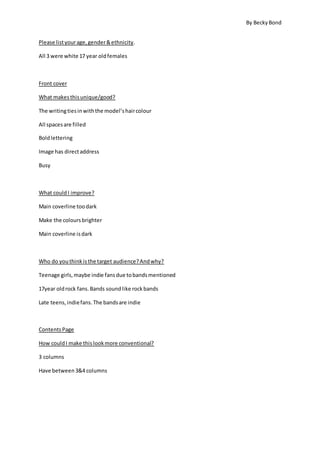
- 1. By BeckyBond Please listyourage,genderðnicity. All 3 were white 17 year oldfemales Front cover What makesthisunique/good? The writingtiesinwiththe model’shaircolour All spacesare filled Boldlettering Image has directaddress Busy What couldI improve? Main coverline toodark Make the coloursbrighter Main coverline isdark Who do youthinkisthe target audience?Andwhy? Teenage girls,maybe indie fansdue tobandsmentioned 17year oldrock fans.Bands soundlike rockbands Late teens,indiefans.The bandsare indie ContentsPage How couldI make thislookmore conventional? 3 columns Have between3&4 columns
- 2. By BeckyBond What’sappealingaboutthis? Colourlinkstofrontpage and everythingisboldandstandsout Extremelyeye catching The amount of pictures Colourscheme Double Page Spread Are my 3 pagesconnectedthroughbranding? Yes Yes,frontcover and contentspage throughcolour Yes,frontcover and contentspage because of the colours.DPscoloursare verydifferent Do youfindthisarticle interesting? Yes,writingstyle isformal yetfriendly Great to readabout someone fromBirmingham Yes Yes – good writingstyle Do youthinkthe writingstyle suitsmymagazine? Yes – verydescriptive Yes Yes What do youthinkaboutthe colourscheme? Boldand striking,differentfromthe usual redandblack Couldbe brighter,isgood Purple isveryfeminine butnotstereotypical.SuitsTargetAudience.
- 3. By BeckyBond From this research I learnt the following things: You get definitive answers from people in your target audience The amount of content on front cover & contents looked appealing Overall colours were good; they matched on front cover and contents page. Printer had made the colours darker than I had intended, and so to improve I would brighten up the entirety of my magazine. One participant thought purple was good for it was feminine but not too stereotypical for a female target audience – this was what I had in mind when I chose that. The target audience was shown through the bands mentioned (appeals to indie fans) and colour scheme. The direct address on the image was good, but the model chosen did not seemto indicate target audience. The matching colours on front page and contents meant I had succeeded in creating house colours through branding. As the colours on the double page spread were all linked to the image, and so were yellow and green, I could have edited the picture to allow purple to become evident there. I had matched the yellow on the dps to the yellow puff on the front cover. To make my contents page more conventional, I could have used 2 or 3 columns rather than 4. I would have to edit content to fit it into just 2 or 3 columns, but doing so could create a more obvious use of rule of thirds. Overall, I was pleased with the feedback and how I had indicated target audience and genre to the participants. I found consistent ways to improve through their answers, and will bear this in mind.