

Empfohlen
Weitere ähnliche Inhalte
Andere mochten auch
Ähnlich wie SP Staff brand overview
Kürzlich hochgeladen
Kürzlich hochgeladen (16)
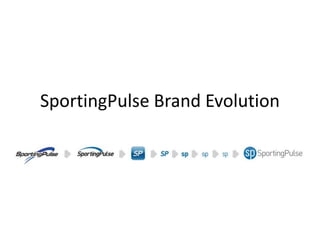
SP Staff brand overview
- 2. Successful initial rebrand, but some legacy fragmentation around mySport and the current SP icon
- 3. SP Brand – evolution, not revolution We have an opportunity to further unify under our current brand guidelines and through the natural evolution and deployment of the SP icon. Our current logo and icon are using an older style font set. The word SportingPulse, and the resultant icon fit with the style of the current brand as a whole
- 4. Next step in de-fragmentation
- 6. We have an opportunity to further unify under our current brand guidelines and through the natural evolution and deployment of the SP icon.
- 7. We have an opportunity to further unify under our current brand guidelines and through the natural evolution and deployment of the SP icon.