Book Sex Workers Available Kolkata Call Girls Service Airport Kolkata ✔ 62971...
Article Research - Kerrang
1. AMY DINSEY 12B
Article Research and Preparation
The magazine that I will be using to carry out my research on to help
with the article I’m going to write myself for my own magazine, ‘The Mix’, is
‘Kerrang!’ as the layout and style is the most similar out of other music
magazines. There is also a informal and laid back style to this magazine,
more than there is to a magazine like ‘Q’, and this is the style me and my
partner want to go for in ‘The Mix’, making Kerrang one of the best
magazines to use for research. The band on the front cover is ‘Good
Charlotte’, which is also a band that we may consider to use on the covers of
‘The Mix’ in the future, that we will be creating.
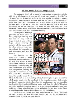
The magazine ‘Kerrang!’
presents its front cover as
being very eye-catching from
the use of large text on
important stories, as well as a
large picture covering the
majority of the page, and by
its colour scheme which runs
throughout the magazine as
well as working well with the
images.
The heading on the
cover that relates to Good
Charlotte, uses a quote to hint
at what the article is about
‘we’ve been through a really
dark time...’, emphasising the
‘really dark time’ by putting it
into a larger font, making the
eyes of a reader want to read
this part first. Underneath
this, the band’s name ‘Good
Charlotte’ is written in a much larger font, becoming the largest text on the
whole page, apart from the masthead of the magazine’s name. Underneath
the band’s name, the two brothers from the band’s names are mentioned in
the heading ‘Benji and Joel Madden battle back from the edge!’. This gives
us a hint on what the article is going to be on, them struggling in some way
to keep the band alive, but succeeding, and gives the two men on the front
recognition to who they are in the band, i.e. the main focus.
The rest of the articles advertised on the front cover are much smaller
to keep the main focus on the main feature, but they all still follow the
colour scheme, and use the same font/s.
2. AMY DINSEY 12B
The first page of the article on Good Charlotte simply provides an image of
the two brothers from the band that this article is focusing on, the heading of the
article (up the side of the page) and a fairly short introduction. In the top right
hand corner of the page, there is also an advert or note of a tour that the band are
going on soon, that tickets are still available. The band’s name ‘Good Charlotte’ is
also highlighted underneath this in white text on a red background, making it
obvious to the reader who the band are if they don’t know already. It also makes it
quicker for the reader to see what this article is about, without having to read the
first paragraph again if they’ve already done so, or aren’t actually interested in
reading it. The heading of the article is unusually up the side of the page. I think
that this is still effective as it makes you look at the picture first, and from looking
at it you may think the two men look similar, it’s only then that the reader will
notice the heading at the side, reading ‘Band of Brothers’, evidencing that the two
men are brothers, and also notifying the reader that this article is about the two
brothers of the band, and not really talking about any of the other members. The
‘of’ is also written in white so that it matches the white text of the two short
paragraph introductions, and makes the reader see ‘Band Brothers’ before noticing
the ‘of’. I think that this is extremely effective as it stands out and is very bold,
representing the strength of the brothers, and how they’ve made it through their
tough time. The two pieces of text on this page both add a different twist on the
introduction on the article, for example the first paragraph talks about the past
and how the band was ‘washed up’, but the second paragraph goes into the
present, saying that ‘things couldn’t be more different’.
The next two pages contain the actual copy of the article. They both follow
the similar layout to the first page. The second page, shown to the right has the
picture on the left and the text on the right, just like the first page does, and the
third page of the three is practically the same layout as the second page, but
flipped, meaning that the text is on the right and the image is on the left. This
3. AMY DINSEY 12B
adds fluency to the whole article, impacting the reader by making them feel
comfortable with how the article flows, and where it carries on to.
The text itself is laid out into two columns on both pages, with a red line
dividing the columns, again making it easier for the reader to know where the text
leads to, and also ties in with the effect of the colour scheme throughout the
article. The colour scheme itself is very strong and powerful represented by the
red, but also works well with the white contrasting the dark images so it’s clear to
see and read, satisfying the reader. The dark images and black underneath the
text is also effective as I think it represents both the music produced by this
particular artist, but also suits the article well as it’s talking about some dark
times that the two brothers have fought through together. The red phrase
beginning each new paragraph awakens the article as it brings the straight into
the next paragraph in a different and interesting way by enlarging and changing
the text colour to red. It also helps to separate the paragraphs, without making the
design and layout look boring and hard to read by just having paragraph after
paragraph of small white copy. On the second and third pages, there is also a pull
quote on each. This quote is written in red, again following the colour scheme, and
is much larger than any other text on that page, instantly drawing the reader’s
attention to this, making them more likely to take the time to read the article.
Underneath the quote, there is the name of the brother who made this statement,
so the reader is not confused as to whom it has come from, and isn’t mislead in
anyway. Interestingly,
both of the pull quotes
on these two pages are
statements given by Joel
Madden. This also
collides with the fact that
in two of the three large
images, Joel is also
standing slightly further
forward than his brother,
Benji. This connotes that
even though the article is
based on both of them,
Joel is the front-man of
the band, and also
perhaps that this article
is more about him that Benji.
The content of the text itself has an extremely pleasant structure, starting
out by introducing Joel and Benji Madden as coming ‘pretty close’ to the cliché of
Dave Grohl being ‘the nicest man in rock’. This opening sentence tells us a huge
amount of information about this article, without even reading any further. It
obviously shows us that these two men were exceptionally great to work with, but
also hints that the article is going to be quite informal after the use of the phrase
‘pretty close’, which in day to day language of the target audience of this magazine
4. AMY DINSEY 12B
is a high frequency word/phrase, but in text this would usually be expected to be
low frequency. From this we can see that this article will probably be quite chatty
and relaxed, rather than an in depth formal demand from the interviewer. The
introduction to the article carries on for a few paragraphs, emphasising how happy
Kerrang was with how friendly the both were, by quoting them which phrases such
as ‘no problem at all’ and absolutely fine’.
The article
properly begins by
stating ‘it’s now’, and
then goes into a quick
summary of what the
brothers are doing
here, and what they’re
here to promote and
talk about, as well as
giving a clue to the gist
of the article. Quotes
from the interview
aren’t used until the
next section of the
article, beginning ‘the
Madden brothers’. This
section goes into how the rest of the band are doing, and then focuses on the
trouble that Joel has been through. The fact the Joel’s problems are spoken about
first may just be a coincidence, but could relate back to the point I made earlier
about Joel being the actual front-man of the band, but this only being connoted by
the structure and images of the article. After Joel’s problems have been spoken
about, the article moves into the troubles that Benji had encountered. After this,
another section is issued to talk about both of the problems colliding and
happening at a similar time, making it harder and harder to support each other,
but even though this happens, they are still always there for each other. The last
section of the article talks about their new album coming out the next week,
‘Cardiology’ and all of their excitement for this. Their tour that is happening in
March 2011 is also mentioned at this point, bringing the article to a finish as all
information on Good Charlotte has been brought to the surface and cleared up.
Fans reading this will now know the exact truth of where the band have been for
so long, and can be easily made up with the news of the new album and tour
dates. The end of the article I personally think is brilliant. Two quotes are used,
the first being ‘We’re ready to give the world a run for their money’ and the second
being ‘Let’s do this’. These quotes are not matched up with either of the brothers,
instead it is just stated ‘says one brother’ and ‘says the other’. This shows that
either of the quotes could have come from either brothers, showing that they’re
both up for this next round of their musical careers, ending the article in an
extremely clever and effective way.