
Empfohlen
Weitere ähnliche Inhalte
Was ist angesagt?
Was ist angesagt? (19)
Andere mochten auch
Ähnlich wie Construction diary front cover
Ähnlich wie Construction diary front cover (20)
Mehr von alicesophie
Construction diary front cover
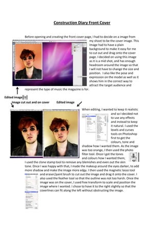
- 1. Construction Diary Front Cover Before opening and creating the front cover page, I had to decide on a image from my shoot to be the cover image. This image had to have a plain background to make it easy for me to cut out and drag onto the cover page. I decided on using this image as it is a mid shot, and has enough headroom around the image so that I will not have to change the size and position. I also like the pose and expression on the model as well as it shows him in the correct way to attract the target audience and represent the type of music the magazine is for. Edited image Image cut out and on cover Edited image When editing, I wanted to keep it realistic and so I decided not to use any effects and instead to keep it natural. I used the levels and curves tools on Photoshop first to get the colours, tone and shadow how I wanted them. As the image was too orange, I then used the photo filter tool. Once I got the tones and colours how I wanted them, I used the clone stamp tool to remove any blemishes and even out the skin tone. Once I was happy with that, I made the makeup around the eyes darker, to add more shadow and make the image more edgy. I then used the magnetic lasso tool and eraser/paint brush to cut out the image and drag it onto the cover. I also used the feather tool so that the outline was not too harsh. Once the image was on the cover, I used free transform to scale and position the image where I wanted. I chose to have it to the right slightly so that the coverlines can fit along the left without obstructing the image.
- 2. Once the image was on the cover, I then added the straplines. This was so that I could then add the logo, insert and text after, as the straplines act as a sort of boundary. To add the straplines I used the rectangle shape tool and created one along the top of the cover. So that they were both the same, I used the duplicate option along the right selection bar. As I knew what I wanted in the straplines, I then added the text. For the text here and throughout the magazine I am using the font style “Capitals”. This is because it is bold and stands out, while still being neat so it will appeal to a wider audience and fits in with the type of magazine. I also used free transform to resize the text so it fitted well across the whole of the strapline. I then added the logo. I decided to put it in the top left corner for a few reasons. Firstly, because I didn’t want it to cover up the image too much, but also use advise from J McKay (2000) The Magazines Handbook, which states that the emphasis needs to be on the left hand side, due to the fact that is the side that will be on show on a shelve or stand in a store. I did this so that people will see the logo and recognize the magazine, therefore picking it up. Too add the logo, I had to drag it from a jpeg onto the cover; this meant there was some white space. To remove this I used the colour selector tool to choose the colours on the logo, then the spray style brush to touch up the blank areas. I then added the insert. I decided to put this in the top right corner, as all of the coverlines are going to be along the left, so it will stand out more there. At first it was just grey, but to make it stand out more – like it should - I added Some effects to it to make it stand out more and appear 3D. This also helped the text to stand out more. I put the “Win” in the insert as advertising a win feature on the cover would encourage people to buy the magazine.
- 3. I then moved onto adding the coverlines. I left these till last as I wanted to fit them in the blank space on the left as I did not want to crowd up the image. As I wanted to keep the font style consistent throughout the magazine, I used “Capitals” again. I added the coverlines and the main coverline separately so I could move them more freely. For the coverlines along the left side, I first added the text all the same size with just one gap separating them. I decided to use the artists name as the coverline as it is more to the point and will attract people more than saying some long explanation without mentioning the artist. I added the brief summary under the artist’s name underneath so that once someone picks up they can see it and be more interested and want to find out more. I decided to make the artists name and the summary different sizes so that it is clear who the feature is about, but I still wanted to keep it clear that the summary and the artist are link, so I put a bigger gap between the different coverlines. When adding the main coverline, I wanted it to be the same as the other coverlines, yet I wanted to make it clear that it was the main coverline. To do this I simply made to the text bigger so that it stood out more and caught attention. I also positioned it away from the rest of the coverlines, without overlapping the image too much. I did try a few different positions for the main coverline before I settled on this one, but they either made the cover look too cluttered, or took away the clarity of the fact it is the main coverline. I decided the overall layout of the coverlines so that they did not overlap the image too much or make the page look too cluttered, which is also another reason why I kept the main coverline separate – to avoid the page looking cluttered.