Top 5 Mobile Design Trends of 2015

We have crunched all the data from various sources and surveys and collected together five of the biggest mobile design trends for 2015. So be prepared to spend your precious ten minutes to get glued to your screen and learn about the most popular mobile design trends of this year. 1. Animated Elements: ‘More the interactions better the usability’ is the concept of the new mobile design. Introducing more interaction seems to be the new strategy to draw more attention this year. Nowadays nothing more than animation or small animated elements can stir the interest and interaction of the users more. Animations will be used in the mobile phones to provide unique and user friendly experience for the mobile users. It helps in breaking the monotony of the mechanical life of the people. 2. Subtle Color Palettes: Mobile design is taking a major step towards minimalistic design. Web design is moving towards bold colors and on the contrary mobile design is constantly switching to more subdued and subtle colors and patterns. Subtle and lucid colors are taking over flashy and neon based color schemes. From psychological point of view, conclusions have been drawn that a flashy color may also be the reason for a distraction. Instead subtle colors can help draw in users and allow for focused concentration. 3. Storytelling: Storytelling has also gained momentum. Mobile design will stop relying on scripts to get its story across. Instead of the monotonous instructions written in blunt words stories will take on a more interactive role. People these days are preferring to scroll through the entire storyline rather than clicking. So more images are being used and collaborated properly to convey a message visually rather than written words. Which is not only more appealing to the eyes of the user but also enhances the understanding to a great extent. 4. Blurred Backgrounds: This mobile design trend has made an indelible mark in the art of designing today. It focuses on certain elements and the remaining background remains blurred. Blur images will not only be more appealing but it will help to draw attention to just the important elements. This aesthetic trick will also make call to action buttons stand out. Using blurred imagery in the interface will allow the users to know which element interacts and which doesn’t. The blurred backgrounds will ensure that you press those buttons to convert but at the same time they will also be used to enhance the interactive storytelling effect. 5. Gestures: We had been using gestures since a long time. The way gestures have changed the use of operating system has differed a lot since the last year. Instead of interface button people navigate through the entire operating system. Almost the whole operating system has become an input method. Users can swipe their fingers up or down to pull up or pull down an extra panel like the notification center.

Empfohlen
Empfohlen
Weitere ähnliche Inhalte
Mehr von Ajeet Singh
Mehr von Ajeet Singh (20)
Top 5 Mobile Design Trends of 2015
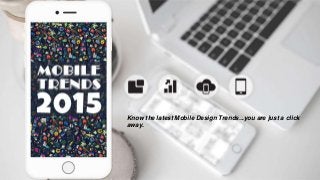
- 1. Know the latest Mobile Design Trends...you are just a click away.
- 2. Mobile Internet will surpass desktop Internet...
- 3. Such predictions were considered highly outlandish during the early But now we know that they were right !!
- 4. We have crunched all the data from various sources and surveys and collected together 5 of the biggest mobile design trends for 2015. brew yourself a cup of hot coffee and let's get started…...
- 6. More the interactions better the usability is the concept of the new mobile design. Nowadays nothing more than animation or small animated elements can stir the interest and interaction of the users more.
- 7. Animations will be used in the mobile phones to provide user friendly experience and for breaking the monotony of the mechanical life of the people.
- 9. Mobile design is constantly switching to more subdued and subtle colors and patterns. Mobile design is stepping towards minimalistic design.
- 10. Subtle colors can help draw in users and help in focused concentration.
- 11. Storytelling
- 12. Storytelling has also gained momentum. Mobile design will stop relying on scripts and get its story across.
- 13. So more images are being used and collaborated properly to convey a message visually rather than written words.
- 15. Blur images will not only be more appealing but it will help to draw attention to just the important elements. Blurring backgrounds focuses on certain elements and the other elements remain blurred.
- 16. Gestures
- 17. The fact that the future devices will probably come with larger screen than the current generation, it is definite that each gesture will come with a lot more meaning. Gestures play a very vital role in mobile design trends these.
- 18. Choose Algoworks For As Your Technology Partner!! Call us at: +1-877-284-1028 Mail us at: sales@algoworks.com support@algoworks.com Official Blog Link: https://mobileappninjas.wordpress.com/2015/08/12/mobile-design-trends-2015/