
Empfohlen
Weitere ähnliche Inhalte
Was ist angesagt?
Was ist angesagt? (20)
Andere mochten auch
Andere mochten auch (10)
Ähnlich wie Slide sharee
Ähnlich wie Slide sharee (20)
Kürzlich hochgeladen
Kürzlich hochgeladen (20)
Slide sharee
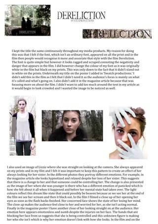
- 1. I kept the title the same continuously throughout my media products. My reason for doing this was that I felt if the font, which isn’t an ordinary font, appeared on all the print and in the film then people would recognise it more and associate that style with the film Dereliction. The font is quite simple but however it looks ragged and scraped connoting the negativity and danger that appears in the film. I did however change the colour of my font as it was originally white in the film but black on my prints. This was only down to the fact that it didn’t stand out in white on the prints. Underneath my title on the poster I added in ‘Swatch productions.’ I didn’t add this in the film as I felt that I didn’t need it as the audience’s focus is mainly on what it’s called and what’s going on. I also didn’t add it in the magazine article because that was focusing more on about the film. I didn’t want to add too much around the text in my article as it would begin to look crowded and I wanted the image to be noticed as well. I also used an image of Lizzie where she was straight on looking at the camera. She always appeared on my prints and in my film and I felt it was important to keep this pattern to create an effect of her always looking for her sister. In the different photos they portray different emotions. For example, in the magazine article she looks hypnotized and relaxed despite her loss of her sister. This suggests that there is a change to her and that someone could be controlling her. The change is also presented as the image of her when she was younger is there who has a different emotion of panicked which is how she felt about it all when it happened and before her mental state had taken over. The light colours reflect this dream like state that could possibly be heaven because as we see her at the end of the film we see her scream and then it black out. In the film I filmed a close up of her opening her eyes as soon as the flash backs finished. Her concerned face shows the state of her losing her mind. The close up makes the audience feel close to her and worried for her, as she isn’t acting normal. Finally in the magazine poster I have another close of her looking straight on at the audience. Her emotion here appears emotionless and numb despite the injuries on her face. The hands that are blocking her face from us suggests that she is being controlled and this unknown figure is making her who she isn’t which is why her emotion doesn’t link with how she looks. In the film and on the
- 2. Something that I changed throughout my media products was the symbol of numbers in the film. In the film it starts of with Lizzie (young) and Tallulah counting in hide and seek. When Lizzie is older and the abduction of her sister get’s to her so much she starts losing her mind there’s a variety of shots of her counting but in the wrong order and along the bench where her and her sister sat. This was the first of the weird events that started happening to her and one of the most important I felt because it links to the game of hide and seek. When creating my poster I indented numbers into the unknown figures arms, which intentionally is Tallulah’s, to show that they are both forever counting and playing the game until her sister finds her. This was one of the most surreal parts of the film. However, in my magazine article I didn’t add any trace of the numbers. I did this mostly because I didn’t want to add too much to the page to make it look messy or unprofessional. I also felt I didn’t want to keep everything too much the same on each products as I already have Lizzie’s face appearing everywhere. film poster her face was centre frame appearing very intimidating towards the audience. I did this because that show needed create the biggest impact, as that was all that’s there. Whereas in the film article it isn’t centre frame as I have text there to create the impact on making the film appear good. I also wanted to majority of the background of the film article to be of the words creating a surreal and enigmatic affect. My colour backgrounds for the film and the film article are very similar as they both focus on the forest. I did this as this was the start of where everything changed and it felt it was very haunting for the audience. However, for the film poster I kept the background plain white. I did this because I wanted her face and the hands to stand out more. Also, the forest connotes nature and freedom but because she is under control she would not be under that atmosphere. The whiteness also connotes purity which is truly how Lizzie is but as the blue hands reach out from the purity it portrays that her sister used to be like that too but now they have both changed.