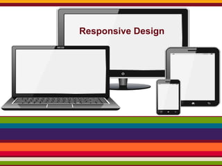
Responsive Web Design
•
1 gefällt mir•1,303 views

Responsive web design, a technique that allows web designers to create flexible web page layouts that change depending on the screen size of the site visitor, allows us to optimize user experiences for the increasingly variable ways people are accessing the Web.

Empfohlen
Weitere ähnliche Inhalte
Was ist angesagt?
Was ist angesagt? (15)
Andere mochten auch
Andere mochten auch (9)
Ähnlich wie Responsive Web Design
Ähnlich wie Responsive Web Design (20)
Mehr von Abhas Agnihotri
Mehr von Abhas Agnihotri (16)
Kürzlich hochgeladen
Kürzlich hochgeladen (20)
Responsive Web Design
- 2. What is Responsive design? Let’s just get right into it believe it or not, that you’re reading about responsive design! To see it in action, open “ http://www.weareunicorn.com/ ” on a desktop browser and slowly make the browser thinner and wider. You should see the layout magically adjust itself to more comfortably fit the new width of the browser, even if you make the page as skinny as the resolution of a mobile phone. Responsive web design, a technique that allows web designers to create flexible web page layouts that change depending on the screen size of the site visitor, allows us to optimize user experiences for the increasingly variable ways people are accessing the Web.
- 4. Three key technical features are the heart of responsive Web design: ● Media queries and media query listeners ● A flexible grid-based layout that uses relative sizing ● Flexible images and media, through dynamic resizing or CSS
- 5. I was inspired to make these responsive web design sketch sheets to help think through layouts for various devices. Thought I’d share. Responsive websites respond to their environment
- 6. Small + Medium + Large One site for every screen. Today I gathered some fresh examples of responsive sites to reinforce the importance of adapting your layout to every screen. Probably you will recognize a few websites from past lists, but they are so good that they deserve to be back here.The response of each of the websites showcased here and I decided to show you the iPhone version of them. Check out the examples I gathered and let us know your thoughts on the subject. http://weareunicorn.com/ http://www.findinglifesfocus.com/ http://budgetingbasics.org/
- 7. Here are some screenshots of what the Think Vitamin design looks like at various screen resolutions:
- 8. 1024x768 (iPad - Landscape)
- 11. 12 Helpful Tools for Responsive Web Design There are a lot of tools out there, and it can be difficult to sort through them all. So for this post, we gathered some of the ones we find the most useful. ● ● ● ● ● ● ● ● ● ● ● ● Responsive Web Design Sketch Sheets Adobe Edge Inspect Foundation RWD Calculator Responsive Layouts, Responsively Wireframed Adaptive Images Bootstrap Retina Images SimpleGrid The 1140px CSS Grid resizeMyBrowser The Responsinator
- 12. When To Use It ? Things to Consider ● ● ● ● ● Time & Money Browser Support Performance Content Website vs. Web App
- 13. Progressive enhancement based on browser, device or feature detection Responsive websites are those crafted to use W3C CSS3 media queries with fluid grids and commonly also fluid images, to adapt the layout to the viewing environment.Where a web site must support basic mobile devices that lack JavaScript, browser detection ,and mobile device detection are two ways of deducing if certain HTML and CSS features are supported (as a basis for progressive enhancement)however, these methods are not completely reliable unless used in conjunction with a device capabilities database.
- 14. A responsive approach to web design has recently become a standard in the global design community. The main feature of the web is its fluidity, and it demands the same solutions in website designs. That is the reason for extreme popularity of responsive designs that appear here and there at a rate of knots. If you want to create really efficient responsive website, you should learn more about this technology. To see the way responsive design picked up steam and follow the main steps of its development, it would be wise to find some trustworthy sources.