Beginners Guide to TikTok for Search - Rachel Pearson - We are Tilt __ Bright...
AS Construction: Contents Page Analysis- My Music Magazine
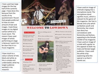
1. I have used two large
images for the top
I have used an image of
half of the contents
a female singing into a
page. I have done this
microphone stand. The
because from the
microphone stand
results of my
signifies music, which is
questionnaire I found
relevant to the genre of
that people preferred
the magazine. Her hair is
to have an even
blonde and curly which
amount of text and
symbolizes youth and
images. I took these
femininity. Her cream
images on my digital
lace dress has
camera whilst at a
connotations with
music event. The
femininity and fashion,
reason I have used
appealing to the female
images of artists
market of my magazine.
performing on stage
I have used an image of
is because I want it to
a male with a guitar as
be clear that it is a
this appeals to both my
music magazine.
male and female target
audience. I have used
I have stuck to a the white strip
colour scheme of red, explaining what the
black and white as special is so that it
this is simple and stands out.
understated, what my
target audience
wanted in my
research.
2. I have used the font I have used an image
Elephant size 30 for taken from my double
the title of my page spread and front
contents page as it is cover shoot to illustrate
bold and is continuity the contents. This
from the cover. I have emphasises the fact that
highlighted ‘welcome’ the interview is central
and ‘Lowdown’ to to this issue of the
draw attention to it. I magazine.
have used the font
Perpetua size 13 for
the text as it is clear I have included an
and easily readable. editor’s note, a
convention of
magazines. This is a
personal touch and
informs the reader of
The red strips with a what they can expect in
white font is this issue.
influenced from Q
Magazine. The red
stands out and I have included a
contrasts against the website by every page
white. number in the
magazine. This is a
typical convention and
promotes their website.