
Empfohlen
Weitere ähnliche Inhalte
Was ist angesagt?
Was ist angesagt? (20)
Ähnlich wie Presentation18
Ähnlich wie Presentation18 (20)
Mehr von Yenpopo
Mehr von Yenpopo (20)
Kürzlich hochgeladen
Kürzlich hochgeladen (8)
Presentation18
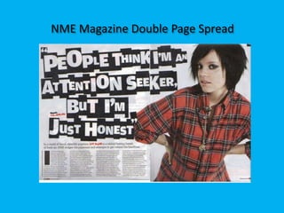
- 1. NME Magazine Double Page Spread
- 2. They have over lapping image of Lilly Allen throughout the double page spread they have done this layout to subconsciously link the two pages together to make a double page spread, this is also called bleeding for images or text. It also has a stand first below the big main quote and text to give a summary of the whole story without revealing it all to make the reader continue reading the whole article. They have also added or featured the journalist on the stand first and it is in different font and colour, which is red and black next to the quote. In this double page spread they have got an article or an interview of Lilly Allen which is one of the typical conventions of a double page spread. On music magazines it would contain interviews of new artist/bands or current bands. Also one page in this magazine has a big bold quote bleeding through the two pages as well uniting the pages together and also it takes the reader’s attention to it. This is because it is bold and big and also it is a controversial and attention grabbing quote. The typeface of the text is quite jumble and in different sizes reiterates the story or the article. By making some of the letters big within the words shows that the title or the headline is also trying to be an ‘attention seeker’ similarly like what the headline says. The typeface of the text is quite jumble and in different sizes reiterates the story or the article. By making some of the letters big within the words shows that the title or the headline is also trying to be an ‘attention seeker’ similarly like what the headline says. The information in this article has 4 columns and this is typical for a double page spread because they want to condense the side of information from it being too long to read across the page it is much easier to read with short columns. They make the letters at the start of some paragraphs big, which is the drop capital for example in this magazine they have made the letter ‘I’ big so that it adds to the style of the magazine and in this double page spread it shows where the reader should start reading. The date is next to the page number in this and it is on the page where there is a picture. One page of the double page spread also fills one page with an image it is usually an artist and in this case it is Lilly Allen featured on the double page spread. They have made this because they want to make the double page spread attractive for the audience to look at.
- 3. Q Magazine Double Page Spread
- 4. This is the double page spread of Q magazine, and they have done an interview of an artist that is featured in the magazine, which is Adam Clayton. This is usual in a double page spread magazine, that they would put an article or an interview on a double page spread. They have also used a blue and red for the colour of the font on their interview. This is so that the reader can differentiate from the questions to the answers. By doing this has made their colour scheme clear and consistent; also this makes the whole article more inviting to read. They have done the same type face technique to the big main quote that is on the picture with the stand first. For example they have used an underscore instead of spaces with in the words. They have added a stand first which includes the journalists’ name on it and it describes what the article is all about. The colour of the stand first is red because they want to continue the colour scheme throughout the double page spread. There are also a small number of typefaces used in double page spreads and in this double page spread they haven't used many type faces, they have only used one type face for the main big quote and the article text. The layout of the magazine is by columns and they have one side dedicated to just texts and article. They have put the text in columns and in this magazine they have 6 columns. A typical magazine double page spread would have 3-5 columns or more than that to break down the text which makes it easier for the reader to read the article. They have got he quote on the picture, which is typical for a music magazine as they feature an artist so they want to relate the image with a quote. The quotes that are featured are usually sentimental or controversial The image that they have is Adam Clayton which anchors the article that the double page spread contains. The image also takes up most of the space on the double page spread and the image bleeds across the page to link the two pages together to make the whole thing consistent. In this image he looks quite determined and ready to perform which shows his personality and attitude towards music. The camera angle is medium low angle shot from the right this shows his determination and confidence to perform. They have also put the date next to the page number.
- 5. The Fly Magazine Double Page Spread
- 6. This is the Fly magazine’s double page spread. They have made the image bleed throughout half of the two page spread. They have done this to make the double page spread attractive to the reader to look at. They have also used a drop capital on the letter ‘P’ to make the layout interesting and to show the reader whereto start reading. They haven’t put the date next to the page number. But they instead put their magazine name next to the page number. They have matched the colour of the background of the image on the double page spread with the quote that they have put on the article to break up the text which makes the article more inviting and interesting to read. They have put their quote there and they haven't put it on top of the text. Their layout of this page focuses more on showcasing the whole band therefore they have shown the members at the top. The purpose of those images are to also construct columns in which they have arrange two columns per page. They have out columns on pages so that it is much easier for the reader to read. The image still dominates the page as half of the double page spread is dedicated to the band’s image. The image of the artist is that they are directly looking at the camera to shows they personalities and to show themselves instead of a picture of them performing. As this is also an article that is dedicated about them and not a review they would require to put the band’s full face image on the spread. This also shows that they are directly looking at the audience and making the whole article quite inviting.
- 7. Kerrang Magazine Double Page Spread
- 8. This is Kerrang’s double page spread where they have used a black background and white text. They have done this because the two colours are contrasted so the letters are more legible. They have also done this so that they are able to utilize this to bleed the monochrome image of the band performing through the two pages. They have used the red, black and white colour scheme because kerrang usually uses red in their magazine and also they have frequently used this colour scheme in their previous issues before. They have used one page of the double page spread and they have dedicated it with images of the band performing and they have also got sub images in the page where the main article is written. The images usually anchors the article which it does because the images are My chemical romance and the article is about the band. They have also got a main big quote in different typeface and colour than the article . This show that they want to make the double page spread took attractive to the reader ; also to make it look interesting and eye grabbing. As quotes or headlines are usually either controversial or sentimental, in this case they have used a sentimental quote from the band. They have put an emphasis on ‘The best MCR’ to show that they are the best and it puts more importance to it by emphasizing it. They again used a drop capital of the letter ‘M’ to guide the reader where to start reading. They have also used a stand first to shows what the article is all about however at the same time it shows that it is an article about their experience with My chemical Romance by Kerrang magazine. They have also used text boxes with a black fill background and white text to annotate the image and they are text that would help the reader understand what the images are about. They have also used a banner or a separate section for reviews of their song which is included in the double page spread as well. For this they have used white for the background so that the black writing is legible and this sets it apart from the black background and white text layout. In this double page spread they have also done only two columns and filled most of the spread with images. By putting it all in columns it makes it easier for the reader to read the article. Similarly like The Fly magazine they haven't put the date next to the magazine page and they have put their magazine name next to it instead.