
Empfohlen
Weitere ähnliche Inhalte
Andere mochten auch
Ähnlich wie Contents evaluation
Ähnlich wie Contents evaluation (20)
Kürzlich hochgeladen
Kürzlich hochgeladen (20)
Contents evaluation
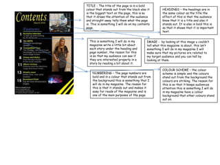
- 1. TITLE - The title of the page is in a bold colour that stands out from the black also it HEADINGS – the headings are in is the biggest text on the page, this is so the same colour as the title the that it draws the attention of the audience effect of this is that the audience and straight away tells them what the page know that it is a title and also it is. This is something I will do on my contents stands out. It is also in bold this is page. so that it shows that it is important text. This is something I will do in my IMAGE - by looking at this image u couldn’t magazine write a little bit about tell what this magazine is about, this isn’t each story under the heading and something I will do in my magazine I will page number, the reason for this make sure that my pictures are related to is so that my audience can see if my target audience and you can tell by they are interested properly in a looking at them. story by reading a bit about it. COLOUR SCHEME – the colour NUMBERING – The page numbers are scheme is simple and the colours bold and in a colour that stands out from stand out from the background the the background this is something that I colours are striking. The reason for will do in my magazine. The reason for this is so that it keeps audiences this is that it stands out and makes it attention this is something I will do easy for reads of the magazine and is in my magazine have a colour one of the main purposes of the page. background that other colours stand out on.