➥🔝 7737669865 🔝▻ jhansi Call-girls in Women Seeking Men 🔝jhansi🔝 Escorts S...
Task 9
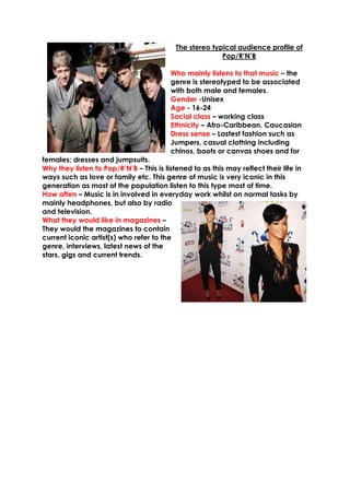
1. The stereo typical audience profile of
Pop/R’N’B
Who mainly listens to that music – the
genre is stereotyped to be associated
with both male and females.
Gender -Unisex
Age - 16-24
Social class – working class
Ethnicity – Afro-Caribbean, Caucasian
Dress sense – Lastest fashion such as
Jumpers, casual clothing including
chinos, boots or canvas shoes and for
females; dresses and jumpsuits.
Why they listen to Pop/R’N’B – This is listened to as this may reflect their life in
ways such as love or family etc. This genre of music is very iconic in this
generation as most of the population listen to this type most of time.
How often – Music is in involved in everyday work whilst on normal tasks by
mainly headphones, but also by radio
and television.
What they would like in magazines –
They would the magazines to contain
current iconic artist(s) who refer to the
genre, interviews, latest news of the
stars, gigs and current trends.
2. My Focus Group
For this task, I asked a mix between 3 males and females with an interest
within the genre from different backgrounds, to see exactly what they would
like in a Pop/R’N’B magazine. I then review there results to see what would be
best suited for my target audience in the magazine.
Front Cover
1. Image on the Front Cover?
The image on the front cover should be outstanding or iconic which has been
monumental throughout the history of the genre whilst linking to recent on goings
and news. Also the image should always allow people to express their
individuality. From my focus group and questionnaire gatherings I have decided
to have an image of ‘The King of Pop’ Micheal Jackson as this relates to the
genre and the majority of my audience can instantly recognize this.
1. Other features to be included on the Front Cover?
For a Pop/R’N’B magazines, there should sell lines which would interest the
audience, such as famous stars both male and female to reach out to both sets
of audience and also promotional offers or free gifts to attract other potential
readers. Moreover including interviews and fashion stories to show the magazine
has more to offer.
2. What appropriate colours to be used?
The colours of the magazine should be very dazzling, as the music is very vibrant
itself, and colour are used to reflect tone of the music and the artist. These colours
may include the primary and secondary colours.
3. What type of language would you expect?
The language on the front cover should not be too formal, as Pop/R’N’B has its
own language involved around the younger age group that are known for their
own language and ‘slang’ or urban, are terms all familiar with the genre.
4. The type of images on a contents page?
There should be more then one image in a contents page, because usually the
images show what’s produced in the magazine. There is normally one central
image of the person or an object such as a musical instrument on the front cover
and then smaller images.
5. What would you want to be contained within the magazine?
The magazine should offer a wide range of things, all of which relating to
Pop/R’N’B and to show it focuses on more then just music, to keep the audience
interest. Such as fashion trends, gigs, interviews and latest gossip, which should
be categorised and clearly numbered to be able to find.
3. 6. How much images and text would you expect?
On a contents page the text should just be mainly on the features and also an
editor’s note, however there should a variety of images to keep readers
interested and to show them what else will be included in the magazine.
7. Images on Double Page Spread?
The images should be about the article that is displayed on the page. In addition
to this furthermore images should relate to the artist’s lifestyle or things to we can
portray as them
8. How would you expect the language to be?
The language reflect the artist that is being mentioned, if it is a interview, the
language tends to be more informal as its speech, also by the language it shows
the Pop/R’N’B due to the use of terms used. The language should also be direct
and allow for readers to follow it easily by understanding it.
9. Image or text based articles?
The double page should be balanced between images and text; there should be
too much text, as it will bore the reader. The images need to be fun and exciting
and usually there are 3 or 4, also the text is not too much, it should be straight to
the point and easy for the audience to understand.