1. Double page spread analysis
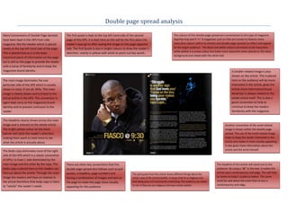
Many Conventions of Double Page Spreads The Pull quote is kept at the top left hand side of the second The colours of this double page spread are conventional to this type of magazine.
have been kept in this DPS from vibe page of this DPS. It is kept here as this will be the first place the Rap/Hip-hop and R “n” B magazines such as Vibe are known to feature more
magazine; like the Header which is placed reader’s eyes go to after seeing the image on the page opposite masculine colours within its articles and double page spreads to reflect and appeal
neatly at the top left hand side of the page. side. The Pull Quote is also in bright colours to draw the reader’s to the target audience. The Black and white colours are known to be masculine,
while yellow is a unisex colour but looks more masculine when placed on the black
This is placed here as it is the least attention, mainly in yellow with white to point out key words.
background and mixed with the white text.
important piece of information on the page
but is still on the page to provide the reader
with a sense of familiarity and to keep the
magazines brand identity. A Smaller related image is also
shown on the article. This is placed
The main image dominates the one here so the audience will be more
particular side of the DPS which is usually interested in the article, gives the
shown in most, if not all, DPSs. This main article more information/visual
image is clearly shown and is linked to the detail but is always related to the
actual article in the DPS. This convention is whole article itself. This is also a
again kept carry on the magazines brand good convention to help to
identity and to prevent confusion to the continue to keep the readers
reader. familiarity with the magazine.
The Headline clearly shown across the main
image and is relevant to the whole article. Another convention of the small related
The bright yellow colour on the black image is shown within this double page
banner will catch the reader’s attention, spread. The use of the small related image
making them want to read more to see helps to keep the reader interested in the
what the article is actually about. article and makes it more visually appealing.
It also gives more information about the
The Body copy dominates most of the right article and the artist himself.
side of the DPS which is a classic convention
of DPSs; to have 1 side dominated by the
main image and the other by the copy. The There are other key conventions that this The headline of the article will stand out to the
body copy is placed here so the readers can double page spread also follows such as pull audience. By using a “@” in the text, it makes the
find out about the article. Through the main quotes, a headline, page numbers and article seem contemporary and edgy. This will help
The pull quote from this article shows different things about the
image the readers will have an interest in having a combination of images and text on artist’s way of life and his beliefs. It shows that he is religious and to relate to today’s audience better. The same
the article therefore th4e body copy is there that being poor isn’t necessarily a bad thing. The audience can relate could be said about the artist that he too is
the page to make the page more visually
to him if they too are religious and have similar beliefs. contemporary and edgy.
to “satisfy” the reader’s needs. appealing for the audience.
2. The Headline clearly shown across the second
The colours of this double page spread are conventional to this type of magazine.
page and is relevant to the whole article. The Rap/Hip-hop and R “n” B magazines such as Vibe are known to feature more
bright yellow colour on the black banner will masculine colours within its articles and double page spreads to reflect and appeal
catch the reader’s attention, making them to the target audience. The Black and white colours are known to be masculine,
want to read more to see what the article is while yellow is a unisex colour but looks more masculine when placed on the white
actually about. background and mixed with the black text.
The main image dominates the one
particular side of the DPS which is
usually shown in most, if not all, DPSs.
This main image is clearly shown and Many Conventions of Double Page
is linked to the actual article in the Spreads have been kept in this DPS
DPS. This convention is again kept from vibe magazine; like the Header
carry on the magazines brand identity which is placed neatly at the right top
and to prevent confusion to the hand side of the page. This is placed
reader. here as it is the least important piece
of information on the page but is still
on the page to provide the reader with
a sense of familiarity and to keep the
magazines brand identity.
There are other key conventions that this
double page spread also follows such as pull The Body copy dominates most of the right side of the DPS which is a classic
quotes, a headline, page numbers and convention of DPSs; to have 1 side dominated by the main image and the
having a combination of images and text on other by the copy. The body copy is placed here so the readers can find out
the page to make the page more visually about the article. Through the main image the readers will have an interest
appealing for the audience. in the article therefore the body copy is there to “satisfy” the reader’s
needs.