1. tim riches - senior creative
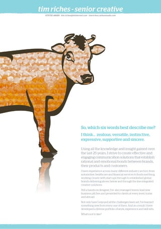
So, which six words best describe me?
I think... zealous, versatile, instinctive,
expressive, supportive and sincere.
Using all the knowledge and insight gained over
the last 25 years, I strive to create effective and
engaging communication solutions that establish
rational and emotional bonds between brands,
their products and customers.
I have experience across many different industry sectors, from
automotive, healthcare and financial services to foods and fmcg,
working closely with start-ups through to established global
brands delivering above, below and through the line integrated
creative solutions.
Still a hands-on designer, I’ve also managed teams, lead new
business pitches and presented to clients at every level, home
and abroad.
Not only have I enjoyed all the challenges been set, I’ve learned
something new from every one of them. And as a result, I have
developed a diverse portfolio of work, experience and skill sets.
What’s not to like?
079795 48689 tim.riches@btinternet.com timriches.carbonmade.com
2. depth & breadth
employment
Ogilvy Healthworld Advertising - October 2014 - Present
Senior Art Director (Freelance)
Senior Freelance Creative - May to October 2014
Ciklum - House brand development.
Serious - GOSH, UEA, NBS, Vanguard.
OUNO - Farnborough Airshow - NHS (HSCIC).
Collider - Epson Inkjet for Business.
Lime - Stena Line, ICMA, FT.com, Optimum IT.
Valiant - January to April 2014
Design Director (Freelance)
Working closely with the MD and creative team to refresh and
inject new creative momentum. Drove the new Valiant brand
refresh and worked with clients including Sony, Novus Interiors
and Cameron Theodore.
FST Marlow - May to November 2013 (6 month contract)
Art Director
Team leader responsible for developing accounts including Avis,
Visa Asia Pacific (Singapore) and Rentokil Initial Workwear.
FST are building a Singapore agency to manage Visa and other
‘local’ clients including Bridgestone. As part of the process I came
in to cover until a Design Director was appointed in Singapore.
Apart from directing the creative I mentored my team and got
involved with reviews and appraisals
CDD - January 2010 to March 2013
Creative Director
Working closely with the MD, my responsibilities include developing
the creative output and new business opportunities in a wide variety
of industries and disciplines including: fmcg, automotive, energy,
private investment, sport and fashion.
Clients include: Aggreko, Aquila Design, ASDA, BLOC sunglasses,
Filofax, House of Dorchester, Le Creuset, Loseley Ice Cream, OVS
Capital, The Royal Ballet, TMD Friction and Yamas! Greek cheese.
Senior Freelance Creative - July 2008 to December 2009
Wunderman: Ford, Land Rover.
Bang!: NHS, European Medicines Agency, Ordnance Survey.
Tiley Woodman: Manor Royal Business Village.
Defacto: Healthcare Commission, Chem Spider.
K4 Creative - September 2006 to July 2008
Design Director
As Design Director, I was responsible for the development and
success of a small, independent creative consultancy based in
Holland Park. This role allowed me to develop my skills as a team
leader and become very involved in the day-to-day business
issues and the direction of the company. I had the satisfaction
of rebuilding the creative team and developing K4’s core
proposition an creative development.
Clients included: Cass University, City University, Credit Suisse,
Fidelity International, GMAC RFC, Barclays iShares, Lion Capital,
Penrose Financial PR and Powerday.
Mirror Image - June 2001 to August 2006
Lead Creative
As second to the Creative Director, I further developed my skills
as a conceptual, hands on designer contributing to the development
of the creative output of the team.
Clients such as BOC, Microsoft, Cisco & HP, Skandia, Wasps RFC,
QPR FC and Vodafone developed my skills including branding,
packaging, POS, DM and internal comms.
AMD Brand Evolution - March 2000 to June 2001
Lead Creative
Brand Evolution was the successor to Smithfieldesign and allowed
me to develop my experience in the property development sector.
Clients included: ASDA Property, Berkeley Homes, St. James Homes,
Marketbet, The Engineering Council and The British Museum.
Smithfieldesign - January 1997 to March 2000
Senior Designer
Identity design and management, annual reports, corporate and
financial literature and property promotions.
Clients included: Friends Provident, Audit Commission, Securicor,
Sun Life, AXA and Pentland.
Gavin Anderson & Company - June to December 1996
Senior Designer
Corporate brand design and development.
Clients included: Xenova plc, Development Securities, Austin Reed,
The Reuter Foundation, Merita Bank, and Unichem.
Grandfield (Rork Collins) - October 1989 to June 1996
Senior Designer
Corporate financial literature and advertising.
Clients included: Amersham International, Eagle Star, Debenhams,
Barclays Private Banking, Midlands Electricity, Trade Indemnity PLC,
Morgan Grenfell Asset Management, Celltech.
professional skills
Over 25 years’ experience covering many industry sectors, brands
and products, producing creative brand development and integrated
marketing campaigns.
Creative, instinctive and zealous team player.
Good knowledge of CS (InDesign, Illustrator, Photoshop).
Creative and art direction for print, video and digital.
Client interaction, creative presentations and general contact on
a day-to-day basis.
Commissioning and working with photographers, illustrators,
copywriters, digital media artists, DOP’s and producers.
Permanent, freelance, and managerial experience.
Team mentoring, interviewing and hiring employees at various levels,
and conducting ongoing appraisals.
Overseas and timezone issues: Working in and remotely for clients
in Europe, Ukraine, Dubai and Singapore.
design education
Epsom School of Art and Design. 1982-86
Godalming College. 1980-82
referees
Adam Lach-Szyrma, GCD - Ogilvy Healthworld: 07717 701842
Camilla Rossi, AD - Ogilvy Healthworld: 07768 293506
Nigel Edginton-Vigus: Head of Copy - Blue Hive: 07711 459296
Steve Radjen, MD - CDD: 07768 934503
Libby Temperley-Shell: ex AD - Pauffley: 07976 899336
tim riches - senior creative
079795 48689 tim.riches@btinternet.com timriches.carbonmade.com
3. le creuset
Le Creuset Stainless Steel range brand definition and
online social activity
If you think Le Creuset, you probably see an orange. heavy cast iron casserole pot.
You may not think beautifully made, high quality 3 ply polished stainless steel.
This exercise, as part of pitching for online social engagement, was to understand
the Le Creuset brand and the issues this relatively new range (launched 2002)
has in competing in a saturated steel market, a credible alternative to the cast iron
option, and to attract new customers to the brand.
I proposed a new, relative identity for the range which suggested the product type
but sat perfectly with the original mark, but also to take it a step further by creating a
name for the range, again empathetic to the original brand and the French origins.
Le Creuset = The Crucible/Melting Pot Acier = Steel Le Acier, Le Creuset
Creating a character for the range was an important distiction. We identified a target
market of A, B, C1’s, Le Creuset ‘disciples’ and young professionals.
Subsequent defining creative routes were developed, leading to online social
engagement, product information and purchasing guides, see below.
Analogy of a Le Creuset Stainless Steel Saucepanas a coveted ‘trophy’, or objet d’art.
Le Creuset cooking from around the world. New recipes, new locations emphasising range of use.
By integrating the product in a country’s landscape gives recognition to the global brand and
becomes the cookwear of choice to a wider market.
Encourage Le Creuset ‘disciples’ to engage with each other by sharing experiences of the range
and their own recipes from their travels as part of an online community initially via Facebook.
Online social competition campaign concept -
‘Where in the world is Le Creuset today?’
This aims to enhance the awareness of Le Creuset’s global
presence to Facebook
• Competitors will gain access to the campaign with a ‘like’
• Users will be required to guess the location of a daily image
• Traffic will revisit each day to increase their chances
• The hook will be a Final Prize draw to win product or visit and
cook in a global region of choice
• Socially an image can quickly go viral
Parallax micro-site concept:
‘Learn more about Le Creuset Steel’
Scrolling vertically, an animated saucepan
rotates to reveal design qualities, cooking
benefits, finally revealng the full range
and purchasing information.
tim riches - senior creative
079795 48689 tim.riches@btinternet.com timriches.carbonmade.com
4. loseley ice cream
Loseley Ice Cream Brand Development.
Loseley dairy products are ‘artisan quality’ and generally found in deli’s, farm shops,
theatre’s and outdoor events. An established premium brand, certainly in the South
of England, Loseley want to establish themselves nationally and naturally increase
sales to compete with direct competitors including Haagen Daz.
Prior to a full brand and product audit and subsequent development, Loseley urgently
required an interim (possibly permanent) creative direction for their ice cream range
to launch in Spring 2011.
Existing Loseley ice cream packaging had 2 major flaws: an inability to distinguish one
flavour from the next, and very poor freezer presence.
By developing its main identifiable asset, the Jersey Cow, I created a considered,
contemporary take on the existing tired packaging by combining the core ingredient
of each variety with a new illustration of the cow.
There was also a requirement to refresh the Loseley identity whilst retaining the
integrity of the existing mark.
Before and after
As illustrated, the new pots deliver a sympathetic
nod to the old styling but now, the product is clearly
expressed, the cow is very engaging and the Loseley
logo has added quality.
tim riches - senior creative
079795 48689 tim.riches@btinternet.com timriches.carbonmade.com
5. rentokil initial workwear
Stage 1 ‘Premium’ range campaign development
Rentokil Initial plc is one of the largest support services companies in the world,
operating in all of the major economies of Europe, North America, Asia Pacific
and Africa.
Initial ‘Premium’ is a new, engineered range of workwear developed to deliver
optimum performance, protection, comfort and functionality. It is the top of the
range option in the workwear ‘Keep me Clean’ category and has a requirement
to distinguish itself from the other available Initial options but act as a leading
brand in the workwear industry as a whole.
Illustrated, are excerpts from the first, second and third stage developments
including moodboards, naming exercises and concept expressions, through to
the final creative.
Concept 1. Expressive attitude
The canvas and the ‘hero’ represent the campaign
theme of ‘a new expressive attitude to workwear.’
Right illustrates stage 1 top level creative.
Represented here as a poster, the Initial and
Textiles branding is very consistant, but the
powerful visual avant garde style shows the
distinction between not only the Initial Universal
styling but also direct competitors.
Literature cover examples
With the creative direction established, it is now applied.
The flexibilty allows distinction between ranges, gender,
and industry etc.
‘Artisan Works’ has now evolved as a potential range name
and underpinned by ‘more than workwear’.
Concept 2. Engineered Workwear
This concept represents an intelligent, high
specification range of workwear.
The photographic styling adds to the attitude
of the range, and allows the possibility to
extend the range beyond the workplave and
into the retail arena. Dickies workwear is a brand
to aspire to.
Concept 3. Freedom of movement
Majoring on the materials, new functions and cut of the
overalls, jackets and trousers etc, this concept shows abstract
movement photography to act as strong visual stimulus.
The principle of this concept was then progressed to the final
direction shown below.
tim riches - senior creative
079795 48689 tim.riches@btinternet.com timriches.carbonmade.com
6. novus interiors
New identity and full integrated brand development
Established interior design firm Novus are now benefitting from a stronger more
cohesive and confident visual brand to take the business forward beyond the UK
and into Europe.
Specialising in commercial property, Novus is quickly establishing itself as a major
player in the competitive world of office design and fitting services.
Above: A selection of case study and testimonial brochure styles.
Right: Initial identity use guidelines illustrating the basics of the identity,
literature and digital and photographic styles.
Below:First stage responsive website/holding page examples.
tim riches - senior creative
079795 48689 tim.riches@btinternet.com timriches.carbonmade.com
7. tmd friction-textar
Textar:braking with tradition for 100 years
New braking performance
that’s out of this world
From Textar, the makers of the world’s best O.E. brake pads,
comes the best O.E quality brake rotor to form the
perfect braking partnership.
• New to the US market
• Engineered to match your cars original braking system
• High carbon content
• Anti-corrosion coated
• Perfectly complements Textar O.E. brake pads
• Performance without the compromise
www.textar.com
Textar:braking with tradition for 100 years
Character building for a premium brake friction brand
Textar is TMD Friction’s flagship brake brand. It is O.E. (original equipment) quality
with primary markets in prestige cars and C.V. (commercial vehicles)
Our first brief for Textar was to create an integrated awareness campaign highlighting
the issues of non regulated C.V, brake friction flooding the European market.
It was designed to implicate fleet decision makers including MD’s (right), fleet
managers, distributors and drivers. A hard hitting campaign, it was very unique
in the marketplace and caused a lot of interest.
Advertising, literature, direct mail, safety video and ipad presentations were
developed for TMD’s Automechanika (world’s largest automotive and component
expo) stand in Frankfurt.
The subsequent success of this initial job for TMD resulted in a great relationship
and allowed us to develop other campaigns off and online for Textar, and other
TMD brands and divisions (automotive and industrial).
The direct mail piece blow illustrates the campaign in
its entirety, showing the negative situation combined
with the benefits of Textar O.E. quality.
Left and above, part of a conceptual
advertising, campaign launching
Textar brake pads and discs into
the American market.
Right, final styling for specific brake
disc campaign for America.
Above, promotional literature for ‘epad’ a specific
Textar product developed for its performance, low
noise and low dust output.
The ceramic based formulation offers a holy grail
to drivers who won’t compromise on performance,
a particular interest in the American market.
Right, online interactive Textar garage, created for
mechanics and customers to either learn about
the products, access to product catalogues and
ordering options.
Far right Textar Marketing on Demand portal for
garages to order product and marketing elements
which are designed to be dual branded.
Elements including offer posters, literature and
branded clothing and be ordered simply and
cheaply. This obviously benefits both parties:
added exposure for the band and professional,
consistent marketing for the garage.
tim riches - senior creative
079795 48689 tim.riches@btinternet.com timriches.carbonmade.com
8. pharma/healthcare
tim riches - senior creative
Various examples.
Identity and product materials for BOC Medical Speciality Gas Heliox.
BOC is an international gas company supplying industrial, medical and scientific gases
and equipment in 30 countries.
Heliox is a gas developed specifically for rapid relief in patients with respiratory problems
prior to entering hospital.
As part of a repositioning programme, the Heliox brand is represented by a leaping archer
through an aperture and underpinned by the strapline -Vital Breathing Space - and illustrates
the point of targeted relief.
A comprehensive list of marketing materials were produced including technical literature
and healthcare press advertising.
Concepts for a brand refresh and marketing for a new online search engine pre-online
application. ChemSpider is a free chemical structure database providing fast access
to over 22 million structures, properties and associated information.
Connecting Chemists,
advancing knowledge
High Quality Care for All was the theme of Lord Darzi’s year long review of the NHS for 2012.
The purpose of the review was to consider the potential to unite everyone working in the NHS.
These are first stage concepts to deliver
the concept and message in an aspiring
and intelligent.
079795 48689 tim.riches@btinternet.com timriches.carbonmade.com
9. aggreko
Winning pitch presentation examples
Aggreko is the world’s largest temporary power supplier to; global industry including
mining and oil & gas, events Olympics, World Cups and music festivals, and disaster
relief in Japan.
We pitched specifically for Aggreko International’s (based in Dubai) business covering
Africa, Middle & Far East and Australasia.
Illustrated here are examples of progressing the brand through various above and
below the line channels including advertising, literature, online activity, direct mail
and CSR exposure.
The majority of the examples concentrate on the mining industry and expressing
Aggreko’s capability in delivering energy and temperature control to the most
remote and difficult situations.
Development is progressing and rolling out in phases beginning Q1 2013.
tim riches - senior creative
079795 48689 tim.riches@btinternet.com timriches.carbonmade.com