

Empfohlen
Empfohlen
Weitere ähnliche Inhalte
Andere mochten auch
Andere mochten auch (20)
Ähnlich wie Boston Globe: Responsive Web Design
Ähnlich wie Boston Globe: Responsive Web Design (20)
Mehr von The Media Consortium
Mehr von The Media Consortium (20)
Kürzlich hochgeladen
Kürzlich hochgeladen (20)
Boston Globe: Responsive Web Design
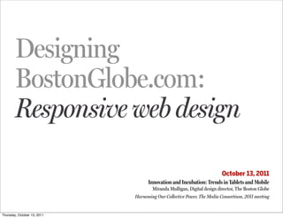
- 1. Designing BostonGlobe.com: Responsive web design October 13, 2011 Innovation and Incubation: Trends in Tablets and Mobile Miranda Mulligan, Digital design director, The Boston Globe Harnessing Our Collective Power, The Media Consortium, 2011 meeting Thursday, October 13, 2011
- 2. hello. Thursday, October 13, 2011
- 3. Thursday, October 13, 2011
- 4. Thursday, October 13, 2011
- 5. we started with a strategy Thursday, October 13, 2011
- 6. we started with a strategy and took a closer look at our readers. Thursday, October 13, 2011
- 7. some users were like red bull . . . (cc) Fristle — bit.ly/mUkfnf Thursday, October 13, 2011
- 8. and some users were like coffee . . . (cc) S. Diddy — bit.ly/prEl5e Thursday, October 13, 2011
- 9. we were now working for a new client. Thursday, October 13, 2011
- 10. readers. Thursday, October 13, 2011
- 11. they also like to browse… Thursday, October 13, 2011
- 12. they also like to browse… to relax… Thursday, October 13, 2011
- 13. they also like to browse… to relax… to stumble upon a story. Thursday, October 13, 2011
- 14. we’d been here before. Thursday, October 13, 2011
- 15. Thursday, October 13, 2011
- 16. Thursday, October 13, 2011
- 17. first steps . . . the early prototypes Thursday, October 13, 2011
- 18. Thursday, October 13, 2011
- 19. Thursday, October 13, 2011
- 20. Thursday, October 13, 2011
- 21. Thursday, October 13, 2011
- 22. Thursday, October 13, 2011
- 23. we did some ‘usability testing’ . . . Thursday, October 13, 2011
- 24. we did some ‘usability testing’ . . . we learned some stuff . . . Thursday, October 13, 2011
- 25. we did some ‘usability testing’ . . . we learned some stuff . . . we were ready to get going . . . Thursday, October 13, 2011
- 26. responsive web design? Thursday, October 13, 2011
- 28. design isn’t just about layout. Thursday, October 13, 2011
- 29. however, we cannot predict the future. Thursday, October 13, 2011
- 30. Responsive design has . . . Thursday, October 13, 2011
- 31. Responsive design has . . . 1. A flexible, grid-based layout Thursday, October 13, 2011
- 32. Responsive design has . . . 1. A flexible, grid-based layout 2. Flexible width media: images, video Thursday, October 13, 2011
- 33. Responsive design has . . . 1. A flexible, grid-based layout 2. Flexible width media: images, video 3. Media queries Thursday, October 13, 2011
- 34. Step 1. The flexible grid target ÷ context = result Thursday, October 13, 2011
- 35. Step 2. Flexible images and media img { max-width: 100%; } github.com/scottjehl/Responsive-Images and github.com/scottjehl/Respond Thursday, October 13, 2011
- 36. Step 3. Media queries designing for breakpoints Thursday, October 13, 2011
- 37. DEVIC E WI DT H Small Screens (landscape) 480 px 7” tablets (portrait) 600 px 10” (portrait) 768 px 10” tablets (landscape) 1024 px Widescreen 1200 px Thursday, October 13, 2011
- 38. responsive design means designing in the browser and less in a ‘comp’. Thursday, October 13, 2011
- 39. so now we needed some coffee . . . (cc) S. Diddy — bit.ly/prEl5e Thursday, October 13, 2011
- 40. and some red bull . . . (cc) Fristle — bit.ly/mUkfnf Thursday, October 13, 2011
- 41. we began to realize some of the visual designs into lots of live prototypes. next, the design pod convenes. Thursday, October 13, 2011
- 42. an interactive design review Thursday, October 13, 2011
- 43. an interactive design review Thursday, October 13, 2011
- 44. design review surfaces challenges. Thursday, October 13, 2011
- 45. refining the masthead Thursday, October 13, 2011
- 46. Thursday, October 13, 2011
- 47. Thursday, October 13, 2011
- 48. from design to code, and back again Thursday, October 13, 2011
- 49. let’s looks at the live site. Thursday, October 13, 2011
- 50. this was fun, thanks. Thursday, October 13, 2011
- 51. 4 Brief books for people who make websites No. Ethan Marcotte RESPONSIVE WEB DESIGN Jeremy Ketih Thursday, October 13, 2011
- 52. 4 Brief books for people who make websites No. Ethan Marcotte RESPONSIVE WEB DESIGN Jeremy Ketih abookapart.com (Fun read. I swear.) Thursday, October 13, 2011