
Empfohlen
Weitere ähnliche Inhalte
Was ist angesagt?
Was ist angesagt? (15)
Andere mochten auch
Andere mochten auch (20)
Ähnlich wie Terna jogo Final Log Book
Ähnlich wie Terna jogo Final Log Book (20)
Kürzlich hochgeladen
Kürzlich hochgeladen (20)
Terna jogo Final Log Book
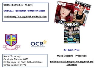
- 1. OCR Media Studies – AS Level Unit G321: Foundation Portfolio in Media Preliminary Task, Log Book and Evaluation Name: Terna Jogo Candidate Number: 6425 Center Name: St. Paul’s Catholic College Center Number: 64770 Set Brief - Print Music Magazine – Production Preliminary Task Progression, Log Book and Evaluation
- 2. Preliminary Task Progression– Evidence Front Cover: Step-by-step
- 3. Step 1 Step 2 Step 3 Preliminary Task Progression– Evidence Front Cover-Step-by-step Firstly I started off with a blank page with the colours maroon and blue at the top, which are St Paul’s colours. This would be my colour scheme. I also added guidelines to help me with the layout of my Front Cover. Next I went a website called ‘Dafont.com’ to find a suitable font for my front cover. I chose a font called ‘Lobster 1.4’ as it was cursive and looked like it had been written in a fountain pen. I also added the St Paul’s logo to the top right hand side of the page. Sticking with the font ‘Lobster 1.4’ in order to be consistent I proceeded to add a strap line ‘Read, lead, succeed’. I also added social networking logos, a barcode, a website address and the date and issue.
- 4. Step 4 Step 5 Step 6 Preliminary Task Progression– Evidence Front Cover-Step-by-step Then I took a picture of two of my friends in their old school uniform and used this as my main image. I made sure they were looking directly at the camera, so as to give a personal feel to the front cover. Next I added a price of 99p. The yellow circle is the only deviation from the colour scheme because I wanted to highlight what a good and cheap price it was. I also added a puff/competition in order to attract readers. Finally I came up with cover lines to add to the Front Cover and wrote a sentence underneath these to give the reader more information about what would be in the magazine. I had to make the text stand out against dark or similar backgrounds by using the ‘stroke’ tool to outline the text in black or white. This is my finished front cover.
- 5. Preliminary Task Progression– Evidence Contents Page: Step-by-step
- 6. Step 1 Step 2 Step 3 Preliminary Task Progression– Evidence Contents Paege-Step-by-step I started off again with a blank page with the colours maroon and blue at the top, as I was continuing with the colour scheme. I also added guidelines to help me with the layout of my Contents Page. Then I added in ‘Contents’ and ‘Paul’s people’ underneath in the same font of Lobster 1.4. I also added the St Paul’s logo in the same position as the front cover. Lastly I wrote out my editors letter on word to ensure there were no spelling/grammar mistakes. Then copied and pasted it onto Photoshop accompanied by an editors photo. I also used the Pen tool to create a Drop Capital for the W. Next I added in the sub-headings, the story headings with the number of the page you could find it on alongside and lastly maroon lines to seperate the stories.
- 7. Step 4 Step 5 Preliminary Task Progression– Evidence Contents Page-Step-by-step After that I wrote out the stories for to go underneath the story headings and also wrote what you needed to do to enter the competition advertised on the front cover. Lastly I screen grabbed the front cover and inserted this onto the contents page with a subscription offer. This is my final Contents Page.
- 8. Log Book
- 9. Music Magazine Genre research Music magazines typically include music news, interviews, photo shoots, essays, record reviews, concert reviews and occasionally have a covermount with recorded music. “Q, NME and and Uncut suffered double-digit year-on-year sales declines in another torrid period for the music magazine sector in the second half of 2011.’’ http://www.theguardian.com/media/2012/feb/16/music-magazines-suffer-sales-decline(2012) Billboard magazine is one of the oldest music magazines founded in 1894 and is still active today Q magazine founded in 1986 http://www.magforum.com/glossies/music_magazines.htm Many sub-genre’s such as rock, hip hop, pop and R&B. Physical hard copies of magazines are declining in popularity due to the increase of the modern and easily accessible online magazines.
- 10. Why Q? I have decided to research and deconstruct Q as my starting point firstly because they are an established, popular and respected magazine, which could offer me some direction in how to structure my magazine and word its contents. However Q is also well known for covering all sectors of the music genre within its pages. From Modern Hip Hop/Rap legend Jay Z to pop star Katy Perry and English Rock Band Beady Eye. Therefore as a result of its diversity, by deconstructing multiple Q front covers, I am able to gain an insight into each music genre before deciding on my genre of focus.
- 11. Established Magazine for my Research Editor Andrew Harrison Genre Music Magazine Frequency Monthly Publisher Bauer Media Group Total 58,980 (ABC Jan–Jul 2013) circulation Readership 377,000 First issue October 1986 Country United Kingdom Language English Website Qthemusic.com This chart denotes that 68.3% of Q readers are male, whilst 31.7% are female. Also 35.5% of their readers are aged 15-24. This connotes that Q’s target audience are males aged 15-24. The chart also denotes that 70% of the ABC1 Profile read Q magazine, which connotes that Q is a popular magazine, if not one of the most popular as the majority of ABC1 profile read Q magazine. The denotation of Q magazine having 4.5% of their readers being over 55 years old connotes that the magazine is distributed widely in order to reach such a variety of ages.
- 12. Target Audience – The target audience for Q magazine can be denoted as British white males aged 15- 24, from a middle class background (Hartley) due to the fact that the magazine (in pounds) is £3.90, which is quite expensive for a magazine. They would conform to being ‘survivors’ (Mazlow) because they will have the security and routine of knowing the latest information about a band/artist as much of Q magazine is devoted to interviews with popular music artists. Furthermore they can also keep up to date with new music and albums as Q also offers an extensive review section. Lastly Q magazine would over the reader a diversion from their reality as they can immerse themselves in the lives of bands/artists through the multitude of interviews with popular artists that Q offers. What is the USP of this magazine? From the research completed into this media product, one of its USP’s is that every issue of Q has an ambiguous message on the spine that encourages reader’s to guess what will feature in the magazine. The message has to do with the content of the magazine. It is interactive and makes the reader feel involved and pro-active. It is referred to as the ‘spine line’. This is an example of a ‘difference’ (Steve Neale) as conventionally most magazines don’t do that and will typically just keep their spine blank or possibly have the date/issue on there. Q magazine is also known for compiling lists such as “The 100 Greatest Albums”. Also every other month Q, and it’s sister magazine ‘Mojo’ have a special edition dedicated to musical times, genres or influential musicians. This is another ‘difference’ as typically magazine will have ‘special edition’ magazines only on very monumental occasions, not every other month, which is fairly regular.
- 13. Masthead: Large, bold and consistent. Instantly catches your attention, due to its red background. Encourages Brand Recognition Strapline: Q magazine has 2 straplines that they alternate between, the second of which is ‘The UK’s biggest music magazine. Since my magazine is going to be a pilot issue I cannot boast of being the UK’s biggest music magazine to attract readers. So instead I am going to include a puff/competition to encourage people to buy/read the magazine. Date and Price: £3.99, ‘March 2012’ Direct and states what the magazine aims to bring to the reader Barcode Cover lines: Colloquial/slang language is used here in terms of the word ‘Git’. Q magazine has a broad audience that ranges from old to young. This story and use of the word ‘Git’ could appeal to both audiences; the younger audience because it is a slang word and they will be familiar with Skrillex (a contemporary Dubstep artist) , but also the older audience because it is a term that someone of an older generation would use. Headline (Main Story): This has been positioned at the top of the page which presents some ‘difference’ (Steve Neal) as conventionally the headline in magazines are positioned at the bottom of the page. Story Separators: XXL magazine is known to do this as well.
- 14. Publisher research http://magazines.bauermediaadvertising.com/magazines/detail/Q http://www.bauermedia.co.uk/brands/q Largest privately owned publishing group in Europe! Offer over 300 magazines in 15 countries plus other media platforms such as TV and radio Founded in 1875 Website: www.bauermedia.co.uk Only publish 4 entertainment/music magazines: Mojo, Empire, Kerrang and Q magazine. Attract 19 million consumers every week through their various media products Their strap line is ‘We think popular’ which connotes that they aim to reach a mass audience In 2010 they made a turnover of €2.129 Billion
- 15. I wanted to look at other music magazines other than Q before I decided which genre I wanted to do. Here are some of the other magazines I looked at…
- 16. Similarly to Q they also covered multiple genres such as hard- core punk, alternative country, reggae and world music, experimental rock and jazz. However they are notably know for its emphasis on ‘college orientated rock music’ and Hip Hop. Stopped publishing in print in 2012 and is now a ‘webzine’. Founded in 1985 Circulation (2011): 459,586 Genre: College oriented rock music and Hip Hop Date/Issue Masthead Barcode Main Image Known for having iconic images on their front covers Main Headline: presents ‘difference’ (Steve Neal) as it is not very big and has been placed in line with the subheadings. Does not really stand out. Possibly didn’t want to distract from the main image? Aimed at “young, forward- thinking audience“
- 17. Genre: Rock/Popular Music/Entertainment Founded in 1967The Rolling Stones not only includes music news but has a heavy emphasis on politics. ‘In the 1990s, the magazine changed its format to appeal to a younger readership interested in youth-oriented television shows, film actors, and popular music’ Jann Wenner one half of the founders of the magazine wrote that Rolling Stone "is not just about the music, but about the things and attitudes that music embraces." Total Circulation (Paid & Verified) 1,464,943 (Annual- 2012) Colour Scheme: Red, Black and White
- 18. Genre: British Rock Music Named after the onomatopoeic word that comes from the sound made when playing a power chord on a distorted electric guitar. First Issue: 6 June 1981 Early 2000s – It was the best selling British newspaper. Dark colours are conventional to the style and genre of music. Rock music can be seen as quite dark. Red, white and Black seems to be a popular colour scheme amongst music magazines. Spin, Rolling Stone and XXL are just a few other music magazines that have adopted these colours. Only magazine I’ve seen with a punctuation mark in the Masthead. This is a ‘difference’ (Steve Neal). Rock music is also known to be quite loud, expressive and involve shouting. The exclamation mark (used to show when something is being said loudly or using strong emotion) connotes this. Puff or some sort of prize attracts people to buy the magazine. Retails at £2.10 Kerrang! is “The world’s largest weekly music magazine” Circulation: 35,127 (Jul-Dec '13) Readership: 345,000 (July-Dec '12) Target audience
- 19. First Issue: November 1, 1894 Known for its record charts Circulation: 16,327 Have a broad multi- coloured colour scheme. This is a ‘difference’ (Steve Neal) as most magazines will usually stick to a maximum of 3. Target audience “key executives and tastemakers in and around the music business” it is intended for music professionals, such as record label executives, artists, musi c retailers, and radio DJs. Strap line: ‘Experience the Buzz’ Published Weekly Genre: Popular Music (as it is a music charting magazine it unconventionally focuses on all genres) Owned by Prometheus Global Media Retails at around $6.95.
- 20. My Chosen Music Magazine Genre I chose to do a Hip Hop magazine because I felt like I could relate the most to it and I am genuinely interested in Hip Hop music and its culture. Although I knew it would be a challenge as it is harder to structure and layout than say a pop magazine, I was ready to take this on. The magazine I decided to model it after is XXL magazine, which is the most bought and read magazine in the niche Hip Hop sector. I also liked the professional yet sleek and simple style of XXL magazine and felt that I could replicate it to a similar if not level standard. Although I am modeling my magazine after XXL magazine, I have been inspired by other Hip Hop magazines such as Vibe and The Source. Whilst looking into the Hip Hop magazine Genre, I noticed many ‘similarities’ (Steve Neal) between them. For instance the colour scheme, red, white and black is very common among them. It is also one of the colours people said they Would like to see in a Hip Hop magazine From my survey monkey. Also the Majority of artists featured on the front Cover are Black and Male, which will indicates who they are aimed at.
- 21. Conventions of a Music Magazine: Front Cover Masthead Strap line: ‘hip hop on a higher level’ Headline (Main Story) Barcode Web address: XXLMAG.COM Date Price: $5.99 Cover lines: (not much information on the what the article will be about. Just indicates who will feature in the magazine) Target Audience: American Black males, who are Hip hop/Rap music fans aged 16-35, from a middle class background as the the price (in £) is approx. £3.70
- 22. Conventions of a Music Magazine: Contents Page XXL always has two contents pages plus a whole page dedicated to the editor’s letter. This is a ‘difference’ (Steve Neal) as most magazines only have one. The A-side deals with the more primary/important features. The B side deals with the secondary less important features. The sub-headings on the B-side stay the same for every issue. XXL logo Date Page number, date and website address. There is consistently a quote here from the artist who is featured in the main story that month, and is on the front cover. Always only one image on the A-side, usually of the artist that is featured in the main story. They are always taken against a plain grey/white background. Eye Candy: This features pictures and interviews with that months most in demand video girl. X-Rated: To XXL the most important aspect of Hip Hop is the music. X-rated is the biggest section in the magazine and includes well informed reviews and critiques of modern tracks, albums and artists. It also includes underground artists and old school lyrics and beats. Doin’ Lines: A chosen artist completes a fill in the blanks Q&A. Made personal as the artists actual handwriting is actually used. Editorial: Editor’s letter 360: Is the first section of XXL magazine. It includes the latest hip-hop news, short interviews and articles on fashion/trends. There are special monthly features such as Step Your Rap Game Up, which highlights rappers who’s lyrics are not up to standard; Murder to XXLence, where Shaheem Reid battles with today’s hottest rappers; and Picture This, the photo of the month. Photo credits
- 23. Conventions of a Music Magazine: Double Page Spread
- 25. Target Audience – The target audience for XXL magazine can be denoted as Black American males (78% of their readers are male and 67% of their readers are black), from a middle class background, aged 16-27, who are fans of hip hop music and hip hop culture as a whole (Hartley). They would conform to being social climbers (Mazlow) as the magazine features a lot of fashion adverts/campaigns mainly by current hip hop/rap artists that have their own clothing brand for instance Wiz Khalifa. As a result of this XXL readers can be know what the latest fashion is and buy the clothes before any of their friends do. In addition XXL offers extensive knowledge on the origin of hip hop and its culture. Therefore their readers can be ‘informed and educated’ (Katz) and gain knowledge that maybe their group of friends don’t know. What is the USP of this magazine? Having deconstructed a number of different issues for XXL, I feel the USP is that XXL offers an extensive knowledge on hip hop/rap culture. This ranges from the style of clothing worn in hip hop videos, to the origin of hip hop (California). This is a ‘difference’ (Steve Neale) as usually music magazines just focus on interviews, reviews and promotions and not educating their readers on the history of the music genre. The USP of XXL’s front cover is that they are known for having iconic front covers such as their front cover entitled ‘the greatest day in Hip Hop’. XXL magazine front covers are typically close ups or mid shots of the main artist featured in the article. They will usually be looking directly at the camera, which gives the impression that they are looking directly at you (the reader). This gives each front cover a personal feel.
- 26. Publisher research XXL magazine is published by Harris publications. Circulation (USA) - 136,532 Number of Issues per year: 11 2012 Statistics Source: http://www.americasmedia.com/mediakits/XXL%20MediaKit.pdf Readership: Male Readers: 78% Median Age: 27 Median HHI: $47,007 College Educated: 44.7% African American: 67% Outsells ‘The Source’, ‘Complex’ and ‘Vibe’ even though it is more expensive by $1 According to Hartley, XXL readers are Middle Class (which is reflected in the price) African American Males, aged 21-29. Monthly page views (www.xxlmag.com) 5,281,435 Monthly unique visitor's (www.xxlmag.com) 1,014,085
- 27. Research for my Magazine – Survey Monkey Questions Answers
- 28. Research for my magazine - Results What is your age? Under 9 10 to 17 18 to 24 25 to 34 35 to 44 45 to 54 What is your gender? Male Female How much would you spend on a magazine? I don't buy magazines £0.01 - £1.00 £1.01 - £2.00 £2.01 - £3.00 £3.01 - £4.00 £4.01 or more What is the most important aspect of a magazine front cover? The Main Image with Star appeal (Richard Dyer) The Masthead The Cover Lines The Main Story Social Networking Links All of the Above
- 29. Research for my magazine - Results Do you listen to rap music? Yes No What would you expect to see in a hip hop magazine? Some reoccurring answers were: - Girls - Famous/Known Hip Hop artists - The Latest Music - Competitions What colours would you like to see in a Hip Hop magazine? Some reoccurring answers were: - Black - Red - Blue - White - Orange What would you expect and interview in a hip hop magazine to consist of? Some reoccurring answers were: - Q and A - Upcoming music and music videos - Artists Future Plans and Track Record - Personal Questions - An insight into the artists lifestyle
- 30. Research for my magazine - Results What would you expect someone featured in a Hip Hop magazine to be wearing? Some reoccurring answers were: - Hoodies - Hats such as a beanie or a snapback - Chains - ‘Trendy’ or ‘Gangsta’ clothing As a result of the responses I received from my Survey Monkey I have decided that the colour scheme of my magazine will be red, white and black. This is because they were some of the colours people said they would like to see in a hip hop magazine. In addition it is also the colour scheme of XXL magazine, which my magazine is modelled after. I will definitely take into account the style suggestions that were received from my Survey Monkey. Although this is not a result from my Survey Monkey, I have decided to do two contents page as this is conventional to XXL magazine.
- 31. Planning my Magazine Pages - Layout
- 32. Planning my Magazine Pages - Photographs In order to take successful photographs for my magazine, I had to carefully plan and then orchestrate my photoshoots. This included choosing a location, a model and ensuring the styling of my model corresponded with what the audience would expect from the Hip Hop genre. I asked my friend Bradley if he could assist me and luckily for me he was very co-operative and a great model! He also fit the stereotypical male that you would see on the front cover of a Hip Hop magazine. We had to negotiate and decide on a time that was convenient for the both of us. In total I did two photoshoots with Bradley, one for the front cover and first contents page and the second for the double page spread. Taking into consideration the answers I got from my Survey monkey, I requested that he brought in a jeans jacket so he would look ‘trendy’ and I provided a black jumper and a chain which people said they would expect to see in the survey monkey. I took the purposely took the pictures against a white/cream wall outside my common room as I knew I wanted to edit them and remove the background, which would be much easier if it was taken against a plain light background. I took LOTS of pictures so I would have many options when it came to choosing a picture for my Front cover and Contents Page. I did the same thing for my double page spread.
- 33. Contact Sheet – Front Cover and Contents Page ………………………………………………………………………………………. Final Images – Before and After Editing Before After (final image) Variation I tried (This was my initial idea) FRONTCOVER Before After (final image) Variation – I removed the background from his neck upwards as I wanted his head to to be in front of the ‘CONTENTS’ heading. These are a selection of some of the best images I took. All pictures edited using Photoshop CS4 and PicMonkey; a free online editing website. CONTENTSPAGE
- 34. Contact Sheet – Double Page Spread …………………..…………………………………………………………………………… Final Images – Before and After Editing Before Before After (final image) After (final image) All pictures edited using Photoshop CS4 and PicMonkey; a free online editing website. These are a selection of some of the best images I took. I decided to style Bradley wearing a hoodie because in my survey monkey that is what people said they would expect to see.