SlideShare ist ein Scribd-Unternehmen logo
1 von 10
This double page spread has been taken from the music magazine ‘NME.’ In terms of music genre, this is Indie.Lily Allen has her hands on her hips, representing the idea that she is in ‘control’ and is ‘tough natured.’ This also links in with the heading, 'People think I’m an attention seeker, but I’m just honest', as it shows that she is making a strong statement.By using a popular face, Lily Allen, many potential custom could be interested in this magazine even if Indie music isn’t what they are in interested in, because many people could recognise Lily Allen and therefore be interested in the article that has been published about her, as she has caused very controversial stories within the media industry. jjjjjjjjjghhjhujhhj<br />Despite NME being a music magazine this article is not based on music, but is based on the musical solo artist. The article written around her is in simple, mutual colours, mainly black and white, whereas Lily Allen herself is in block colour of red, which also links with her name being published in red. The masthead catches viewers attention as it is a quote from the musician, and not a masthead that a publisher made up, therefore giving reader’s an idea of what Lily Allen’s article is about, and also showing she has put her opinion forward, making the article more interesting because the musician is personally talking. -8572501134110A page number is featured at the bottom of the page along with the name of the magazine and the date which reinforces the advertisement of the company whilst displaying clear information to help search the magazine.The fonts and colours used are bold, in which represents Lily Allen’s personality as ‘what you see is what you get.’  <br />6451601323975This double page spread featured in Q magazine.This music magazine is all about Shakira’s most recent album and how it was recorded and produced.The headline, “Danger! Shakira At Work” also implies to the reader that the article is based on Shakira and the work she has produced. The headline is humorous as it is joking about Shakira being a hazard whilst at work, in which is a good factor to include in a magazine as the audience could feel they will enjoy this article. The headline itself overlays the main picture and is in bright white, contrasting greatly with the dark, saturated colours in the picture, making it easily visible and the first thing the reader will look to read.One of the first thing to catch the reader’s attention is the long shot of Shakira putting her feet up as she represents working in a studio, in which could relate to a woman’s everyday life as a ‘typical working woman.’ This gives the impression that this is what the article will be based on. The other picture on the page is a profile medium close up shot of Shakira in a photo shoot. Her pose is unnatural, in which she is clearly posing for the camera for her article, looking like a celebrity, ‘glamorous.’ Her facial expression portrays her seeming quite vulnerable yet also a conflict as some could think this is sexy due, to her lack of clothing and the pose she is in, concealing parts of herself with her arms from the camera.  This contrasts to the more natural, laid back and everyday typical Shakira in the main picture. This particular article would be aimed towards women rather than men, due to Shakira being portrayed as an admirable powerful woman and the second picture, a role model for women and how you could look.<br />The text placed on the top left entitling ‘Mr Freeze’ in a bold font, with brief information positioned directly underneath, in which summarises what the article produced covers, therefore informing the reader what future readings will bring them to, giving them the opportunity to decide whether they would like to carry on or not, depending on if they have any interest in the article. Towards the right, is the interview in which Jay Sean has particular say in, not a general typical made up article in a lot of existing magazines.The photograph taken is a Medium Close Up of Jay Sean, enhancing his body position, giving the reader the ability to understand his ‘attitude’ by this, and also his facial expression. In terms of colour, bold and bland colours have been used, therefore keeping the article ‘simple’ and straight forward, keeping the reader’s attention without any distractions. The denotation of this music magazine is Jay Sean, a very recognisable and popular English song writer and solo artist.933450160972600In terms of lighting, the lighting enhances this double page spread as it’s placed with a white background and tends to look quite neutral. High-key lighting is used as it’s bright and free from any dark shadows. The dark clothing Jay Sean is wearing also enhances the light background, making himself and the article stand out more as there’s no distractions. The connotations that come to mind whilst reviewing this double page spread is money, wealth, popularity, respectability and style. The costume Jay Sean appears to be wearing reflects the whole article produced about him as it is perceived as, ‘cool’ and ‘urban’ in which this article is. He looks trendy but still respectable. The colour also relates to the article as it is still black and white, basic everyday colours.  In terms of the font used throughout this double page spread, sans serif fonts are used. Sans serif fonts have no flick ups and generally connote a font which is more modern, therefore not hard to understand and very readable to the viewers of this magazine.<br />The colour scheme used is basic colours, such as black and white, in which at this moment in time is becoming more conventional. The ‘L’ published over the writing article in red, clearly stands out representing ‘Lady’ just like Lady Gaga herself does, as she is an individual. She is naked in which much of her flesh is clearly exposed, with her hands and a metal chain necklace covering the more revealing areas, in which she is posing for, therefore is not a natural pose. The artist naked is both for controversy, which gains both the artist and the magazine an audience, and for sexual image and attraction. Her hair is styled to be wild, eccentric and untamed, this represents the artist to have a wild, crazy and eccentric personality that cannot be tamed.It has a simple design, easy for the reader to understand and interpret, with one page dedicated to an image and the other to the article. The article is on one of the most controversial music stars in today’s society - Lady Gaga. The image on the left page is a mid-shot of Lady Gaga, with her upper torso and head visible, therefore giving a certain impression and attitude to the reader.254079946500This double page spread is from the music magazine quot;
Qquot;
 (April 2010) The image itself has been edited in post-production into black and white, to create mood and a dramatic effect, and to give her the look of an old film star - commenting that she is already a massive star and will survive the test of time in her career.<br />The title of this article, ‘You’ve got the love’ is very ironic but also very clever. This is due to the fact that ‘you’ve got the love’ is one of Florence’s songs, therefore the whole article linking together as it has that in depth link with her music. It is in a fancy italic font therefore catching the reader’s attention, making the article look stylish and interesting. This is an example of a double-page spread from NME music magazine featuring the solo artist Florence from 'Florence and the Machines'.<br />The font for the text is a small sized font. This allows the article to fit onto the page. It is also black, which makes it look professional as it stands out against the white/grey background. Simple colours are used, with the addition of red, standing out more. Also, the font is very clear. This makes it readable. It also makes the double-page spread look professional as it is very understandable and presented well. The photograph is situated on the left hand side of the page. It is a big image that takes up half the page of the double-page spread, which means it is A4 sized. This makes the page look full.  The photo is appealing to all as Florence is facing the audience. It also prevents it from looking too busy with too much writing. The effect this has is that it draws the reader in, especially fans of Florence, because of the big clear image. Audience will be interested as there is a reasonable amount of text and a decent sized photograph. The photograph taken is a Medium Close Up of Jay Sean, enhancing his body position, giving the reader the ability to understand his ‘attitude’ by this, and also his facial expression. It has a very simple layout. The image is on the left-hand side of the page, with the text on the right. The reader will easily be able to understand and interpret what the article is about as the photograph represents this. -89902219458600<br />The colours used are veru block colours, such as black and white. There is no other colours used, in which could put off a lot of readers straight away as it doesn’t give off a good attitude, but does give off a bad attitude. One of the first things noticed about this double page spread, is that it is very different and also unconventional. This is because usually, photographs are placed on one side, mainly the left side, and then the writing is situated on the other half of the double page, but in this case the photographs are placed on different sides.  <br />The photograph is a medium close up, which enables us to understand the attitude of the body. He is also looking forward, giving the reader the ‘mood’ of the article straight away.  This is a dark article, therefore could represent the mood of the article, the situation, or even his personal opinion. Darkness represents punkish music, and heavy metal.  The text slightly goes over the picture, giving the sense he is in the background, and therefore less prominent in the cover.The writing is situated around the photographs, in which seems to be a lot. This is quite unconventional as usually one page is dedicated to the photo, and the other to the writing, but in this case there is more than one page used for writing,  -874644170436800<br />293867-42114300<br />The style of the text is clearly laid out in which keeps the page looking respectable and easy to interpret. The structure is well ordered too. The photograph is positioned next to the article, therefore not interrupting the text and distracting the reader,  The headline featured is conventional as it is very big and bold, in which is a question, a very clever factor in which interests and involves the reader straight away. This stands out against the white background. The same fonts are used for the subheadings and quote.  This keeps is understandable and sophisticated, so there is not too many fonts making it confusing. The general layout for this double-page spread is the one main image of the artist of this feature, standing against a white background with the columns of text to the left side of the page. She takes up most of the space on the second page making it obvious to the reader that she is the topic of this story and is important, therefore representing this particular article. There are 3 columns of text, in which have been broken up by a quote linking to the article, in which lies in the centre of the column. This makes it visually more interesting. The general colour scheme is black and white, quite typical colours used. There are some usage of blue in which shows connection between the artist and the article. <br /> At the top of the left hand side page is a by – line which tells us who the article is written by and the photographer. This is shown in black, and against the dark red background it does not stand out as much, this shows that this information is not as important as other information shown in a brighter colour. Underneath the main text but on top of the headline is a kicker which gives a slight description of the artist on a positive note in order to make the reader fond of her and want to read what is written about her. This is written in white in order to create consistency on the page. This double page spread is from the music magazine “Ebony.”The background colours used make the photograph of the artist and the text stand out more. This is a very beautiful cover which will not confuse the reader as it is stylish but complex. The main image is of the R’n’B artist; ‘Alicia Keys’. This relates to the genre of the music the magazine promotes. Alicia Keys is represented as elegant and beautiful. The mis–en–scene shows a piece of material on the sides of the artists which she is holding. The photograph is a medium close up shot, in which shows Alicia keys wearing a dress, which is represented as quite feminine and also her makeup which is simple yet effective. The photograph is stylish and iconic. The main colour scheme to this music magazine varies, and is unconventional as it isn’t plain with simple colours! This does consist of interesting maroon, red, orange and white. 576892161411500<br />The colour scheme is quite simple; black white and gold. The use of the gold makes the page look stylish, and it adds glamour, as it is an ‘individual and rich’ colour. It also gives an effective metallic look. Black and white are very plain, simple colours, whereas gold is a very vibrant, stylish colour. The gold adds to the plain colours which makes it look 'eye-catching'. Gold also represents wealth and individuality, therefore adding this effect to the article produced, in which brings attraction and a unique point towards the double page spread. The sub-heading is situated half way down the left hand side of the page, in which is quite unconventional as it is also over the image. As it is below, this ensures us that as an audience are able to see the artists fully as the writing is placed down below. The font used gives off the ‘electrical’ feel. The positioning of this article makes it less complicated, but professional as it stops the double page spread from looking overcrowded in which could put the potential target off. As there are 4 people within Black Eyed Peas, this explains the reason as to why the photograph takes up the room that it does on the magazine because of the positioning of it, and also the size. This is an example of a double page spread featuring a popular pop band, ‘Black Eyed Peas.’ I wanted to research for my preliminary task a pop band and I was considering featuring a band in my magazine, but did not know how they featured in magazines therefore needed to get more of an idea of how to do it with a professional and conventional style.  Once again, the layout is very simple, with the photograph placed on the left hand side of the double page spread, and the article writing positioned on the right hand side. This makes it easy and understandable for all viewers. 1137037135967300<br />Wearing the red dress makes the artist stand out and become the main focus of the article, also with her name being the only other thing in the article. With lots of text this shows vibe aims to educate readers not only entertain them.The colours of the fonts used are very natural and mutual, therefore appealing to both males and females.  -2381252009775Solange Knowles is wearing a short red dress with high heels. This image represents that body image is important within the R&B genre of music. Solange Knowles’ choice of clothing is the dominant photo in this double page spread as the bold block of red in her clothing stands out.  Due to the colour scheme being quite bland, mainly sticking to black and white, the main photograph now stands out more, catching the reader’s eye. This double page spread is from the music magazine ‘Vibe.’ The photographs are surrounded by lots of text, in which in this case the photographs represent what the article is going to be based on. <br />
10 Double Spread Page of Music Magazine - Analysis

Weitere ähnliche Inhalte

Andere mochten auch

Research and planning
Research and planningResearch and planning
Research and planningryans96
 
Double page spread music magazine analysis
Double page spread music magazine analysisDouble page spread music magazine analysis
Double page spread music magazine analysisbarrettlasharn
 
Evaluation 7
Evaluation 7Evaluation 7
Evaluation 7stannerz
 
Evaluation 5
Evaluation 5Evaluation 5
Evaluation 5stannerz
 
Interview for music magazine double page spread
Interview for music magazine double page spreadInterview for music magazine double page spread
Interview for music magazine double page spreadoksanatorhan
 
Question 5 evaluation
Question 5 evaluationQuestion 5 evaluation
Question 5 evaluationeloisek96
 
Double page spread deconstructions
Double page spread deconstructionsDouble page spread deconstructions
Double page spread deconstructionsjamesrobinson4696
 
Analysis of exisiting pop music
Analysis of exisiting pop musicAnalysis of exisiting pop music
Analysis of exisiting pop musicellsrose
 
Music magazine double page spread
Music magazine double page spreadMusic magazine double page spread
Music magazine double page spreadSashawallen
 
Lilly allen double page spread analysis copy
Lilly allen double page spread analysis   copyLilly allen double page spread analysis   copy
Lilly allen double page spread analysis copyChelseaHowsin1994
 
Double page spread analysis
Double page spread analysisDouble page spread analysis
Double page spread analysisJack Allinson
 
Double page spread analysis
Double page spread analysisDouble page spread analysis
Double page spread analysisDavid Stout
 

Andere mochten auch (14)

Research and planning
Research and planningResearch and planning
Research and planning
 
Double page spread music magazine analysis
Double page spread music magazine analysisDouble page spread music magazine analysis
Double page spread music magazine analysis
 
Evaluation 7
Evaluation 7Evaluation 7
Evaluation 7
 
Evaluation 5
Evaluation 5Evaluation 5
Evaluation 5
 
Textual analysis
Textual analysisTextual analysis
Textual analysis
 
QUESTION 1
QUESTION 1QUESTION 1
QUESTION 1
 
Interview for music magazine double page spread
Interview for music magazine double page spreadInterview for music magazine double page spread
Interview for music magazine double page spread
 
Question 5 evaluation
Question 5 evaluationQuestion 5 evaluation
Question 5 evaluation
 
Double page spread deconstructions
Double page spread deconstructionsDouble page spread deconstructions
Double page spread deconstructions
 
Analysis of exisiting pop music
Analysis of exisiting pop musicAnalysis of exisiting pop music
Analysis of exisiting pop music
 
Music magazine double page spread
Music magazine double page spreadMusic magazine double page spread
Music magazine double page spread
 
Lilly allen double page spread analysis copy
Lilly allen double page spread analysis   copyLilly allen double page spread analysis   copy
Lilly allen double page spread analysis copy
 
Double page spread analysis
Double page spread analysisDouble page spread analysis
Double page spread analysis
 
Double page spread analysis
Double page spread analysisDouble page spread analysis
Double page spread analysis
 

Mehr von TamaraAvery

Media Preliminary Front Cover
Media Preliminary Front CoverMedia Preliminary Front Cover
Media Preliminary Front CoverTamaraAvery
 
Preliminary Magazine Front Cover
Preliminary Magazine Front CoverPreliminary Magazine Front Cover
Preliminary Magazine Front CoverTamaraAvery
 
Preliminary Task Evaluation
Preliminary Task EvaluationPreliminary Task Evaluation
Preliminary Task EvaluationTamaraAvery
 
Preliminary Task Evaluation
Preliminary Task EvaluationPreliminary Task Evaluation
Preliminary Task EvaluationTamaraAvery
 
Preliminary Task Evaluation
Preliminary Task EvaluationPreliminary Task Evaluation
Preliminary Task EvaluationTamaraAvery
 
Preliminary Task Evaluation
Preliminary Task EvaluationPreliminary Task Evaluation
Preliminary Task EvaluationTamaraAvery
 
Final Media Evaluation
Final Media EvaluationFinal Media Evaluation
Final Media EvaluationTamaraAvery
 
Research into Media Institutions
Research into Media InstitutionsResearch into Media Institutions
Research into Media InstitutionsTamaraAvery
 
Audience feedback
Audience feedbackAudience feedback
Audience feedbackTamaraAvery
 
Final Evaluation Task!
Final Evaluation Task!Final Evaluation Task!
Final Evaluation Task!TamaraAvery
 
Evidence of Image Manipulation
Evidence of Image ManipulationEvidence of Image Manipulation
Evidence of Image ManipulationTamaraAvery
 
Preliminary Front Cover
Preliminary Front CoverPreliminary Front Cover
Preliminary Front CoverTamaraAvery
 
Preliminary Front Cover
Preliminary Front CoverPreliminary Front Cover
Preliminary Front CoverTamaraAvery
 
Preliminary Front Cover
Preliminary Front CoverPreliminary Front Cover
Preliminary Front CoverTamaraAvery
 
Evidence of Image Manipulation
Evidence of Image ManipulationEvidence of Image Manipulation
Evidence of Image ManipulationTamaraAvery
 
Masthead Planning
Masthead PlanningMasthead Planning
Masthead PlanningTamaraAvery
 
Magazine Analysis
Magazine AnalysisMagazine Analysis
Magazine AnalysisTamaraAvery
 

Mehr von TamaraAvery (20)

Media Preliminary Front Cover
Media Preliminary Front CoverMedia Preliminary Front Cover
Media Preliminary Front Cover
 
Preliminary Magazine Front Cover
Preliminary Magazine Front CoverPreliminary Magazine Front Cover
Preliminary Magazine Front Cover
 
Preliminary Task Evaluation
Preliminary Task EvaluationPreliminary Task Evaluation
Preliminary Task Evaluation
 
Preliminary Task Evaluation
Preliminary Task EvaluationPreliminary Task Evaluation
Preliminary Task Evaluation
 
Preliminary Task Evaluation
Preliminary Task EvaluationPreliminary Task Evaluation
Preliminary Task Evaluation
 
Preliminary Task Evaluation
Preliminary Task EvaluationPreliminary Task Evaluation
Preliminary Task Evaluation
 
Final Media Evaluation
Final Media EvaluationFinal Media Evaluation
Final Media Evaluation
 
Research into Media Institutions
Research into Media InstitutionsResearch into Media Institutions
Research into Media Institutions
 
Audience feedback
Audience feedbackAudience feedback
Audience feedback
 
Final Evaluation Task!
Final Evaluation Task!Final Evaluation Task!
Final Evaluation Task!
 
Evidence of Image Manipulation
Evidence of Image ManipulationEvidence of Image Manipulation
Evidence of Image Manipulation
 
Preliminary Front Cover
Preliminary Front CoverPreliminary Front Cover
Preliminary Front Cover
 
Preliminary Front Cover
Preliminary Front CoverPreliminary Front Cover
Preliminary Front Cover
 
Preliminary Front Cover
Preliminary Front CoverPreliminary Front Cover
Preliminary Front Cover
 
Evidence of Image Manipulation
Evidence of Image ManipulationEvidence of Image Manipulation
Evidence of Image Manipulation
 
Masthead Planning
Masthead PlanningMasthead Planning
Masthead Planning
 
Find Your Tribe
Find Your TribeFind Your Tribe
Find Your Tribe
 
Mood Board
Mood BoardMood Board
Mood Board
 
Flat Plan
Flat PlanFlat Plan
Flat Plan
 
Magazine Analysis
Magazine AnalysisMagazine Analysis
Magazine Analysis
 

Kürzlich hochgeladen

Aiims Call Girls : ☎ 8527673949, Low rate Call Girls
Aiims Call Girls : ☎ 8527673949, Low rate Call GirlsAiims Call Girls : ☎ 8527673949, Low rate Call Girls
Aiims Call Girls : ☎ 8527673949, Low rate Call Girlsashishs7044
 
Villa De Cubero Trading Post, Curio Shop, Villa de Cubero NM
Villa De Cubero Trading Post, Curio Shop, Villa de Cubero NMVilla De Cubero Trading Post, Curio Shop, Villa de Cubero NM
Villa De Cubero Trading Post, Curio Shop, Villa de Cubero NMroute66connected
 
Russian⚡ Call Girls In Sector 104 Noida✨8375860717⚡Escorts Service
Russian⚡ Call Girls In Sector 104 Noida✨8375860717⚡Escorts ServiceRussian⚡ Call Girls In Sector 104 Noida✨8375860717⚡Escorts Service
Russian⚡ Call Girls In Sector 104 Noida✨8375860717⚡Escorts Servicedoor45step
 
Call Girl in Bur Dubai O5286O4116 Indian Call Girls in Bur Dubai By VIP Bur D...
Call Girl in Bur Dubai O5286O4116 Indian Call Girls in Bur Dubai By VIP Bur D...Call Girl in Bur Dubai O5286O4116 Indian Call Girls in Bur Dubai By VIP Bur D...
Call Girl in Bur Dubai O5286O4116 Indian Call Girls in Bur Dubai By VIP Bur D...dajasot375
 
Roadrunner Lodge, Motel/Residence, Tucumcari NM
Roadrunner Lodge, Motel/Residence, Tucumcari NMRoadrunner Lodge, Motel/Residence, Tucumcari NM
Roadrunner Lodge, Motel/Residence, Tucumcari NMroute66connected
 
Kristy Soto's Industrial design Portfolio
Kristy Soto's Industrial design PortfolioKristy Soto's Industrial design Portfolio
Kristy Soto's Industrial design PortfolioKristySoto
 
FULL ENJOY - 9953040155 Call Girls in Moti Nagar | Delhi
FULL ENJOY - 9953040155 Call Girls in Moti Nagar | DelhiFULL ENJOY - 9953040155 Call Girls in Moti Nagar | Delhi
FULL ENJOY - 9953040155 Call Girls in Moti Nagar | DelhiMalviyaNagarCallGirl
 
Olivia Cox. intertextual references.pptx
Olivia Cox. intertextual references.pptxOlivia Cox. intertextual references.pptx
Olivia Cox. intertextual references.pptxLauraFagan6
 
San Jon Motel, Motel/Residence, San Jon NM
San Jon Motel, Motel/Residence, San Jon NMSan Jon Motel, Motel/Residence, San Jon NM
San Jon Motel, Motel/Residence, San Jon NMroute66connected
 
9654467111 Call Girls In Noida Sector 62 Short 1500 Night 6000
9654467111 Call Girls In Noida Sector 62 Short 1500 Night 60009654467111 Call Girls In Noida Sector 62 Short 1500 Night 6000
9654467111 Call Girls In Noida Sector 62 Short 1500 Night 6000Sapana Sha
 
Russian Call Girls Delhi NCR 9999965857 Call or WhatsApp Anytime
Russian Call Girls Delhi NCR 9999965857 Call or WhatsApp AnytimeRussian Call Girls Delhi NCR 9999965857 Call or WhatsApp Anytime
Russian Call Girls Delhi NCR 9999965857 Call or WhatsApp AnytimeKomal Khan
 
FULL ENJOY - 9953040155 Call Girls in Paschim Vihar | Delhi
FULL ENJOY - 9953040155 Call Girls in Paschim Vihar | DelhiFULL ENJOY - 9953040155 Call Girls in Paschim Vihar | Delhi
FULL ENJOY - 9953040155 Call Girls in Paschim Vihar | DelhiMalviyaNagarCallGirl
 
Karol Bagh Call Girls : ☎ 8527673949, Low rate Call Girls
Karol Bagh Call Girls : ☎ 8527673949, Low rate Call GirlsKarol Bagh Call Girls : ☎ 8527673949, Low rate Call Girls
Karol Bagh Call Girls : ☎ 8527673949, Low rate Call Girlsashishs7044
 
FULL ENJOY - 9953040155 Call Girls in Gandhi Vihar | Delhi
FULL ENJOY - 9953040155 Call Girls in Gandhi Vihar | DelhiFULL ENJOY - 9953040155 Call Girls in Gandhi Vihar | Delhi
FULL ENJOY - 9953040155 Call Girls in Gandhi Vihar | DelhiMalviyaNagarCallGirl
 
Clines Corners Travel Center, Curio Shop, Clines Corners NM
Clines Corners Travel Center, Curio Shop, Clines Corners NMClines Corners Travel Center, Curio Shop, Clines Corners NM
Clines Corners Travel Center, Curio Shop, Clines Corners NMroute66connected
 
Benjamin Portfolio Process Work Slideshow
Benjamin Portfolio Process Work SlideshowBenjamin Portfolio Process Work Slideshow
Benjamin Portfolio Process Work Slideshowssuser971f6c
 
Mandi House Call Girls : ☎ 8527673949, Low rate Call Girls
Mandi House Call Girls : ☎ 8527673949, Low rate Call GirlsMandi House Call Girls : ☎ 8527673949, Low rate Call Girls
Mandi House Call Girls : ☎ 8527673949, Low rate Call Girlsashishs7044
 
Burari Call Girls : ☎ 8527673949, Low rate Call Girls
Burari Call Girls : ☎ 8527673949, Low rate Call GirlsBurari Call Girls : ☎ 8527673949, Low rate Call Girls
Burari Call Girls : ☎ 8527673949, Low rate Call Girlsashishs7044
 
Zagor VČ OP 055 - Oluja nad Haitijem.pdf
Zagor VČ OP 055 - Oluja nad Haitijem.pdfZagor VČ OP 055 - Oluja nad Haitijem.pdf
Zagor VČ OP 055 - Oluja nad Haitijem.pdfStripovizijacom
 
Laxmi Nagar Call Girls : ☎ 8527673949, Low rate Call Girls
Laxmi Nagar Call Girls : ☎ 8527673949, Low rate Call GirlsLaxmi Nagar Call Girls : ☎ 8527673949, Low rate Call Girls
Laxmi Nagar Call Girls : ☎ 8527673949, Low rate Call Girlsashishs7044
 

Kürzlich hochgeladen (20)

Aiims Call Girls : ☎ 8527673949, Low rate Call Girls
Aiims Call Girls : ☎ 8527673949, Low rate Call GirlsAiims Call Girls : ☎ 8527673949, Low rate Call Girls
Aiims Call Girls : ☎ 8527673949, Low rate Call Girls
 
Villa De Cubero Trading Post, Curio Shop, Villa de Cubero NM
Villa De Cubero Trading Post, Curio Shop, Villa de Cubero NMVilla De Cubero Trading Post, Curio Shop, Villa de Cubero NM
Villa De Cubero Trading Post, Curio Shop, Villa de Cubero NM
 
Russian⚡ Call Girls In Sector 104 Noida✨8375860717⚡Escorts Service
Russian⚡ Call Girls In Sector 104 Noida✨8375860717⚡Escorts ServiceRussian⚡ Call Girls In Sector 104 Noida✨8375860717⚡Escorts Service
Russian⚡ Call Girls In Sector 104 Noida✨8375860717⚡Escorts Service
 
Call Girl in Bur Dubai O5286O4116 Indian Call Girls in Bur Dubai By VIP Bur D...
Call Girl in Bur Dubai O5286O4116 Indian Call Girls in Bur Dubai By VIP Bur D...Call Girl in Bur Dubai O5286O4116 Indian Call Girls in Bur Dubai By VIP Bur D...
Call Girl in Bur Dubai O5286O4116 Indian Call Girls in Bur Dubai By VIP Bur D...
 
Roadrunner Lodge, Motel/Residence, Tucumcari NM
Roadrunner Lodge, Motel/Residence, Tucumcari NMRoadrunner Lodge, Motel/Residence, Tucumcari NM
Roadrunner Lodge, Motel/Residence, Tucumcari NM
 
Kristy Soto's Industrial design Portfolio
Kristy Soto's Industrial design PortfolioKristy Soto's Industrial design Portfolio
Kristy Soto's Industrial design Portfolio
 
FULL ENJOY - 9953040155 Call Girls in Moti Nagar | Delhi
FULL ENJOY - 9953040155 Call Girls in Moti Nagar | DelhiFULL ENJOY - 9953040155 Call Girls in Moti Nagar | Delhi
FULL ENJOY - 9953040155 Call Girls in Moti Nagar | Delhi
 
Olivia Cox. intertextual references.pptx
Olivia Cox. intertextual references.pptxOlivia Cox. intertextual references.pptx
Olivia Cox. intertextual references.pptx
 
San Jon Motel, Motel/Residence, San Jon NM
San Jon Motel, Motel/Residence, San Jon NMSan Jon Motel, Motel/Residence, San Jon NM
San Jon Motel, Motel/Residence, San Jon NM
 
9654467111 Call Girls In Noida Sector 62 Short 1500 Night 6000
9654467111 Call Girls In Noida Sector 62 Short 1500 Night 60009654467111 Call Girls In Noida Sector 62 Short 1500 Night 6000
9654467111 Call Girls In Noida Sector 62 Short 1500 Night 6000
 
Russian Call Girls Delhi NCR 9999965857 Call or WhatsApp Anytime
Russian Call Girls Delhi NCR 9999965857 Call or WhatsApp AnytimeRussian Call Girls Delhi NCR 9999965857 Call or WhatsApp Anytime
Russian Call Girls Delhi NCR 9999965857 Call or WhatsApp Anytime
 
FULL ENJOY - 9953040155 Call Girls in Paschim Vihar | Delhi
FULL ENJOY - 9953040155 Call Girls in Paschim Vihar | DelhiFULL ENJOY - 9953040155 Call Girls in Paschim Vihar | Delhi
FULL ENJOY - 9953040155 Call Girls in Paschim Vihar | Delhi
 
Karol Bagh Call Girls : ☎ 8527673949, Low rate Call Girls
Karol Bagh Call Girls : ☎ 8527673949, Low rate Call GirlsKarol Bagh Call Girls : ☎ 8527673949, Low rate Call Girls
Karol Bagh Call Girls : ☎ 8527673949, Low rate Call Girls
 
FULL ENJOY - 9953040155 Call Girls in Gandhi Vihar | Delhi
FULL ENJOY - 9953040155 Call Girls in Gandhi Vihar | DelhiFULL ENJOY - 9953040155 Call Girls in Gandhi Vihar | Delhi
FULL ENJOY - 9953040155 Call Girls in Gandhi Vihar | Delhi
 
Clines Corners Travel Center, Curio Shop, Clines Corners NM
Clines Corners Travel Center, Curio Shop, Clines Corners NMClines Corners Travel Center, Curio Shop, Clines Corners NM
Clines Corners Travel Center, Curio Shop, Clines Corners NM
 
Benjamin Portfolio Process Work Slideshow
Benjamin Portfolio Process Work SlideshowBenjamin Portfolio Process Work Slideshow
Benjamin Portfolio Process Work Slideshow
 
Mandi House Call Girls : ☎ 8527673949, Low rate Call Girls
Mandi House Call Girls : ☎ 8527673949, Low rate Call GirlsMandi House Call Girls : ☎ 8527673949, Low rate Call Girls
Mandi House Call Girls : ☎ 8527673949, Low rate Call Girls
 
Burari Call Girls : ☎ 8527673949, Low rate Call Girls
Burari Call Girls : ☎ 8527673949, Low rate Call GirlsBurari Call Girls : ☎ 8527673949, Low rate Call Girls
Burari Call Girls : ☎ 8527673949, Low rate Call Girls
 
Zagor VČ OP 055 - Oluja nad Haitijem.pdf
Zagor VČ OP 055 - Oluja nad Haitijem.pdfZagor VČ OP 055 - Oluja nad Haitijem.pdf
Zagor VČ OP 055 - Oluja nad Haitijem.pdf
 
Laxmi Nagar Call Girls : ☎ 8527673949, Low rate Call Girls
Laxmi Nagar Call Girls : ☎ 8527673949, Low rate Call GirlsLaxmi Nagar Call Girls : ☎ 8527673949, Low rate Call Girls
Laxmi Nagar Call Girls : ☎ 8527673949, Low rate Call Girls
 

10 Double Spread Page of Music Magazine - Analysis

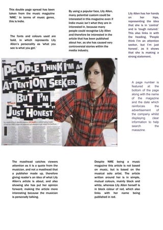
  • 1. This double page spread has been taken from the music magazine ‘NME.’ In terms of music genre, this is Indie.Lily Allen has her hands on her hips, representing the idea that she is in ‘control’ and is ‘tough natured.’ This also links in with the heading, 'People think I’m an attention seeker, but I’m just honest', as it shows that she is making a strong statement.By using a popular face, Lily Allen, many potential custom could be interested in this magazine even if Indie music isn’t what they are in interested in, because many people could recognise Lily Allen and therefore be interested in the article that has been published about her, as she has caused very controversial stories within the media industry. jjjjjjjjjghhjhujhhj<br />Despite NME being a music magazine this article is not based on music, but is based on the musical solo artist. The article written around her is in simple, mutual colours, mainly black and white, whereas Lily Allen herself is in block colour of red, which also links with her name being published in red. The masthead catches viewers attention as it is a quote from the musician, and not a masthead that a publisher made up, therefore giving reader’s an idea of what Lily Allen’s article is about, and also showing she has put her opinion forward, making the article more interesting because the musician is personally talking. -8572501134110A page number is featured at the bottom of the page along with the name of the magazine and the date which reinforces the advertisement of the company whilst displaying clear information to help search the magazine.The fonts and colours used are bold, in which represents Lily Allen’s personality as ‘what you see is what you get.’ <br />6451601323975This double page spread featured in Q magazine.This music magazine is all about Shakira’s most recent album and how it was recorded and produced.The headline, “Danger! Shakira At Work” also implies to the reader that the article is based on Shakira and the work she has produced. The headline is humorous as it is joking about Shakira being a hazard whilst at work, in which is a good factor to include in a magazine as the audience could feel they will enjoy this article. The headline itself overlays the main picture and is in bright white, contrasting greatly with the dark, saturated colours in the picture, making it easily visible and the first thing the reader will look to read.One of the first thing to catch the reader’s attention is the long shot of Shakira putting her feet up as she represents working in a studio, in which could relate to a woman’s everyday life as a ‘typical working woman.’ This gives the impression that this is what the article will be based on. The other picture on the page is a profile medium close up shot of Shakira in a photo shoot. Her pose is unnatural, in which she is clearly posing for the camera for her article, looking like a celebrity, ‘glamorous.’ Her facial expression portrays her seeming quite vulnerable yet also a conflict as some could think this is sexy due, to her lack of clothing and the pose she is in, concealing parts of herself with her arms from the camera.  This contrasts to the more natural, laid back and everyday typical Shakira in the main picture. This particular article would be aimed towards women rather than men, due to Shakira being portrayed as an admirable powerful woman and the second picture, a role model for women and how you could look.<br />The text placed on the top left entitling ‘Mr Freeze’ in a bold font, with brief information positioned directly underneath, in which summarises what the article produced covers, therefore informing the reader what future readings will bring them to, giving them the opportunity to decide whether they would like to carry on or not, depending on if they have any interest in the article. Towards the right, is the interview in which Jay Sean has particular say in, not a general typical made up article in a lot of existing magazines.The photograph taken is a Medium Close Up of Jay Sean, enhancing his body position, giving the reader the ability to understand his ‘attitude’ by this, and also his facial expression. In terms of colour, bold and bland colours have been used, therefore keeping the article ‘simple’ and straight forward, keeping the reader’s attention without any distractions. The denotation of this music magazine is Jay Sean, a very recognisable and popular English song writer and solo artist.933450160972600In terms of lighting, the lighting enhances this double page spread as it’s placed with a white background and tends to look quite neutral. High-key lighting is used as it’s bright and free from any dark shadows. The dark clothing Jay Sean is wearing also enhances the light background, making himself and the article stand out more as there’s no distractions. The connotations that come to mind whilst reviewing this double page spread is money, wealth, popularity, respectability and style. The costume Jay Sean appears to be wearing reflects the whole article produced about him as it is perceived as, ‘cool’ and ‘urban’ in which this article is. He looks trendy but still respectable. The colour also relates to the article as it is still black and white, basic everyday colours. In terms of the font used throughout this double page spread, sans serif fonts are used. Sans serif fonts have no flick ups and generally connote a font which is more modern, therefore not hard to understand and very readable to the viewers of this magazine.<br />The colour scheme used is basic colours, such as black and white, in which at this moment in time is becoming more conventional. The ‘L’ published over the writing article in red, clearly stands out representing ‘Lady’ just like Lady Gaga herself does, as she is an individual. She is naked in which much of her flesh is clearly exposed, with her hands and a metal chain necklace covering the more revealing areas, in which she is posing for, therefore is not a natural pose. The artist naked is both for controversy, which gains both the artist and the magazine an audience, and for sexual image and attraction. Her hair is styled to be wild, eccentric and untamed, this represents the artist to have a wild, crazy and eccentric personality that cannot be tamed.It has a simple design, easy for the reader to understand and interpret, with one page dedicated to an image and the other to the article. The article is on one of the most controversial music stars in today’s society - Lady Gaga. The image on the left page is a mid-shot of Lady Gaga, with her upper torso and head visible, therefore giving a certain impression and attitude to the reader.254079946500This double page spread is from the music magazine quot; Qquot; (April 2010) The image itself has been edited in post-production into black and white, to create mood and a dramatic effect, and to give her the look of an old film star - commenting that she is already a massive star and will survive the test of time in her career.<br />The title of this article, ‘You’ve got the love’ is very ironic but also very clever. This is due to the fact that ‘you’ve got the love’ is one of Florence’s songs, therefore the whole article linking together as it has that in depth link with her music. It is in a fancy italic font therefore catching the reader’s attention, making the article look stylish and interesting. This is an example of a double-page spread from NME music magazine featuring the solo artist Florence from 'Florence and the Machines'.<br />The font for the text is a small sized font. This allows the article to fit onto the page. It is also black, which makes it look professional as it stands out against the white/grey background. Simple colours are used, with the addition of red, standing out more. Also, the font is very clear. This makes it readable. It also makes the double-page spread look professional as it is very understandable and presented well. The photograph is situated on the left hand side of the page. It is a big image that takes up half the page of the double-page spread, which means it is A4 sized. This makes the page look full. The photo is appealing to all as Florence is facing the audience. It also prevents it from looking too busy with too much writing. The effect this has is that it draws the reader in, especially fans of Florence, because of the big clear image. Audience will be interested as there is a reasonable amount of text and a decent sized photograph. The photograph taken is a Medium Close Up of Jay Sean, enhancing his body position, giving the reader the ability to understand his ‘attitude’ by this, and also his facial expression. It has a very simple layout. The image is on the left-hand side of the page, with the text on the right. The reader will easily be able to understand and interpret what the article is about as the photograph represents this. -89902219458600<br />The colours used are veru block colours, such as black and white. There is no other colours used, in which could put off a lot of readers straight away as it doesn’t give off a good attitude, but does give off a bad attitude. One of the first things noticed about this double page spread, is that it is very different and also unconventional. This is because usually, photographs are placed on one side, mainly the left side, and then the writing is situated on the other half of the double page, but in this case the photographs are placed on different sides. <br />The photograph is a medium close up, which enables us to understand the attitude of the body. He is also looking forward, giving the reader the ‘mood’ of the article straight away. This is a dark article, therefore could represent the mood of the article, the situation, or even his personal opinion. Darkness represents punkish music, and heavy metal. The text slightly goes over the picture, giving the sense he is in the background, and therefore less prominent in the cover.The writing is situated around the photographs, in which seems to be a lot. This is quite unconventional as usually one page is dedicated to the photo, and the other to the writing, but in this case there is more than one page used for writing, -874644170436800<br />293867-42114300<br />The style of the text is clearly laid out in which keeps the page looking respectable and easy to interpret. The structure is well ordered too. The photograph is positioned next to the article, therefore not interrupting the text and distracting the reader, The headline featured is conventional as it is very big and bold, in which is a question, a very clever factor in which interests and involves the reader straight away. This stands out against the white background. The same fonts are used for the subheadings and quote. This keeps is understandable and sophisticated, so there is not too many fonts making it confusing. The general layout for this double-page spread is the one main image of the artist of this feature, standing against a white background with the columns of text to the left side of the page. She takes up most of the space on the second page making it obvious to the reader that she is the topic of this story and is important, therefore representing this particular article. There are 3 columns of text, in which have been broken up by a quote linking to the article, in which lies in the centre of the column. This makes it visually more interesting. The general colour scheme is black and white, quite typical colours used. There are some usage of blue in which shows connection between the artist and the article. <br /> At the top of the left hand side page is a by – line which tells us who the article is written by and the photographer. This is shown in black, and against the dark red background it does not stand out as much, this shows that this information is not as important as other information shown in a brighter colour. Underneath the main text but on top of the headline is a kicker which gives a slight description of the artist on a positive note in order to make the reader fond of her and want to read what is written about her. This is written in white in order to create consistency on the page. This double page spread is from the music magazine “Ebony.”The background colours used make the photograph of the artist and the text stand out more. This is a very beautiful cover which will not confuse the reader as it is stylish but complex. The main image is of the R’n’B artist; ‘Alicia Keys’. This relates to the genre of the music the magazine promotes. Alicia Keys is represented as elegant and beautiful. The mis–en–scene shows a piece of material on the sides of the artists which she is holding. The photograph is a medium close up shot, in which shows Alicia keys wearing a dress, which is represented as quite feminine and also her makeup which is simple yet effective. The photograph is stylish and iconic. The main colour scheme to this music magazine varies, and is unconventional as it isn’t plain with simple colours! This does consist of interesting maroon, red, orange and white. 576892161411500<br />The colour scheme is quite simple; black white and gold. The use of the gold makes the page look stylish, and it adds glamour, as it is an ‘individual and rich’ colour. It also gives an effective metallic look. Black and white are very plain, simple colours, whereas gold is a very vibrant, stylish colour. The gold adds to the plain colours which makes it look 'eye-catching'. Gold also represents wealth and individuality, therefore adding this effect to the article produced, in which brings attraction and a unique point towards the double page spread. The sub-heading is situated half way down the left hand side of the page, in which is quite unconventional as it is also over the image. As it is below, this ensures us that as an audience are able to see the artists fully as the writing is placed down below. The font used gives off the ‘electrical’ feel. The positioning of this article makes it less complicated, but professional as it stops the double page spread from looking overcrowded in which could put the potential target off. As there are 4 people within Black Eyed Peas, this explains the reason as to why the photograph takes up the room that it does on the magazine because of the positioning of it, and also the size. This is an example of a double page spread featuring a popular pop band, ‘Black Eyed Peas.’ I wanted to research for my preliminary task a pop band and I was considering featuring a band in my magazine, but did not know how they featured in magazines therefore needed to get more of an idea of how to do it with a professional and conventional style. Once again, the layout is very simple, with the photograph placed on the left hand side of the double page spread, and the article writing positioned on the right hand side. This makes it easy and understandable for all viewers. 1137037135967300<br />Wearing the red dress makes the artist stand out and become the main focus of the article, also with her name being the only other thing in the article. With lots of text this shows vibe aims to educate readers not only entertain them.The colours of the fonts used are very natural and mutual, therefore appealing to both males and females. -2381252009775Solange Knowles is wearing a short red dress with high heels. This image represents that body image is important within the R&B genre of music. Solange Knowles’ choice of clothing is the dominant photo in this double page spread as the bold block of red in her clothing stands out. Due to the colour scheme being quite bland, mainly sticking to black and white, the main photograph now stands out more, catching the reader’s eye. This double page spread is from the music magazine ‘Vibe.’ The photographs are surrounded by lots of text, in which in this case the photographs represent what the article is going to be based on. <br />