Absolute Beginner's Guide to Creating Your Sales Booklet
•
6 gefällt mir•4,403 views

This document provides guidance on creating a basic sales booklet. It recommends starting with a dummy layout and plan to determine page counts and elements. Key elements include a title page, product description, speaker bios, case studies, and a sales form. Design elements like fonts, images, and columns are discussed. A sample booklet is shown as a worked example. Finally, it covers printing considerations like file types and finding a compatible printer. The overall message is that a professional, tangible sales booklet can help pre-sell products and make offers feel real and compelling to prospects.

Empfohlen
Weitere ähnliche Inhalte
Was ist angesagt?
Was ist angesagt? (17)
Ähnlich wie Absolute Beginner's Guide to Creating Your Sales Booklet
Ähnlich wie Absolute Beginner's Guide to Creating Your Sales Booklet (20)
Mehr von Andrew Priestley
Mehr von Andrew Priestley (20)
Kürzlich hochgeladen
Kürzlich hochgeladen (20)
Absolute Beginner's Guide to Creating Your Sales Booklet
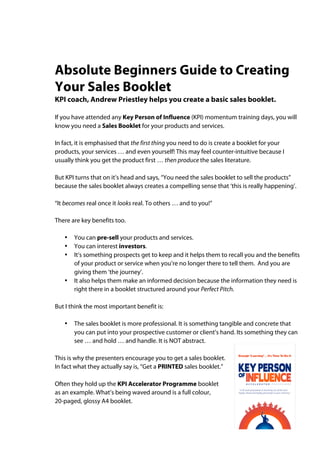
- 1. Absolute Beginners Guide to Creating Your Sales Booklet KPI coach, Andrew Priestley helps you create a basic sales booklet. If you have attended any Key Person of Influence (KPI) momentum training days, you will know you need a Sales Booklet for your products and services. In fact, it is emphasised that the first thing you need to do is create a booklet for your products, your services … and even yourself! This may feel counter-intuitive because I usually think you get the product first … then produce the sales literature. But KPI turns that on it’s head and says, “You need the sales booklet to sell the products” because the sales booklet always creates a compelling sense that ‘this is really happening’. “It becomes real once it looks real. To others … and to you!” There are key benefits too. • You can pre-sell your products and services. • You can interest investors. • It’s something prospects get to keep and it helps them to recall you and the benefits of your product or service when you’re no longer there to tell them. And you are giving them ‘the journey’. • It also helps them make an informed decision because the information they need is right there in a booklet structured around your Perfect Pitch. But I think the most important benefit is: • The sales booklet is more professional. It is something tangible and concrete that you can put into your prospective customer or client’s hand. Its something they can see … and hold … and handle. It is NOT abstract. This is why the presenters encourage you to get a sales booklet. In fact what they actually say is, “Get a PRINTED sales booklet.” Often they hold up the KPI Accelerator Programme booklet as an example. What’s being waved around is a full colour, 20-paged, glossy A4 booklet.
- 2. Now the first time I thought about the sales booklet idea I wondered: Could I do that? Could I produce a booklet like that? See, I’m not a graphic artist or a designer. I only have basic Word skills. I know how to upload my photos, download clip art and insert picture files into a Word document. And I can resize an image or crop it … basically. Nothing flash. But I can do the basics. So, I decided to write a Beginners Guide to Creating Your Sales Booklet. It’s in four parts. Part 1 unpacks the KPI sales booklet and reverse engineers the KPI sales booklet as a suggested template. And, that’s where we will start. Part 1. Set Up The Basic Concept Understand, that the KPI ‘product’ – conceptually - is already created. The KPI Accelerator Programme has five core components – Pitch, Publish, Product, Profile and Partnerships. So we know what the product is. And KPI has secured presenters and venues and subsequently created the price points for the programme. So we know who, when, where and how the programme will be delivered. But this demonstrates how they turned that information into a promotion piece. The Dummy – creating the basic look and layout Always start with a folded dummy. The dummy is usually a rough pen sketch of your ideas. Hand-drawn. Rough. Get several sheets of A3 paper, and fold them into an A4 booklet. One sheet of A3 folded in half gives you four A4 pages. Printers work in multiples of four pages (anything less than four pages is usually a single or double sided handbill). So your dummy booklet will have 4, 8, 12, 16, 20 … etc pages. Multiples of four. Next number the pages in the dummy. The Layout Plan A layout plan shows what will appear on each page. In this case, the KPI sales booklet is 20-pages for a specific reason. Your sales booklet may not need 20 pages. But the KPI booklet does.
- 3. Here’s why. • It needs a Title page. • It needs to describe the product or service. • It needs to introduce each speaker and give some background about each person, and what benefits they will deliver in the KPI programme. • It needs some case studies and testimonials. • It needs a perforated sales page (or pages). KPI has given each of these elements a double page spread so the layout plan looks like this. Specifically: • Title/front page (1 page) • KPI Framework (2 pages) • Speaker 1 (2 pages) • Speaker 2 (2 pages) • Speaker 3 (2 pages) • Speaker 4 (2 pages) • Speaker 5 (2 pages) • Case Studies (4 pages) • Notes (1 page) • Sales Form (2 pages) Total 20 pages NB: The sales page is usually on the back page and it is perforated (perfed) so it can be detached. This means the prospect can complete the paperwork … but keep the booklet. Activity: So at this point, go ahead and prepare a dummy; and a layout plan. See how you go. (If you don’t have A3 paper, use A4 sheets - but remember in multiples of 4.) Tip: I use a bulldog clip to start with. Then once I have worked out how many A4 sheets I’ll need, I staple them into a booklet.
- 4. Part 2: The Design Elements I went through the KPI booklet and asked WHAT is actually in the booklet from a design point of view? So obviously there are words and pictures, but there are more than just words and pictures. Have a look at a sample of these spreads – not the content but visually what’s ON the pages. The Title page has copy and a logo. The ‘What is a Key Person?’ page has copy and some clip art and a colour strip along the bottom of the page. The next page has copy and photos and a coloured call out box. The next page has copy, photos and features a logo. The next page has copy and features a cartoon. The last page is set out as a sales form. Fonts The booklet uses just two lettering styles or fonts – one for the headings and sub- headings (called sub-heads) and another for the text (copy) and captions. But that’s it. A big mistake you can make is using too many fonts. Font Sizes The booklet has a uniform usage of font sizes throughout the booklet. Headings are the same size (36pt). Sub-heads are another size (24 pt) – same font just smaller. The copy is a uniform size (14pt). This makes the booklet nicer to look at, easy to read and it looks and feels professional. (NB. The font sizes I’ve just cited are examples only).
- 5. Number of Columns The KPI booklet is set out in just one column throughout, but I’ve included an example of a 3-column layout that has a lot more copy. The advantage of columns is it makes something easier to read i.e., newspaper, and magazines – especially if you have to read a lot of copy. In both examples, swathes of copy is broken up by well thought out subheads and images. Creating columns I’m going to assume you are going to create your booklet in Word like me. Creating columns in Word is simple a matter of clicking on the Columns icon in the task bar. It brings up an icon showing the number of columns. You drag your cursor across the column icon and highlight the number of columns you want. In the example, I’ve highlighted two columns. Word then creates two columns. NB: There are a lot of tutorials on YouTube that deal specifically with working with columns in Word because while it’s easy to create columns Word can be clunky once you start inserting pictures. For example, in the three column example above its actually made up of one column for the heading … then insert a space … then insert three columns for the text. Its easy once you get the hang of it, but it takes practice. I am also NOT going to explain how to insert, crop or text wrap pictures. Go to YouTube or Microsoft’s website for the excellent tutorials on placing images into a document. This is just the basics.
- 6. Pit Stop: Be Organised! I should have said this earlier – but be organised on your computer. Folders Here’s a screen shot of my computer. Starting on the left hand side, it goes Desktop > KPI Booklet folder > KPI People Small.jpg > image of selected file. Everything I needed for this document is in the KPI Booklet folder ready to use … BEFORE I started writing the document. Image Library You can see I have all the images I need for this tutorial already scanned as JPEGS in a folder ready to use. I work with JPEGS. I’ve also downloaded some copyright-free clip art from the Microsoft support site that I am able to use at no cost in my marketing. I have not infringed any copyright by using fee-based images i.e., Getty or Google Images. I also had to reduce the kb size of some of the images, too. Why? Because otherwise the file becomes too big, especially if I want to email it later as a PDF e-booklet. NB: Once again, I won’t give you a tutorial on sizing images. Go to YouTube to learn how to scan and manage the image size of your pictures. But let’s agree that I’m organised and I’ve collated all the images I need and they are ready to insert in my document.
- 7. Very Important Tip: The Offer/s It goes without saying that the point of the sales booklet … is to sell something. So you need to know what your offer is. In the example, the booklet is selling the benefits of the KPI programme throughout the entire booklet. But in the KPI sales booklet the specific purchase offer and price point details are on the perforated sales pages. It might sound obvious by why have a sales page? Let’s say your prospect says, “Yes”. You have everything you need to do the business then and there. The Copy Guess what happened on 4 July 1983? It is a crossroads event in history. Apple released the Apple Mac in tandem with PageMaker software. In one single stroke they started the desktop publishing revolution (DTP) and almost killed the art of copy WRITING. Prior to this date you had to get the message right … first … and only THEN laid it out. You had to get the message right because your copy had to be typeset … then bromided into galleys … then cut … then pasted into lay-up pages … then plates were made … then … But desktop publishing eliminated this entire typesetting/paste up process. Now you could fit your copy into nice layouts instantly. Design was made very easy and efficient. But we discovered that you still have to write good copy … first. How do we know? Because the science of measuring what people read, read most and associate has NOT changed in over 120 years despite the changes in technology. The message still has to work no matter how pretty it looks. In the KPI example, the copy works because the author, Daniel, writes good copy … first. Here are two of his tricks that make his copy conversational and compelling. Trick 1: Sound proof it Here’s a great writing tip from the good old days of advertising. Once you’ve finished writing the copy record it and then listen back to it. If it doesn’t sound right to you … it isn’t right yet. Your two ears are the best BS detectors invented. Read it aloud, record it, or have someone read it back to you. You’ll hear what doesn’t sound right and needs reworking. Trick 2: Have someone else edit it And edit thoroughly. If you can afford a journalist or professional writer, get them to edit it. They will pick up typos, grammatical errors and most importantly, over writing. They will trim the copy and make it sizzle. You do this step in the Publish part of the KPI programme. Of course, you would be following the Perfect Pitch structure, wouldn’t you?
- 8. Part 3 A Worked Example OK, I’m going to be very cheeky and use my sales booklet as a simple illustration. (To balance that up the print is small and almost illegible and if you try reading this you will probably go blind!) NB: I’ve featured six pages here but it is an 8-paged sales booklet. Title Moving left to right, you can see a Title page. The name of the product is plain enough. I’ve incorporated a piece of clip art, i.e., a globe. And the front page features the special offer. I’ve only used two fonts. And I’ve broken up my copy with sub-heads. It probably needs some images to help break up the text. Product spread I’ve mirrored the KPI booklet and started off with a 2 page spread on the product – what it is and why it works etc. The only difference is I’ve used two columns instead of one. Bare in mind, this is a first attempt. Presenter spread I’ve maintained the two-column format. Again I’ve copied the KPI booklet format by spending a little time establishing the credibility of the presenters. And I’ve introduced headshots. Notice that headshots look directly at the reader. Here’s a tip about headshots.
- 9. What’s wrong with this picture? The copy reads OK. It offers many benefits … but where am I looking? Correct. NOT at what I’m offering. The message being conveyed is: I’m not interested in what I do … and neither should you. This mistake is so commonplace it’s not funny! One poorly placed picture can undo all your effort. See the difference? At least I am now looking at what I am promoting. So, make sure your headshot – at least - look at what you are selling. But have I connected with the reader, at all? I can connect with the reader simply by facing the reader and making eye contact. This face on shot dramatically increases the impact of the piece. Now I am interested in what YOU think and I’m at last connecting with you. Does it make sense? That’s why, headshots come in three kinds – looking left (left facing), looking right (right facing) and looking directly on (face on). In your Press Kit you would supply all three or at least offer these three options. Why? Because given a choice, a graphic artist will always try and position your headshot either looking at your product or the reader. Tip: in the examples above I simply flipped the picture. But if I were standing in front of a sign, the writing would also be reversed telling you the picture has been flipped. The Product Kit spread I’m selling a home study, self-paced, business turnaround program and so I want to show what’s included in the kit. I’ve used screen shots taken off my computer. (Again, go to YouTube for how to take a screen shot – it is different for Mac and PC but screen shots are fabulous).
- 10. Once again, the two column format is maintained; and I’ve stuck with two fonts – one for my headings and sub-headings (Caslon 24pt bold); and one for the body copy (Goudy 12 pt). (Again, this is an example and NOT a font recommendation. However, please note I have NOT used quirky fonts because this product is for business people). Sales Page You’ll also notice a picture of the entire kit on the Sales page. This was actually created in Photoshop by a friend and supplied to me as a JPEG. I believe it’s easy enough to do, but I still had to phone a friend to make that happen. Overall I did the whole booklet in Word. Nothing fancy. It is a very simple two-column layout using a small amount of pictures. It took me about four hours to get it to the finished proof stage. Oh yes … Proof Read > Prof Read > Poof Read! Guess what? In preparing this tutorial I only just picked up that my booklet does NOT have the correct phone number! I cannot emphasise enough – prof read everything. Proof read for typos and grammatical errors. Spell check will NOT pock up everything. Especially check phone numbers, email addresses, the correct spelling of people’s names, titles, mandatory numbers (i.e., licenses, VAT), dates, prices, physical addresses. And so on. I have seen very expensive booklets go to print … with the wrong price. They reversed two numbers from £3172 to £1372 and undersold the product by £2000. So proof, proof, proof. We’re almost done. So now … Part 4 Let’s print it! Finding a printer Can I suggest you shop around? But you do NOT want the cheapest printer even though we recommend that you are cost sensitive. The most important thing is that your printer can handle your working file. If you created your booklet in Word on a PC … you want a printer with a PC who can handle Word files. If you created the file on a Mac, you need a printer who can handle Mac files. (I recently, spoke to a VERY CHEAP printer … who said he needed to convert my Word file into a Corel Draw file before he could print it! This is an accident waiting to happen.)
- 11. In any case ask the printer what computers they use (platform) … and software … and then how they want the file supplied. PDF files You can get around the platform issue by saving your file as a PDF document. But … … despite being the 21st Century some printers still want the PDF … and all the source files. That means the original Word file … and the JPEGs …and the fonts. If this is the case, you’ll need to parcel all those files onto a USB memory stick or burn to a CD. Fortunately, most printers can handle PDF files. But ask, “What do you need, exactly?” Printing vs. Photocopying There is a difference. In most cases today, your booklet will be photocopied on a commercial photocopier. It is faster and cheaper this way. And the quality no longer suffers. It is still printed but not on a traditional printing machine. Just thought you should know. Flat size and Finished Size Traditional printers will ask, “What’s the flat size?” If you are doing an A4 booklet the flat size is going to be an A3 spread (420 x 297mm). The finished size is what you want to end up with when its finished. In any case, I recommend that you take in your dummy and show them what you want to finish up with and in this tutorial we are aiming to finish up with an A4 booklet. What is A4? A4 is a universal standard sized piece of paper that measures 210 x 297mm. A4 was invented by an Australian. (Not really). OK … now here’s the tricky bit. Bleed vs. No Bleed Look at the very bottom of this sample page from the KPI document. You’ll see a colour box that goes right to bottom edges of the page. This is what we call a bleed or a bleed off. Full bleed means it bleeds off all four sides. (The page in the example actually bleeds off the two sides as well). The only way to do a bleed off is to print on an oversized sheet of paper, and then trim the paper back to the finished A4 size. For example, and A4OS sheet is 12mm bigger all round than a standard A4.
- 12. You can do a bleed off but it adds cost to the job because you use more paper and there is a finishing charge to trim the paper back to a standard A4 finish. And … the working file must be set up so that the printer CAN do a bleed off. If you want a bleed off you need to talk to your printer BEFORE you start any design work. They will tell you how they want the page sizes set up. Or even supply you with you a template file. You’ll notice on my booklet that there are no bleed offs. This means I can work with a standard Word file and keep my costs down. Given my skill level, its less fiddly. Pre-Press Pre-press simply means everything mentioned above. Deciding the finished size … bleed or no bleed … supplying the artwork in a file that is compatible with the printer’s platform and software etc. It also means that you printed out a finished copy of your brochure at home, collated it and stapled it into a finished art mock up brochure and carefully proofed it. I strongly recommend you give the finished art mock up to the printer so they can SEE exactly what you want. First Test Proof If you can be there, ask for one copy to be printed as a test proof. The reason you do this is because sometimes the file you supplied can corrupt on the printer’s computer and revert back to a previous saved version. It is rare but it can happen. So if you can, check the test against your mock up especially if you are printing more than 50 copies. Get ‘em going! Get it into the hands of your prospects. I know a guy with 1000 sales booklets neatly stored under his staircase. If you have any questions email us at info@triumphantevents.co.uk