
Empfohlen
Empfohlen
Weitere ähnliche Inhalte
Ähnlich wie Stephanie Presentation 2
Ähnlich wie Stephanie Presentation 2 (20)
Stephanie Presentation 2
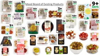
- 1. Mood Board of Existing Products
- 2. S • Great quality food (1) • Combinations which make consumers find food easy to put together (2) • Picnic range- ready to eat, buckets reduce waste, easy to identify range (1) • Consistency with packaging makes the range easy to identify (1) • Mature style makes the prime focus the food and not the packaging (3) • Quality for money (1) • Huge range of food, customer is not limited (1) W • Colours are very bland (1) • The packaging does not highlight the quality of the food nor does it draw attention to it (1) • May look slightly childish which does not match the target audience (1) • Writing doesn’t suit the target market and may not be considered ‘mature’ (2) • Quality of packaging doesn’t reflect the quality of the food (1) O • Consistent symbol clearly representing the range and making it easy to identify (1) • Stemming out to more than just an antipasti range but including food for occasions e.g BBQ (3) • Contrasting colour of packaging to food makes it more bold (1) • Making the country in which the food is from clearer to assist customers with foreign dining (2) • 3 part platter sets (2) • More inviting writing which emphasises the natural elements of the product (2) • More ready to eat food to broaden the target market to working people (1) • Colours allocated to represent the hotness of the food (3) • More vegetable based and colourful food (2) T • Many existing ‘to go’ and ‘table ready’ ranges (1) • Other retailers adapting to this idea and making it available to a larger range (2) • Introduction of different foods could increase cost of producing food (1) (1)= most important (3)= least important
- 3. Picture Ingredients and quantities (grams) Strengths Weaknesses Improvements 1 • Peppers= 83 • Feta= 35 • Easy to pick from • Colourful • Can be table ready for parties • Feta to pepper ratio might not be enough • Slightly bland • Add seasoning to improve flavour • Add more feta 2 • Black olives= 80 • Green olives= 110 • Feta= 76 • Focaccia fingers= 30 • Plain bruschetta= 30 • Table ready • Wide selection • Lacks a dip • No seasoning • Improve the olives • Add a hummus dip in replacement of the feta? 3 • Olives= 70 • Chorizo=30 • Feta= 15 • Colourful • Food compliments each other • Lack of seasoning makes it look bland • Add parsley and oil to the olives to enhance their appearance 4 • Feta= 20 • Pepper Sauce= 75 • Bruschetta(plain)= 12 • Tastes good together • Has the ability to be shared • Pot it is in isn’t convenient • Too much sauce is left over at the end • Change the pot • Change the cheese • Improve the sauce as it was runny Development Submission One
- 4. 5 • Green olives=46 • Feta= 36 • Colourfully displayed • Food compliments each other • Three parts to packaging could be allocated to three different foods • Too many olives • Unseasoned • Season the olives and feta • Add more variation or maybe introduce another food 6 • 1 feta cube for 4 olives • Good combination • Colourful and appealing • Already exists • Looks messy • Not enough variation • Find a consistent method to make the product look neater • Season the olives 7 • Peppers= 180 • Feta= 80 • Colourfully displayed • Only a two person serving • Feta to pepper ratio not equal • May be hard to pick up the pepper • Use already chopped up peppers instead to make it easier for the customer to eat it 8 • 1 chorizo bite for 2 olives • 1 feta cube for 4 olives • Good variation • Creative • Not practical and would be hard to carry out in the factory • Use already cut chorizo
- 5. Platter Evaluation STRENGTHS ------------------ WEAKNESSES More informally placed, no need for organising the bruschetta Looks full Enough space to put enough food Reflection After evaluating both platter pots, I found the second is more suitable for the product and is therefore the one I am going to take forward. The dip and the feta may get slightly messy at the pots are not that deep Each element of the pot is in rough proportion of the pot Not much sweet pepper sauce is wasted at the end Looks generous in terms of serving The use of toothpicks allows the customer to eat remaining feta and keep their hands clean The ratio of bruschetta to feta is much more equal The bruschetta has to be stacked up by hand Can be table ready Each compart ment is very close to each other and there may be spillage No toothpicks therefore customers hands might get dirty The pot is easy to stack and doesn’t take up much space After use, there was too much sauce in proportion to everything else therefore it would just get wasted Organised in compartments Organised in compartments Interesting shape fits only 9 bruschetta therefore may only be fit for a 2 person serving, unless used for party food
- 6. Development of ‘Development submission one- food 4’ Picture Ingredients and quantities (grams) Strengths Weaknesses Improvements 1 • Bruschetta(plain)= 18 • Pepper sauce= 36 • Feta= 39 • The plain bruschetta didn’t distract the taste from the pepper sauce and feta • Pepper sauce was too runny and it was hard to pick it up with the bruschetta • Either add starch of don’t blend the peppers so much so that its easier to scoop up 2 • Bruschetta(sundried tomato)= 17 • Pepper sauce= 36 • Feta= 39 • The feta and the sun dried tomato bruschetta complimented each other • “ • Feta is much more crumbly and may be harder to pick up (toothpicks?) • “ 3 • Bruschetta(plain)= 18 • Pepper sauce=36 • Halloumi= 33 • Halloumi gave it more of a salty taste • “ • Colour of the plain bruschetta doesn’t add colour as the halloumi is also white • “ 4 • Bruschetta(sundried tomato)=17 • Pepper sauce= 36 • Halloumi= 33 • The halloumi compliments the sun dried tomato bruschetta • “ • Can be criticized that the sundried tomato bruschetta distracts the taste from the halloumi • “
- 7. Final Food Product I decided to take this product forward as out of the four combinations, it was the one that was not only the best tasting, but the one which could possibly fill a market gap. By introducing halloumi being eaten raw, it then widens the market for other halloumi products and gets customers out of the habit that it should be eaten grilled. Furthermore, the sweet dip contrasts with the saltiness of the halloumi and finally the sundried tomato bruschetta embellishes the taste and adds a hint of taste. Overall the combination of these three foods can be perceived as exotic and can be a great new addition to the existing range.
- 8. Packaging Green tries to show the quality of a product, how good it is for us or for our environment. It also signalizes that the product is healthier, has less fat and maybe fewer calories. Red, on the other hand is an aggressive colour that is often used for packaging food. Red wants to us to become hungry or thirsty. Purple is colour that is very rare. It indicates that it is something special. Producers use purple to show that something is of good quality. Blue is not very often found in food packaging because there are not very many foods that have a blue colour. Consumer Reports did a study that put packaging of different colours in front of buyers and asked them to point out which products caught their eyes first and what they thought of those products. They even asked marketing and product design experts, and there's a lot of science behind the way the boxes look on the shelf. Clearly you should always buy with budget, quality, and health in mind, but knowing how the marketing plays tricks on your brain can help you make the right choices. Reflection After doing some research into colours and how they affect the perception of food, I have decided to use the colour pink for the packaging as it reflects the sweet nature of the dip and is also very summery, therefore blending in with the summer theme of the platter range. Colour Research
- 9. Net Development To prevent customers from moving the packaging and ruining it and for extra support Flaps get stick behind and are hidden Sufficient space for nutrition information Space for name and brand might be limited so it will have to be kept short and o the point Space is wasted when it is cut out however shape may be able to tessellate to avoid waste
- 10. The colour of the rim would be changed to a pink colour to make it relevant to the sweetness of the pepper dip The Bruschetta should be outlined in black in order for it to be more visible Improvements/ additions to existing packaging Continue to include it into the al fresco deal but also have it elsewhere as it would normally be purchased alongside the other products in its range. Also the symbol of the sun makes it easy to identify which range it is from. The background should remain the same as the colours are distinctive and clearly show they are part of the same range. An indication that the product is new should be included so it can appeal more to customers Change the colour of the writing as it is not very visible in white Nutritional information should remain in the same place as it can be easily read and is an important part of the packaging.
- 11. Final Packaging Design The bright colours in the packaging draw attention to the product and give the customer a clear indication of what type of product to expect. Furthermore, the slight alterations made allow the packaging to be more visible and easier to read. The ‘new’ indicates that this is an add on to an existing range and may also encourage the customer to buy others from the range. Overall, the font is large and easy to read and the eye catching colours make it a product that will not only sell as a result of the quality of food but also on accord of the creativity of the design.
- 12. Final Product