How to Troubleshoot Apps for the Modern Connected Worker
Billboardcontents 120115130549-phpapp02
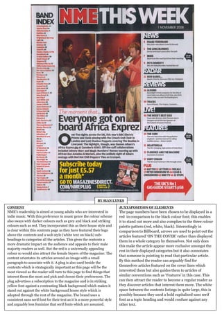
1. BY SIAN LYNES
CONTENT JUXTAPOSITION OF ELEMENTS
NME’s readership is aimed at young adults who are interested in The page numbers have been chosen to be displayed in a
indie music. With this preference in music genre the colour scheme red in comparison to the black colour font; this enables
also sways with darker colours such as grey and black and striking it to stand out more and also complies to the three colour
colours such as red. They incorporated this as their house style and palette pattern (red, white, black). Interestingly in
is clear within this contents page as they have featured their logo comparison to Billboard, arrows are used to point out the
above the contents and a wob style (white text on black) sub- articles featured ‘ON THE COVER’ rather than displayed
headings to categorise all the articles. This gives the contents a them in a whole category by themselves. Not only does
more dramatic impact on the audience and appeals to their male
this make the article appear more exclusive amongst the
majority readers as well. But the red is a universally appealing
rest in their displayed categories but it also connotates
colour so would also attract the female buyers of the magazine. The
that someone is pointing to read that particular article.
content orientates its articles around an image with a small
By this method the reader can arguably find for
paragraph to associate with it. A plug is also used beside the
contents which is strategically important as this page will be the
themselves articles featured on the cover lines which
most viewed as the reader will turn to this page to find things that interested them but also guides them to articles of
interest them the most and pick and choose their preferences. The similar conventions such as ‘Features’ in this case. This
plug advertises a subscription to the magazine and is in striking can then attract the reader to become a regular reader as
yellow font against a contrasting black background which makes it they discover articles that interest them more. The white
stand out against the white background house style which is space between the contents listings in quite large, this is
adopted through the rest of the magazine. The brand uses a possibly because they used a bold capitalised sans serif
consistent sans serif font for their text as it is a more powerful style font as a topic heading and would confuse against any
and arguably less feminine that serif fonts which are assumed. other text.