
Empfohlen
Empfohlen
Weitere ähnliche Inhalte
Was ist angesagt?
Was ist angesagt? (20)
Andere mochten auch
Andere mochten auch (12)
Ähnlich wie Empire Magazine Analysis
Ähnlich wie Empire Magazine Analysis (20)
Mehr von Seeg_100
Kürzlich hochgeladen
Kürzlich hochgeladen (20)
Empire Magazine Analysis
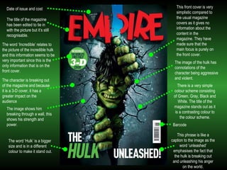
- 1. This front cover is very simplistic compared to the usual magazine covers as it gives no information about the content in the magazine. They have made sure that the main focus is purely on the front cover. Barcode The character is breaking out of the magazine and because it is a 3-D cover, it has a greater impact on the audience Date of issue and cost The title of the magazine has been edited to tie in with the picture but it’s still recognisable. The word ‘Incredible’ relates to the picture of the incredible hulk and this information seems to be very important since this is the only information that is on the front cover. The image of the hulk has connotations of the character being aggressive and violent. The image shows him breaking through a wall, this shows his strength and power. There is a very simple colour scheme consisting of Green, Gray, Black and White. The title of the magazine stands out as it is a contrasting colour to the colour scheme. The word ‘Hulk’ is a bigger size and is in a different colour to make it stand out. This phrase is like a caption to the image as the word ‘unleashed’ emphasises the fact that the hulk is breaking out and unleashing his anger on the world.
- 2. Special edition, encouraging people to buy it twice for the different covers. Trying to boost magazine sales. Electric blue outlining the title of the magazine makes it stand out and striking. Another way to entice the audience. The colour scheme is very dark and dramatic with only 3 primary colours. The blue creates a hostile and cold feeling to the character on the cover. Value for money! Making the reader think they are going to get exclusive information on the film His facial expression adds tension and drama to the cover. Only his face is on the cover showing importance and dominance that he has. He is also an iconic character and is renowned for his mask. It’s worded so it sounds like a massive battle between two characters. Tag line to keep the audience intrigued. Contents of other grabbing stories which are included in the magazine. It looks as though the character is hiding since he blends into the background of the magazine and all you can see is his eyes and mouth that make him distinguishable.
- 3. Different covers to collect, making readers buy more magazines. Making the magazine covers more important than the actual magazine content. Subject’s face is covering the title of the magazine to make the cover look more 3-D and shows that this magazine is recognisable even without the full title visible. Quote from the movie, helps audience to remember the film. Doesn’t include what’s inside the magazine like it usually does meaning that the subject on the magazine cover is the most important. The ‘500’ is emphasised to show importance to the phrase. It also links this phrase to the picture since the film isn’t new. Black, white and red are main colour scheme. Name of film is in a different colour to most of the writing which makes it stand out. It is also in block capital letters and has a solid block of colour next to it which draws your attention to it. This cover is simplistic and minimal yet it looks effective and eye catching.