1. Reviewing Existing Products
Student Name: Sam Lount
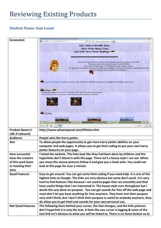
Screenshot
Product Name (+
URL if relevant)
http://www.wheezieprod.com/HPskins.htm
Audience People who like harry potter.
Aim To allow people the opportunity to get more harry potter abilities on your
computer and web pages. It allows you to get html coding to put your own harry
potter features on your page.
How successful
have the creators
of this work been
in meeting their
aims
I hated the website. The links look like they had been done by children and the
hyperlinks don’t blend in with the page. There isn’t a house style I can see. When
you move the mouse pictures follow it and give you a head ache. You could not
look at this page for over a minute.
Good Features Easy to get around. You can get some html coding if you need help. It is one of the
highest links on Google. The links are very obvious but some don’t work. It is very
hard to find feature I like because I am used to pages that run smoothly and that
have useful things that I am interested in. The house style runs throughout but I
doubt this was done on purpose. You can get sounds for free off the web page and
most don’t let you have anything for free anymore. They have met their purpose
very well I think, but I don’t think their purpose is useful to anybody anymore, they
do allow you to get html and sounds for your own personal use.
Not Good Features The following faces behind your cursor, the text changes, and the links pictures
don’t hyperlink it is only the text, It feels like you cursor is lagging & some of the
text link isn’t obvious to what you will be linked to. There is no home button so to
2. get back you have to the home page using the arrows. The website makes no sense
of its purpose and I couldn’t understand why the website was even published. It is
from 2001 so therefore the website has no new data and has not been updated in
quite a while. The website has no new pictures or links so the website has been
outdated but it still is at the top this makes people click it and then go off the page
should have been deleted. The pictures are only from the first harry potter and
people aren’t interested in that anymore. Technology has moved on from this
website and I think that the page should be taken down I don’t understand some
of the features because they don’t have any purpose.
Possible
Improvements
Take off the following cursor. Make it fit with the house style. Make it more
modern. The picture qualities aren’t good. Make the aim of the website clearer I
was on the website and I didn’t really understand the point of it at all.
Possible elements
for use
It allows you to get the html for a trailing cursor but personally I would not use it. I
could bullet point my web page to get ideas across more easily.
Elements to avoid All of it, the whole website gives you a head ache. The aim of the website really
doesn’t help anybody. I would like my web page to be modern and not outdated
meaning that I would like the page to have a plain style with a bit of edge and I
think that my page should meet the purpose; this one doesn’t.