Josephine printmaking powerpoint
•Als PPTX, PDF herunterladen•
1 gefällt mir•1,145 views

This document discusses how artists use elements of design in printmaking to convey messages in their work. It outlines the key elements of line, shape, form, space, and color. It provides examples of how artists like Ernst Ludwig Kirchner, Felix Edouard Vallotton, Ernst Haeckel, Francisco Goya, and Henri de Toulouse-lautrec employ these elements in their prints. The document also contrasts digital and traditional printmaking methods and their advantages and disadvantages.

Empfohlen
Weitere ähnliche Inhalte
Was ist angesagt?
Was ist angesagt? (20)
Ähnlich wie Josephine printmaking powerpoint
Ähnlich wie Josephine printmaking powerpoint (20)
Mehr von Rebecca Jardin
Mehr von Rebecca Jardin (20)
Josephine printmaking powerpoint
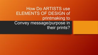
- 1. How Do ARTISTS use ELEMENTS OF DESIGN of printmaking to Convey message/purpose in their prints?
- 2. ORDER OF PRESENTATION • Artists • The elements of designs • The purpose/message in the work • Contemporary practices • Difference between Digital and Traditional printmaking
- 3. ARTISTS: Ernst Ludwig Kirchner Felix Edouard Vallotton Ernst Haeckel Francisco Goya Henri De Toulouse-lautrec
- 4. The Elements of Design of Printmaking LINE COLOR SHAPE FORM SPACE TEXTURE
- 5. Now, how are the elements used? LINE Most common and basic element Created as a mark that connects two dots Used to be able to control the audience’s eye create unity Balance Most importantly, Printmakers use it to help construct meaning in their work. Ernst Ludwig is well-known for his great usage of line in his prints
- 7. SHAPE • Shape is a form of line. • When a combinations of line are created, it usually forms the shape of the subject of the image. • An artist who uses Line in his work is Felix Edouard Vallotton. • Vallotton
- 8. For instance….. • This is a “La Raison Probante,” woodcut by Félix Vallotton in 1898. Felix Vallotton autoportriat 1895
- 9. FORM FORM is just like shape only it’s in 3-D it can be measured by height, width, and depth. It’s also the shape of parts of composition A printmaker who uses this type of design is Ernst Haeckel.
- 10. Ernst Haeckel The “Kunstformen der Natur”
- 11. QUIZ • Which artist is well-known for his use of a) Line b) Form c) Shape QUIZ QUIZ QUIZ QUIZ QUIZ QUIZ QUIZ QUIZ QUIZ QUIZ
- 12. SPACE • Used to find a way that objects relate to each other. • It is also an illusion of three dimensions. • Francisco Goya, a Spanish romantic painter and printmaker is known for his great usage of space in his prints. • Goya is more of the intaglio printmaking type. • Most of his prints uses etching or aquatint, or sometimes a combination of both.
- 13. Goya’s “Disparate 22. Lluvia de toros o Disparate de toritos” THIS IS AN AQUATINT PRINT Purpose: To give the illusion of a deep black space around the bulls
- 14. COLOR • is a special element of design. • Created through the audience. • There are three qualities of color in prints. These are Hue Value intensity • An example of a printmaker who is known to use color very well in his work is Henri de Toulouse-Lautrec. COLOR COLOR
- 16. TRUE OR FALSE QUESTIONS • Color is a special element of design • Francisco Goya is a relief printmaker • The most common and basic element is Form BONUS QS CAN YOU DEFINE LINE, SHAPE, AND FORM.
- 18. DIGITAL PRINTING PROS CONS -Incredibly fast Making it ideal for projects with a tight deadline. - Design project’s texts, images and colors can be customized without been slowed down -Budget free but only on smaller quality pieces -Large quality pieces are not budget friendly -Inks aren’t fully absorbed into the print paper, which means cracks can appear in the color near edges which are folded in the finished publication.
- 19. TRADITIONAL PRINTING PROS CONS -It’s more cost effective for higher volume print runs. -It’s the best quality type of printing available for graphic designers. - They enable more choice when it comes to print materials. -Not nearly as fast as digital. -More costly for LOWER VOLUME PRINT JOBS. -Far more difficult to customize the print jobs during the print run as the printer NEEDS to be adjusted.
- 20. THIS BRINGS US TO OUR NEXT QUIZ !!!!!!!!!!!!
- 21. What type of printing is this?
- 22. What type of printing is this?
- 23. THE END