Manual de estilo
•
0 gefällt mir•514 views

Manual de estilo para la utilización de la marca Qustodian.

Empfohlen
Empfohlen
Weitere ähnliche Inhalte
Andere mochten auch
Andere mochten auch (7)
Ähnlich wie Manual de estilo
Ähnlich wie Manual de estilo (20)
Mehr von Qustodian España
Manual de estilo
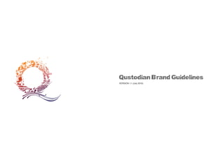
- 1. Qustodian Brand Guidelines VERSION 1.1 (July 2010)
- 2. 1.00 Introduction to the Qustodian identity system
- 3. Introduction 1.01 Welcome to the Qustodian Brand Guidelines. It’s purpose is a gentle introduction to our new identity together with basic visual and tonal ‘guides’ that help show the Qustodian brand in it’s best light. Although there are certain rules that should be followed, common sense and a sense of visual style must be used at all times. The rules outlined in this manual are here to ‘guide’, not to restrain. QUSTODIAN BRAND GUIDELINES VERSION 1.1 (July 2010)
- 4. About our brand & identity ELEMENTS The Qustodian identity consists of several elements: visual and tonal. Consistent use of both of these elements will strengthen the visual recognition and in turn, make us stronger and more recognisable as a brand. The brandmark & LOGOTYPE The ‘Brandmark’ (the Q), is our most recognisable asset. Our identity consists of a recognisable Q (the brandmark) and the Qustodian name (the logotype). Together they make up our brandmark & logotype. There are a variety of versions that should accommodate most needs. However, if the versions contained within these guidelines are not sufficient, please contact the Qustodian Marketing Department. Do not attempt to amend the master files. WHAT DOES IT MEAN? The ‘Q’ is designed to intrigue the viewer. At first glance, it may look like an abstract ‘Q’ but on closer inspection, you will find that there is more to it than at first sight. The important thing to remember is not the individual elements in isolation but that fact that all of these elements combine to make the Qustodian brandmark. On this point, you do not have to see every single detail contained within the brandmark - rather that you can see that there is something and you are intrigued to find out more. On closer inspection, you will find that the elements that make up the brandmark are not a random selection of objects but are, in fact related to the 12 categories of Qustodian. 1.02 WHY DO THE COLOURS CHANGE? Qustodian is a ‘white brand’. In that sense, we have no colour (white) or we are every colour hence the variety of colour versions available. Qustodian will carry a lot of very well known and recognisable brands and as such, it is important that our brand does not conflict with our partners’ visual identities. We do not want to be known as ‘the lime green brand’ but want for our visual identity to be as flexible as possible to be able to accommodate our partners’ needs whenever possible. IT ALL SEEMS A BIT ‘COMPLICATED’? With all the media channels available to the consumer nowadays, it is important for a new brand to stand out amid all of the other companies out there. Whilst we know it would be easier to have a green logo that always appeared in the bottom right of every page, we also realise that is not the best way of building brand recognition. We are very proud of the new logotype and brandmark and feel that it sets us apart. With careful use, we feel that it can really help with all of our communication needs. QUSTODIAN BRAND GUIDELINES VERSION 1.1 (July 2010)
- 5. What we are and how we speak 1.03 PRINCIPLES Our brand is not just about how we look, it is about how we feel, talk, act and communicate - both internally and externally. We are new and will change as we learn and grow - both as a brand and as a company. What might be true today, may not be true tomorrow. To that end, we have defined a few key words and brand values that will help when talking about the Qustodian brand. We are: Clear Engaging Trustworthy Fun Surprising Useful Intrusive Static Misleading Frivolous Dull We are clear, simple and to the point. We avoid technology and marketing jargon. We are unpretentious and informal. We like to laugh. We are not: We realise that the mobile is personal. We respect that and will never send unwelcome or intrusive communications. We are passionate about what we do. We take it very seriously. Our communication is two-way. It is interesting not dull. We are honest and genuine. We do not like hidden small print. We like to do good things that make you smile. We are a benefit not a pain. We want to become a part of people’s lives. We are new and always looking to improve. We should always look to do and be better. We do not confuse with waffle or small print. We should never be boring. Boredom and dullness means people stop listening. QUSTODIAN BRAND GUIDELINES VERSION 1.1 (July 2010)
- 6. 2.00 Brandmarks & logotypes QUSTODIAN BRAND GUIDELINES VERSION 1.1 (July 2010)
- 7. The brandmark & logotypes: At a glance 2.01 THE BRANDMARK & LOGOTYPE These are the primary versions and should be used wherever possible. brandmark & logotype: vertical MASTER brandmark & logotype: horizontal MASTER brandmark & logotype: CATEGORY MASTERS THE BRANDMARK These brandmark master versions should only be used when the primary versions cannot be used. Brandmark: MASTER VERSION Brandmark: ICON VERSION Brandmark: APP BAR VERSION logotype: MASTER VERSION logotype: SECONDARY VERSION The icon and App bar versions have specifically designed to work at small sizes i.e on mobile phones. They should not be used in place of the master version of the brandmark. The Logotype These versions are rarely used on their own. If they are to be used, they should be used as a supporting element to the brandmark. QUSTODIAN BRAND GUIDELINES VERSION 1.1 (July 2010)
- 8. The brandmark & logotype: vertical primary version 2.02 USAGE Either this or the horizontal master version should be used when presenting the Qustodian brand. Which version to use will often depend on the format of the deliverable. For example, the vertical version (shown here) would work best on a ‘goalpost’ web banner. The horizontal version would work best on a landscape web banner. Common sense and optimum legibility should dictate which version should be used. CONSTRUCTION The relationship between the logotype (Qustodian) and the brandmark (the Q) is fixed and should not be altered. If you need to separate the elements, use the individual versions. However, the elements should be kept separate and not used to create new configurations. COLOUR VERSIONS The colour version shown here is the preferred version. Each of the colour versions have been specially designed to ensure optimum legibility across a range of sizes. Only the colour versions shown in this manual should be used. Do not attempt to make your own colours. TAGLINE The ‘Keeper of Yoads’ tagline is preferred to be used where possible. However, if the legibility is compromised, it can be omitted. QUSTODIAN BRAND GUIDELINES VERSION 1.1 (July 2010)
- 9. The brandmark & logotype: vertical secondary versions 2.03 USAGE In addition to the primary versions, there are 4 additional colour versions. They are secondary versions and should only be used when the primary versions are not appropriate. The black or white versions should only be used when either of the primary versions are not suitable i.e. where full-colour printing is not cost-effective. CONSTRUCTION The relationship between the logotype (Qustodian) and the brandmark (the Q) is fixed and should not be altered. If you need to separate the elements, use the individual versions. However, the elements should be kept separate and not used to create new configurations. COLOUR VERSIONS There are 4 secondary colour versions: magenta, green (shown here) cyan and orange. Each of the colour versions have been specially designed to ensure optimum legibility across a range of sizes. Only the colour versions shown in this manual should be used. Do not attempt to make your own colours. TAGLINE The ‘Keeper of Yoads’ tagline is preferred to be used where possible. However, if the legibility is compromised, it can be omitted. QUSTODIAN BRAND GUIDELINES VERSION 1.1 (July 2010)
- 10. The brandmark & logotype: horizontal primary version 2.04 USAGE Either this or the vertical master version should be used when presenting the Qustodian brand. Which version to use will often depend on the format of the deliverable. For example, the horizontal version (shown here) would work best on a landscape web banner. The vertical version would work best on a ‘goalpost’ web banner. Common sense and optimum legibility should dictate which version should be used. CONSTRUCTION The relationship between the logotype (Qustodian) and the brandmark (the Q) is fixed and should not be altered. If you need to separate the elements, use the individual versions. However, the elements should be kept separate and not used to create new configurations. COLOUR VERSIONS The colour version shown here is the preferred version. TAGLINE The ‘Keeper of Yoads’ tagline is preferred to be used where possible. However, if the legibility is compromised, it can be omitted. QUSTODIAN BRAND GUIDELINES VERSION 1.1 (July 2010)
- 11. The brandmark & logotype: horizontal secondary versions 2.05 USAGE In addition to the primary versions, there are 4 additional colour versions. They are secondary versions and should only be used when the primary versions are not appropriate. The black or white versions should only be used when either of the primary versions are not suitable i.e. where full-colour printing is not cost-effective. CONSTRUCTION The relationship between the logotype (Qustodian) and the brandmark (the Q) is fixed and should not be altered. If you need to separate the elements, use the individual versions. However, the elements should be kept separate and not used to create new configurations. COLOUR VERSIONS Each of the colour versions have been specially designed to ensure optimum legibility across a range of sizes. Only the colour versions shown in this manual should be used. TAGLINE The ‘Keeper of Yoads’ tagline is preferred to be used where possible. However, if the legibility is compromised, it can be omitted. QUSTODIAN BRAND GUIDELINES VERSION 1.1 (July 2010)
- 12. The brandmark & logotype: category versions 2.06 USAGE These versions are only used when referencing the individual categories. They should not be used in place of the master brandmark or logotype. CONSTRUCTION The relationship between the logotype (Qustodian) and the brandmark (the Q) is fixed and should not be altered. If you need to separate the elements, use the individual versions. However, the elements should be kept separate and not used to create new configurations. COLOUR VERSIONS The colour versions shown here are not the all of the colour versions available. There are unique colour versions for each of the 12 brand categories. TAGLINE The ‘Keeper of Yoads’ tagline is replaced by the category identifier. QUSTODIAN BRAND GUIDELINES VERSION 1.1 (July 2010)
- 13. The brandmark: primary version 2.07 USAGE This version is used if the brandmark is used in isolation or if the brandmark and logotype need to be used as individual elements. COLOUR VERSIONS The colour version shown here is the preferred version. Each of the colour versions have been specially designed to ensure optimum legibility across a range of sizes. Only the colour versions shown in this manual should be used. Do not attempt to make your own colours. As a colour alternative to the master version shown here, there are the 4 secondary colour versions available. QUSTODIAN BRAND GUIDELINES VERSION 1.1 (July 2010)
- 14. The brandmark: icon versions 2.08 USAGE These brandmark versions are used as the icon on mobile devices. CONSTRUCTION The icons shown here are simplified versions of the master brandmarks. They are specifically designed to be legible at small sizes and should only be used for this purpose. Do not enlarge these icon brandmarks. COLOUR VERSIONS The colour versions shown here are the only versions available. Do not attempt to recolour the icon versions of the brandmark. Photos ICON USAGE 1. The full colour icon version should be used on high resolution devices such as Smartphones. Settings Qustodian ICON USAGE 2. The single colour icon version should be used on more basic mobile devices. There is no pre-defined pixel size for which each of the icons should be used. Where possible, use the full-colour version otherwise use the single colour version. Common sense should be your guide. QUSTODIAN BRAND GUIDELINES VERSION 1.1 (July 2010)
- 15. The brandmark & logotype: App bar versions 2.09 USAGE These brandmark versions are used as the icon on mobile devices. CONSTRUCTION The icons shown here are simplified versions of the master brandmarks. They are specifcally designed to be legible at small sizes and should only be used for this purpose. Do not enlarge these icon brandmarks. COLOUR VERSIONS The colour versions shown here are the only versions available. Do not attempt to recolour the icon versions of the brandmark. APP BAR USAGE 1. The full colour App bar version should be used on high resolution devices such as Smartphones. Please note that the positioning shown here are not to dictate where it should be used on screen. They are to show on what type of the devices they should be used. APP BAR USAGE 2. The single colour App bar version should be used on more basic mobile devices. There is no pre-defined pixel size for which each of the versions should be used. Where possible, use the full-colour version otherwise use the single colour version. Common sense should be your guide. QUSTODIAN BRAND GUIDELINES VERSION 1.1 (July 2010)
- 16. The logotype: individual versions 2.09 USAGE This logotype should only be used when the brandmark & logotype versions are not suitable. CONSTRUCTION If you need to separate the elements, then you should use this individual version. However, the elements should be kept separate and not used to create new configurations. COLOUR VERSIONS The colour version shown here is the preferred version. Each of the colour versions have been specially designed to ensure optimum legibility across a range of sizes. Only the colour versions shown in this manual should be used. Do not attempt to make your own colours. TAGLINE The ‘Keeper of Yoads’ tagline is preferred to be used where possible. However, if the legibility is compromised, it can be omitted. QUSTODIAN BRAND GUIDELINES VERSION 1.1 (July 2010)
- 17. 3.00 Brandmark & logotype usage
- 18. The brandmark & logotype: exclusion zones 3.01 USAGE To maintain a clear and consistent use of the logotype and brandmark, there must remain a clear area (exclusion zone) around them which is not encroached on. This exclusion zone is defined by the width of the ‘Q’ or the height of the ‘n’ in Qustodian - as shown by the tinted blue box. Nothing should fall within this clear space, as it represents the minimum distance between any adjoining elements and the Qustodian brandmarks and logotypes. Please note that the exclusion zones shown here are just as a guideline and are not intended a substitute for good design form and aesthetics. QUSTODIAN BRAND GUIDELINES VERSION 1.1 (July 2010)
- 19. Correct brandmark & logotype usage The Qustodian brand allows a certain amount of freedom within some very flexible guidelines. Unfortunately, this freedom of expression can also be interpreted incorrectly. 3.02 1 2 3 4 5 6 A few examples of the Qustodian brandmark & logotype being correctly implemented are shown here: 1. The brandmark & logotype are used on a white / light background. The background colours should either be neutral (white, black, light tints of non-colours i.e grey) or from the recommended colour palette (see 2). 2. The Qustodian brandmarks contrast with background colours from the recommended palette. Care should be taken that the brandmark and logotype remain legible. 3. The brandmark is placed over an image. Care should be taken so that the brandmark remains legible. Headings are set in 30 point Helvetica Bold 4. The secondary colour brandmark is used on a neutral (white) background. The ‘Q’ is also • Body copy is 24pt Helvetica Regular. seperate from the ‘Qustodian’ confusion etc. • They are colored 80% black. • Headlines can be any colour from the Qustodian palette. • The Qustodian logo changes colour through the pages. 5. The secondary colour brandmark is used on a recommended colour background. 6. The brandmark as a decorative element. The white version is used and cropped to highlight the individual categories. 4 © Qustodian 18 June 2010 These are just a few examples of good usage of the brandmark and logotype. QUSTODIAN BRAND GUIDELINES VERSION 1.1 (July 2010)
- 20. Incorrect brandmark & logotype usage The Qustodian brand allows a certain amount of freedom within some very flexible guidelines. Unfortunately, this freedom of expression can also be interpreted incorrectly. 3.03 1 2 3 4 5 6 A few examples of the Qustodian brandmark being incorrectly implemented are shown here: 1. Do not mix your own colours on the brandmark or logotype. Only the approved supplied colour versions should be used. 2. The brandmark, logotype and background colours are not from the Qustodian colour palette. 3. The relationship between the brandmark and the logotype is fixed and should not be altered. 4. Do not substitute typefaces. The Qustodian logotype has been specially created and should not be altered. 5. Do not distort (stretch or squash) the logotype or brandmark. 6. Ensure that the brandmark is always legible. When using colours, only use the colours from the Qustodian recommended palette. Qustodian QUSTODIAN BRAND GUIDELINES VERSION 1.1 (July 2010)
- 22. Typefaces 4.01 Orial Bold ABCDEFGHIJKLMNOPQRSTU} VWXYZ abcdefghijklmnopqrstuvwx} yz0123456789 Headlines & large size text (above 18 pt). Helvetica Neue 45 Light ABCDEFGHIJKLMNOPQRSTUVWXYZ abcdefghijklmnopqrstuvwxyz0123456789 This is the recommended weight for the majority of Qustodian usage. i.e. main body text, captions and headlines. Helvetica Neue 75 Bold ABCDEFGHIJKLMNOPQRSTUVWXYZ abcdefghijklmnopqrstuvwxyz0123456789 Titles, sub-headings and for emphasis text. Can also be used sparingly for introductory paragraph text. Please note that this typeface is very limited in use as it is not a full character set. What this means is that it does not contain certain characters i.e the Euro symbol. QUSTODIAN BRAND GUIDELINES VERSION 1.1 (July 2010)
- 23. Colour palette Health & Beauty Ivory Lifestyle Yellow Music & Entertainment Orange Sport Red Food & Drink Wine Red Fun & Recreation Purple Fashion Violet Automotive Petrol Blue Finance & Banking Blue Travel & Tourism Turquoise Information & Education Green Technology & Gadgets Steel Grey 4.02 0:5:20:0 255:239:207 CMYK RGB 15:50:50:10 194:130:111 0:10:100:0 255:221:0 0:75:100:0 242:101:34 0:60:100:0 245:130:32 20:100:100:0 201:37:44 0:100:100:0 237:28:36 0:100:100:60 121:0:0 30:100:100:20 153:31:35 60:100:100:50 76:17:19 40:100:0:0 163:35:142 70:100:20:60 55:0:62 80:100:0:0 92:45:145 90:100:0:75 17:0:56 100:65:35:15 0:84:118 100:100:70:25 40:37:64 100:50:0:0 0:114:188 100:100:0:50 28:8:87 100:0:40:0 0:170:173 100:40:40:40 0:83:98 50:0:100:0 141:198:63 100:30:100:0 0:133:74 40:40:0:40 104:101:137 CMYK RGB 80:60:0:60 27:49:94 QUSTODIAN BRAND GUIDELINES VERSION 1.1 (July 2010)
- 24. 5.00 Qustodian brandmark & logotype implementation
- 25. Business Cards 5.01 The business card design is designed to be both stylish yet functional. The white front contains all the essential information with the name and title being the most prominent. The reverse show details of the 12 categories - each with their associated colour vignette. To add a bit of fun to the cards, they form together to make a complete Qustodian ‘Q’. QUSTODIAN BRAND GUIDELINES VERSION 1.1 (July 2010)
- 26. Powerpoint The Powerpoint templates are a basic yet essential part of communicating the Qustodian brand. The Qustodian Powerpoint consists of: 5.02 1. 2. Headings are set in 30 point Helvetica Bold 1. Title slides can either be with a simple white or coloured background (from the recommended colour palette). • Body copy is 24pt Helvetica Regular. • They are colored 80% black. Title Slide (colour version) 2-3. Standard text pages consist of a simple and functional page with the Qustodian brandmark. The brandmark can either be the master colour or one of the 4 secondary colour versions. • Headlines can be any colour from the Qustodian palette. • The Qustodian logo changes colour through the pages. Sub-heading here 4. Divider slides consist of coloured backgrounds from the recommended palette with large text. 4 © Qustodian 18 June 2010 Headings are set in 30 point Helvetica Bold • Body copy is 24pt Helvetica Regular. This is a divider slide which uses oversized text • They are colored 80% black. • Headlines can be any colour from the Qustodian palette. • The Qustodian logo changes colour through the pages. 3 3. © Qustodian 6 18 June 2010 4. © Qustodian 18 June 2010 QUSTODIAN BRAND GUIDELINES VERSION 1.1 (July 2010)